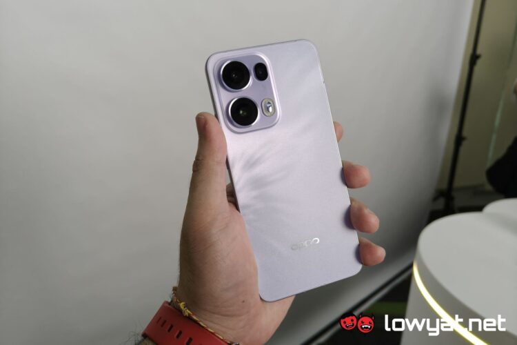
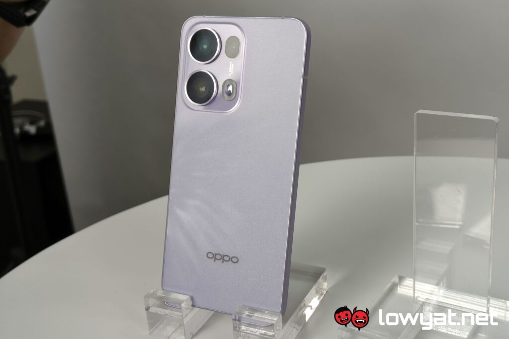
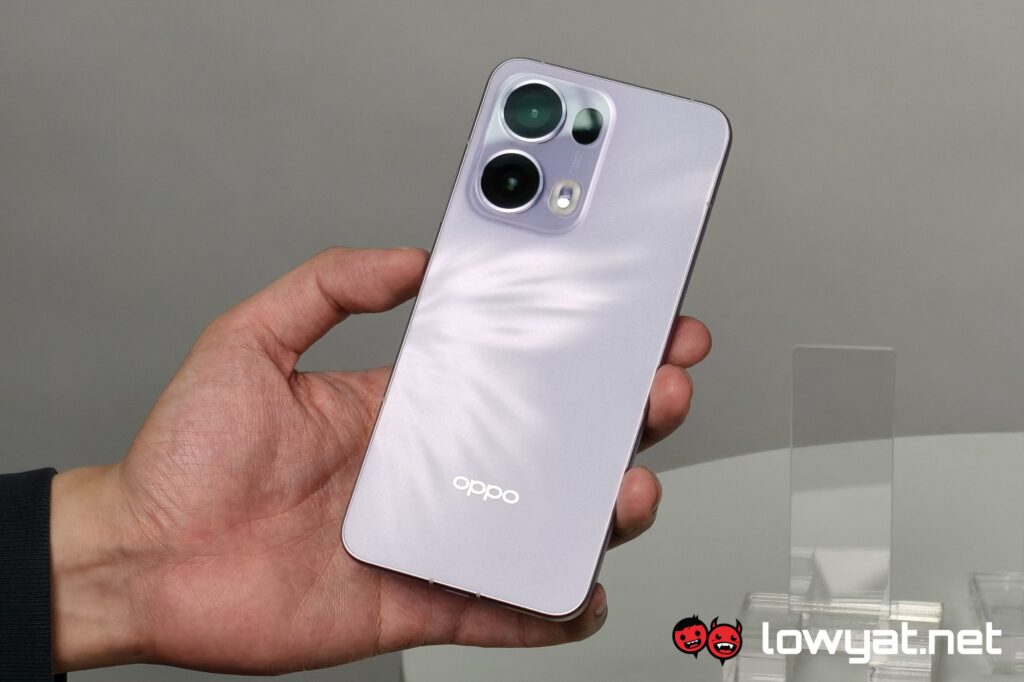
The OPPO Reno13 series has just been launched earlier today, but the brand actually gave us a sneak peek at the devices a couple of weeks ago. But for the purpose of this hands on, I’ll be focusing on giving my immediate impressions on the Pro model, with a mention of the base model as a second point of comparison.
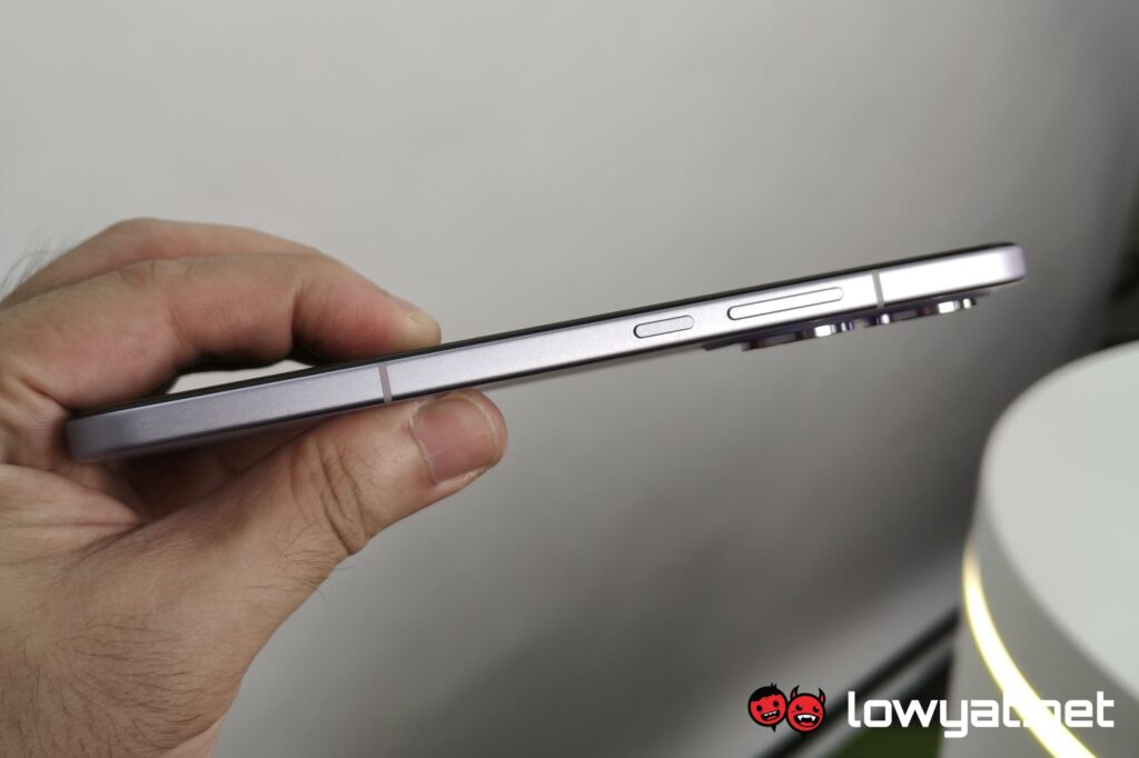
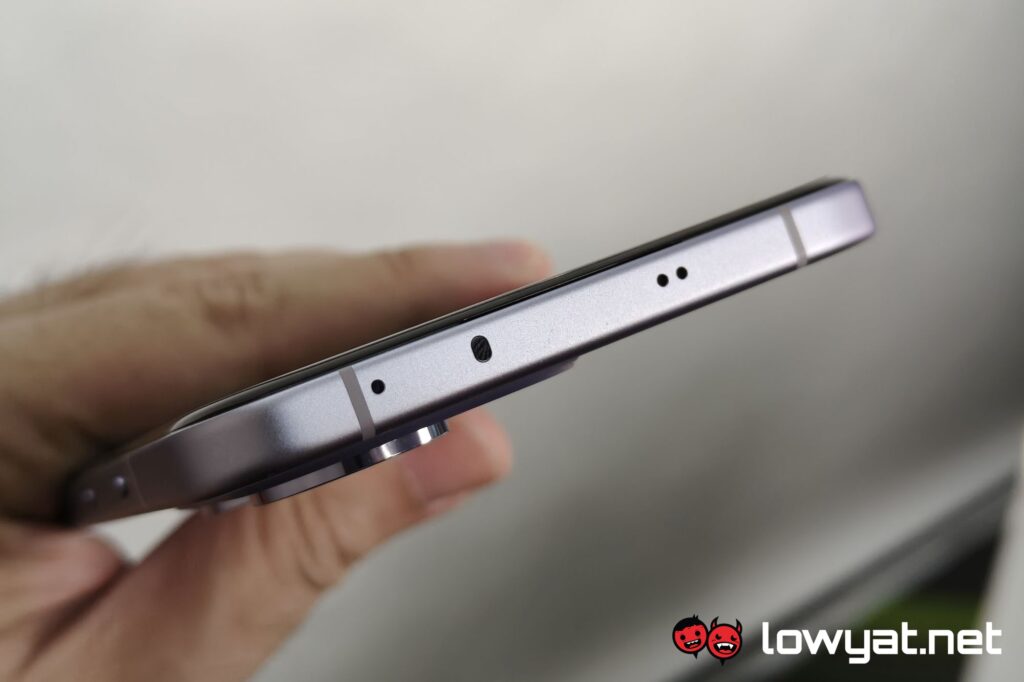
As with many smartphones introduced since the start of last year, the OPPO Reno13 Pro has most of its focus on the software side of things, with emphasis on generative AI. In fairness, this also applies to the predecessor model, so it’s at least nice to see that there are some visual differentiating factors between the two. The second visible difference is the material on the side now being a less reflective matte surface compared to before.
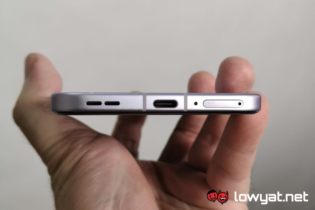
Beyond that though, you’ll likely be hard-pressed to find more differences between the two, but only because smartphone design has been mostly homogenised now. The volume rocker and power button are on the right where you’d expect, with the former being atop the latter. Going to the bottom, you’ll find the SIM tray, USB-C port and the speaker slits being in the exact same position as before.
Comparing between the base model and the Pro model, on the other hand, the camera island is where the most obvious difference is. Specifically the size and location of the LED flash. Beyond that, the OPPO Reno13 Pro is marginally larger than the base model, but it’s probably not something you’d notice at just a glance.

As for the way the OPPO Reno13 Pro feels in hand, it feels pretty light in hand, which is continuing the trend from the previous phone. The battery capacity has been bumped up to 5,800 mAh, and it feels just about the right size for a device with a 6.83-inch screen. On a more granular level though, the less reflective side did not add more texture – and therefore grip – than I thought it would.
For the back, it could go both ways, because the texture is more immediately noticeable, though this doesn’t always translate to less slippage. Unless you touch the camera island, which is the usual glass. Of course, a silicone case is available in the box for a different feel of the phone altogether, with a slight increase in durability in the face of accidents.
Swiping around from screen to screen and from app to app is pretty smooth, but that’s to be expected with a 120Hz display and a MediaTek Dimensity 8350 chipset. On the software side of things, you also get OPPO’s own take on the Apple Dynamic Island, which pops up when you get notifications, though a quick look didn’t quite allow me to check if it has extended features beyond that.

In terms of camera quality the OPPO Reno13 Pro does pretty well, at least with limited testing. All of the images you see in this article is taken with the phone itself, at the very least it’s good enough to preserve the texture detail at the back of the phone that I described earlier. That being said, the setting, with warm-ish lighting, made it difficult to judge colour accuracy, though historically these phones tend to fall on the warmer and more vibrant side of things.
To reiterate what was mentioned in the launch report, the OPPO Reno13 series, including the base, Pro and F models are available for pre-order starting today until 10 January. They should be available via the usual retail channels after that. As for a more in-depth look of the phone, stay tuned for the review coming up in the near future.

