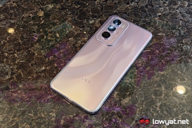
The OPPO Reno12 Pro was launched today, alongside the base model. But prior to the launch, the company had provided us with the device to give it a quick test run. Worth noting though that things will be a little different this time around compared to the way we usually share our hands-on impressions.
This is simply because the OPPO Reno12 Pro that we have on our hands is running pre-release software. This means that while it will feel and handle the same as the ones you find on shelves, there may be some software differences between the two. That being the case, the pre-release software still showcases the most important bit on that front, which should still be present when the retail version becomes available.
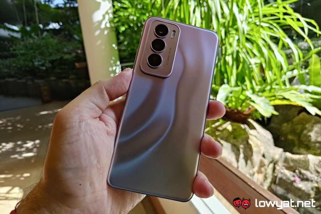
With that out of the way, let’s describe what the OPPO Reno12 Pro looks and feels like, as we usually do. And to start, the phone feels light in hand which, on one hand, probably not something you’d expect from a phone with a 5,000mAh battery. But on the flip side, the company has also achieved this with the previously launched Reno11 F, so it’s more of a trend than a true surprise.
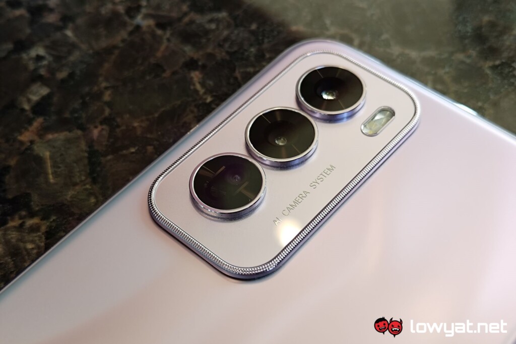
While the OPPO Reno12 Pro has a flatter profile compared to the base model, the very edges are still mildly curved. This further enhances the comfort factor when it is held. The back is very mildly textured, besides the bit with the company’s branding, which can make it pretty slippery at times.
For what it’s worth, the phone does come with a silicon case in the box if that becomes a problem. But putting this on does obscure the pretty looking back of the phone though, so there’s that to be considered.
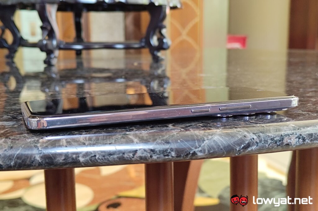
Buttons-wise, things are pretty standard here on the OPPO Reno12 Pro. There’s the usual power button and volume rocker on the right side, but by default holding the former doesn’t give you the option to restart or turn off the device. Instead, these are brought up by holding down and volume up instead.
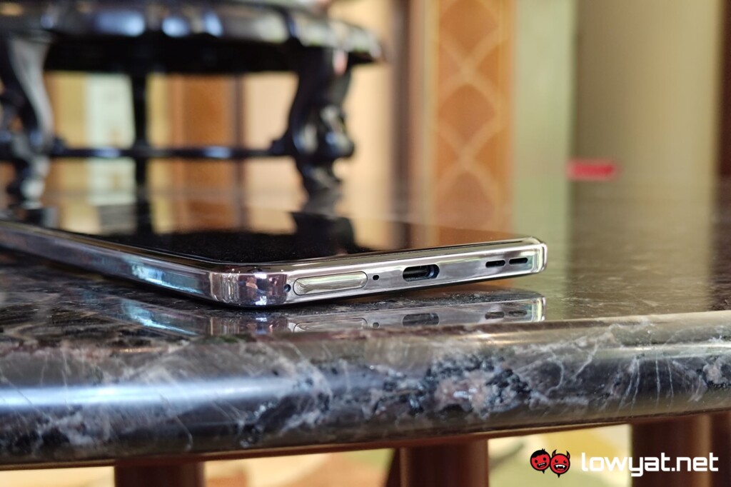
As for ports, unfortunately, as Bluetooth audio accessories become more common, the 3.5mm audio jack becomes rarer instead. With that, the only one to be found is the USB-C charging port at the bottom. As usual, you have the speaker grille as well as the SIM tray flanking said port.
But as mentioned, the main draw of the OPPO Reno12 Pro, and indeed its base model, are the AI features that come out of the box, that prior devices got via OTA updates. Likely the more used of the two is the AI Eraser in the brand’s Photos app. More specifically, the feature to remove people from your images. Of course, you can get it to struggle if you order it to remove everyone in a crowded place like a mall, but in less extreme situations, it should work just fine. That being said, you’ll still need to be online to use the feature.
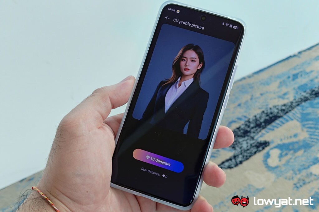
The other feature that, while interesting, won’t be seeing as much use is the AI Studio app. This adds the magic of AI image generation to completely change tone of an image. Unfortunately, this won’t see as much use simply because each use consumes tokens, and you only have a limited amount of these to start with. At the time of writing, earning more of these tokens means going through a gamified process, which may not be everyone’s cup of tea.
As mentioned in the launch report, the OPPO Reno12 Pro, as well as the base model, are available immediately. The Pro model specifically is priced at RM2,599, which you can get from the brand’s official online store, linked here.
Follow us on Instagram, Facebook, Twitter or Telegram for more updates and breaking news.


