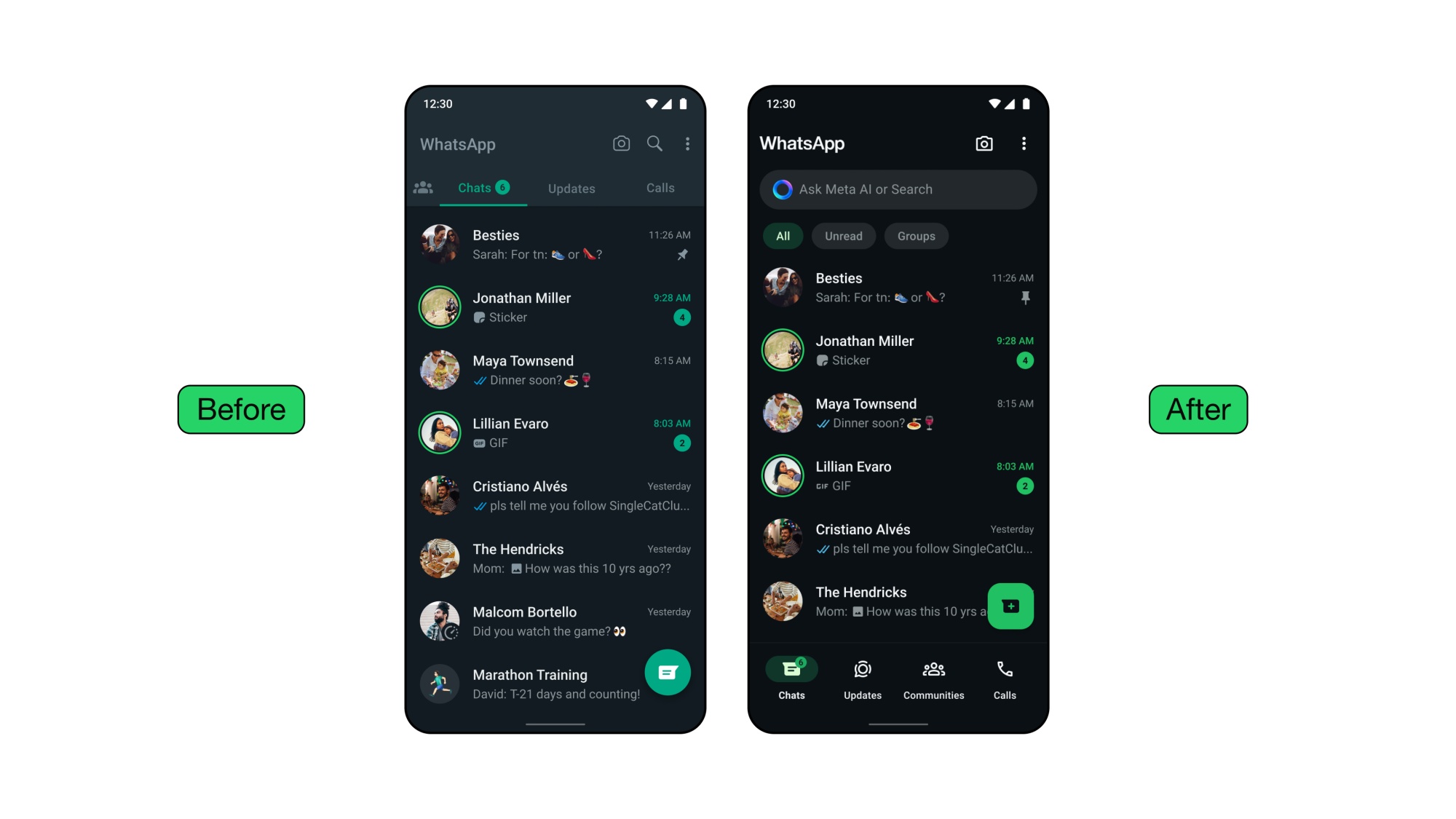
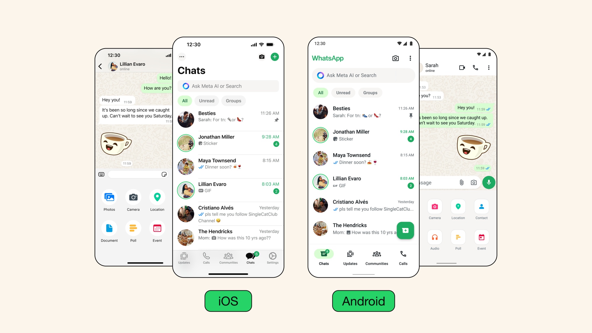
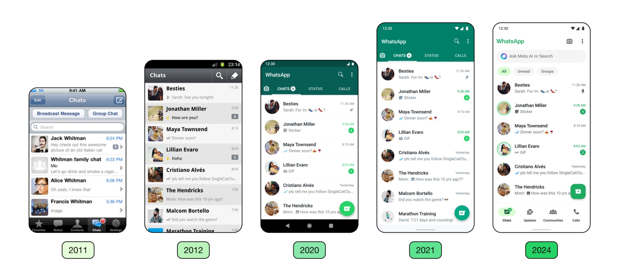
WhatsApp today has made its latest interface design update official. This provides a more streamlined look for its app on Android and iOS, with many of these newer elements already rolled out to users in stages prior to this.
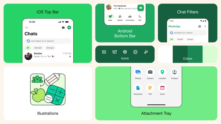
One of which is a new, consistent green palette for a unified experience on both mobile platforms. The Meta-owned messaging service says it had considered over 35 different colour iterations, ultimately aligning with its iconic green and opting for a palette that allows for harmonious colour pairings throughout the app.

WhatsApp also focused on deeper tones to reduce eye strain in low-light conditions, hence why the app’s dark mode is now one shade darker. The default background in chats is updated as well, while icons inside the app now feature a more rounded, outlined style.

On Android, the navigation bar is now offered at the bottom, making it easier for users to find what they’re looking for. This mirrors the interface initially offered on iOS,which enables users to quickly look at chats, updates, communities, and calls.

Meanwhile, over on iOS, WhatsApp has made it easier to send photos and videos thanks to a new attachment layout. Instead of a full-screen menu, users will now see an expandable tray that allows them to see the options more clearly when sending media, polls, documents, and more.
(Source: WhatsApp [official blog])
Follow us on Instagram, Facebook, Twitter or Telegram for more updates and breaking news.


