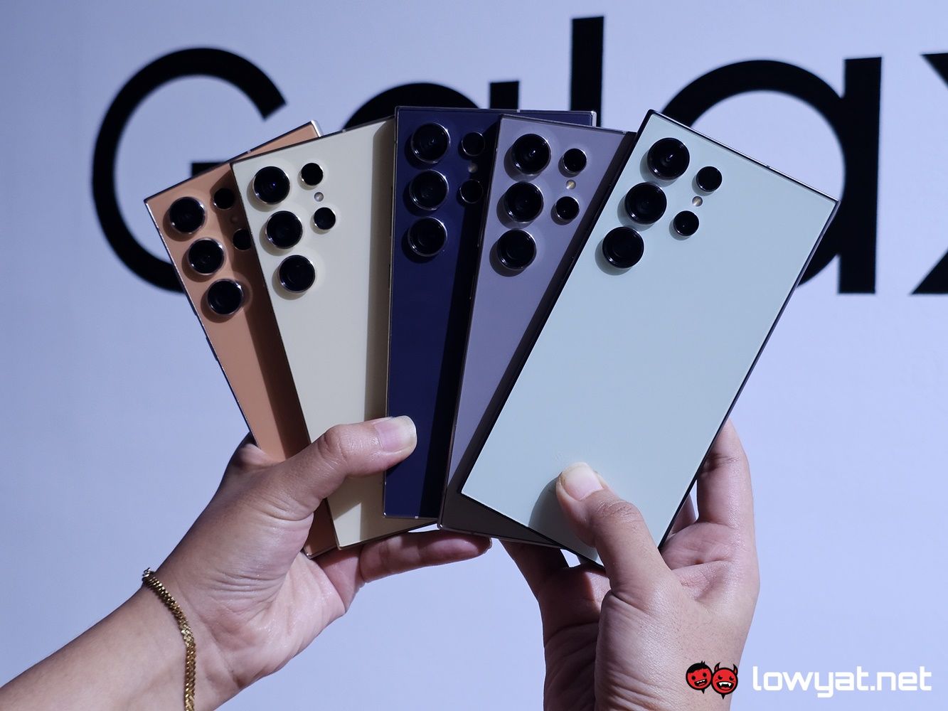
As my colleague mentioned with his hands on of the base Galaxy S24, Samsung passed us all three units of the series and in this hands on, I’ll be giving you my initial impressions of the flagship of the series, the S24 Ultra.
Out of the box, there is a noticeable difference in the weight of the phone. Even without a casing, it’s heavier than its predecessor and my daily driver, the S23 Ultra. And despite having the same 6.8-inch display size as each other, allow me to be the first to burst your bubble on one particular factor: no, you’re not going to be able to reuse the casing from the previous model, with the S24 Ultra. On paper, it’s got a wider screen-to-ratio than its predecessor. Believe me, I tried recycling my casing and suffice to say, the suit just didn’t fit.
On a side note, I suppose it would be prudent to remind you that, among the three, the S24 Ultra is the only model of the trio that is rocking the new Qualcomm Snapdragon 8 Gen 3. The other two are, unfortunately, given the Exynos 2400.
Another thing that is gone is curved sides of the display, an aesthetic that my colleague says what inevitably on the way out the door. For the uninitiated, curved edges have been around for a while and while visually pleasing, Samsung is decidedly doing away with them on the Galaxy S24 Series. There is, however, a small of economies of scale to forsaking the curves, and that is thinner bezels all around the edges. Honestly, it gives the front of the phone a tighter and, dare I say it, more uniform look.
As it has been the case with all Note-sized and Ultra devices, the S24 Ultra not only feels weighty but fairly cumbersome in both hands. That is to be expected for a plus-sized device and it’s also the price that is one-handed navigation and handling that is always paid with such devices.
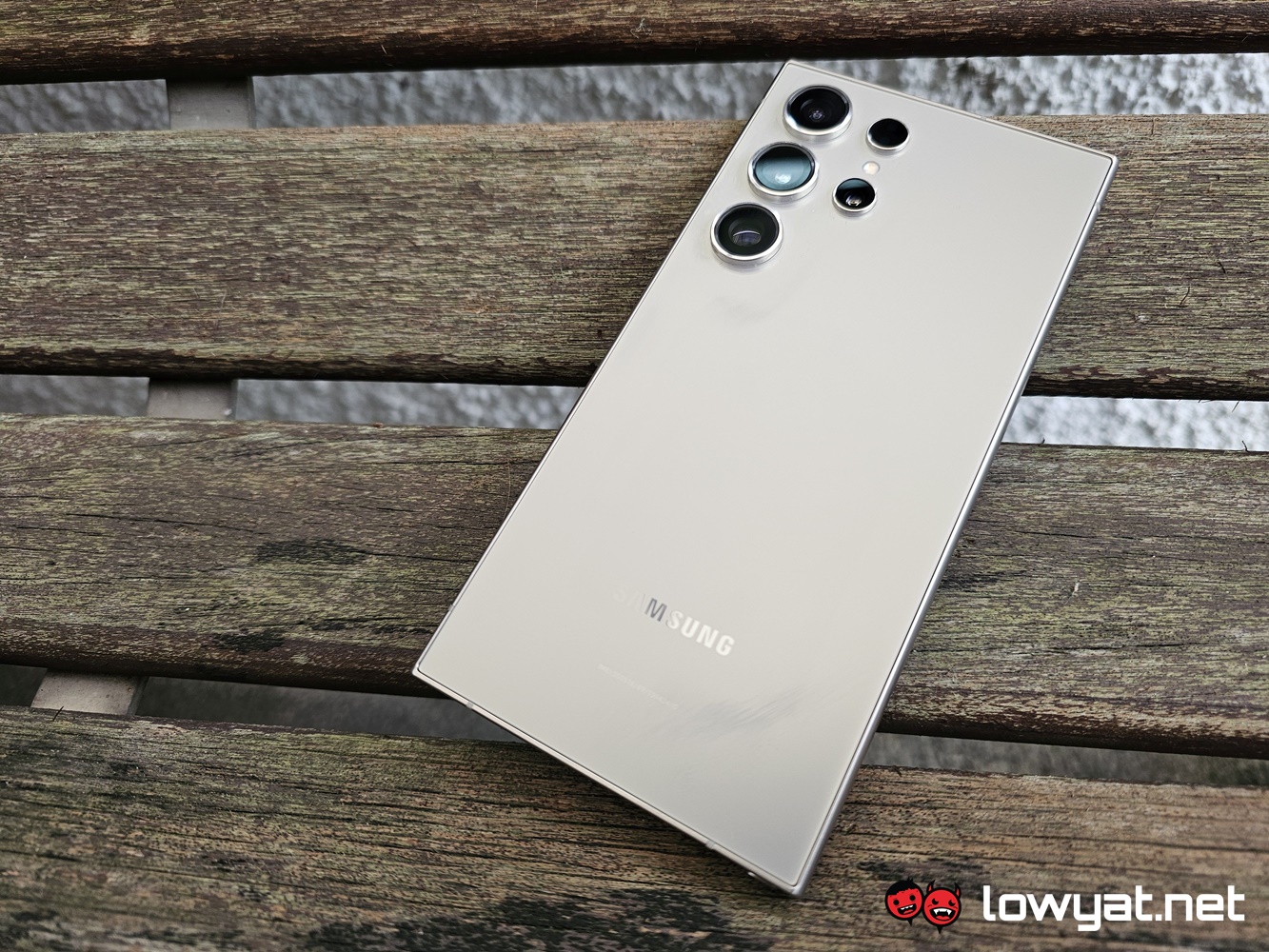
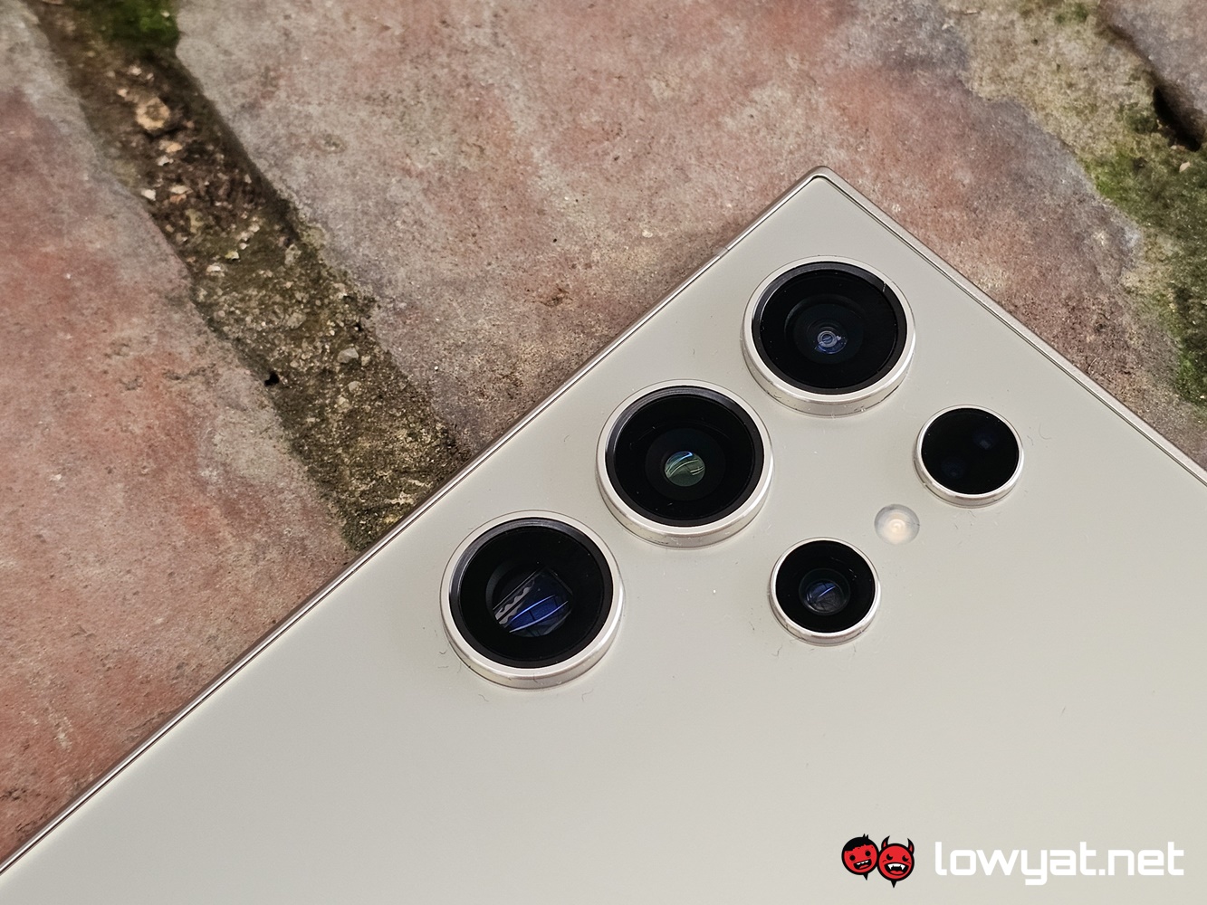
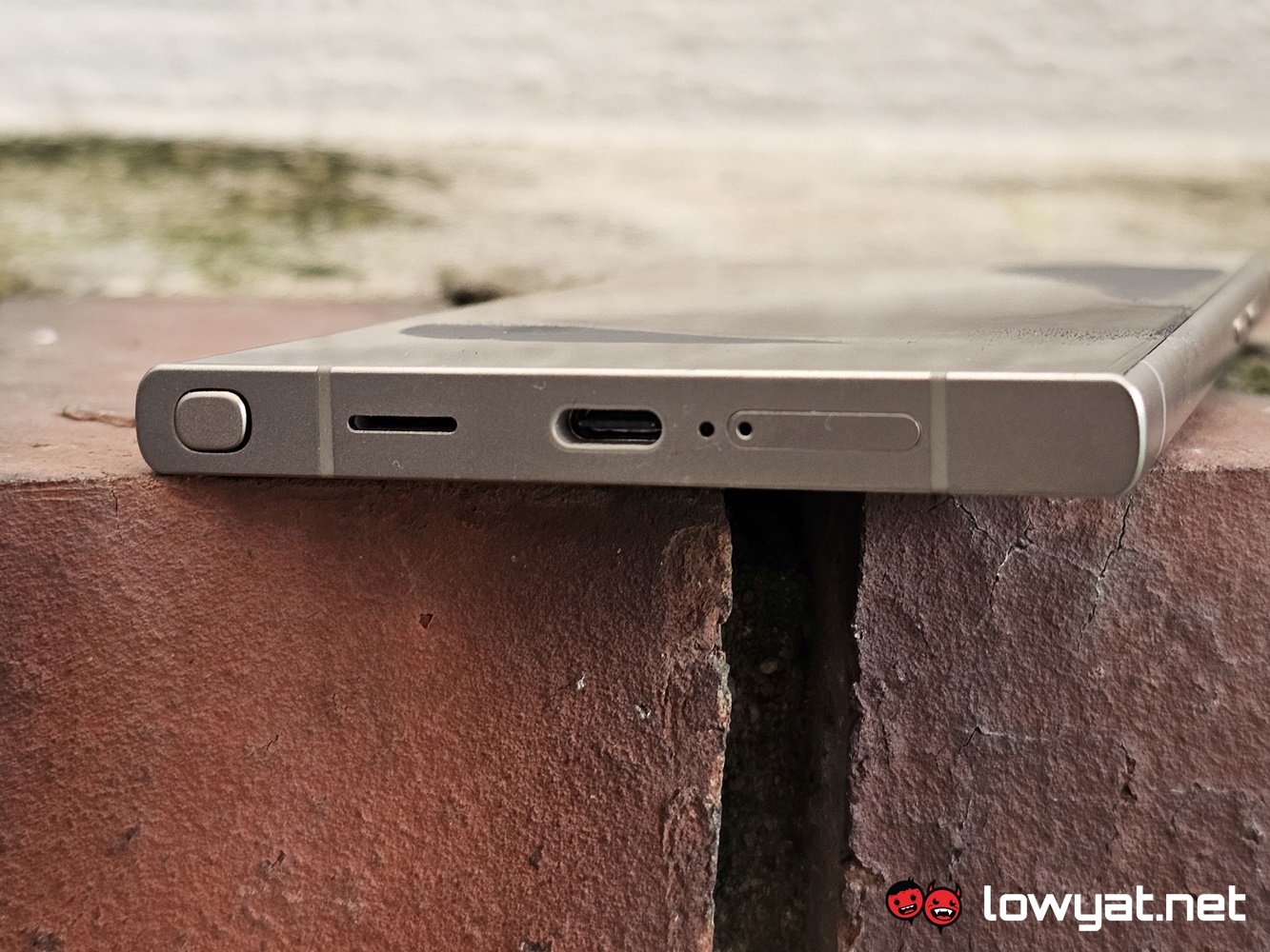
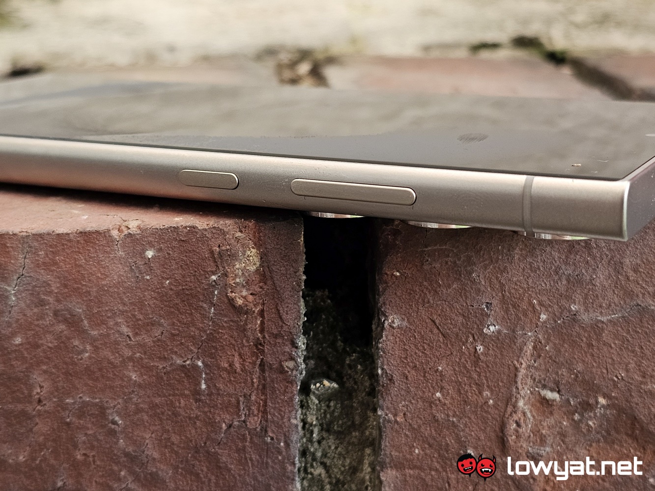
Still on the looks of the S24 Ultra, Titanium is very clearly the theme for the flagship model of the series. In my hands is the Titanium Gray model and it is spread evenly across the phone. The back of the phone is obviously the showcase for it but if you pay extra attention to the frame, the colourway is featured on it as well, and with brushed metal effect, to boot.
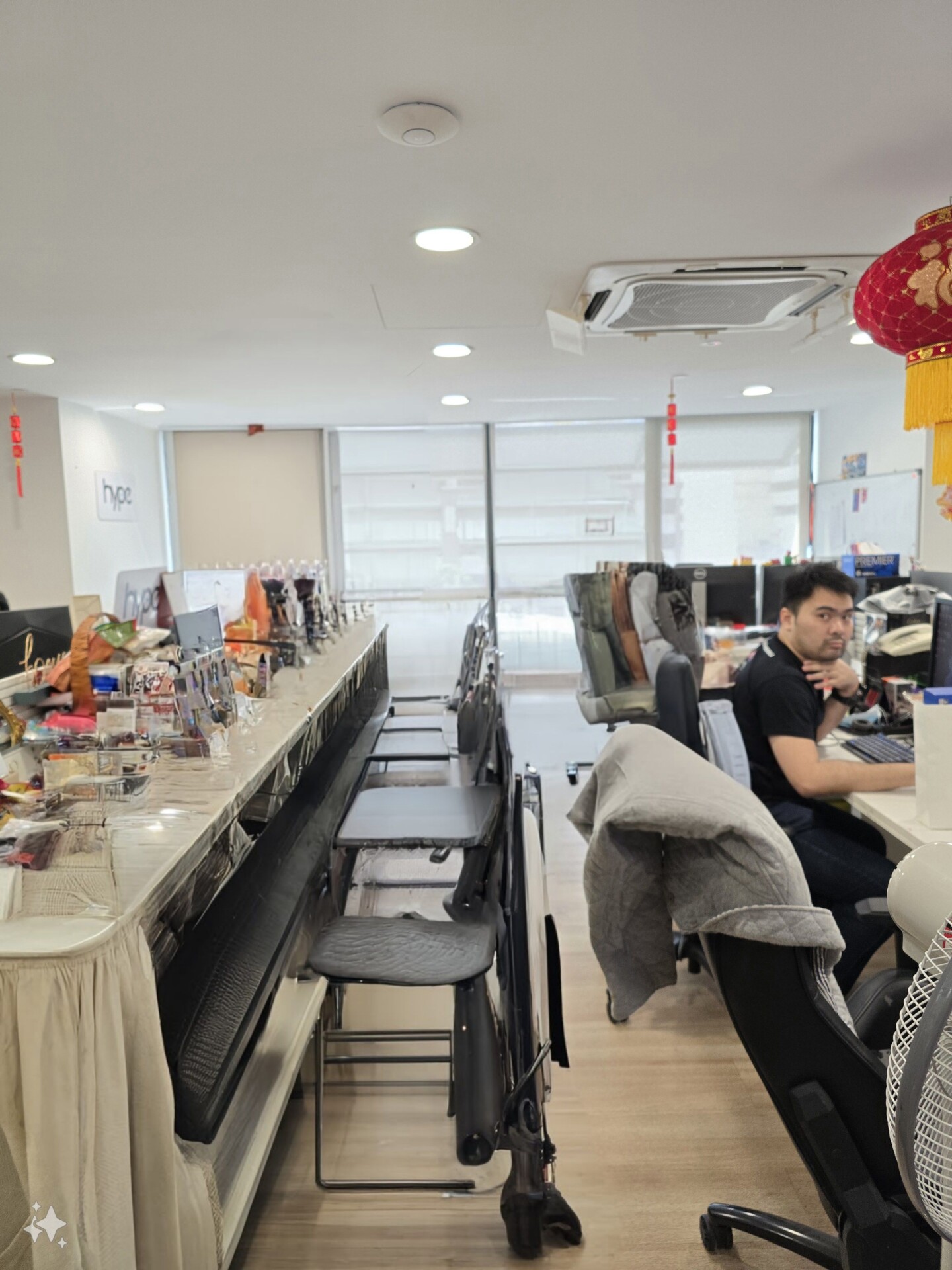
Oh, and while I’m at it, I can tell you that I did manage to play around with Samsung’s whole “Galaxy AI” spiel. Specifically the Generative Edit function with photos. And my first impression of it is that the feature still needs a bit of work and training, quite literally, within its LLM servers. Case in point, while the AI removes my colleague from the original picture, it still running on limited information of office layout, meaning that it overcompensates for what the actual background actually is. To that end, allow me to make it clear that we do not have bar-top style tables and chairs.
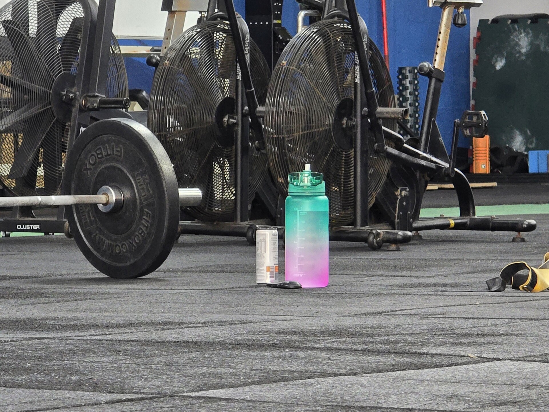
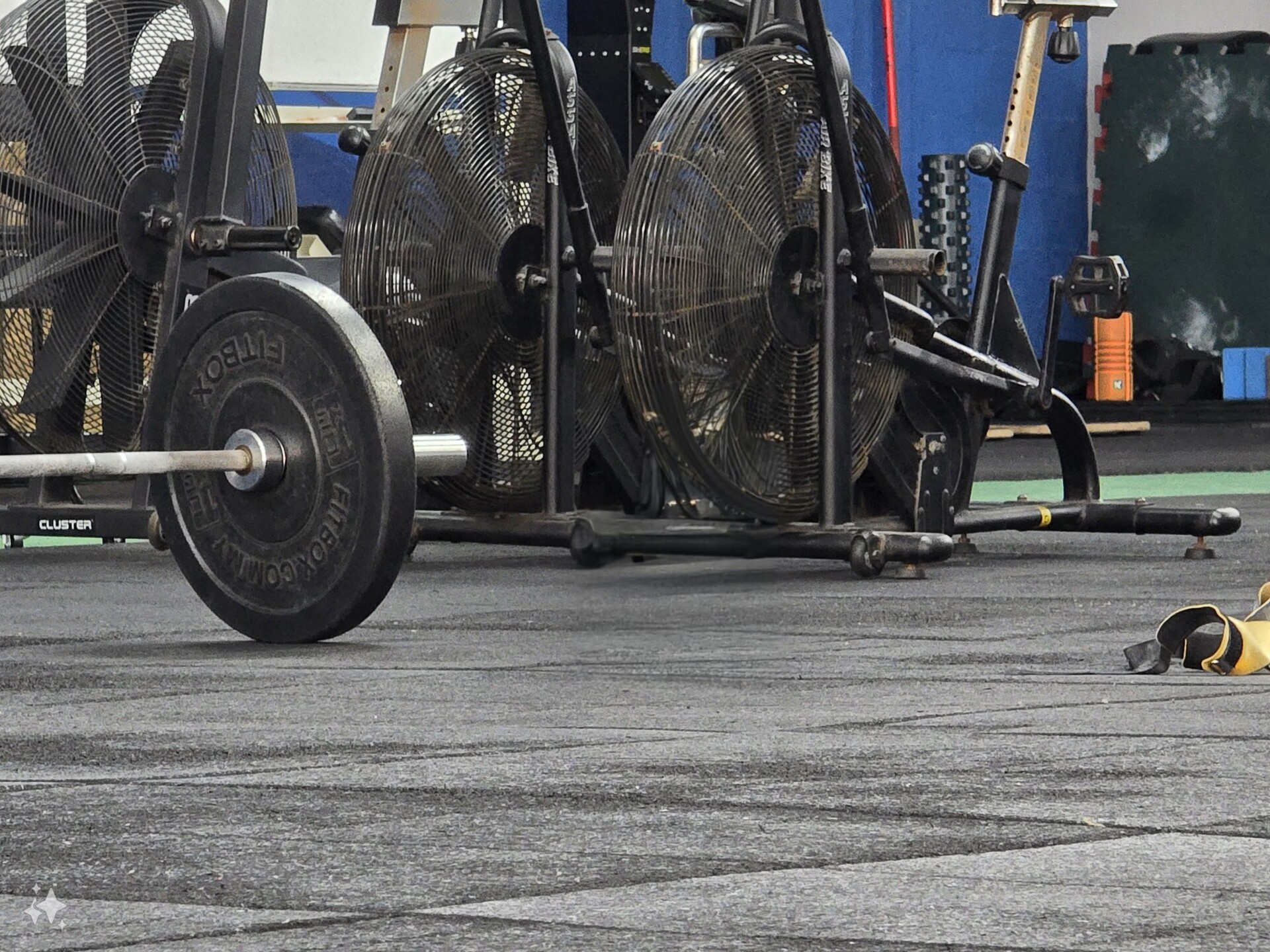
But, having said that, the Generative editing is competent enough, provided the item in question is smaller and doesn’t take up a major part of the background. To provide yet another example, removing the bottle in the following photo, the Galaxy AI engine doesn’t struggle in compensating for the practically all-black background.
At the time of writing, I am still playing around with the S24 Ultra, so I am still discovering certain new aspects brought about by the inclusion of Galaxy AI. A review of the phone will be coming soon so check this space from time to time.
Follow us on Instagram, Facebook, Twitter or Telegram for more updates and breaking news.


