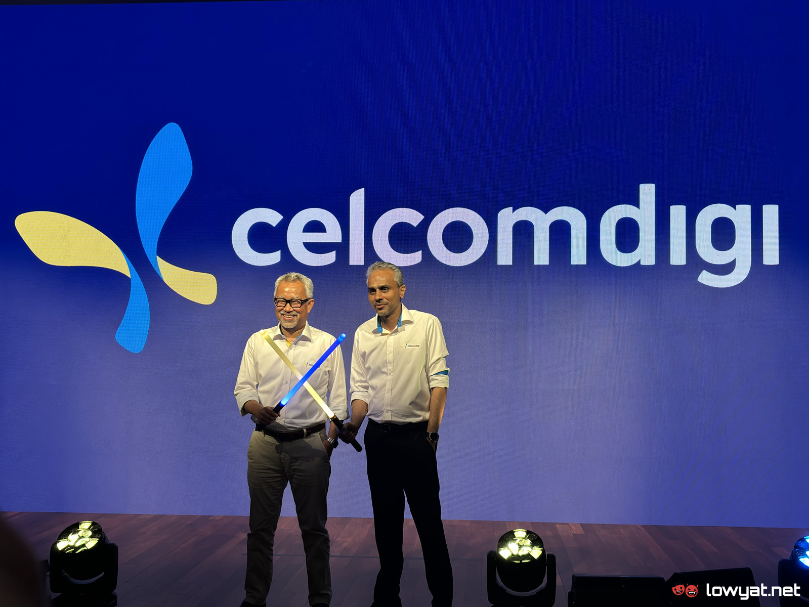
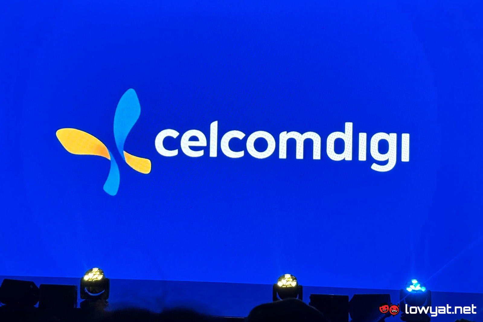
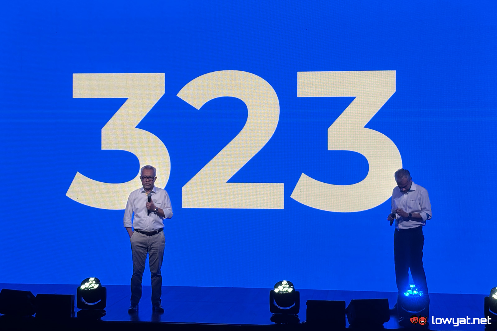
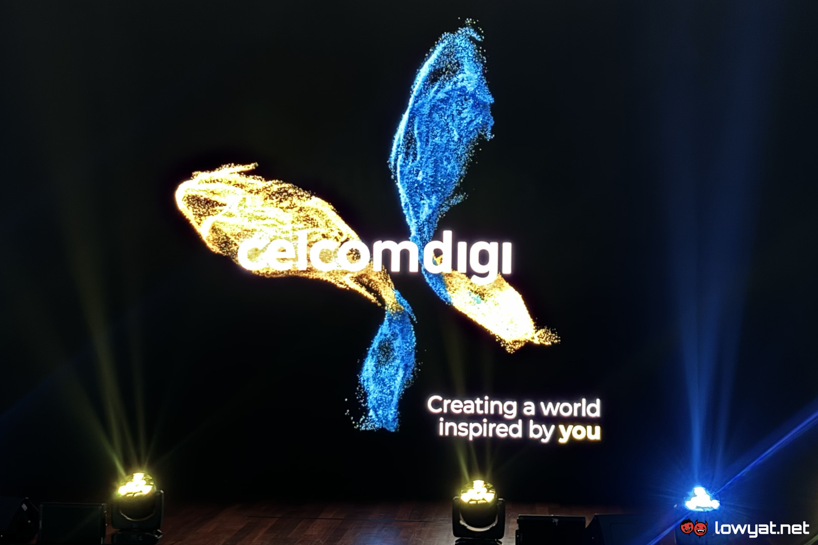
It has been over 10 months since the telco giants Celcom and Digi merged and became the entity known as CelcomDigi — 323 days, to be exact. When the company was first announced, it came with a new logo combining both carriers’ signature blue and yellow colours. Today, CelcomDigi unveiled a replacement for that logo, signifying its progress in becoming a single brand.
It still features the same colours as before but instead of a collection of blue and yellow particles, the logo now looks somewhat similar to a butterfly, which also looks like the letters “D” and “C”. Moving forward, this will be CelcomDigi’s new branding and it will be slowly reflected in their products and stores.
Currently, physical Celcom and Digi stores still exist as separate brands, but customers of both telcos are already able to get serviced at either of them. The company will still maintain legacy products as many of its customers are using them, but it will start introducing more products under the CelcomDigi brand such as its recent fibre offerings. Eventually, it will gradually migrate Celcom and Digi’s stores, websites, and apps under the new brand, but CEO Mohamad Idham Nawawi notes that this will take a while.
On a related note, Idham said the divestment of Yoodo is “on track” to meet the deadline, but did not give any other details. In case you’re unfamiliar, as part of the conditions for the merger to get clearance, Celcom’s MVNO Yoodo must be divested within 18 months of the deal being completed or it will have to be shut down.
Follow us on Instagram, Facebook, Twitter or Telegram for more updates and breaking news.


