It’s barely been a year since I last reviewed the Xperia 1 IV, and already the phone’s parent company, Sony, has launched the 5th generation of its flagship, aptly dubbed the Xperia 1 V. Like all brands and their flagship devices, Sony’s template for the Xperia 1 and 5 lineup has remained identical to each other and yet, by some miracle, it manages to make this year’s model look and feel fresh.
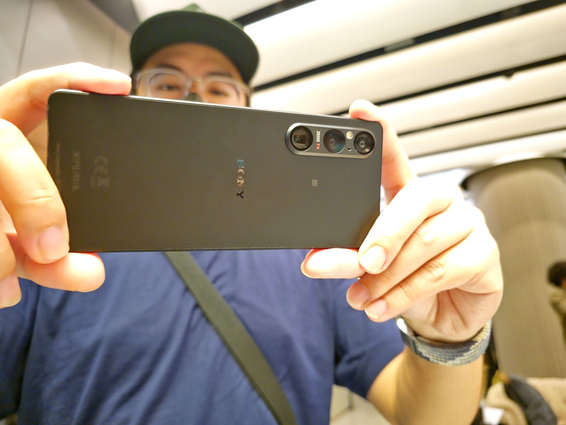
I’m going to start with the back of the phone. During our early preview of the phone, I couldn’t help but continuously run my fingers across the entirety of the phone’s back. That’s because the back of the Xperia 1 V is textured, something that Sony describes as its new “Tactile” design. It is a far cry from the generic glass back that the brand has long used with previous Xperia generations and as my colleague said when he held it: the application of the texture feels better executed than what Xiaomi did with its 13 Ultra. In trying to emulate the grip of a full-sized camera.
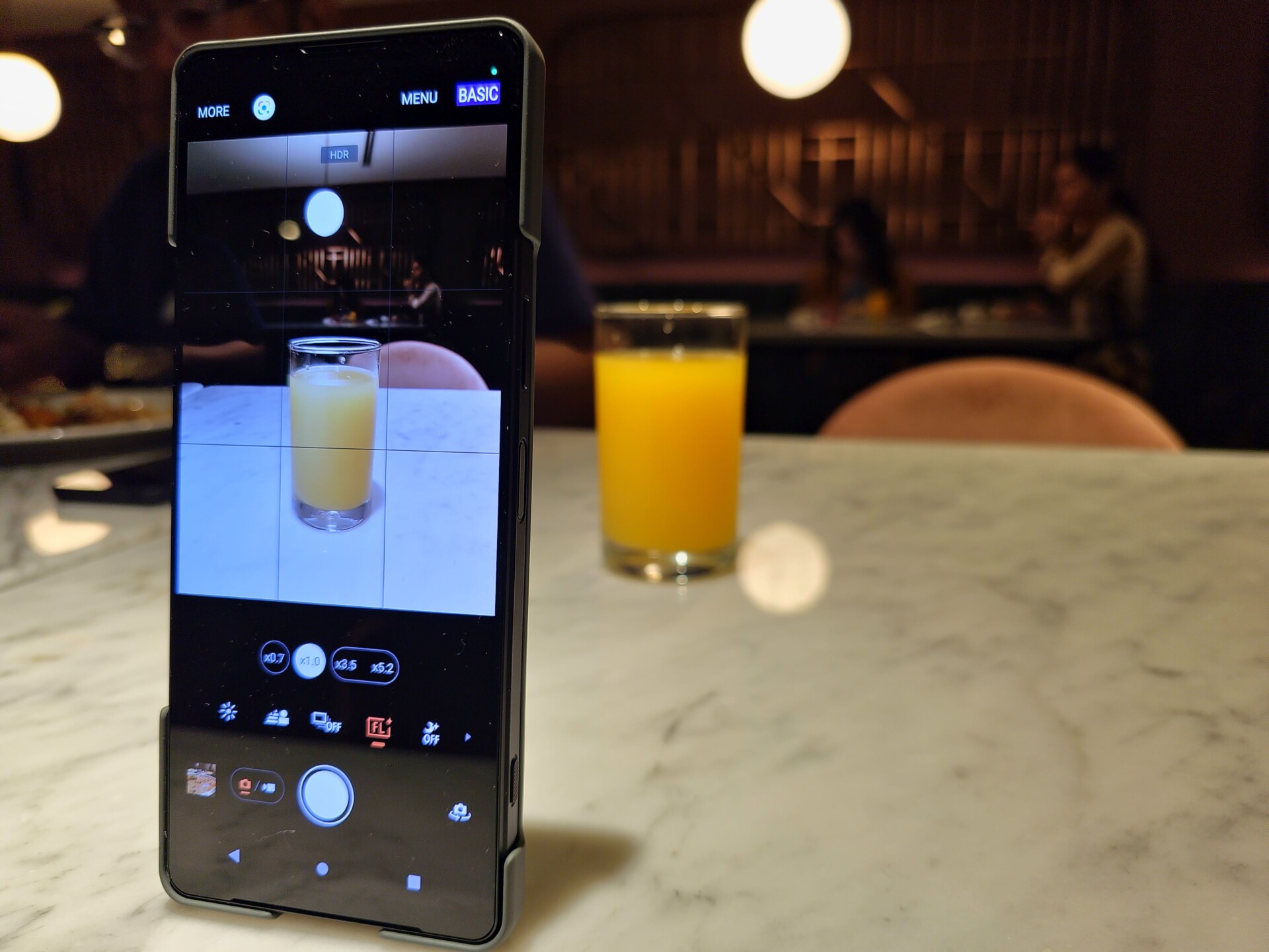
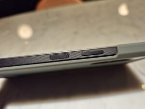
The dedicated shutter button on the side of the Xperia 1 V is also textured, allowing me to have a firmer grip of the phone. As per its design, it is also two-tiered, meaning that like a DLSR or mirrorless camera, you can press it halfway for the camera to assess its focus, before fully depressing it to capture the moment. I have said this before: that may not seem like a big deal to many, but it is a feature that really lends the belief that you’re handling a full-frame camera, and not a phone. To that end, Sony also provided us with an official Xperia 1 V casing that adds to the illusion of the phone’s handling when used in photography or videography mode.
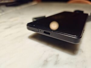
The rest of the sides of the Xperia 1 V are also textured, although ribbed would be a more accurate description for the ridges that run along the frame. Again, I like this design, as it provides the extra added comfort of grip.
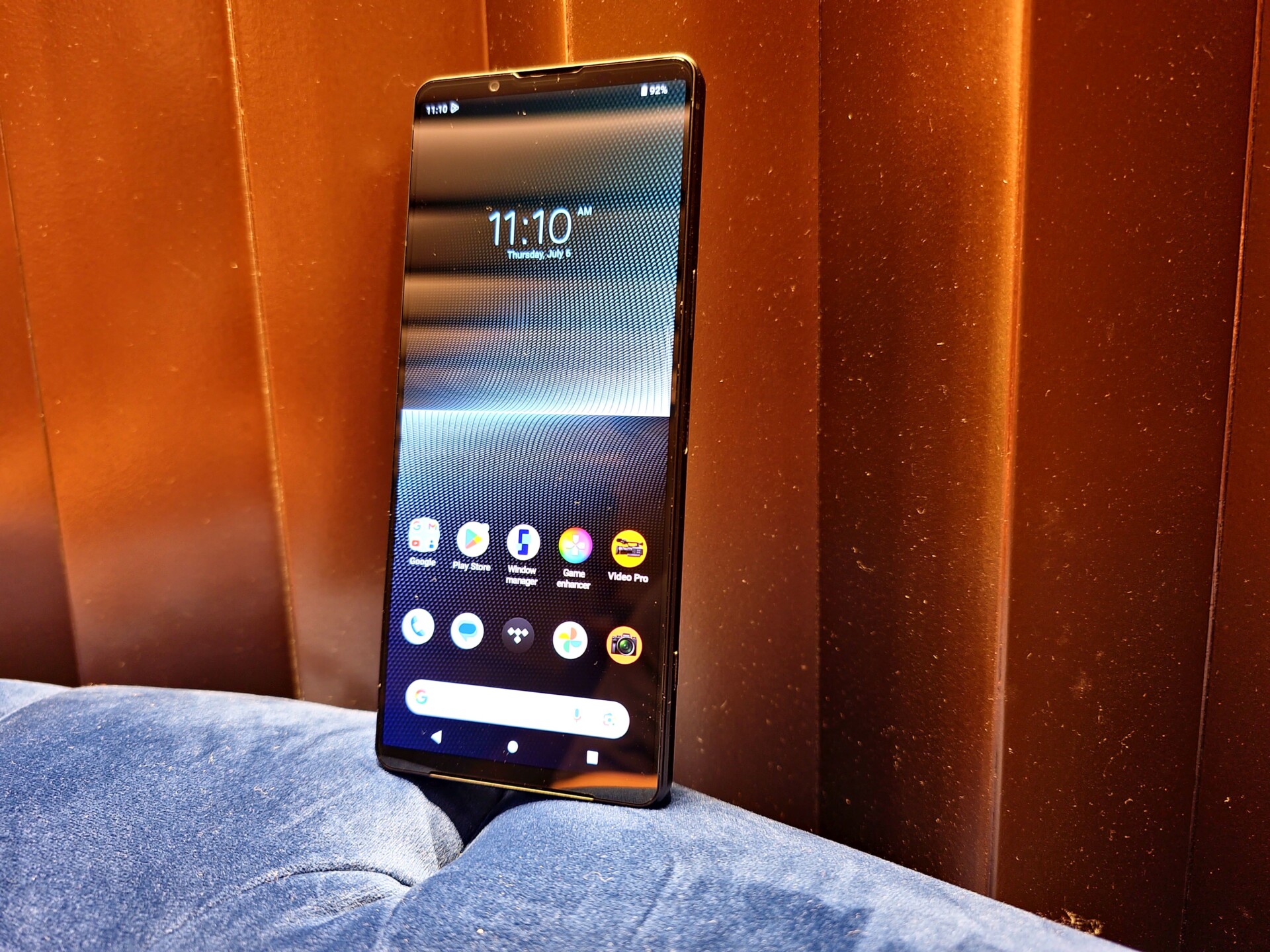
Moving on, there’s also the 4K+ display of the Xperia 1 V, which is a pride point for Sony and it is gorgeous to look at, with one spokesperson for the brand saying that it’s like having a BRAVIA TV in your pocket. Then as now, given its non-standard 21:9 aspect ratio and longer 6.5-inch display form factor, the resolution is actually 3840 x 1644 pixels, meaning that some media content that you view on it may have black bars on the side, given that said content was recorded in the standard 16:9 aspect ratio. But not a big deal.
There is also the obvious upgrades to the Xperia 1 V and its main triple-camera module. The primary wide unit now houses Sony’s Exmor T, which is a new 1/1.35-inch two-layer sensor with a maximum resolution of 52MP (48MP effective), although to be fair, I am still trying to work out how to gain the full 52MP, instead of the limiting 12MP. Having said that, the low-light photography experience has is certainly an improvement, but taking ultrawide and telephoto zoom sensors do not always produce the clearest of shots and can sometimes get noisy.
We have the Xperia 1 V in our lab and are currently conducting our usual in-depth phone testing. Be sure to look out for our review.
Photography by John Law.
Follow us on Instagram, Facebook, Twitter or Telegram for more updates and breaking news.


