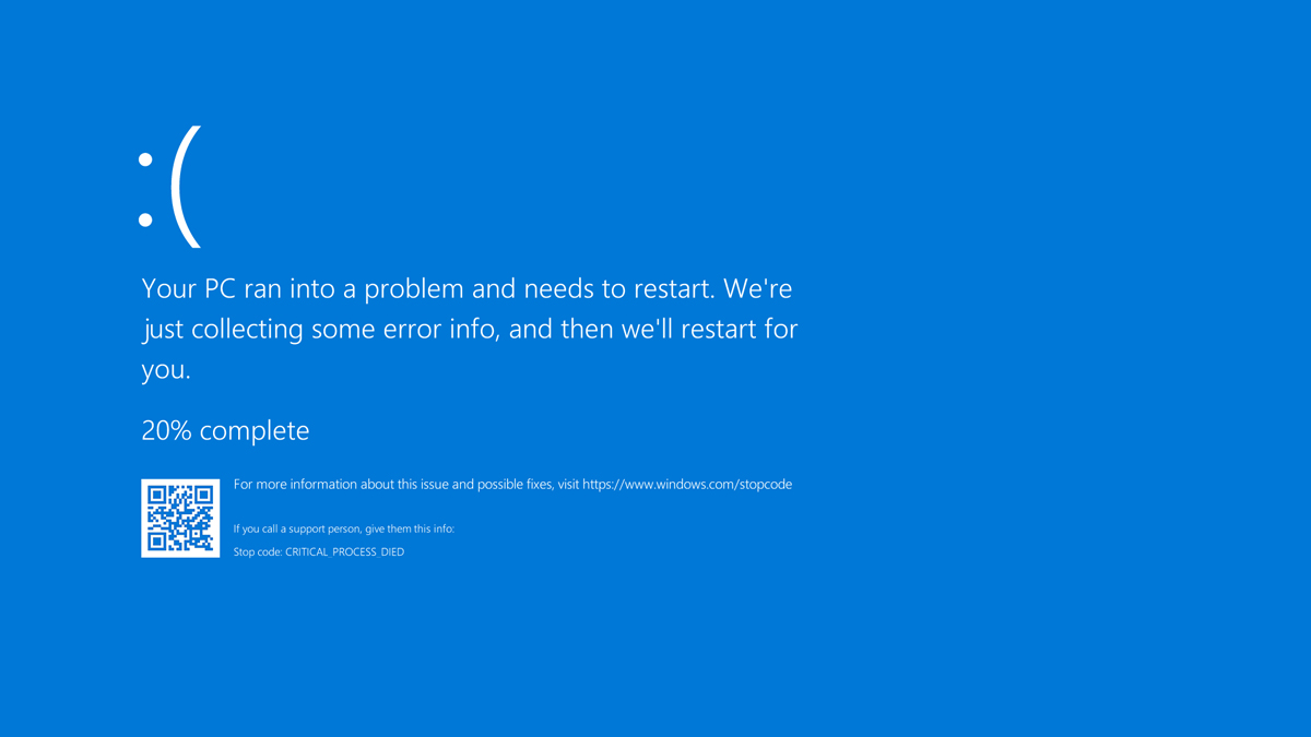
Microsoft’s Blue Screen of Death (BSOD) on its Windows platform is perhaps the most recognisable error screen to have ever existed. Originally presented as a blue screen of text, it has since been updated to appear more simplified in the later versions of the operating system – even including a sad emoticon as a way to help lessen your anxiety. Probably.
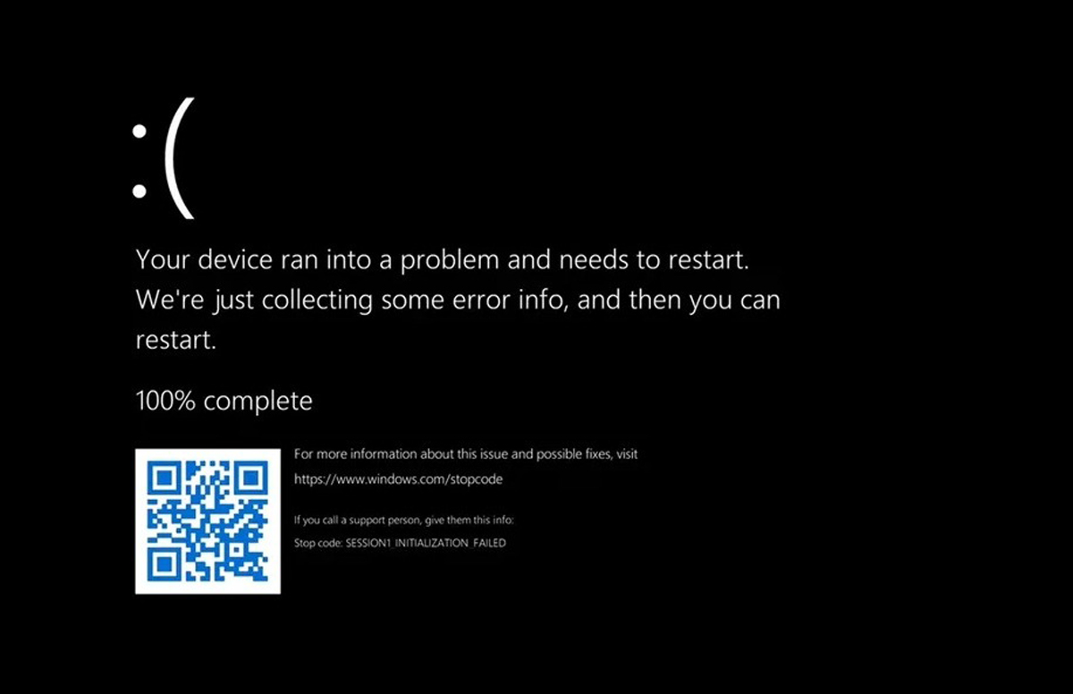
As recently revealed by the company, the dreadful BSOD will be undergoing another change in the upcoming Windows 11 system update. Rather than wiping it out entirely from existence, Microsoft instead has decided to drastically change one of the error screen’s iconic elements: its colour.
Meet the new Black Screen of Death. While the same format and abbreviation of its predecessor are retained, the screen now features an even more gloomy look and a name that would impress any Swedish metal band.

Microsoft did not reveal why it has decided to change the colour to its most recognisable (yet infamous) Windows error screen. But if we are to speculate, it’s likely that the company intended to streamline all of its system screens (ie: login and shutdown) to feature a unified colour scheme. With the recent popularity of Dark Mode, a black version of BSOD would also appear much easier on the eyes. Although, the same can’t be said for the misery felt when encountering the pop-up, especially when least expected.
So what do you think? Are you digging the more edgy black colour, or would you rather if Microsoft didn’t change it at all? Share it with us in the comments section.
(Source: The Verge)
Follow us on Instagram, Facebook, Twitter or Telegram for more updates and breaking news.


