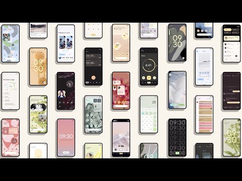
During the Google I/O event, the internet search giant has officially launched Android 12. There’s a heavy emphasis on security with this new mobile OS, as is the case for the whole event. But more than that, this new version of Android actually looks a lot like iOS. And it looks like the biggest change in Android 12 is in its UI.
Overall the new design system is known as Material You. And one aspect of this UI change is the range of personalisation elements.
Among them is what the company calls colour extraction. This lets you pick a wallpaper of your choice. The OS itself then determines the best colours that suit it, and applies them to the whole OS like a custom theme. AI is naturally at play here to make this possible.

There’s also the improvements to the motions and animations of the OS with Android 12. For example, a phone’s screen will light up from sleep in different ways depending on the way it was woken up. Beyond that, elements of the UI are overall larger and brighter.
A fair number of security shortcuts
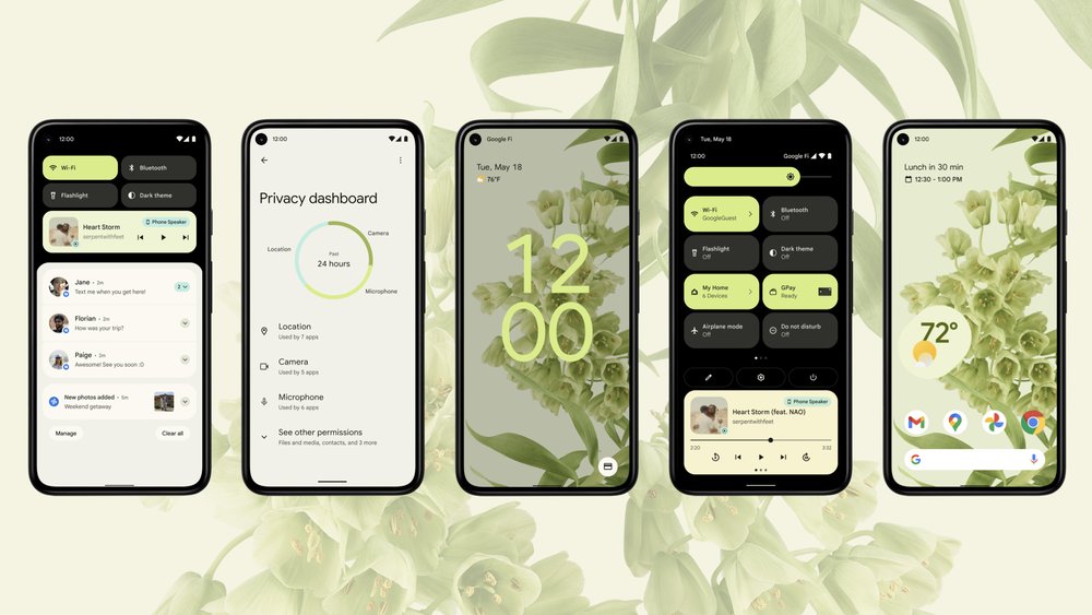
Google has also decided to put the Privacy Dashboard shortcut in the notification shroud. This makes it so that you can check your device’s permissions more easily. You can also grant and revoke permissions from here.
Continuing with the privacy and security features, there will also be an indication when the phone’s camera or microphone are in use. There’s even a shortcut to cut off all apps’ permissions to use them.

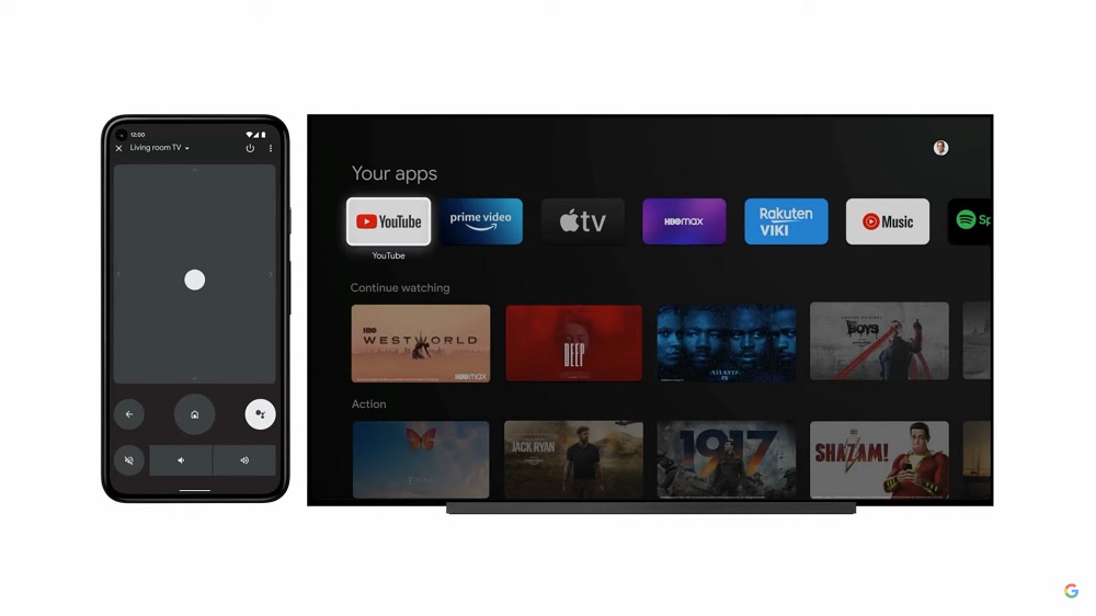
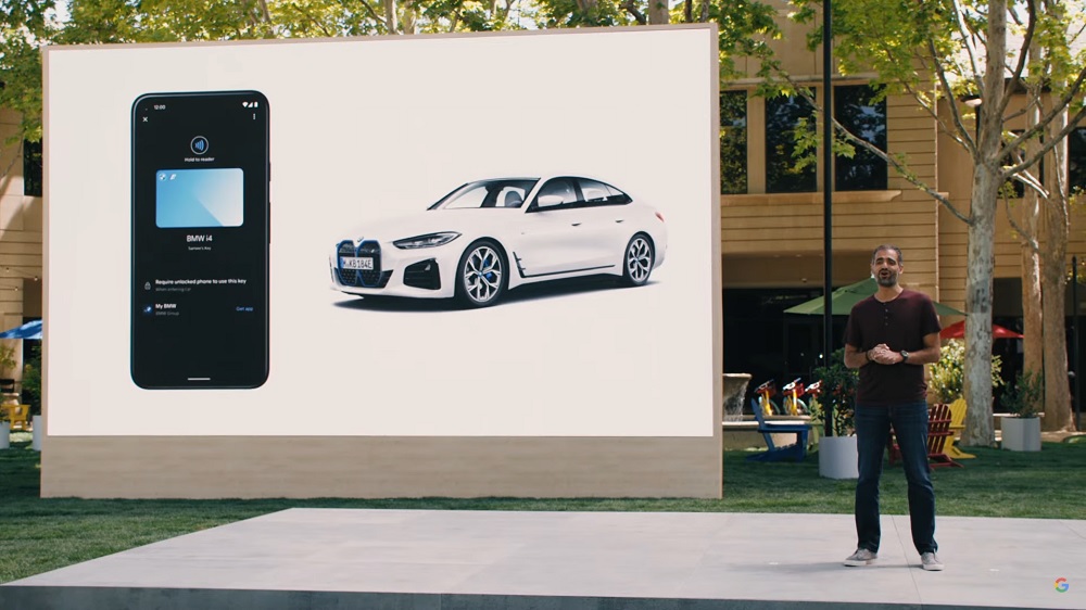
Other features of Android 12 include allowing your phone to double as a remote for an Android TV. The OS will also have what’s called the Digital Car Key, which is similar to the Apple CarKey.

If you’re interested in trying these features out, Google says that the beta for Android 12 is available starting today. Though this is limited to the company’s own Pixel phones, as well as selected devices from 11 brands.
(Source: Google [1], [2])
Follow us on Instagram, Facebook, Twitter or Telegram for more updates and breaking news.


