Amazon has quickly and quietly changed its app icon after many social media users said it reminded them of murderous German dictator Adolf Hitler, the BBC and The Washington Post reported. The app had previously sported a shopping cart logo for over five years. Then last January, the company unveiled a new icon that boasted its signature swooshing smile and a blue tape.
The tape, with its jagged edges and position right above the smile, was the problem – people said it looked like Hitler’s iconic toothbrush moustache. So in its latest update, Amazon straightened out the tape’s edges and folded up a part of it – presumably to evoke the experience of pulling away tape and opening a package.

Social media users are predictably having a field day over this. But this is far from the first time that a brand has received brickbats and mockery over its logo.
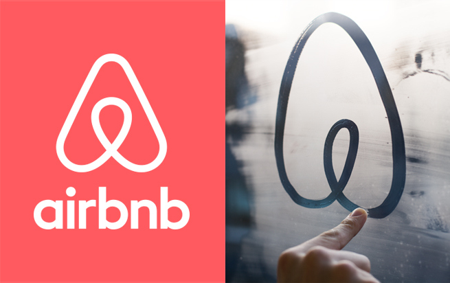
As The Washington Post noted, Airbnb took quite the beating when it revealed its new logo – people said it looked like a butt or, uh, a certain genitalia. But Airbnb has stuck with it, perhaps gambling that the notoriety is worth all the extra attention.

As for Amazon, the company tactfully told media outlets that the change had been made after receiving customer feedback, and then trotted out a generic press statement about designing the new icon to “spark anticipation, excitement, and joy.”
All in all, a wise decision on Amazon’s part. After all, what if Amazon users suddenly felt the inexplicable urge to invade Poland?
(Source: BBC, The Washington Post [1] [2]. Header image: Amazon via Alex Hern / Twitter.)
Follow us on Instagram, Facebook, Twitter or Telegram for more updates and breaking news.


