Facebook is currently rolling out its redesigned website layout to all desktop users. The social media company previously unveiled the interface back in 2018, and had rolled out the redesign to a small number of users for testing from October of last year.
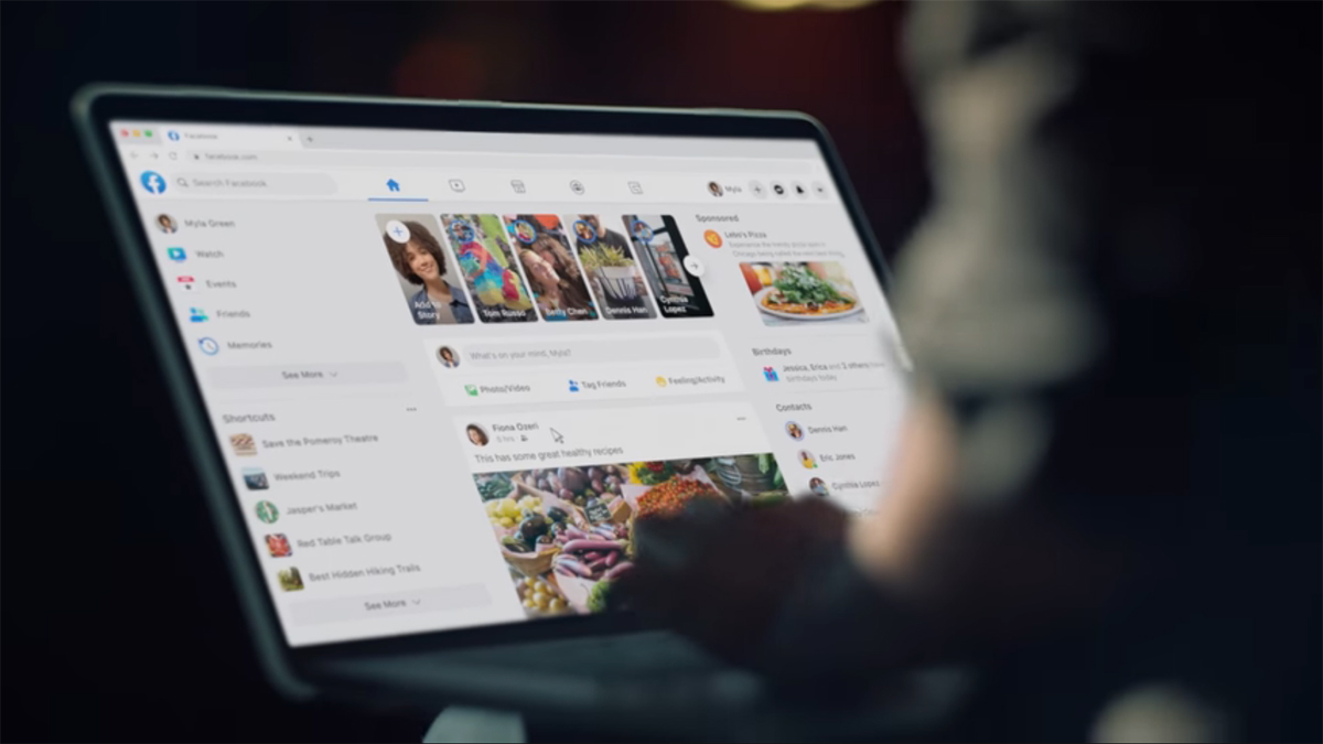
The new layout features a simplified design to ease navigation. However, unlike the current layout with smaller icons and a lot of negative space, the redesign now mostly fills up your desktop screen from one end to the other.
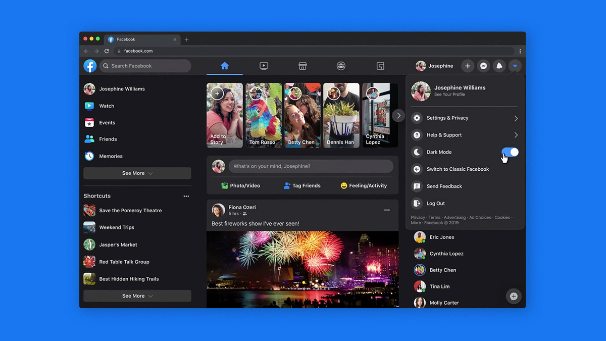
Navigating around your Facebook timeline is also somewhat similar, with three columns displayed on the page; the Shortcuts column to the left, Pages and Contacts on the right, and the main timeline in the middle. Additionally, Stories will appear on the very top of your timeline as well. Above these columns is a top bar that provides quick access to the website’s home, user profile, Messenger, notifications, search bar, and more.

Another new addition for the new Facebook redesign is the ability to view the website in Dark Mode, which is a much welcomed feature that minimizes screen glare for use in low light conditions. The company also claims that the new home page will load faster and transition between pages smoother. Other than that, Facebook added that it can automatically scale to different window sizes effectively regardless of resolution.
To activate the new layout, navigate to the website’s top bar, click on the “down” button, and select “Switch to new Facebook.” The page will automatically default to Dark Mode if it detects that your Chrome or PC settings has the feature activated. Furthermore, you can still switch back to the “classic” design if you so wish.
For those who do not have the option to switch to the new redesign, you may need to wait a couple of days until it is made available to you.
(Source: Facebook Blog)
Follow us on Instagram, Facebook, Twitter or Telegram for more updates and breaking news.


