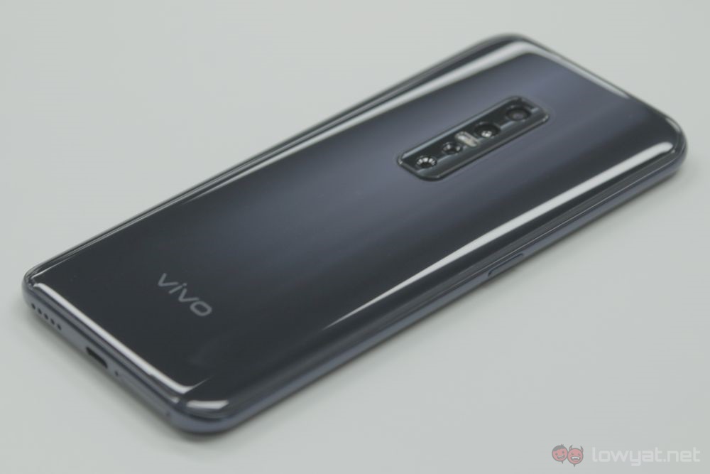
The Vivo V17 Pro was just launched locally not too long ago. That said, we’ve had access to the phone a little prior to the event. This gave us some time to take a closer look at the phone, and this is what I think of it so far.
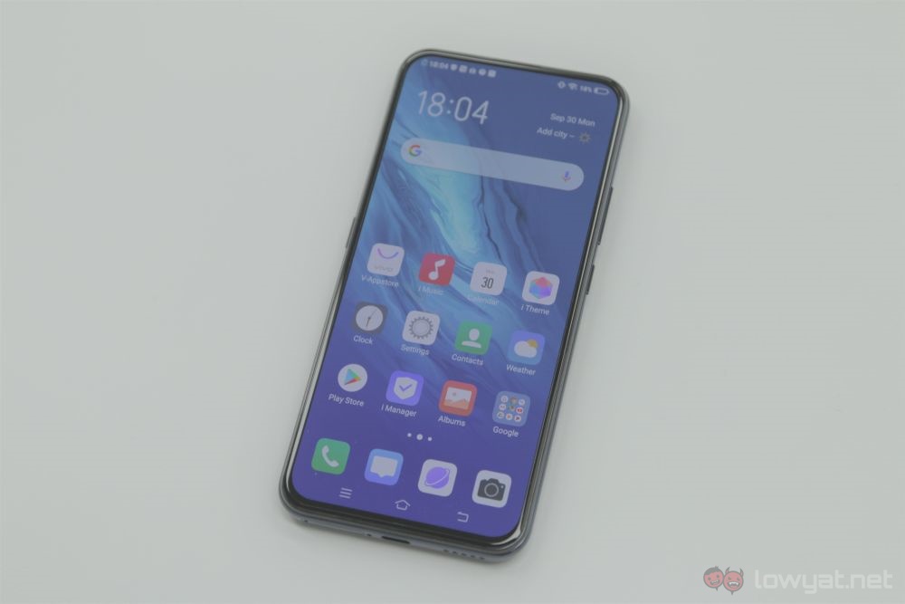
Much like the V15 Pro that came before it, the V17 Pro has the display taking the entirety of the front. The screen itself measures in at 6.44 inches, and is a Full HD+ display. It’s also got a fingerprint sensor underneath it.
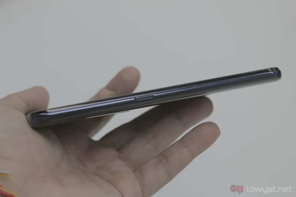
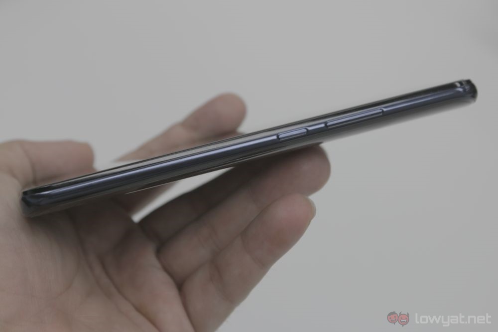
And it’s not just the front either, as the V17 Pro is quite similar to its predecessor on the sides. On the right, you have the power button and volume rocker. On the left, there’s the button that acts as a shortcut to the Google Assistant.
One thing that’s missing here is the microSD card tray. Unfortunately, the V17 Pro doesn’t support expandable storage.
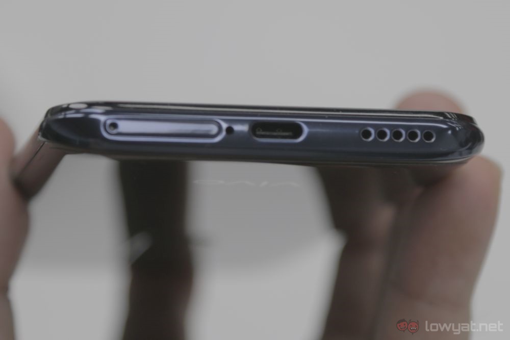
Moving on to the bottom, there’s the dual Nano-SIM tray, the mono speaker grille and the charging port. The latter is now a USB-C port, which is a pleasant surprise to say the least. The speakers are also also capable of fairly high volumes.
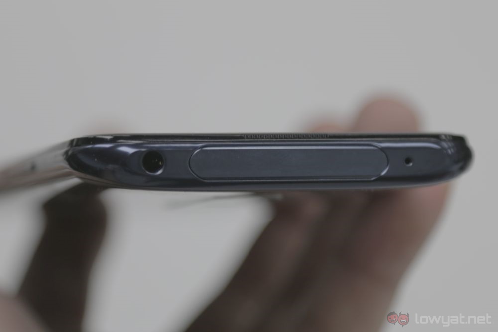
On the top, you’ll still see a segment where the front-facing camera pops up. It now sits at the centre, while the 3.5mm audio jack has moved from the left side to the right.
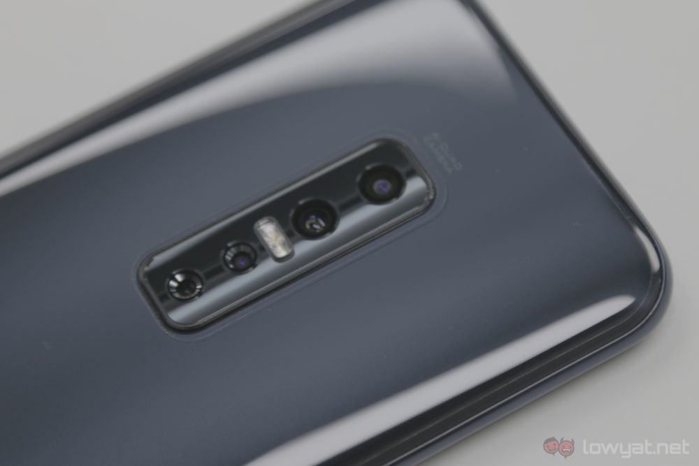
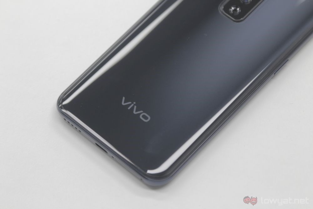
The back of the Vivo V17 Pro is where its difference is the most apparent compared to the V15 Pro. It’s quite the looker now, with no camera bump, and the camera array itself sits closer to the centre of the phone. Vivo’s branding still sits in the same spot, which now looks a little more organised compared to before.
The V17 Pro also sits very comfortably in hand. And unlike before, it doesn’t feel top-heavy. Vivo has managed to balance the phone’s weight so that you’ll only see the popup camera when it’s in use, rather than feel it when it’s tucked away.
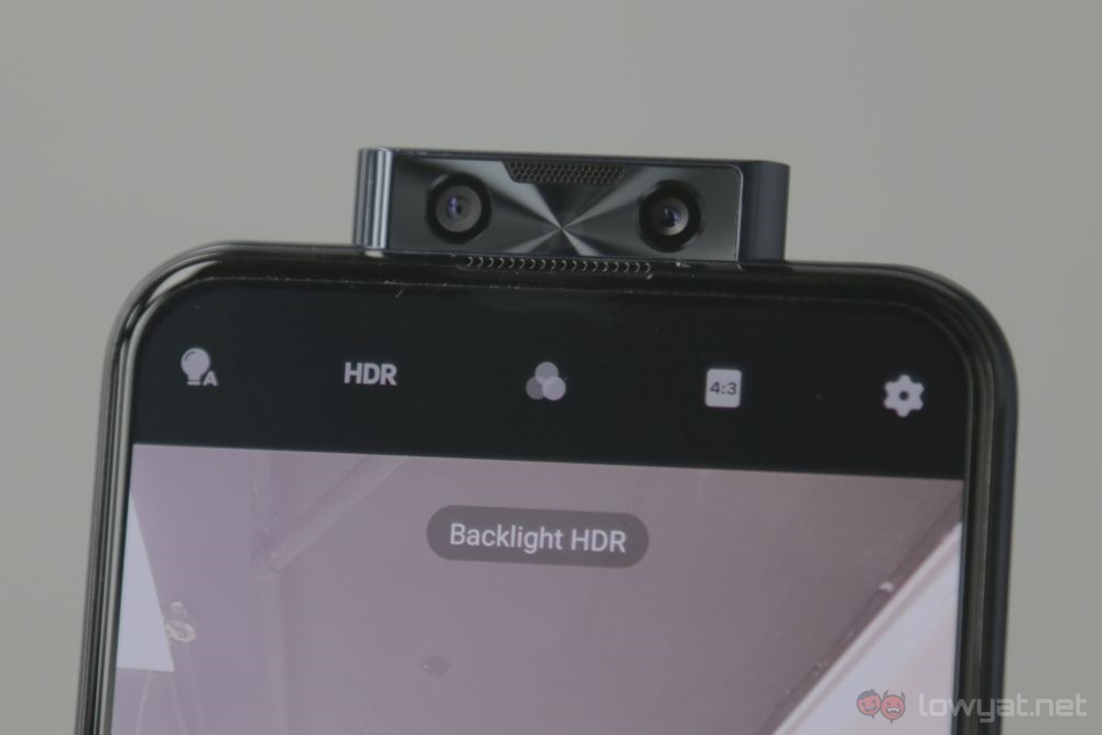
And when it does pop up, the fact that it’s in the middle makes it a little more natural to look at. Granted, there are two cameras here – a 32MP wide-angle camera and a 2MP depth sensor, so it’s not exactly in the middle. But it beats having to look at a protrusion at the corner of the phone.
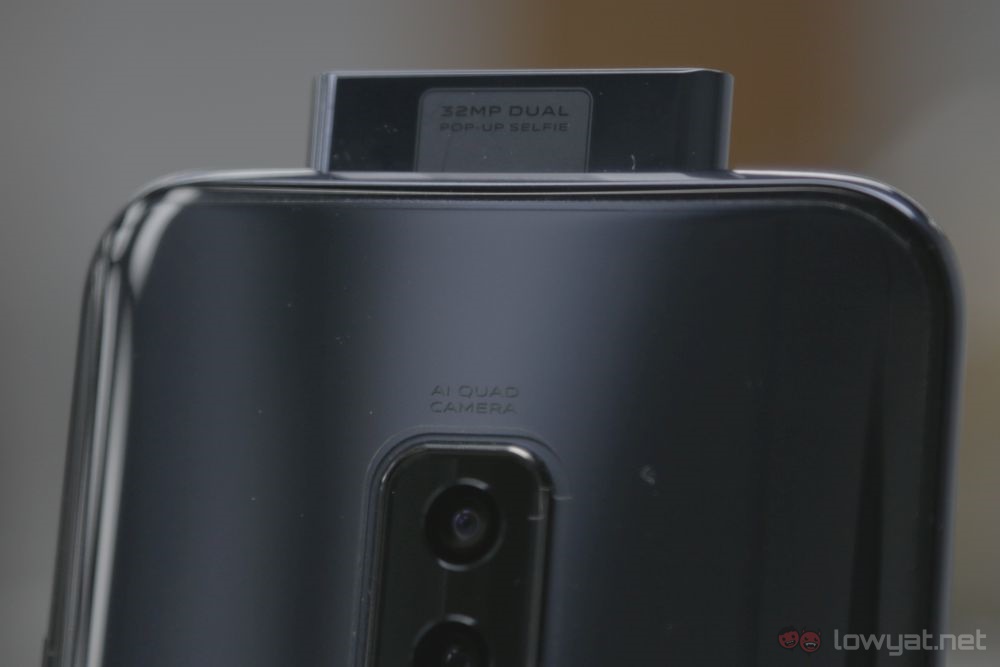
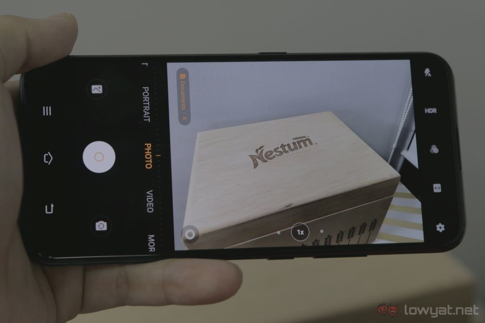
The camera also behaves quite similarly to the one found on the V15 Pro. Colours produced by the 48MP + 8MP +2MP + 2MP combo don’t have a warm bias as you’d expect from most Chinese manufacturers. That said, it’s still not exactly natural, as shots are notably more vivid than they should be.
All in all, the Vivo V17 Pro looks to be a pretty solid mid-range phone. The fact that it’s using the same chipset as its predecessor may be a worry, though. We’ll have to wait and see if that’s really the case
Follow us on Instagram, Facebook, Twitter or Telegram for more updates and breaking news.


