As phone makers come up with more ways to hide the notch and get rid of bezels, the popup design for the front-facing camera seemed like an inevitability. To that end, Vivo itself has adopted said design for the V15 Pro. It’s also one of the earliest to do so, which gives the Vivo V15 Pro another point of distinction. And of course, being the Pro variant, it’s also better armed than the standard variant.
That said, is the rest of the phone worthy of as much recognition as the popup camera? Or is the phone simply equipped with one iconic feature, while the rest of the phone is just another entry into the smartphone market? Let’s find out.
Specifications
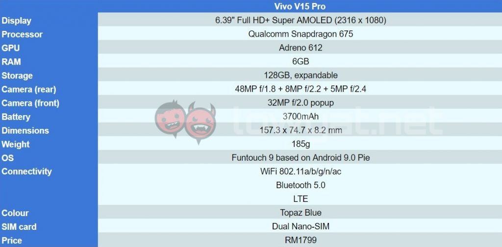
As far as the numbers go, at least, the Vivo V15 Pro stacks up pretty well. We’re looking at a Qualcomm Snapdragon 675, 6GB of RAM, 128GB of internal storage, a 6.39-inch Full HD+ display, an in-display fingerprint sensor, and Funtouch OS 9.0 based on Android 9 Pie. As for cameras, we have the 48MP + 8MP + 5MP triple camera combo at the back, and the 32MP front-facing popup camera.
Design
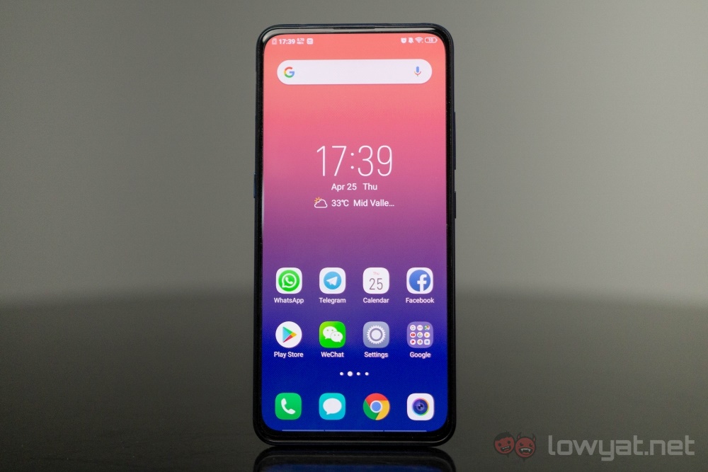
In this day and age, where phone makers all opt for an all-display front, notches and cutouts are the norm. But by having the front-facing camera mechanically hidden, the Vivo V15 Pro is one of those that has achieved the truly all-display design. The result is absolutely nothing distracting you from your visual content. This is inherently a good thing, but it does come at a cost. Whether or not it’s one that you can live with, that’s something else entirely, but we’ll get to that in a bit.
A typical design aesthetic at first glance.
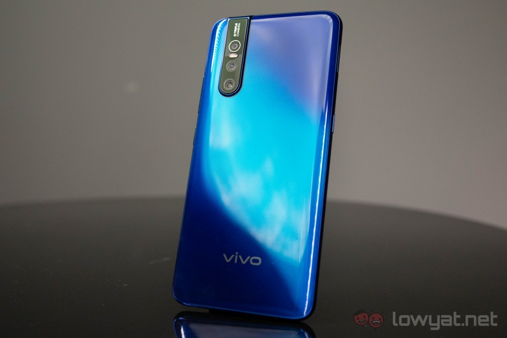
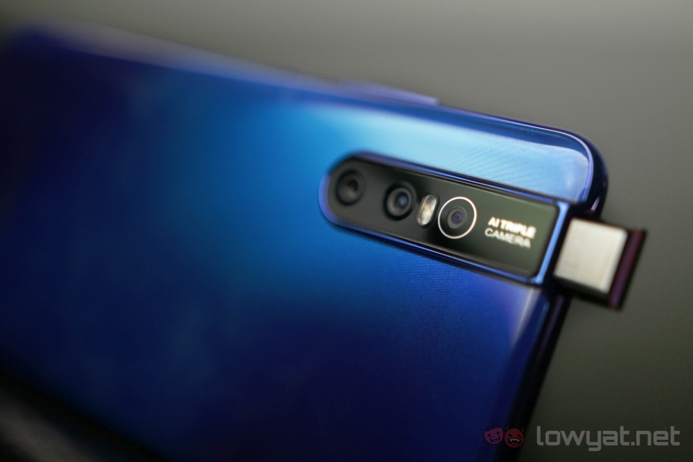
While the display may be the only thing you see on the front of the phone, there is still a fingerprint sensor sitting beneath it. This leaves only the three-camera setup on the back. But as is common these days, there is a bump to go with the camera setup. That said, this bump is slightly larger than usual, because it’s also where the mechanism for the popup front camera is.
On the right side is the power button and the volume rocker, but curiously there is another button on the left. It’s called the smart button, and the closest thing this button resembles is the Bixby button on flagship Samsung phones.
The smart button has limited functions.
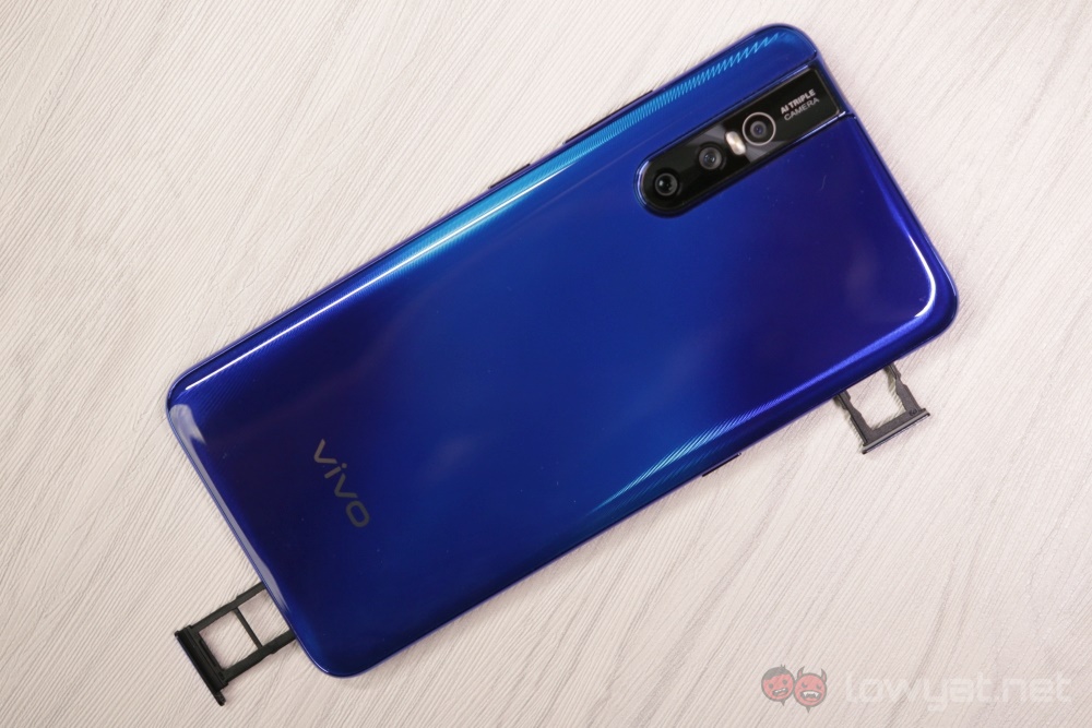
You have up to three different functions accessible depending on if you pressed the button once, twice, or held it down. That said, they all revolve around the Google Assistant, and you are not granted the freedom to remap it to whatever function that you want. Above the Smart Button is the microSD tray for your external storage needs.

At the bottom, you’ll find the mono speaker grille and the Micro-USB charging port. In addition to the microSD tray on the left, here you’ll find the tray for your two Nano-SIM cards. Having two trays is still a pretty novel idea, and it’s nice for when you only need to access one of them. Also, because the SIM tray takes the usual spot of the 3.5mm audio jack, you’ll find the latter at the top instead.
Finally, we come to the main attraction, as it were, of the Vivo V15 Pro – the front-facing camera that pops up from the top when engaged. Depending on your usage patterns, though, this could be extremely infrequently, or every single time you use the phone. And if you like to use facial recognition to unlock your phone, the latter will likely apply to you.
Activating the front-facing camera generates a synthetic noise.
Even more so if you take selfies frequently. By default, engaging the popup camera will also play a synthetic motor sound. You have the option to either change it to two other available options, or turn it off altogether, which is what I did. When off, you’ll still hear the sound of gears moving, but it’s a lot less audible and conspicuous.
That said, moving parts usually have a tendency to wrong sooner than parts that don’t. If you intend to get a phone and get it to last as long as possible, that may be a problem. On the other hand, if you intend to make a change after a certain amount of time, then this may not be that much of a dealbreaker for you.
User Experience
I’m tempted to say that smartphone design has reached a point of maturation, where every manufacturer is able to make a phone that fits comfortably in hand. The Vivo V15 Pro feels a lot like any other phone of this age where despite subtle differences, you can hold them for extended periods of time without feeling the strain on your palm.
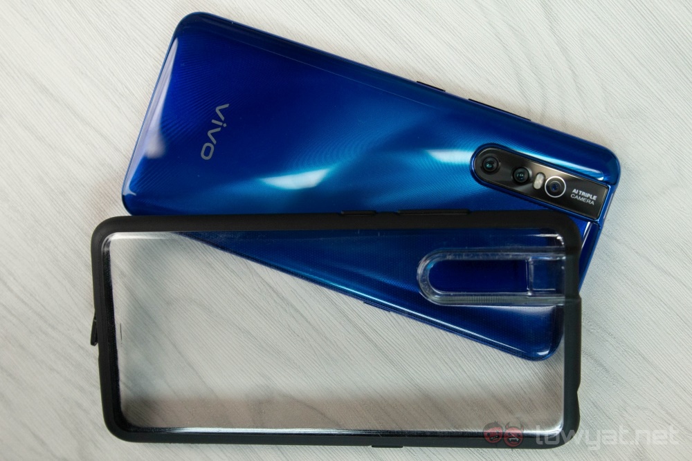
The Vivo V15 Pro comes with a unique hard case.
While a number of phones now also come with a case in the box, the one that comes with the Vivo V15 Pro is pretty unique. Unlike most other free cases which are soft and completely transparent, the V15 Pro comes with a hard case which features a black frame around the sides. The case doesn’t really change the feel of the V15 Pro in your hand beyond thickness, so there’s little reason to not use it. That said, because it’s a hard case, it’s prone to getting scratches, whereas most soft cases will only ever suffer from dust buildup, or turn yellow over time due to UV ray exposure.
The Vivo V15 Pro runs the Funtouch 9 overlay over the base Android 9 Pie operating system. It’s name aside, it behaves a lot like most other overlays by Chinese manufacturers. That’s just another way of saying that it works like a cross between Android and iOS. There’s a small selection of pre-installed apps, most of which are just Vivo’s take on existing ones.
There is no app drawer.
But being an Android OS that looks like iOS, this simply means that there’s no app drawer. If you’re a light user who doesn’t have a lot of apps installed, then this is fine. But if you use a lot of different apps – multiple eWallets for example – and like using widgets, then it will become a problem sooner or later, as you accumulate more apps that you frequently use. You can tidy them up by organising them into folders, but this just means more taps than necessary to get to the app you want.
That aside, swiping from page to page and scrolling through social media is a smooth experience. By default, the Vivo V15 Pro is also pretty aggressive in clearing its RAM cache, so you won’t have extended periods of stuttering after you’re done playing graphically intensive games. That said, it could also mean that your messaging apps get killed in the background, leading to no notifications on your apps until you launch them, after which you’ll be abruptly flooded by unread messages.
The Vivo V15 Pro is pretty aggressive in clearing its RAM cache.
Like most phones, the V15 Pro comes with a mono speaker at the bottom. It is capable of pushing out high volume, but expect distortion if you max it out. Simply put, audio clarity is not a strong suit of the phone.
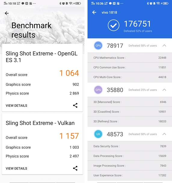
With a Qualcomm Snapdragon 675, the Vivo V15 Pro is pretty reliable when it comes to performance. It runs almost any game you throw at it smoothly, and as mentioned earlier, its aggressive optimisation ensures that it recovers quickly when you’re done with your games. As far as synthetic benchmarks go, it’s pretty much the kind of numbers you’d expect from it too.
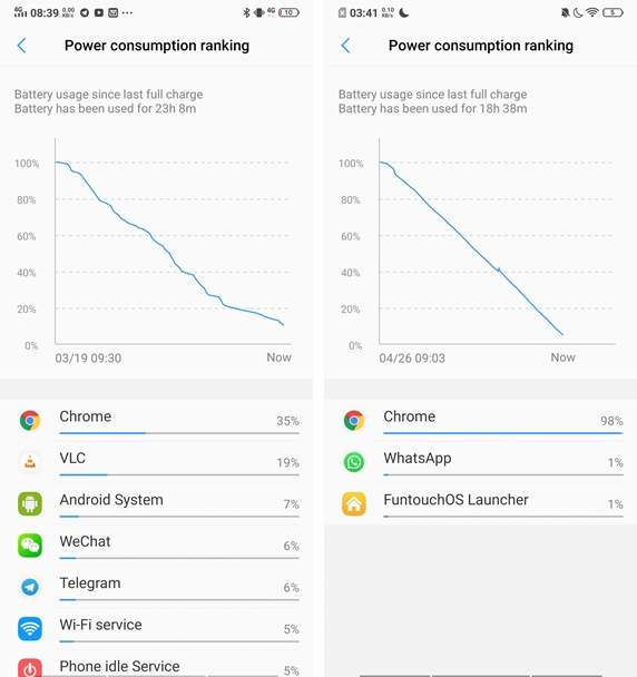
Battery life is also very impressive. Even if you’re a heavy user, it should last a whole day pretty comfortably. Running a video loop test playing YouTube videos on Google Chrome, the Vivo V15 Pro lasted for just a minute shy of 18 and a half hours. It’s actually pretty impressive, but your mileage may vary if you use the YouTube app itself, or even Netflix.
Charging speed, on the other hand, is pretty average. Using the charger provided, the battery of the V15 Pro goes from 5% to 100% in two hours and 17 minutes.
Camera
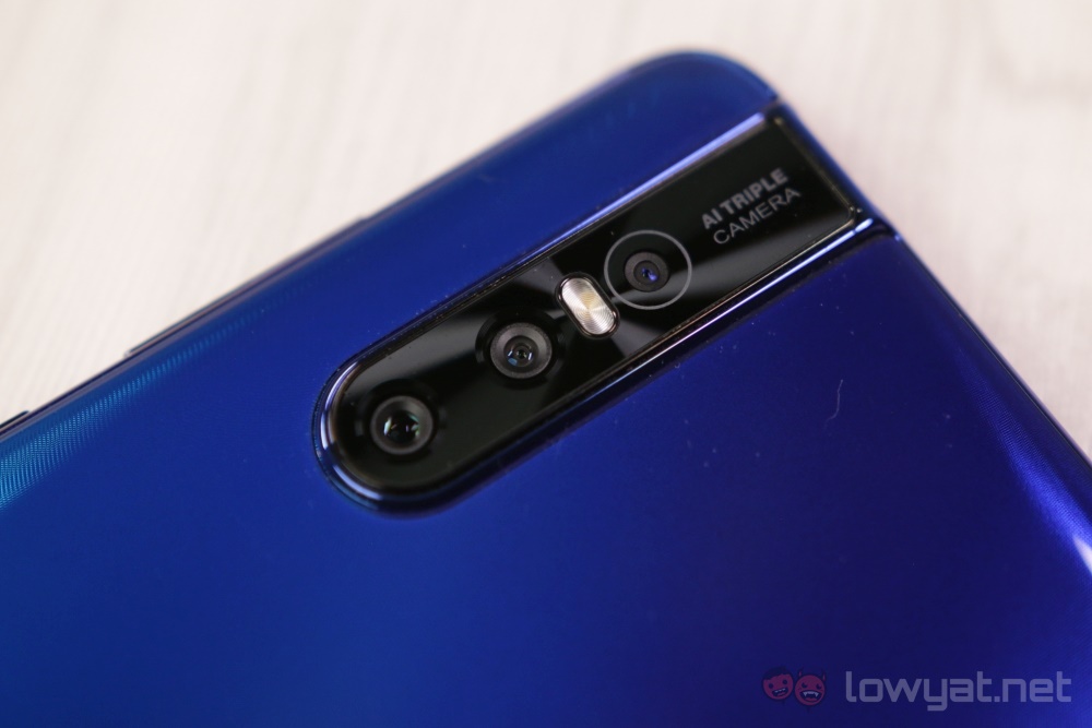
Unlike most phones for the mid-range market, the Vivo V15 Pro’s camera maintains a fairly neutral colour profile. It comes with a 48MP + 8MP + 5MP camera setup, but to make use of the 48MP unit, you’ll have to toggle it manually. It also gets turned off whenever you engage any other mode, like the night or panorama modes for instance. The good thing is that the mode change is only suggested to you whenever the onboard AI thinks it’s necessary, and ultimately you still make the final decision.
The improvement brought by the 48MP shooting mode isn’t as much of as you’d think. Detail retention is about equal between the standard Auto and 48MP modes. In general, though, the detail retention is decent. That said, if you need to pick a mode to shoot with that’s not the standard auto mode, then the 48MP mode is your best bet
Here’s why – for shots in the dark, the 48MP shooting mode actually does better than the dedicated night mode. With the latter, shots are more vibrant, but also with a higher tendency to be overexposed. Detail retention is also, as you’d expect, not as good with night mode. As for the wide-angle mode, colours look a little washed out. The 48MP mode, on the other hand, fluctuates between neutral and a little vibrant. The wide-angle mode can be helpful in certain situations, but the 48MP mode is still superior in most cases.
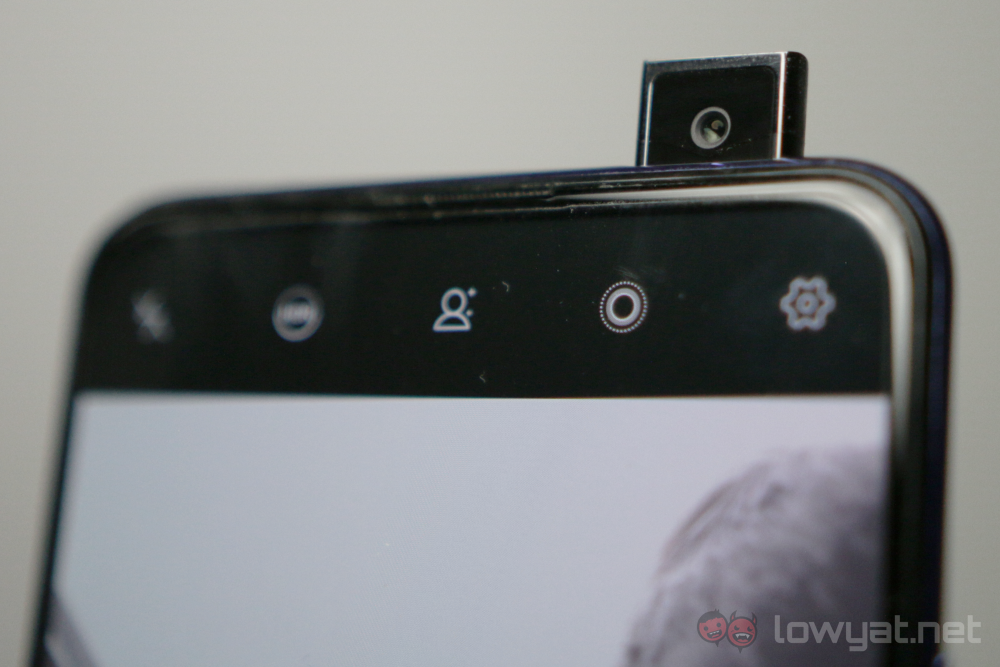
As for the front-facing popup camera, I liked it best when used without the AI beautification, and in adequate lighting. As is common with most other AI beautification implementations, details are often lost in the name of removing blemishes and other ways of improving your face. This will be especially obvious in low light.
Sample Images




Competition
While the Qualcomm Snapdragon 675 is not particularly impressive an item on the Vivo V15 Pro’s spec sheet, other items like the 48MP main camera, and the 32MP front-facing popup camera are. Coupled with a launch price of RM1799, what’s the competition like?
HONOR View20
We had the HONOR View20 with us previously, and it’s the only other phone with a 48MP main camera that we’ve reviewed fairly extensively. In my mind, it makes it easier for it to be compared to the Vivo V15 Pro.
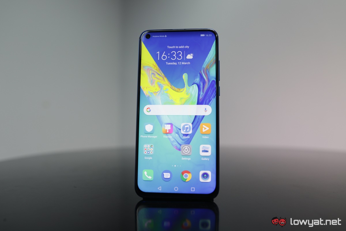
Now, I can appreciate the fact that the Honor View 20 is a whole RM200 more expensive than the Vivo V15 Pro. But for the extra RM200, you get the more premium Kirin 980 SoC and a slightly larger battery. A lot of the other items on the specs sheet are also comparable, namely the pixel count for the main camera, the display size and resolution, and even the RAM and storage capacity.
On the flip side, the Vivo V15 Pro has a higher pixel count for the front camera and a novelty popup mechanism. The HONOR View 20, on the other hand, has a 25MP unit sitting in a punch-hole cutout at the top left corner of the display.
Samsung Galaxy A70
To be fair the Samsung Galaxy A70 would be better compared to the HONOR View 20 than it would the Vivo V15 Pro. But considering the fact that they’re pretty similar anyway, this comparison would still be a relevant one.
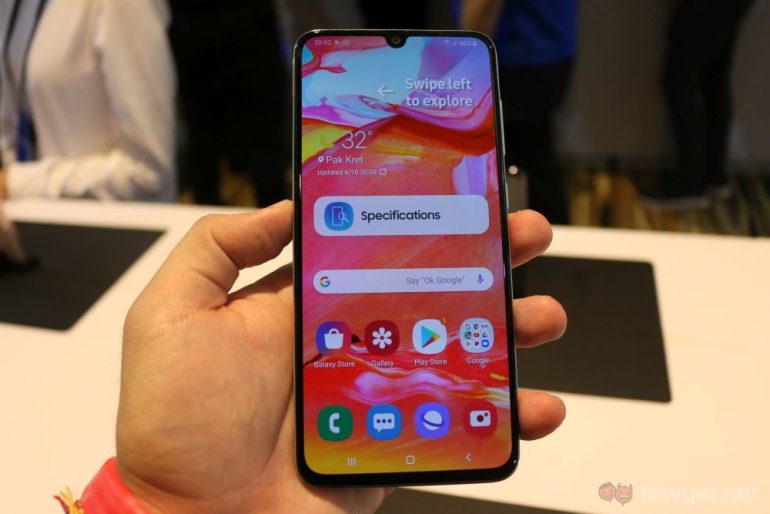
To start, the Samsung Galaxy A70 has the same chipset as the Vivo V15 Pro – a Qualcomm Snapdragon 675. It also has an in-display fingerprint sensor, the same storage capacity, the same pixel count for the front-facing camera at 32MP, and a triple-camera setup at the back. But where the main camera for the rear is 48MP for the Vivo V15 Pro, the Samsung Galaxy A70 only comes with a 32MP unit.
However, the Galaxy A70 has a much larger battery, and the variant that we’re getting also has more RAM. It also comes with the same price as the HONOR View20, at RM1999. My time with this phone was brief, so I can’t say much in terms of what it’s like to live with., As far as hardware goes, they are still pretty comparable.
Conclusion
Generally speaking, the Vivo V15 Pro is a good phone, especially for its asking price. It does many things well; The UI is smooth, the battery life is decent, and the camera is pretty impressive. You get a marginal improvement if you shoot with the 48MP mode, at the cost of higher space usage.
But the standout feature of the phone – the popup camera – is something that has nagged at the back of my head throughout my time using the Vivo V15 Pro. Sure, it’s mechanically sound, and the quality of the 32MP images are decent too. But it’s undeniably great to have only the screen on the front of the phone. But it being a moving part is essentially another avenue for something to go wrong.
That said, you get performance worthy of its asking price, decent image quality from both cameras, and best of all, a full-screen front panel, with no notches or cutouts getting in the way of your videos and games.
Photography by Hoo Ke Ming.
Follow us on Instagram, Facebook, Twitter or Telegram for more updates and breaking news.


