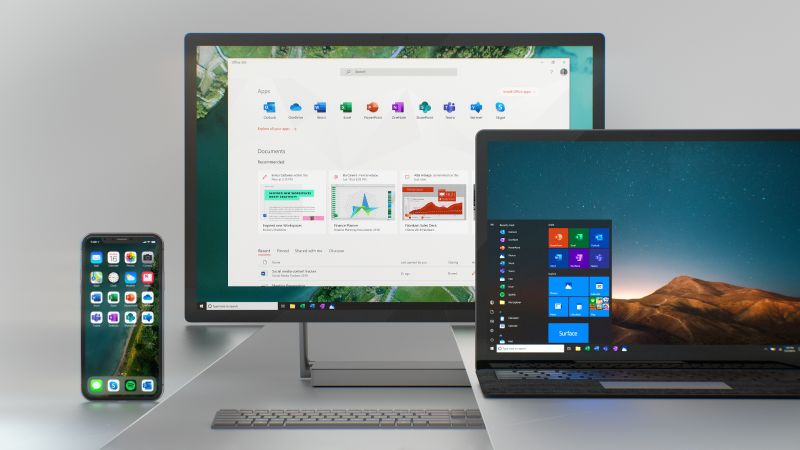
Microsoft is reportedly in the works of giving several, if not all of the Windows 10 icons a fresh new look. As per a report by The Verge, news of the project comes less than a week after the software company revealed a new icon design for apps in its Office suite.
“It is a huge undertaking to build a common system and design 10 icons at the same time,” Jon Friedman, Head of Office Design, Microsoft, said about the endeavour. “Now that we have established the system we will start to scale it across all of Microsoft.”
Friedman also released several concept images over his blog, hinting at how several of the Windows 10 icons could look like at the end of the day. These concept images include icons for Photos, news, mail, and many others. Again, nothing is set in stone, and it wouldn’t surprise us if Friedman were to pull a complete about face with the current designs.

If anything, many of the Windows 10 apps have long required a design change. As pointed out, many of the app icons that we see in the OS have looked the same for over a decade. To put it bluntly; some of these apps stick out like a sore thumb and look as though they have no place being a part of the current modern design of Windows 10.
(Source: Medium via The Verge, Thurrott)
Follow us on Instagram, Facebook, Twitter or Telegram for more updates and breaking news.


