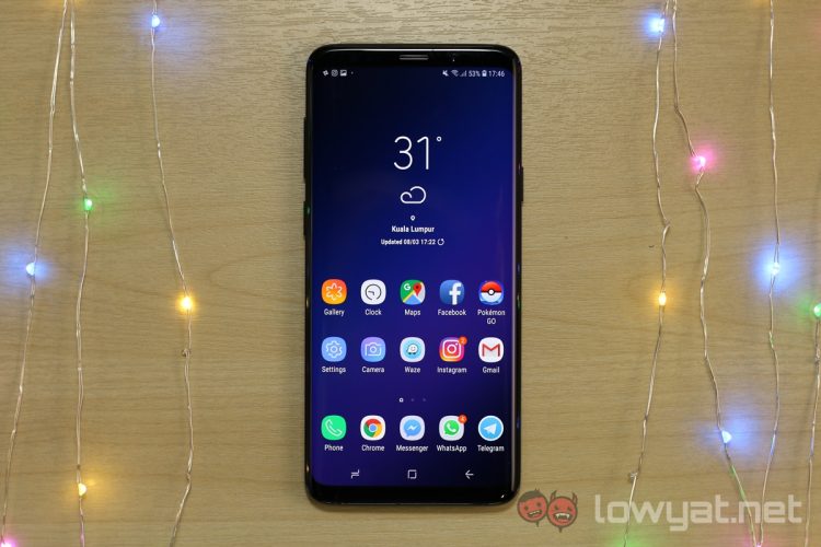
An early build of the Samsung Experience 10, which is based on Android 9 Pie, has been spotted by XDA Developers. Judging by the screenshots, there will be massive changes in UI and user experience.
An evolution from Grace UI and TouchWiz, the Samsung Experience UI has seen many changes throughout its lifetime. With the latest version, it’s evident that Samsung is leaning more towards the Google inspired designs than before.
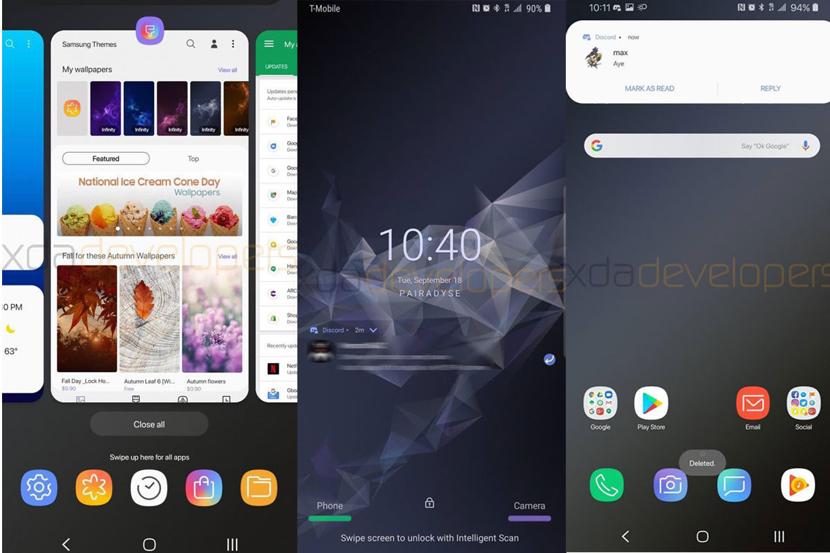
For one, the card UI in the app selection window looks similar to the stock Android 9 Pie, with its tall design and curved edges. The new design extends to many parts of the Experience as well. And while Android 9 Pie seeks to introduce gesture-based controls to users, Samsung is incorporating the new controls as well as the traditional three-button controls. The buttons are also redesigned to fit more with the new Android design language.
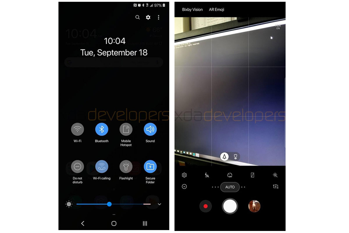
Other visible changes include the new Lock Screen, with the clock now sitting squarely in the middle of the screen, rather than its subtly cascading from top to bottom. The quick launch icons are also gone, replaced by the names of the functions, along with a line just below it. Speaking of icons, the new app icons are also more rounded, and for the first time Samsung is offering users a Dark Mode theme out of the box.
Samsung’s apps also sees major revamp in design. The Calendar, Dialer, Messages and Camera are now more streamlined and to fit the new design scheme.
The Samsung Experience 10 beta is currently out for the Samsung Galaxy S9+. The existence of the new OS version this early also hints at the existence of Google’s Project Treble. That said, it’s possible that a new update will roll out to customers sooner than we think, and way sooner than Samsung’s usual timeline for OS updates.
(Source: XDA Developers)


