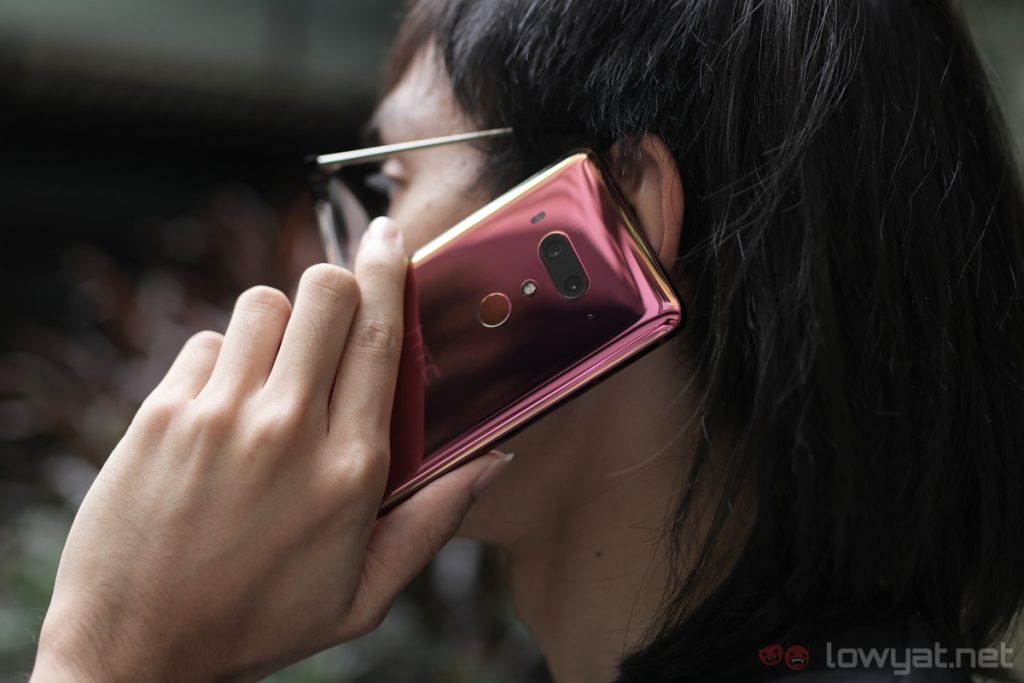
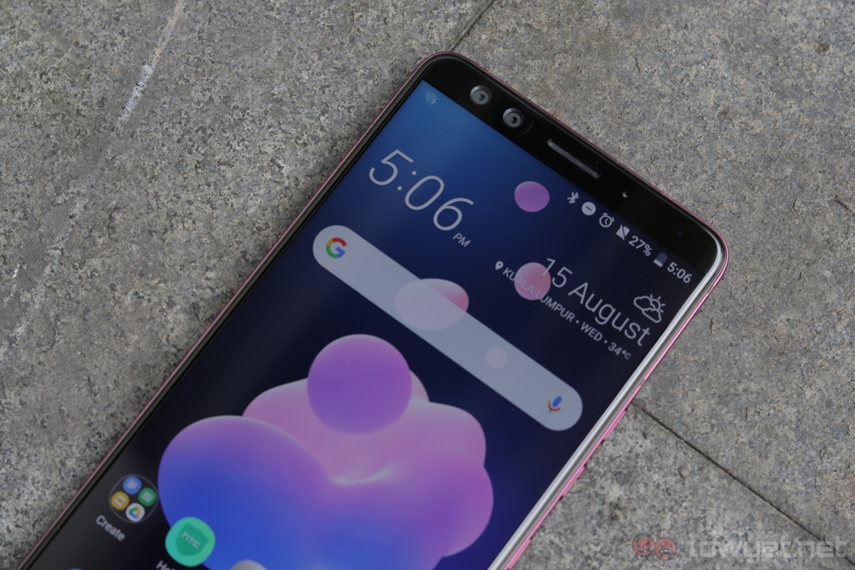
HTC has a long history with Android. The Taiwanese company was the first to release a Nexus-branded phone, and since then, there were some pretty impressive HTC smartphones. And now, we have its latest flagship: the HTC U12+.
Without a doubt the U12+ has some good things going for it, and it certain areas, it’s absolutely brilliant. However, there is one fundamental fault with the phone, and paired with a steep asking price, the U12+ is a difficult phone to recommend.
Specifications
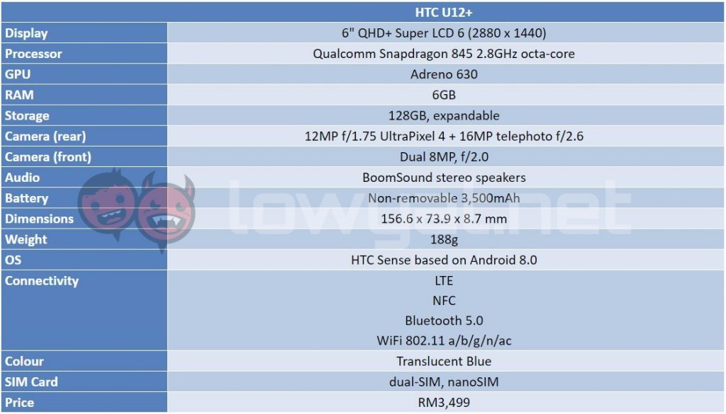
Cutting edge hardware is what you’ll find on the U12+. It has Qualcomm’s best chipset yet, the Snapdragon 845, a bright and vibrant 6-inch Super LCD 6 display, generous amount of RAM and storage at 6GB and 128GB respectively, as well as BoomSound stereo speakers. On top of that, the phone is also IP68-rated, giving it water and dust resistance.
If i were to nitpick, I’d say the U12+ could use a bigger battery than its 3,500mAh cell. It’s not that it has bad battery life, of course, but it’s worth noting that most of its competition have larger batteries – some as big as 4,000mAh.
Design
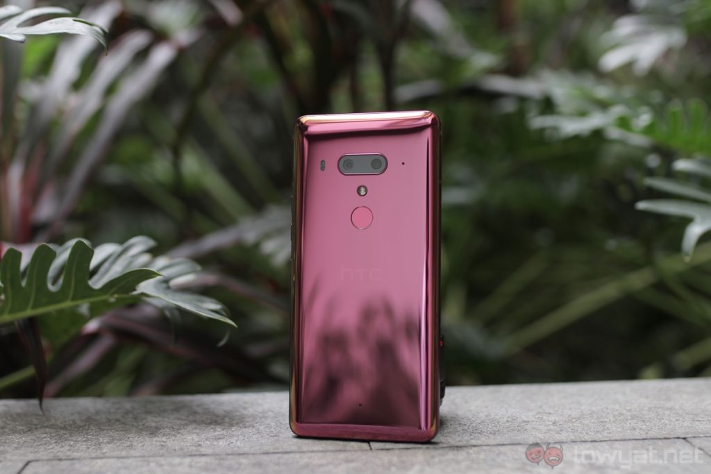
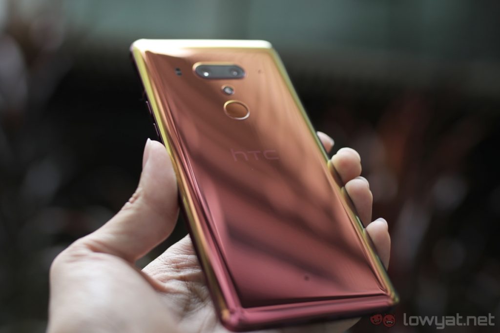
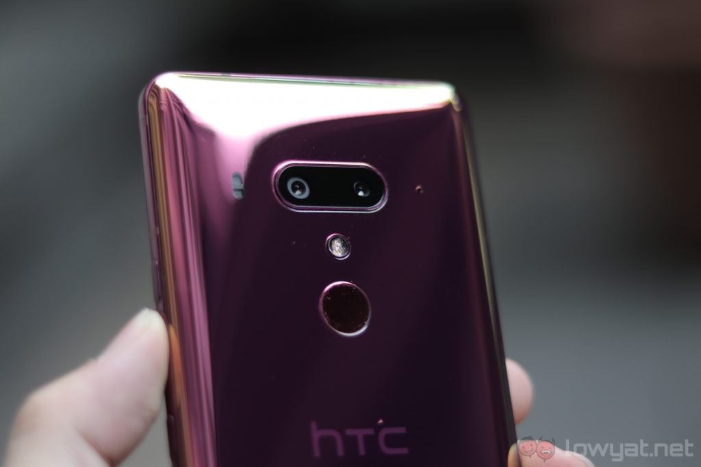
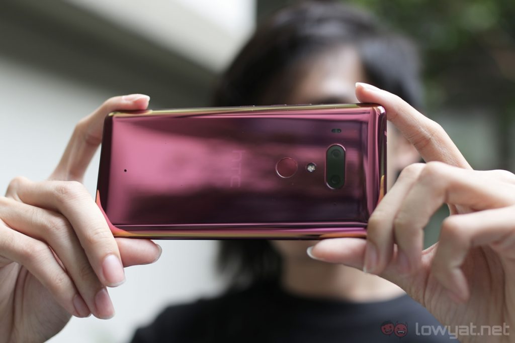
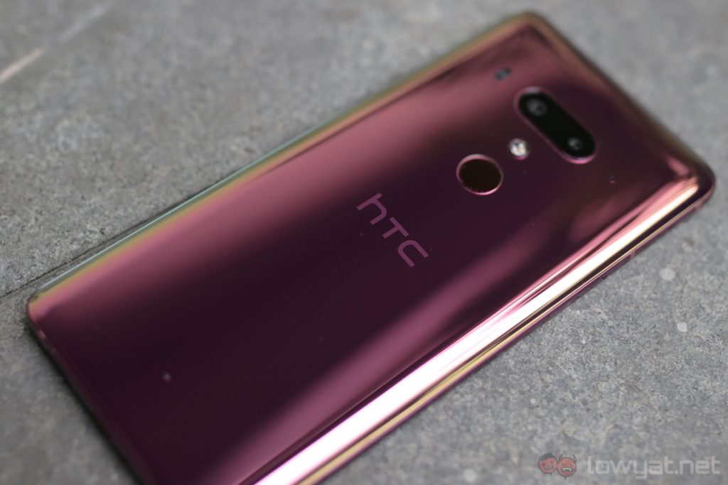
Let’s start on a positive note: I absolutely love the U12+’s glass back. Our review unit is the Flame Red model, and it’s a great-looking colour. I love how it has an iridescent effect when viewed from different angles; it’s as if the colour is a mix of pink and red. Unfortunately, this particular colourway is not available in Malaysia.
Very unique see-through design.
That being said, our market is getting the Translucent Blue colour, which is equally sleek. Unlike other colourways of the U12+, the Translucent Blue colour exposes the internal components of the phone. Not many phones in the market today – with the exception of the Xiaomi Mi 8 Explorer Edition – has such a unique design.
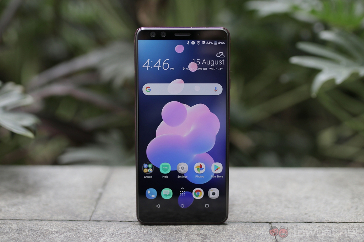
Aside from that, thanks to its nearly non-existent side bezels, the U12+ is quite a narrow phone. In fact, it’s narrower than most of its competition. This, in turn, makes it easier to use with only one hand.
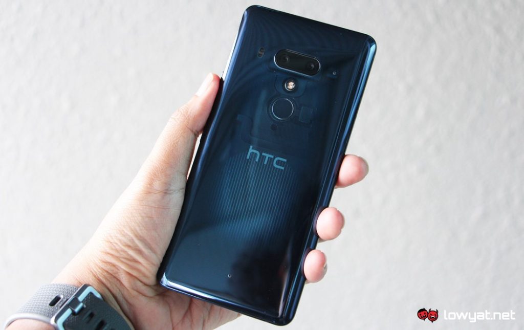 The Flame Red (top) and Translucent Blue U12+.
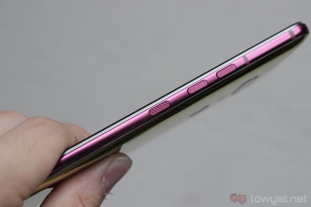
But there is one major flaw with the U12+’s design: the new “pressure-sensitive” side buttons. Instead of mechanical buttons, HTC decided to use faux buttons that give haptic feedback when you press them. Concept-wise, this makes a lot of sense, as mechanical keys are often one of the first things to fail on a device. The problem is, HTC’s implementation could’ve been much, much better.
Horrible pressure-sensitive buttons.
Firstly, these “buttons” are hard to activate consistently. Sometimes I needed to really press down on them to get a response, and at other times, a slight brush was enough for the buttons to activate. Not only does this get frustrating really fast, not having reliable side buttons leads to a fundamentally bad user experience.
Beyond the bad buttons design, I really do like the U12+’s overall design. I just wish HTC had opted to use normal, mechanical buttons with the phone – that alone would’ve made it a much more practical device.
User Experience
In comparison to its predecessor, HTC Sense is largely unchanged on the U12+. It still feels quite lightweight, there are not that many bloatware, and the phone is very responsive and zippy throughout my time with it. While this can be attributed to the U12+’s powerful Snapdragon 845 chipset, it also shows the polished nature of HTC Sense.
And then we have the Edge Sense feature, and it still feels rather gimmicky. Despite the availability of more options – you can now double tap either sides of the phone to perform certain actions – Edge Sense isn’t exactly a must have feature; it’s more of a novelty than anything else.
Edge Sense still feels gimmicky.
Of course, squeezing the bottom half of the U12+’s pressure-sensitive frame to launch the camera app or activate the flashlight is certainly a neat trick to show your friends or family, but I ended up disabling the feature outright when it kept activating when I was simply putting the phone in my pocket.
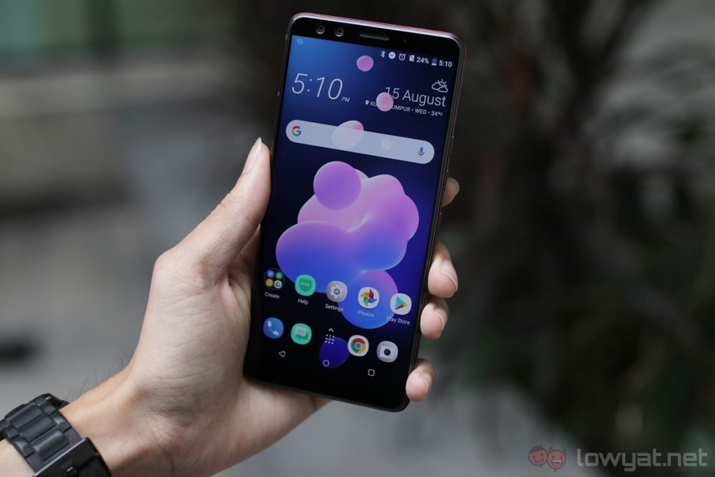
Besides that, the U12+’s 6-inch Super LCD 6 display is very impressive – almost on par with an AMOLED panel, in fact. While it can’t match the black levels of an AMOLED display, the U12+’s screen is one of the best LCD displays I’ve ever used. It’s sharp, it has great viewing angles, and colours look really lifelike.
Great display and performance.
Performance is another strong area for the U12+. It’s incredibly enjoyable to do some serious mobile gaming on this phone – especially PUBG Mobile – and it just flies in day-to-day usage. It did not skip a single beat when I used it as my daily driver, and it just does what I want it to do quickly and efficiently.
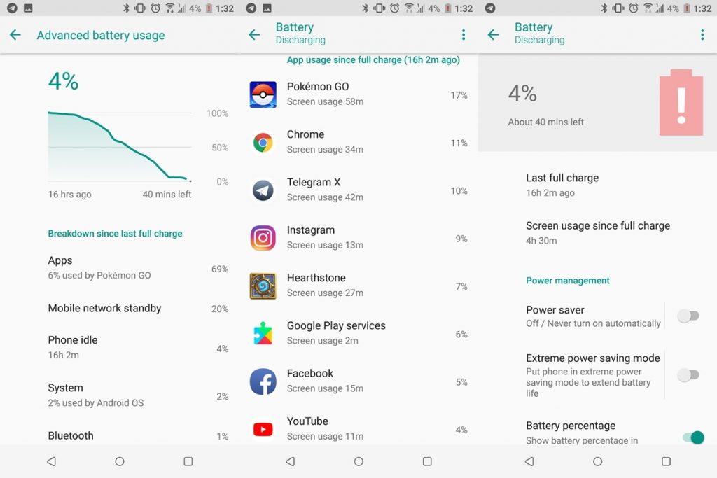
Battery life, on the other hand, is quite average in comparison to its competition. I can consistently get about four and a half hour of screen on time with the U12+, and it’s quite effortless to squeeze a day’s worth of use out of the phone. Considering the fact that the U12+ only has a 3,500mAh cell, this is pretty good battery life.
Unfortunately, HTC did not provide us with a quick charger to test out the U12+’s charging rate. But rest assured, the phone does support Quick Charge 3.0.
Did I enjoy using the U12+ as my daily driver? Absolutely. If you ignore the gimmicky Edge Sense feature, you have a really sensible and powerful flagship smartphone here. Now, let’s move on to its other strength: camera.
Camera
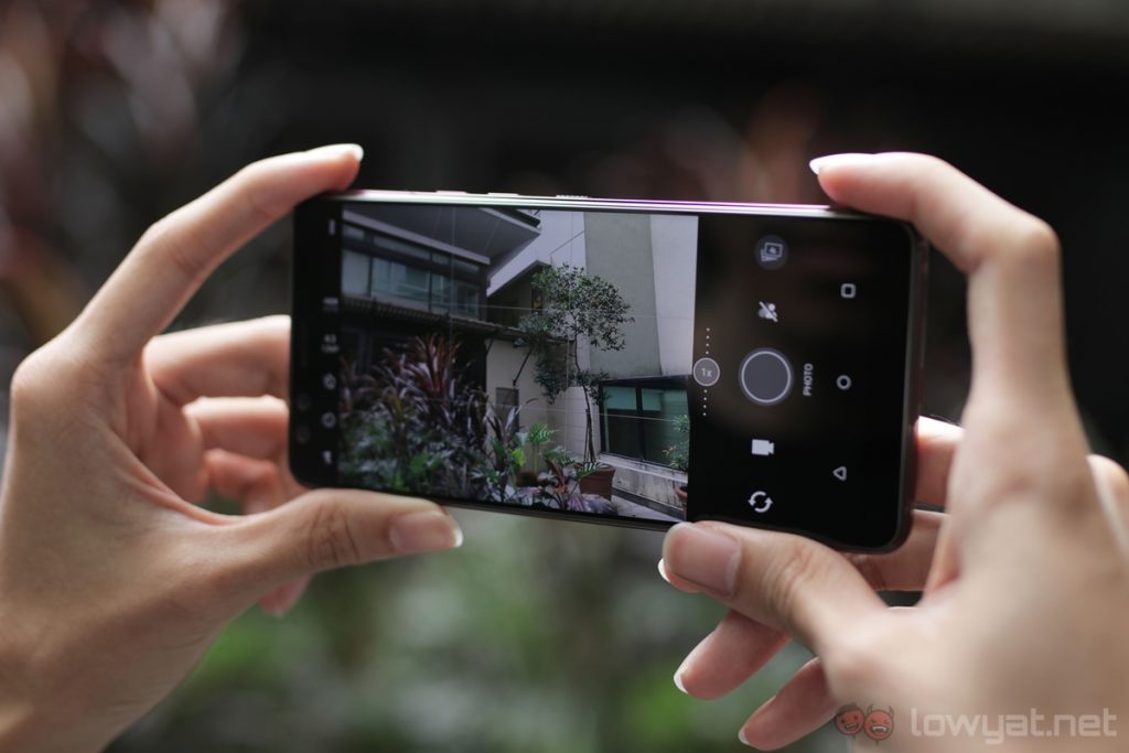
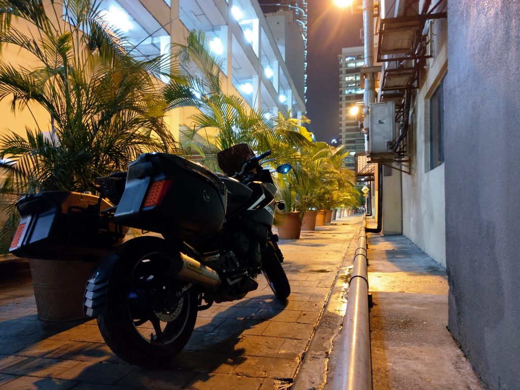
Sporting a 12MP + 16MP dual-camera system, the U12+ has one of the best camera performances I’ve seen from a flagship smartphone. It performs great in both daytime and low light conditions, and the results almost always surprise me whenever I look back at my shots.
Very, very impressive camera performance.
DxOMark gave the U12+’s camera a score of 103, placing it in second place right behind the current leader of the chart, the Huawei P20 Pro. After spending quite some time with the U12+’s camera, I’m inclined to agree with DxOMark’s scoring. The camera’s autofocus is fast, it has fairly accurate white balance, and images look sharp with wide dynamic range.
But there is one thing with the U12+’s camera that bothers me: the camera interface doesn’t feel particularly responsive, especially in challenging lighting situations. The shutter speed seems to slow down a bit as it gets darker, and there’s very noticeable shutter delay. Despite all of these, however, images I took still look great. Perhaps the camera just needs a software tweak to make it feel more responsive.
While I’m not thrilled with the camera’s general responsiveness, the U12+ definitely has one of the best cameras I’ve had the pleasure to review. Is it as good as class leaders like the Samsung Galaxy S9+ and Huawei P20 Pro? Well, not quite – on the basis of ease of use and user experience – but it’s definitely very close.
Sample Images
Competition
Retailing at RM3,499, the U12+ demands a premium price tag, putting it in the same price range as other high-end smartphones. Here are some of its most notable competition.
Samsung Galaxy S9+
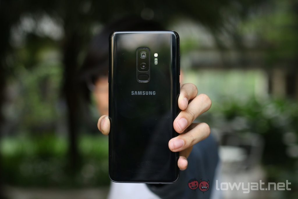
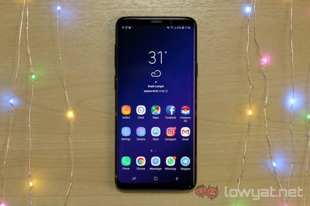
Now going for as low as RM3,199, the base model of the Galaxy S9+ is more affordable than the U12+. Not only does it cost less, the S9+ also offers a more impressive display and superior camera performance. You’re getting a 3.5mm headphone jack too with Samsung’s offering, if that’s essential to you.
But the U12+ does come with double the internal storage at 128GB when compared to the S9+’s base model, not to mention a more unique design. It’s not every day you see a phone with a translucent glass back.
Huawei P20 Pro
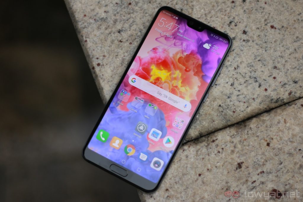
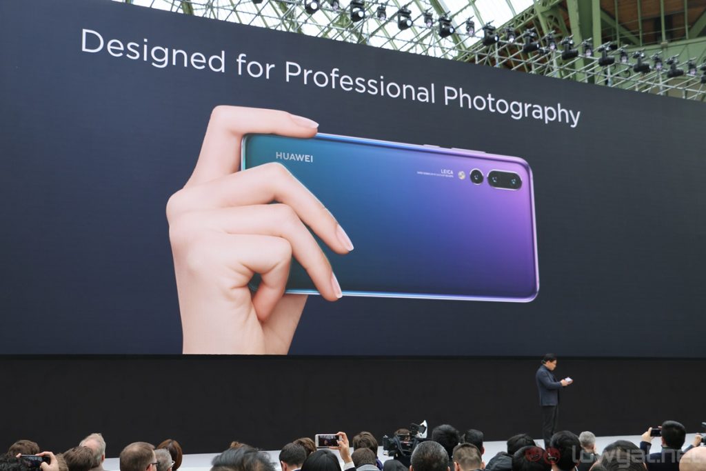
And of course, we have arguably Huawei’s most impressive phone yet, the P20 Pro. Without a doubt the P20 Pro has better camera performance than the U12+, and personally, I prefer its gradient, Twilight colourway over the U12+’s see-through back panel.
On top of that, the P20 Pro easily costs less than the U12+ – you can get it from only RM2,749 now.
So why would you get the U12+ over the P20 Pro? Well, there are a couple of things. For one, the U12+ has a superior and sharper 1440p display, along with better software experience, support for expandable storage, and BoomSound stereo speakers. But it’s up to you to decide whether or not these advantages can justify the price difference between the two phones.
Conclusion
HTC can still make very good flagship smartphones, and the HTC U12+ shows just that. In fact, it would’ve been one of my favourite high-end phones this year, if not for one thing: its horrible buttons.
It’s no exaggeration to say that buttons on a smartphone are extremely important to the overall user experience. It’s a fundamental feature, and having buttons that don’t work the way they’re intended to be consistently is not acceptable – especially for a flagship smartphone.
The HTC U12+ would’ve been a very sensible flagship if it had better buttons.
But beyond that, the U12+ is a great device in other areas. It has impressive camera performance, a great-looking display, and unique design. The only real deal breaker here are the wonky buttons, which makes it tough to accept the U12+’s already high asking price.
Photography by Ming Hoo.
Follow us on Instagram, Facebook, Twitter or Telegram for more updates and breaking news.


