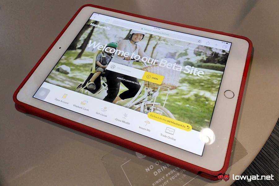
To be officially available to public later this week, Maybank today has unveiled a new look for its Maybank2u online banking site. While the bank has attempted a similar effort a few years ago, the 2018 redesign offers a much better implementation than the previous effort in 2013.
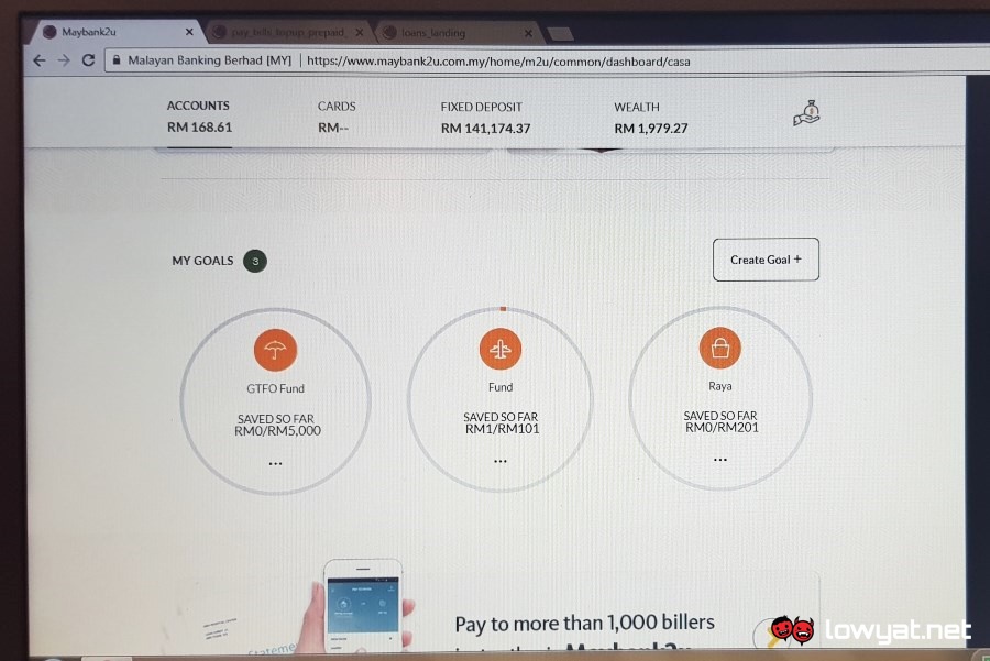
As mentioned earlier, among the objectives of the redesign is to provide a more simplified online banking experience to users. One of the ways Maybank aims to achieve that is through the site’s new dashboard, which allows users to see and access their bank accounts and investments quickly.

At the same time, the new design also finally makes the Maybank2u website much more usable on smaller screens as compared to the existing design. Furthermore, users can also now upload their own Security Image as well as choose personalized themes for the site, which changes according to the time of day.
Aside from new UI, Maybank has also come out with new set of features for the site. However, these new functionalities will only be made available to users in the coming weeks as they will be rolled out in stages.
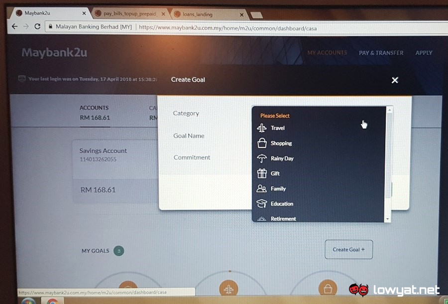
One such function is the Goal Savings Plan which allows users to put aside their savings automatically into sub-accounts that will be created under their existing Maybank accounts. They can set a specific category that is relevant to the goals of these sub-accounts such as travel, shopping, retirement, and more. A Maybank representative confirmed that the Goal Savings Plan also offers higher interest rates than a standard savings plan, therefore encouraging customers to save more.
On top of that, Maybank will also be able to notify customers of promotions that are related to categories based on their Goal Savings Plans; no personal data will be shared with any third parties as this will all be done internally on Maybank’s end.
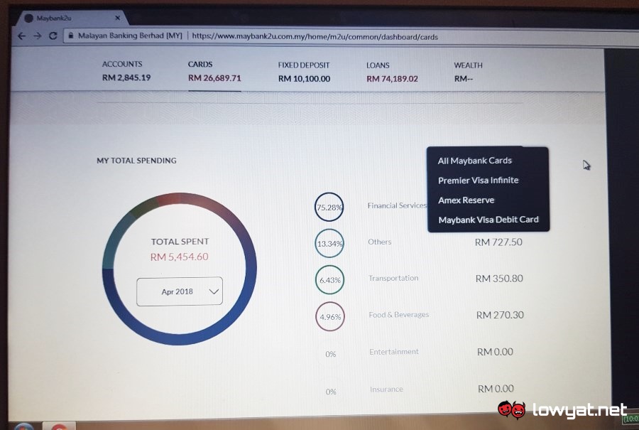
The other new feature that will be available to users soon is a Spending Pattern Tracker for debit and credit cards. Through this particular feature, users will be able to see their spending habits in very organised manner. Users also can see a breakdown of their spending for each individual Maybank credit card they own. Finally, this feature also allows users to set a monthly spending limit to their cards. Once they hit the specified limit, they will receive notifications via the Maybank2u mobile app.
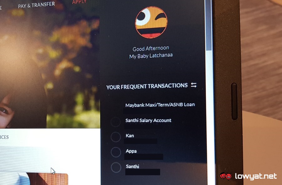
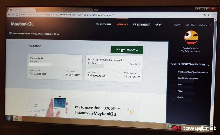
Other than that, the newly redesigned site will also include another new feature called Quick Pay. Located on the site’s side bar, it allows users to complete any of their 5 most frequent transactions with just a single mouse click. Last but not least, Maybank will also provide a dedicated dashboard for users to monitor and manage their insurance policies.
While there are no specific roll-out dates for the new features that we mentioned above, a Maybank representative stated that all of them should be available to users by Q3 this year. Meanwhile, you can give the newly redesigned Maybank2u website a try right here ahead of its official launch on 19 April.
Follow us on Instagram, Facebook, Twitter or Telegram for more updates and breaking news.

