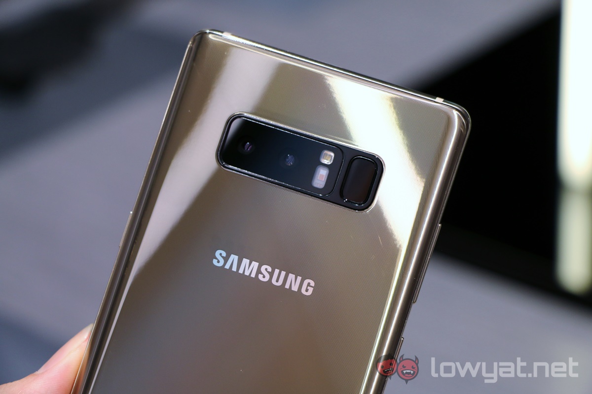
I’ve been trying out the new Samsung Galaxy Note 8 for about two days now, with a keen focus on its new dual camera setup. After all, while Samsung’s excellent dual-pixel technology on its rear cameras have been class-leading, it would have lagged behind the competition if it did not release a dual camera module; as it is, Samsung is already rather late to the pack.
But within seconds of trying out the Live Focus mode – basically Samsung’s version of Portrait Mode on the iPhone 7 Plus – I was left flustered and pretty disappointed. Perhaps it was both a pity and good fortune that there was only one reason behind this negativity.
Unnecessarily Complex Operations
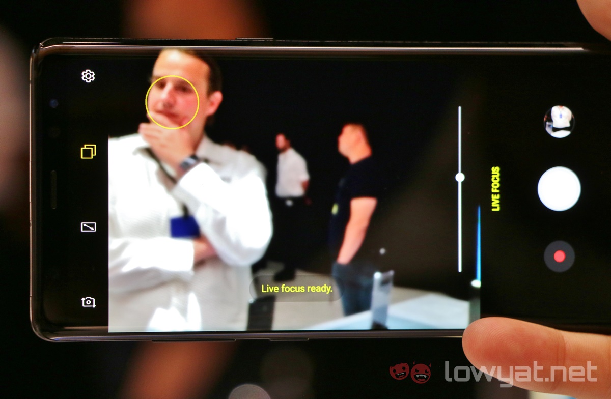
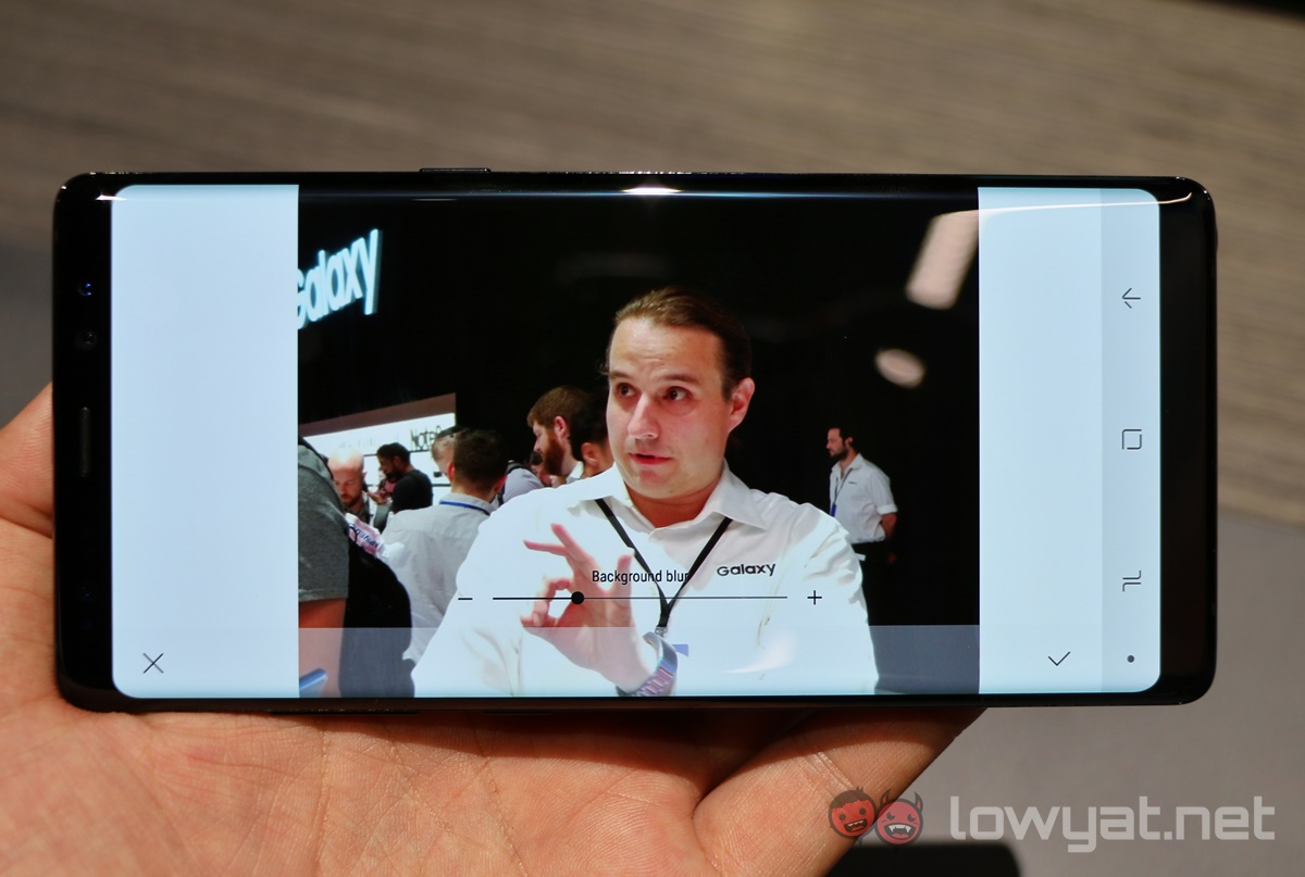
What irked me about Live Focus was just how unnecessarily complex the whole thing was. Here’s what it does: switching to the telephoto lens, the camera attempts to simulate depth of field effects using computational algorithms.
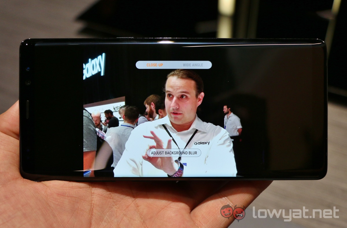
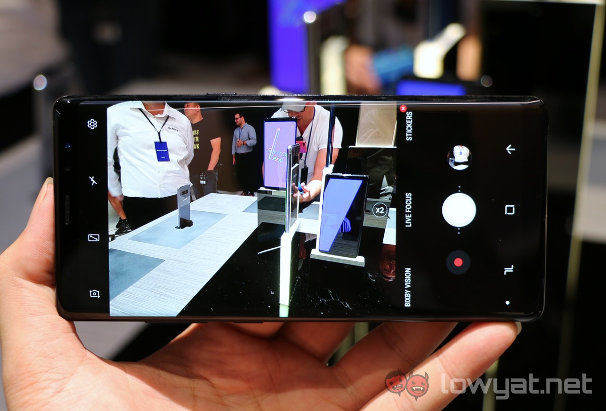
When the frame has a clearly defined foreground and background, textual prompts (I count three different ones so far) turn yellow (“Live Focus ready.”) to indicate there is enough depth information to enable Live Focus. A slider beneath this text lets you determine the level of bokeh, which is shown in real time as you move the slider. If you prefer, you can also edit this after the photo is taken.
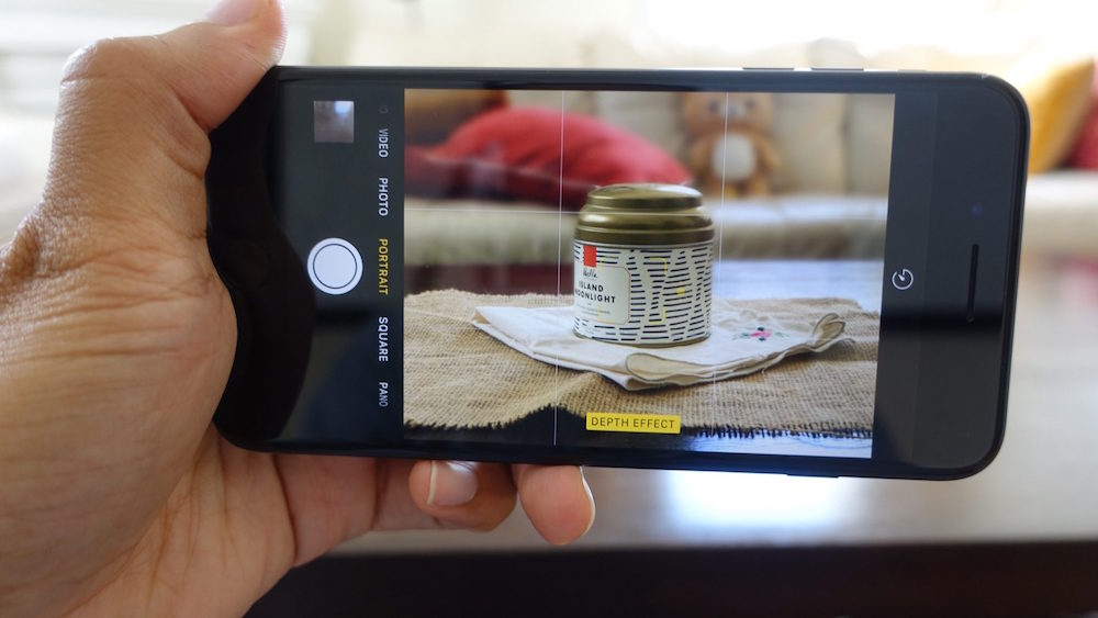
Here’s how Portrait Mode works on the iPhone 7 Plus: switching to the telephoto lens, the camera attempts to simulate depth of field effects using computational algorithms. When the frame has a clearly defined foreground and background, the “Depth Effect” prompt glows from grey to yellow to indicate there is enough depth information to use Portrait mode. Tapping the shutter button captures two images: one with and another without bokeh effects.
Taking photographs has a lot to do with speed. While portrait photography understandably takes a bit more time to prep, it should not have to be this way when using a smartphone. Apple made the right call to keep Portrait mode dead simple to use, and its computational photography algorithms do all the heavy lifting. From my experience, Portrait mode has been delivering some impressive results – even if it is still labeled as a beta feature.
Meanwhile, Samsung went the complete opposite route, complicating the UX with unnecessarily long textual prompts. But the biggest sin for me is that darn slider – why would you want to adjust the effects in real time, with the full knowledge than you can do so after the image has been taken?
Imagine a scenario where you want to take a nice portrait shot of your partner, and making them hold a pose while you adjust the “perfect” depth of field. Not only is that annoying, it strips away the joy of smartphone photography, which has always been about speed and mobility.
Furthermore, the slider does not have a default or automatic setting – when you enable Live Focus, the slider will be at the point where it was last used. For the first few times you use it, it definitely feels confusing – is this what the camera algorithms suggested, or not?
Unrefined UI Design
It almost seems like Samsung was harking back to its old ways, offering features for the sake of having more features, regardless whether they may be useful or not. The bokeh effect slider is a classic example here – there’s no need for it to clutter the camera UI.
Let’s go deeper into the Note 8’s camera UI. One feature I’ve always hated using on smartphone cameras was zooming; after all, it made no difference than to crop in post anyway. But with dual camera setups with telephoto lens, a proper zoom UI suddenly becomes important. And again, Samsung falls short.
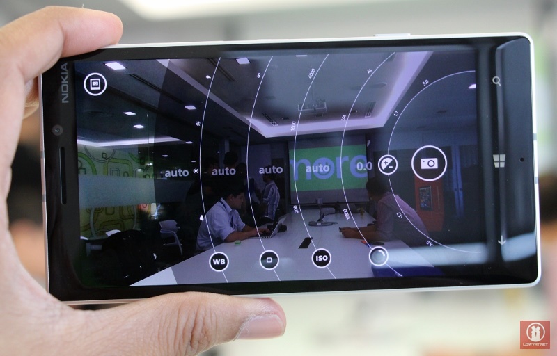
Nokia had been way ahead of its time in a lot of things, and the heart fondly remembers its early advances in smartphone cameras – and with it, its camera UI. Nokia’s Pro Camera UI for Lumia smartphones back then was not only aesthetically awesome, it was actually really functional as well. The dial-style manual controls has since been adopted by many smartphone makers.
The iPhone 7 Plus has a similar control, but adapted for a much better zooming experience. Its camera UI has a simple tiny circle that switches between “1x” and “2x”, but if you press and hold that button, a circular dial shows up that lets you slowly zoom all the way to 10x. It’s exceptionally useful when recording videos – operating zoom only needs a single finger.
https://www.youtube.com/watch?v=wsaA1s7oCKA
Contrast this to the Note 8. While it also has a tiny circle that swiches between “1x” and “2x”, you can’t slide up or down the button to zoom beyond 2x (or between 1x and 2x, for that matter). To do that, you need to resort to pinching with two fingers before the zoom slider comes out. It’s unintuitive and primitive, and worst of all, disrupts the shooting experience – especially when recording videos. (update: there is a zoom mechanism by pressing and holding the shutter button up or down).
Difference in Philosophies
This may be a little off-tangent, but perhaps these differences can be attributed to the way Apple and Android OEMs operate. While Apple has nobody in the ecosystem to fend off, Android OEMs are always adding features that they hope will differentiate themselves from other OEMs. Offering more usually means being better – when that usually isn’t the case.
In the meantime, Apple has always thrived in simplicity. iOS has many limitations that will frustrate many Android users, but as the saying goes, it just works. It’s a simple platform that (thankfully) has adapted features from Android and other platforms to make it more useful, but simplicity by design remains at the core.
In the case of the Galaxy Note 8, Samsung may have felt the need to add more features on its dual camera setup to make it look better than Apple’s Portrait Mode. The Android power user mentality may have seeped through when designing Live Focus, giving users unnecessary power over something that can better be controlled by algorithms.
All is Not Lost
But, as I mentioned earlier, it may be good fortune that the Galaxy Note 8 suffers from merely a UI/UX issue, and not an algorithm problem with the dual camera setup. I’ve tested both the Galaxy Note 8 and iPhone 7 Plus with their respective portrait modes, and it is quite clear that the Note 8’s camera yielded better outputs. Photos shot on iPhone cameras usually lack vibrancy, and it’s the same case here.
As for the depth of field algorithms, both devices seamlessly isolate subjects from the background in real time (though shooting in a crowd is a real challenge for the cameras).
Essentially, Samsung need only tweak the camera UI, because what’s underneath is already really good. Remove that slider (because it is redundant), and textual prompts need not be as long as 14 words.
Having a more intuitive zoom function would be great as well – the pinch-to-zoom gesture will soon be a decade old. There has to be an easier way, and if Apple can find it, why can’t Samsung? (update: there is a zoom mechanism by pressing and holding the shutter button up or down).
As I mentioned, these are just cosmetic issues that can easily be iterated upon and pushed out via software updates. In recent years Samsung has shown a willingness to listen to feedback and move quickly from there, which leaves me feeling hopeful that things will work out. But until then, I still think the iPhone 7 Plus has the best Portrait Mode setup.
Follow us on Instagram, Facebook, Twitter or Telegram for more updates and breaking news.


