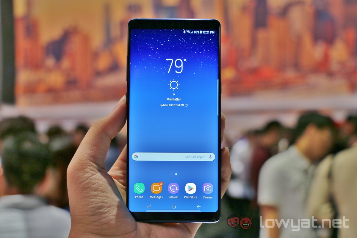
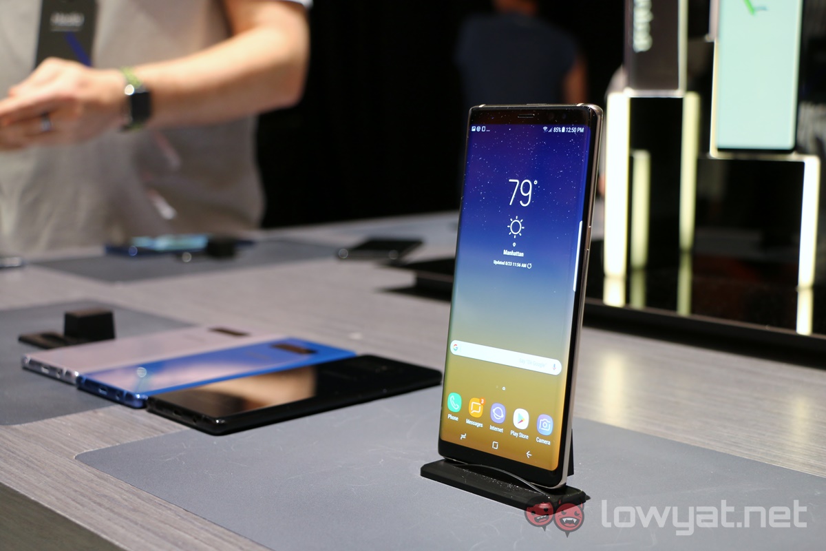
A year ago this month, Samsung released its finest smartphone yet. As we all know, things didn’t quite go as planned, and Samsung has been hard at work since to repair its reputation as one of the world’s best smartphone makers. The Galaxy S8 series was a sensational testament to that, but today’s the real acid test for Samsung: successor to the ill-fated Galaxy Note 7, the Galaxy Note 8.
After spending some time with the Galaxy Note 8, it must be said that there is a strong sense of deja vu – the device has the familiarity of the Galaxy Note 7, with the handsome Infinity Display from the S8 series patched on for good measure. Perhaps because of this (and the much-needed dual-camera upgrade), the Galaxy Note 8 is – somewhat surprisingly – rather uninspired.
New Old S Pen
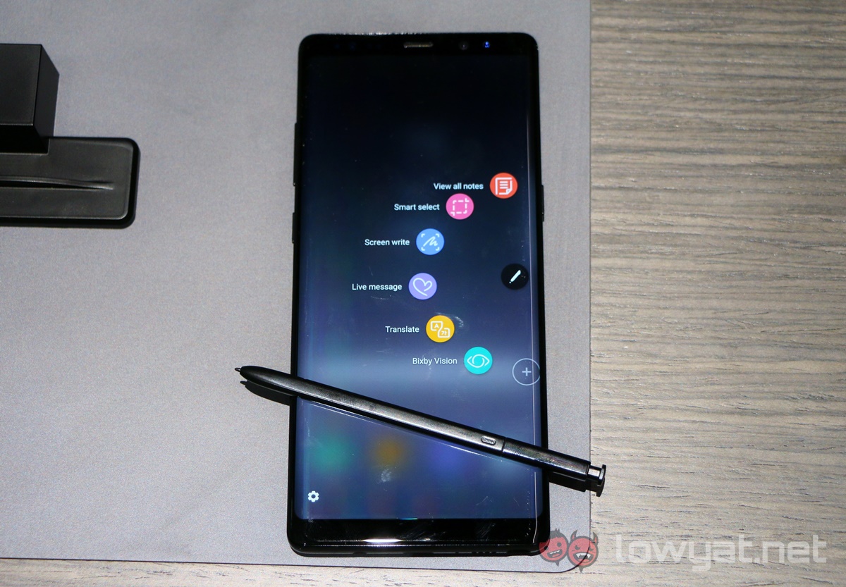
The first inclination of this was in the press release, where comparisons such as the S Pen were not made between the Note 8 and Note 7, but rather with the Note 5 – a phone from 2015. Physically, the S Pen looks and feels the same as that on the Note 7; we’re told it is very slightly thinner. There were also few new features for the S Pen that isn’t gimmicky (Live Message) or iterative (Screen Off Memo now supports up to 100 pages, because reasons).
But these new features do sound useful for the business user, where the Note series is a popular choice. The Glance feature allows you to minimise an app, and hovering the S Pen over the minimised app opens it in full screen; moving the S Pen away minimises it again. S Pen Translate is basically a renamed version of Translate from the Note 7; it can now translate sentences from up to 71 languages.
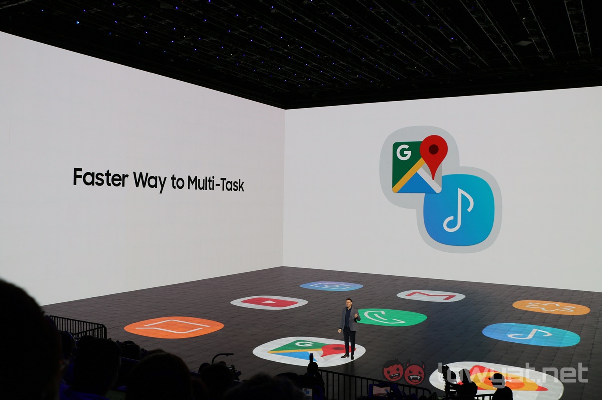
Meanwhile, one Note 8 feature that sounds very useful is App Pairing. Basically, it makes opening two apps in Multi Window in just one swipe from the Apps Edge menu. Users can customise which two apps can be opened together in the App Pairing menu (for example, YouTube and Gmail), and it’ll appear on the Apps Edge menu.
Big(ger) Brother
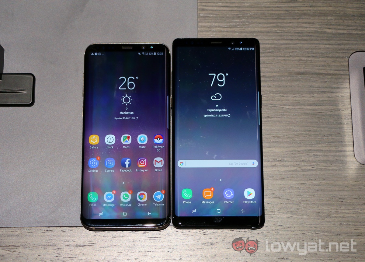
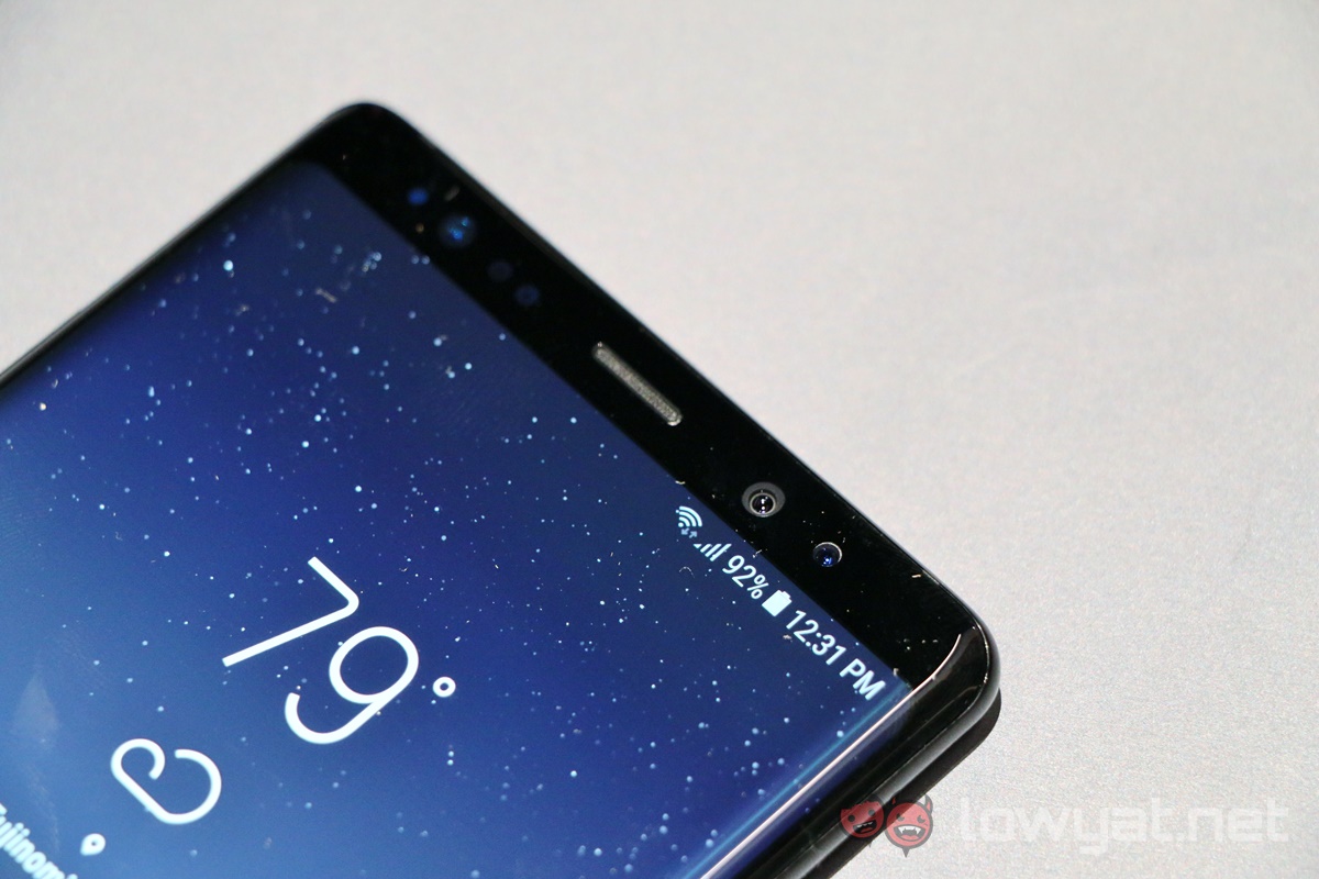
This being a Samsung product, the Galaxy Note 8 is still a handsome, well-crafted device. It shares a similar design language with the Galaxy S8 series, but with some caveats. The dual-curve display has has a more acute curve angle compared to the S8 for better note-taking, but as a result, the phone itself has a boxier feel to it.
Perhaps I’ve been spoiled by the use of the Galaxy S8+, but the Note 8 feels larger than it should be despite being only marginally larger then the S8+. The different, more acute curvature of the Galaxy Note 8 makes it really tough to touch the top corners of the display with one hand, even if the display is only 0.1 inch larger than the S8+.
Dual Camera Misstep
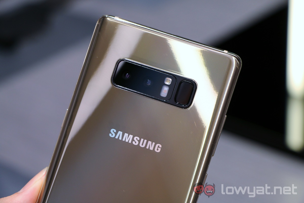
But of course, the biggest difference here is at the back. There’s a new dual-camera module, comprising of two 12MP sensors, and in an industry first, both sensors have Optical Image Stabilisation. The solution here is similar to that on the iPhone 7 Plus, but on paper at least, the Note 8 has the superior option. The telephoto lens allows for 2x optical zoom, just like the iPhone 7 Plus, but the inclusion of OIS and an f/2.4 aperture (f/2.8 on the iPhone 7 Plus) means the Note 8’s secondary camera should perform better.
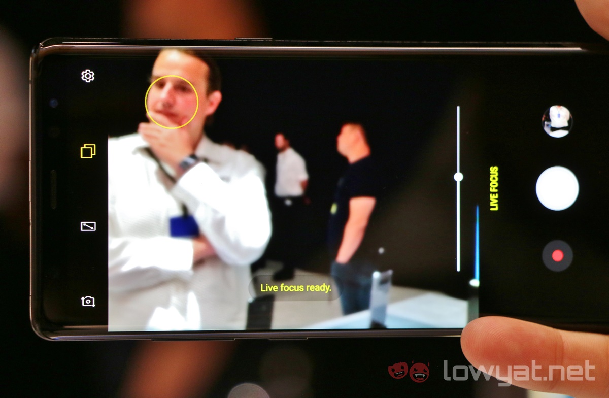
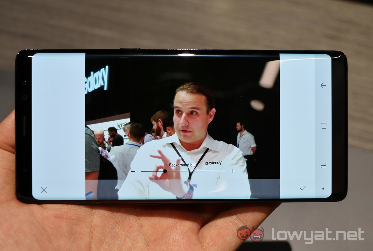
This of course means the Galaxy Note 8 has its own portrait mode, and here it’s called Live Focus. The difference here is that it allows you to adjust the depth of field levels in real time; you can also do it after the image is taken.
That’s where I feel Samsung got it wrong.
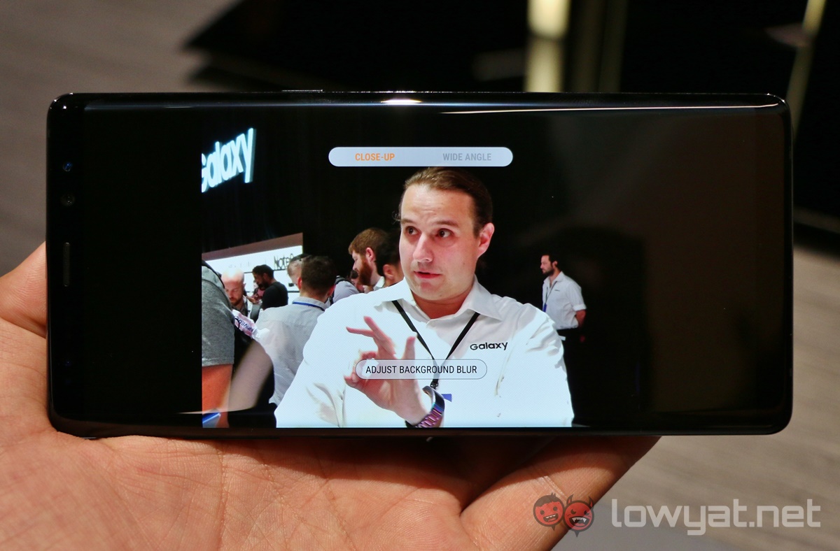
While the ability to adjust the bokeh effect might sound beneficial, Samsung’s implementation of this is rather poor. Images shot in Live Focus mode have zero bokeh effects by default, and look the same as any other 2x zoom shots. There will be an option to “Adjust Background Blur” in the Gallery, with a slider to adjust depth of field, and saving the end product.
This is the complete opposite of Portrait Mode in the iPhone 7 Plus, which does all of the computational work automatically, and also gives a real-time preview of the bokeh effect. The Galaxy Note 8, on the other hand, makes you work hard for it. Definitely room for improvement here.
Unlike the iPhone 7 Plus, when photographing in Live Focus mode, the other sensor is also used, resulting in two images captured at the same time – but with vastly different frames. This opens up quite an interesting way of capturing two different images at the same time.
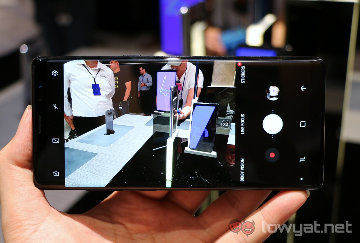
On a related note, the camera UI has also been tweaked slightly. There is now a one-touch toggle between 2x and 1x zoom (which is necessary because of the dual-camera setup), but below the frame are additional shooting modes: Bixby Vision, Live Focus, and Stickers. While Bixby Vision and Stickers aren’t new (they debuted in the S8), their UI have been changed from icons to text, which helps visibility. Otherwise, the UI remains similar, and will be instantly familiar to Galaxy S and Note users.
One piece of good news: Bixby Vision still has huge prominence in the UI as Samsung aims to feed the AI platform more raw data to learn from, but thankfully the annoying pop-up to use Bixby Vision on the S8 camera is no longer here.
It also appears that Samsung has its own way of addressing concerns with the location of the fingerprint sensor. It is still at the back, but Samsung has moved the heart rate sensor to be in between the dual camera module and the fingerprint sensor, making it less awkward to use. It is still quite difficult to reach, though.
We will be working on a separate post comparing the Galaxy Note 8’s camera with the Galaxy S8+, so stay tuned for that.
User-Friendly UI Tweaks
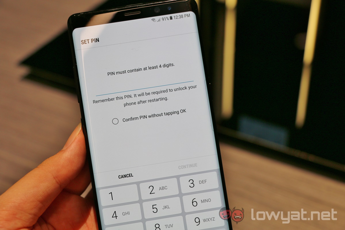
There are very subtle changes in the phone UI too. The Galaxy Note 8 is basically the same as the S8 series with additional S Pen software, but digging deeper into the Settings app shows some genuinely user-friendly updates. For example, there’s an option to “confirm PIN without tapping OK” when using PIN codes to unlock the phone. This is a ridiculously simple tweak, but it fixes a genuinely irritating issue with the lock screen (for those not using any of the biometric security unlocking modes).
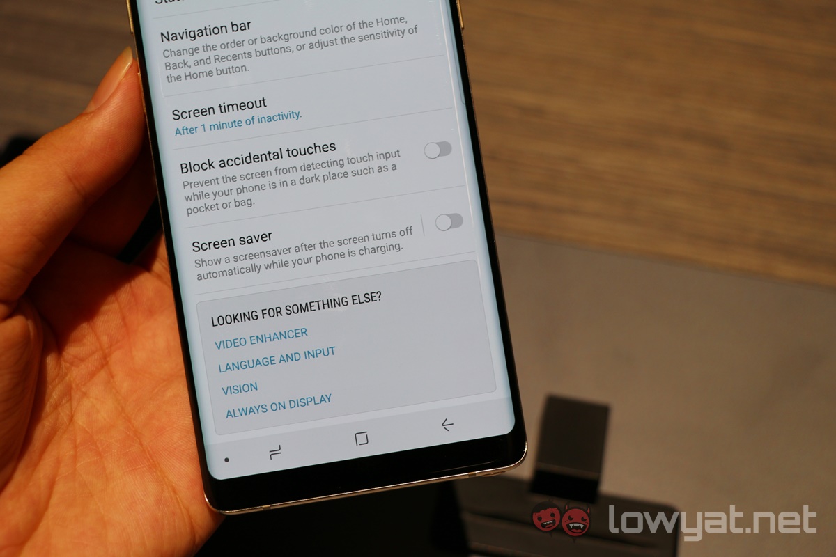
There’s also a new setting that prevents the display panel from registering accidental touches when the phone is in a dark place such as a pocket or bag. Again, it sounds like a mindless feature, but it means an end to pocket dials and butt selfies.
The specs are mainly similar to the Galaxy S8+, with 10nm Snapdragon 835 or Exynos 8895 chipsets, but 6GB of RAM would definitely help power users – and using it with the DeX Station. One concern would likely be battery life: at just 3,300mAh, it is smaller than the 3,500mAh unit on the Galaxy S8+. It appears Samsung is still tip-toeing the area of batteries.
Playing Safe
In fact, the entire phone feels like Samsung is playing safe. Despite the stellar performance of the Galaxy S8 series, it seems like Samsung is still haunted by the Note 7, and is opting to iterate instead of pushing boundaries. The addition of a dual camera and the Infinity Display are two such examples here: they’re necessary upgrades, but not entirely groundbreaking.
It is, of course, too early to draw conclusions at this point, and so we will reserve judgment when our full review is out.
Follow us on Instagram, Facebook, Twitter or Telegram for more updates and breaking news.


