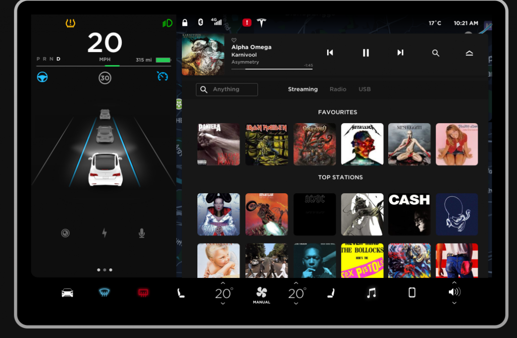
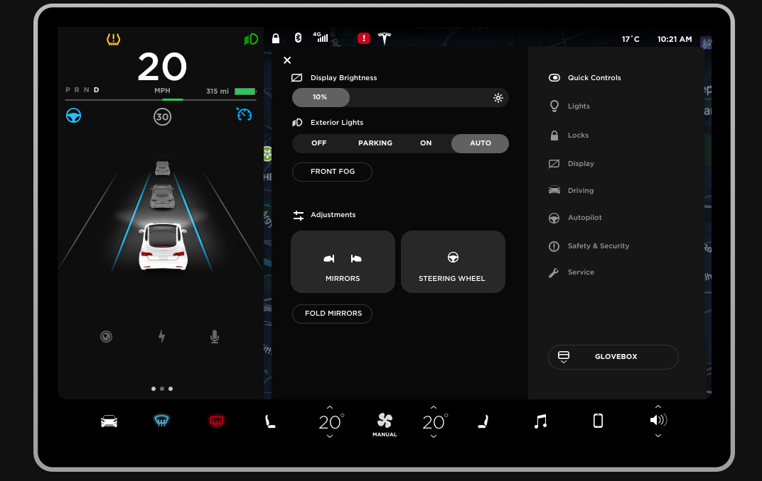
Remember when we said that the Tesla Model 3 didn’t have a key and that you have to use your smartphone? Well, it turns out that not only does the Tesla Model 3 have no key or ignition but it also lacks buttons. Everything is controlled from the 15-inch touchscreen.
So how would it be if you were to control your existing car with just a horizontal centre screen? Thanks to a Tesla fan who is also a UI/UX designer, Andrew Goodlad has created a mockup of the 15-inch screen which allows you to try navigating through the user interface of the Tesla Model 3.
The mockup allows us to click on several buttons which bring in new screens and navigations for the car. It does get a little complicated as we are a creature of habits and it takes a bit of getting used to relying on a touch screen for controls which normally have been reserved for buttons at certain locations in the car.
 Since the mockup was done by a fan so it isn’t 100% accurate to the real deal but it does give you an overall feel of what you might have to click and press to navigate through. Andrew Goodlad is still working on the mockup and as time goes on, the mockup will be updated and more buttons are being added.
[Source: Electrek.co]
Follow us on Instagram, Facebook, Twitter or Telegram for more updates and breaking news.


