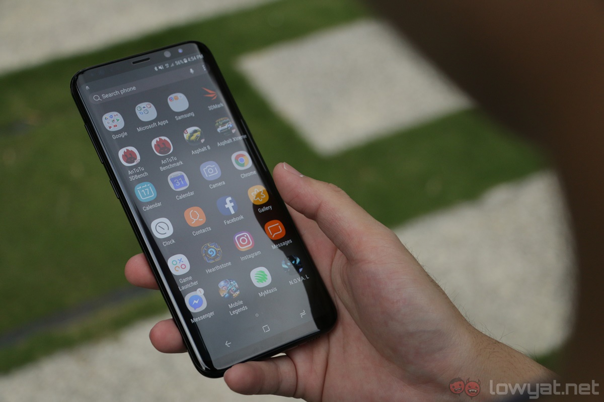
The Samsung Galaxy S8 is finally here, and it is easily one of Samsung’s most anticipated smartphones to date. Sporting a new, almost bezel-less Infinity Display, it’s arguably the S8’s most impressive hardware, and Samsung knows this very well: its marketing campaign capitalised quite a bit on this one aspect alone.
But at the end of the day, are the Galaxy S8 devices worth it? Not only are they Samsung’s most expensive phones to date, these two phones have a lot to prove. Well, after using the Galaxy S8+ as my daily driver for the past week, I can say this with confidence: it is the smartphone to beat this year.
Design & First Impressions
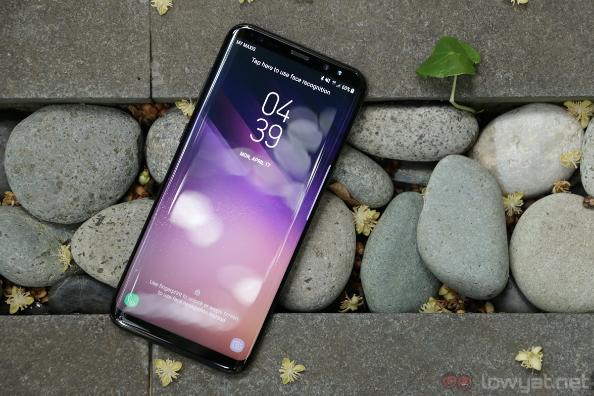
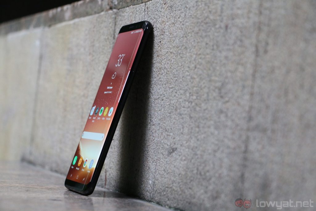
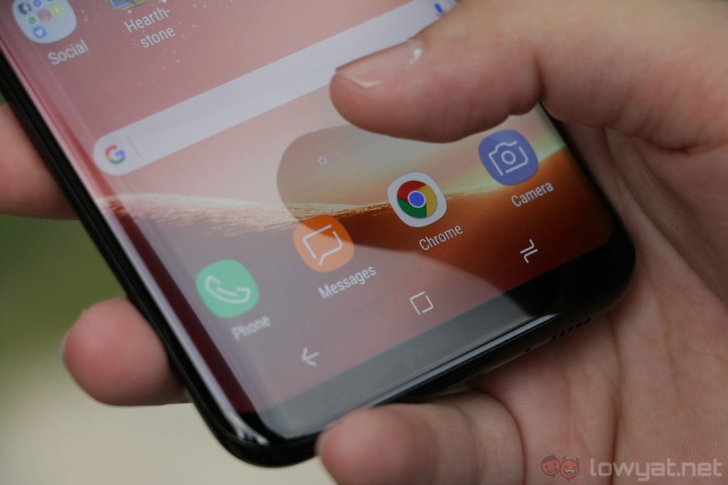
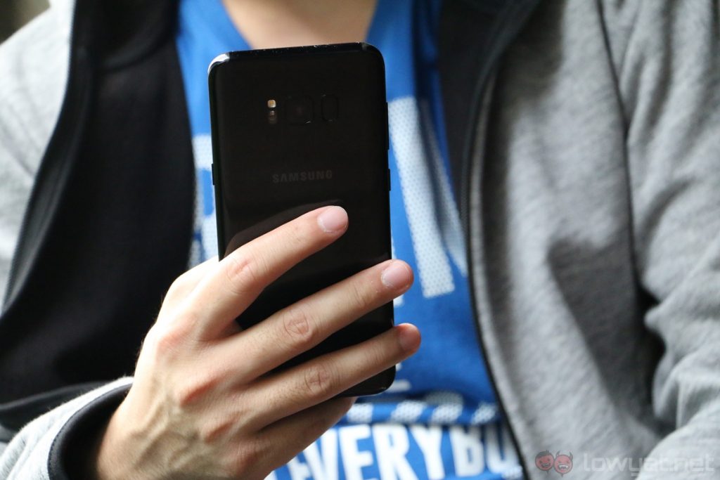
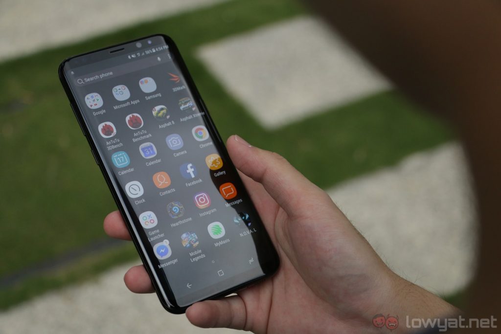
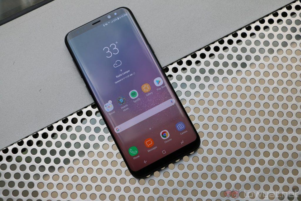
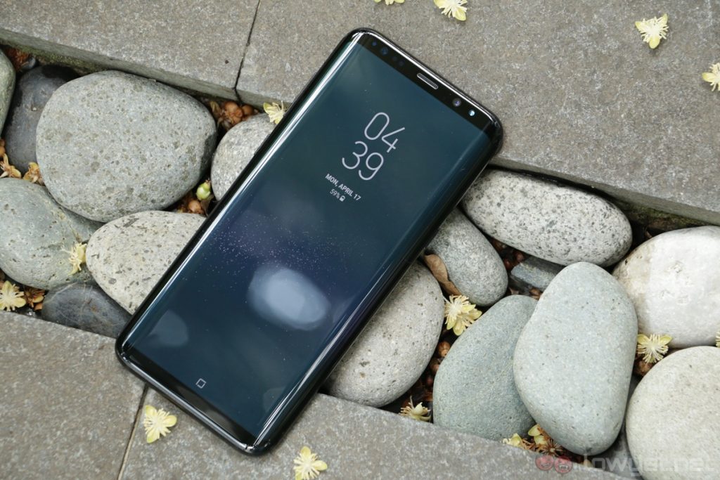
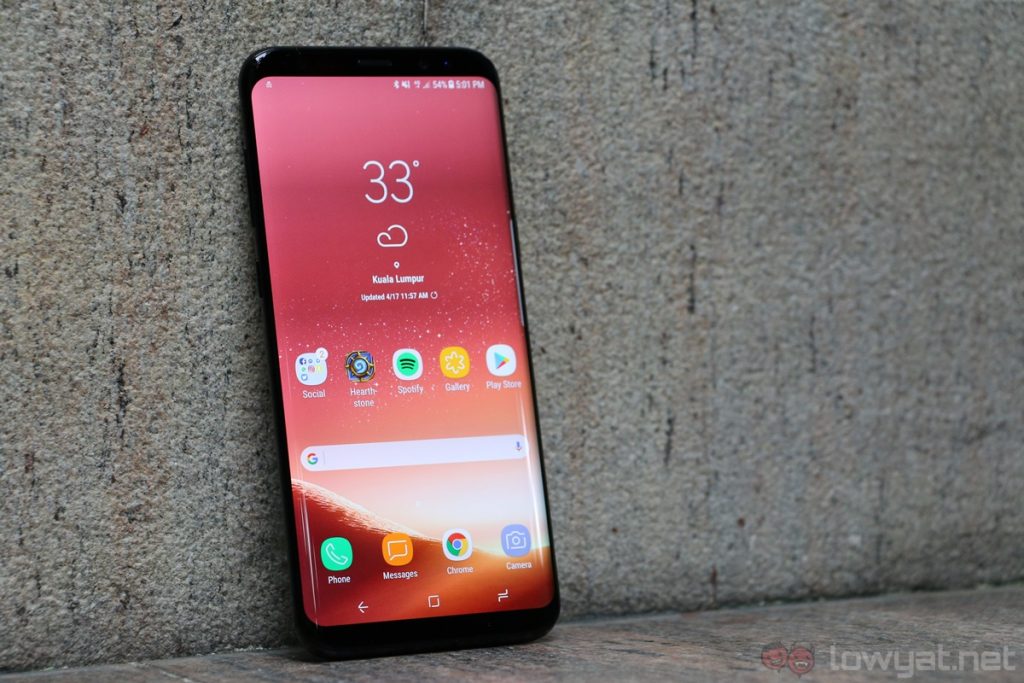
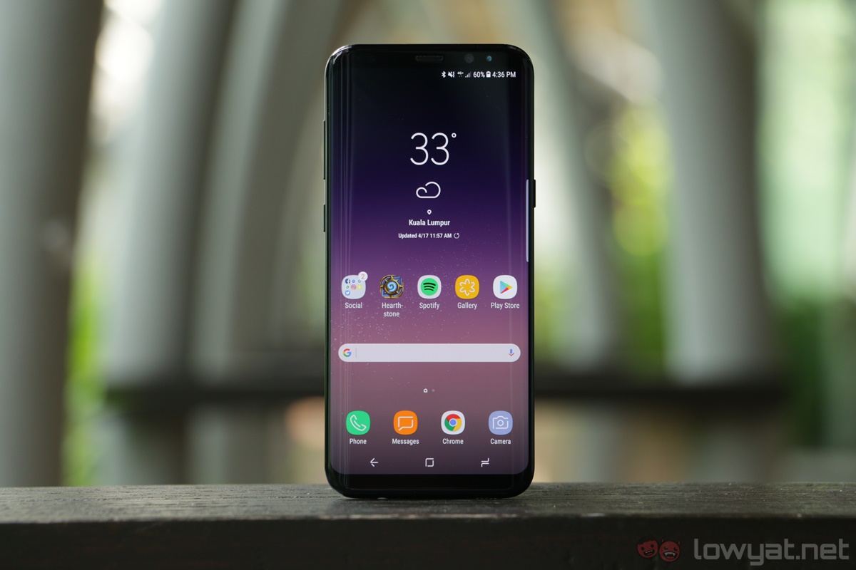
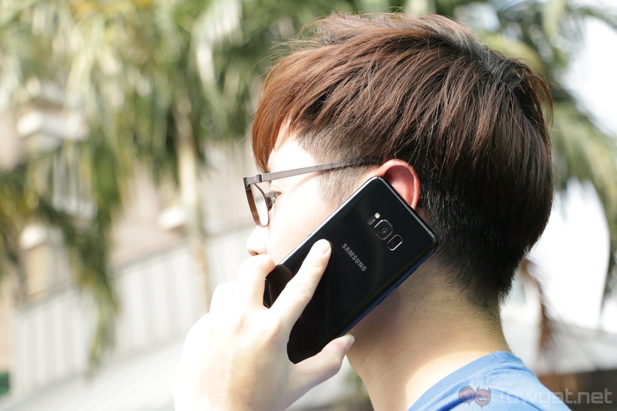
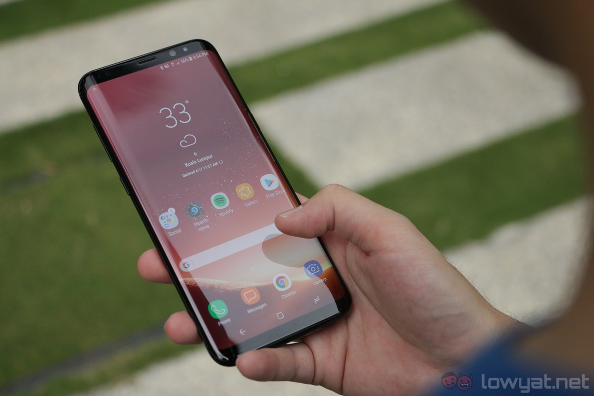
You’d be hard-pressed to find a phone as gorgeous as the Galaxy S8+; it looks like something that came out of a concept design. The almost bezel-less Infinity Display is a delight to look at – even more so than the Xiaomi Mi Mix, in my opinion – and Samsung’s signature glass and metal design is even more refined on the S8+.
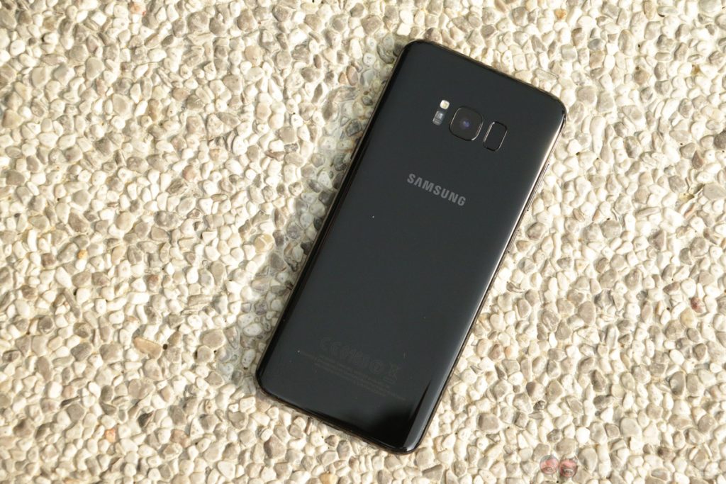
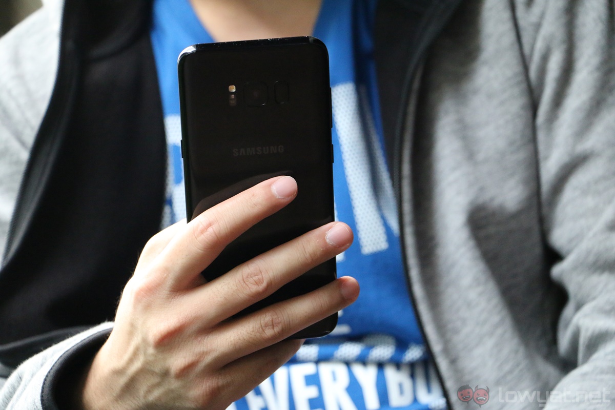
Naturally, the Galaxy S8+’s build quality is excellent: it feels very premium, and it’s just a really, really nice phone to hold. However, as sleek as it looks, the S8+’s design isn’t perfect. For one, its glass back attracts fingerprints very easily, and the mostly glass construction means I’m a little extra paranoid about its durability (even if the reality may not be the case).
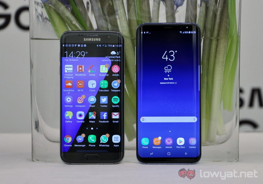
One of my main gripes with the Samsung Galaxy S7 edge was its dual-curved display. More often than not, the phone would register accidental touches on the curved sides of the display. Thankfully, this isn’t an issue anymore with the Galaxy S8+. Not only is the curvature more subtle, it seems like Samsung improved the palm rejection too.
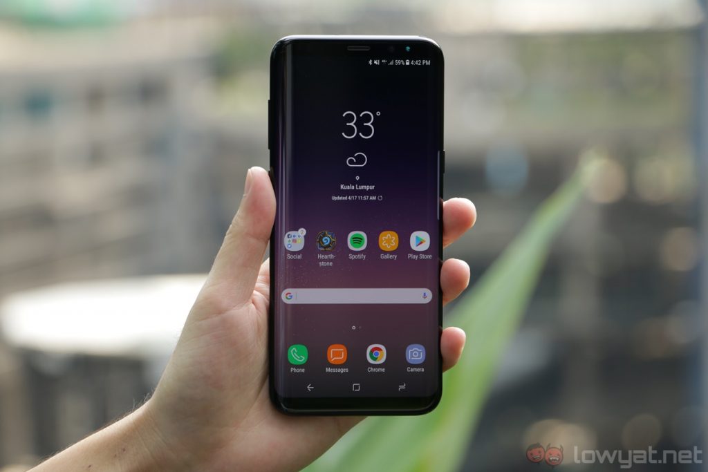
And then there’s the Galaxy S8+’s unusual 18.5:9 aspect ratio display. Not only is this a change from the conventional 16:9 displays of virtually all smartphones in the market, it also gives the S8+ a taller than usual display. To be honest, it took me quite some time to get used to this, but there’s a marked advantage here: the Galaxy S8+ doesn’t feel as unwieldy as its screen size would suggest.
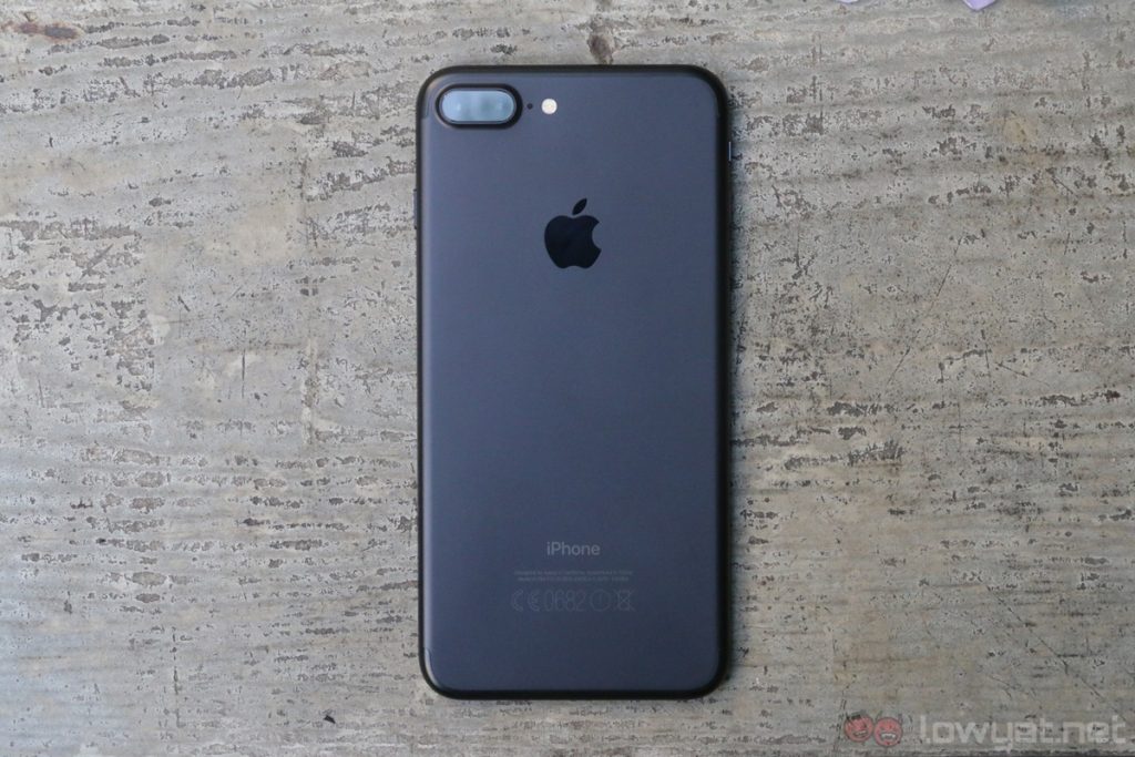
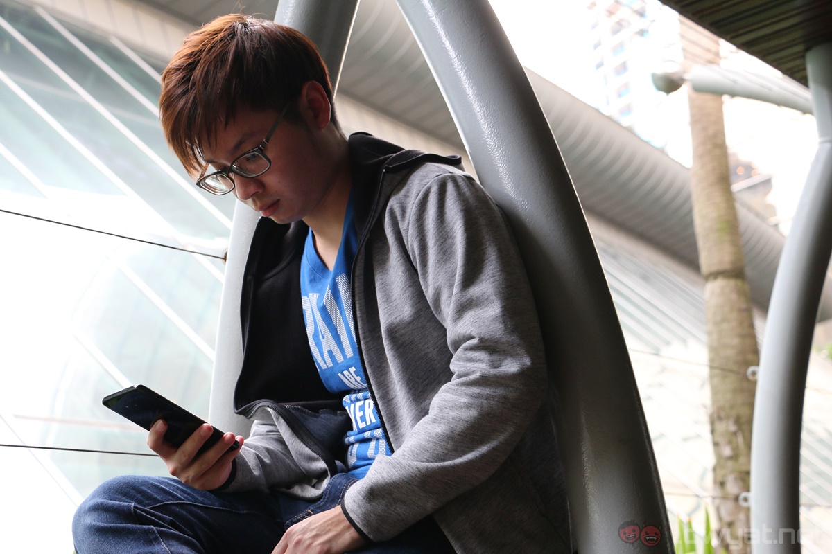
Although the 6.2-inch display of the Galaxy S8+ sounds huge on paper, I can comfortably use the device with one hand. In practice, the S8+ feels a lot like using a standard-sized phablet like the iPhone 7 Plus and Huawei Mate 9. As a matter of fact, the S8+ (73.4mm) is narrower than both the 5.5-inch iPhone 7 Plus (77.9mm) and 5.9-inch Mate 9 (78.9mm). That said, it’s worth noting that the S8+ is taller than these two devices.
That being said, there is one issue with the usability of the Galaxy S8+’s tall display: it’s…too tall. When using the phone naturally, it’s a struggle to reach to the top of the display with one hand to pull down the notification panel. I could use the rear fingerprint sensor instead to pull it down, but that’s an issue on its own.
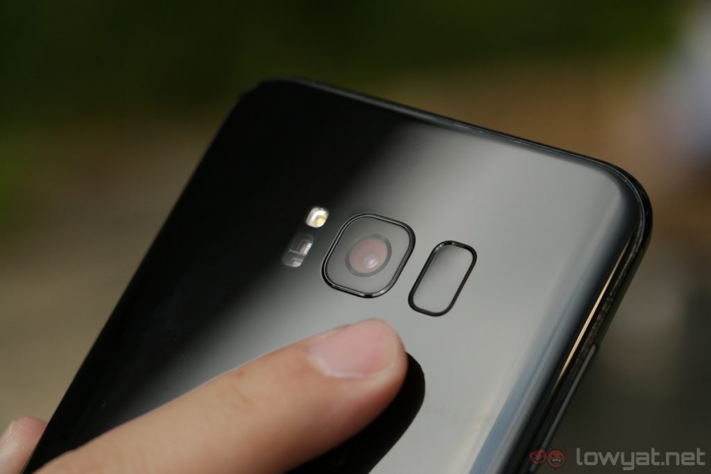
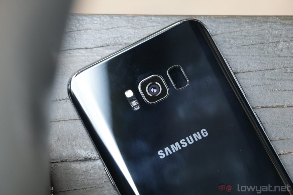
Unlike Huawei or LG, Samsung decided to put the Galaxy S8+’s fingerprint sensor right beside the camera lens. Not only do I almost always smudge the camera lens whenever I want to use the sensor, it’s not the most natural position to reach too. Fortunately, I almost never needed to use the fingerprint sensor to unlock the S8+ thanks to the new facial recognition feature on the S8+.
The Galaxy S8+’s facial recognition is not as secure as the fingerprint sensor or the iris scanner – it can be tricked with a simple photograph – but the Galaxy S8+’s face unlock is incredibly convenient. While it does take some time to recognise my face on certain occasions, it’s really quite fast most of the time.
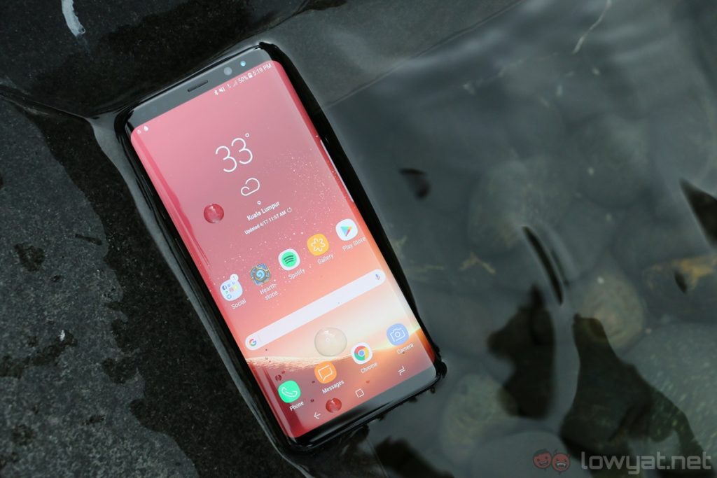
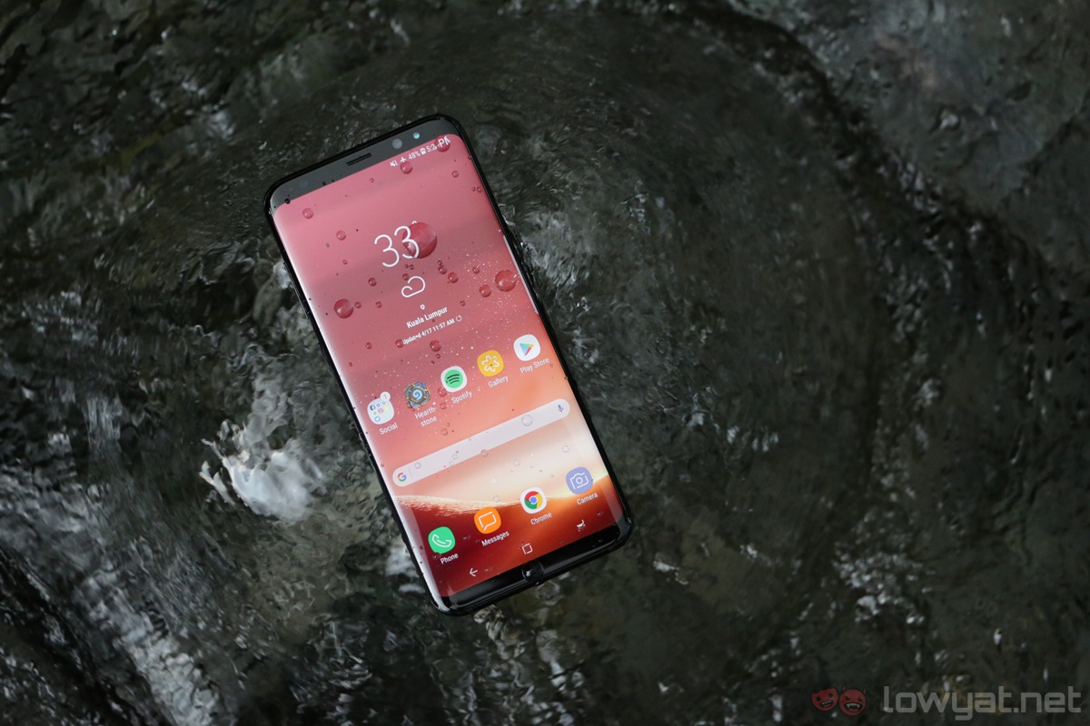
Samsung has consistently delivered some of the best designed smartphones in recent years, and the Galaxy S8+ raises the bar even higher. Aside from the odd fingerprint sensor’s placement, the S8+ is a very well-designed phone. Heck, I’d argue it’s the sleekest-looking phone in the market right now – it’s IP68-rated too.
Hardware
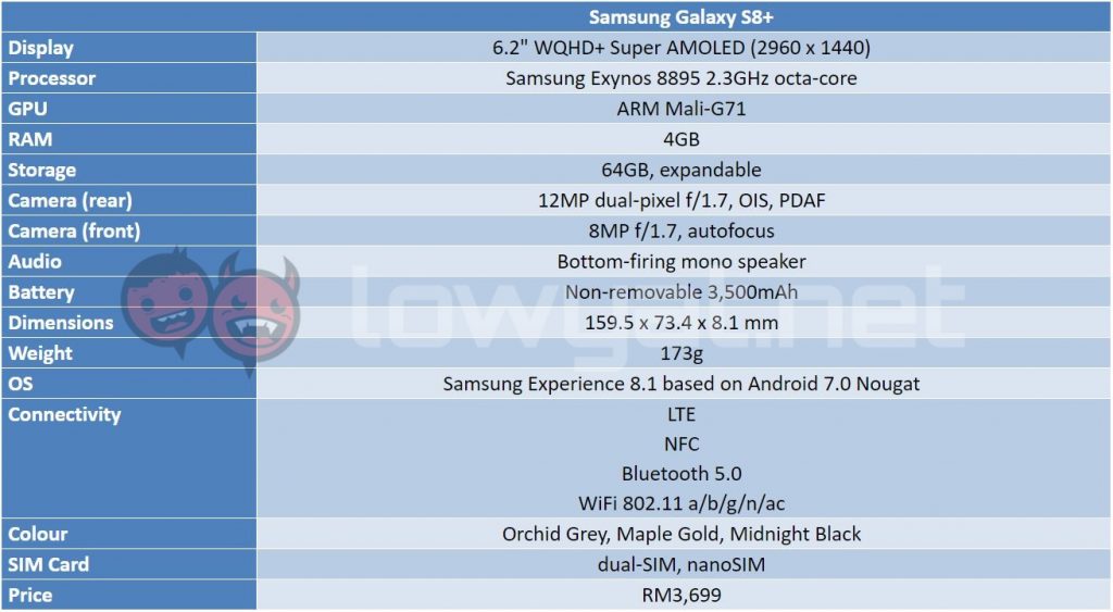
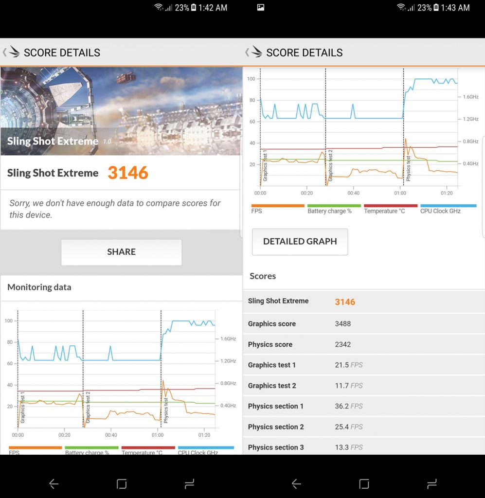
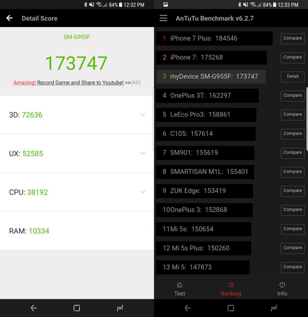
If you’re all about hardware, the Galaxy S8+ is as cutting edge as it gets for a 2017 flagship smartphone. Powered by Samsung’s brand new 10nm Exynos 8895 processor, the S8+ is a very, very capable phone. Multitasking with the S8+ is a breeze, and it can handle any game I throw at it with relative ease.
But there’s one particular hardware of the Galaxy S8+ that stands out, and not in a good way: its battery capacity. For a device this big, 3,500mAh isn’t a very generous capacity, so battery life was one of my main concerns with the S8+. Well…I can tell you now there’s nothing to worry about; I’ll elaborate further down this review.
Benchmark
Software
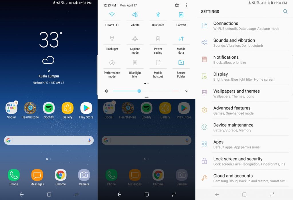
TouchWiz isn’t exactly a consumer favourite – especially among Android purists – but on the Galaxy S8+, TouchWiz is no more: enter Samsung Experience. Aside from a new name, Samsung’s Android skin has matured considerably, and Samsung Experience on the S8+ is a very polished experience.
Like many noteworthy iterations of Android in recent times, the Galaxy S8’s software is on the light side of things, which is great. It doesn’t feel cluttered or sluggish, and the overall look and feel of the user interface are very…fresh. I also like how customisable it is.
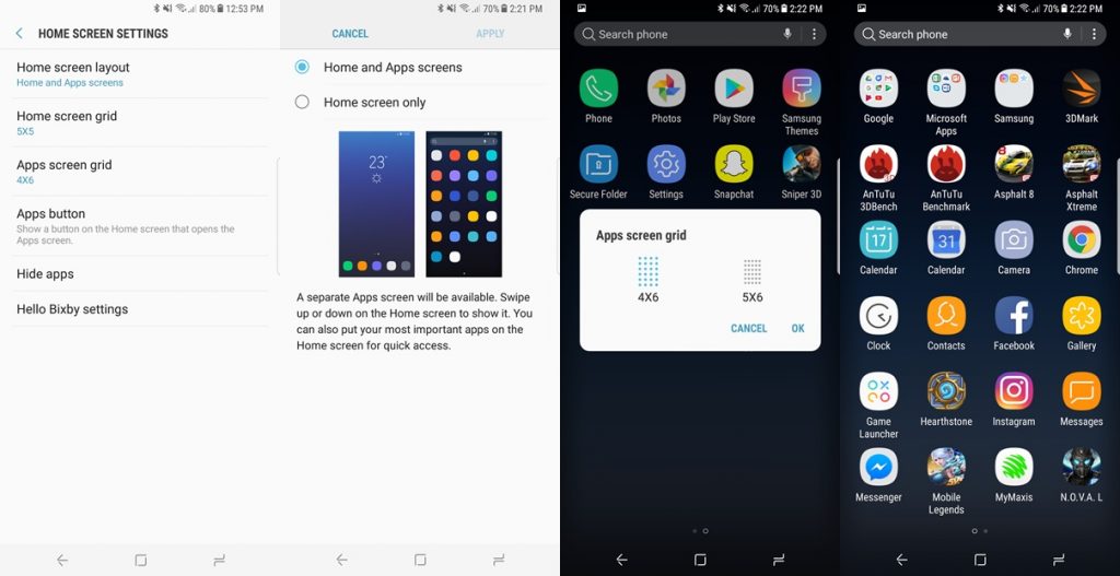
Out of the box, there’s no icon to access the app drawer on the home page. Instead, I’ll have to swipe up or down to summon the app drawer, which I find pretty convenient. If this method isn’t for you, the app drawer icon can always be enabled. Also, you can hide certain apps and decide if you’d rather have all your apps displayed on the home screen.
Bloatware was – and still is, for certain brands – one of the most intrusive elements of custom versions of Android, and this isn’t something Galaxy S8+ owners will have to worry about. When setting up the device, I was actually given a choice to install or forego apps from Samsung. This isn’t a choice many phone makers offer their users, and it’s great to see Samsung – which was once notorious for its bloatware – giving its consumers this level of control.
Samsung Experience on the Galaxy S8+ is a well-thought-out, polished take on Android, and it’s easily one of the most pleasant Android skins I’ve come across. I really appreciate the Always On Display of the S8+ too: I can easily glance over the phone for any notifications I might have missed.
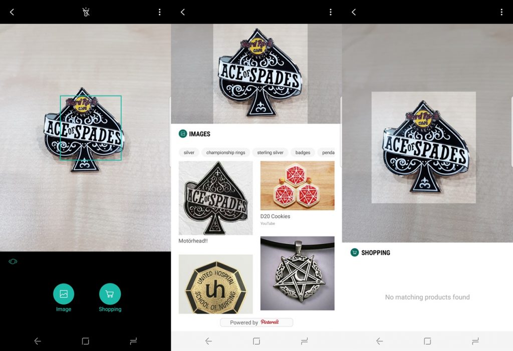
Oh right, aside from Google Assistant, the Galaxy S8+ also comes with Samsung’s very own digital assistant: Bixby. Unfortunately, the voice feature isn’t quite ready yet at launch. For the time being, Bixby only shows cards akin to Google Now cards. Bixby Vision is also a rather fun feature to play around with, although in its current state, it’s not quite as…well, functional.
Battery Life
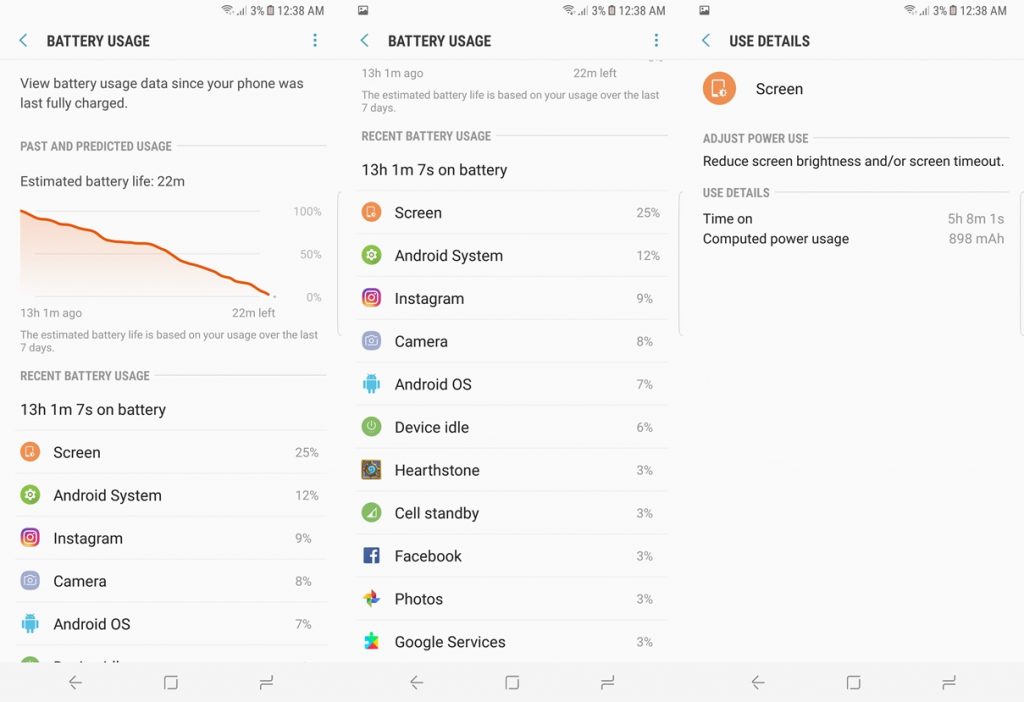
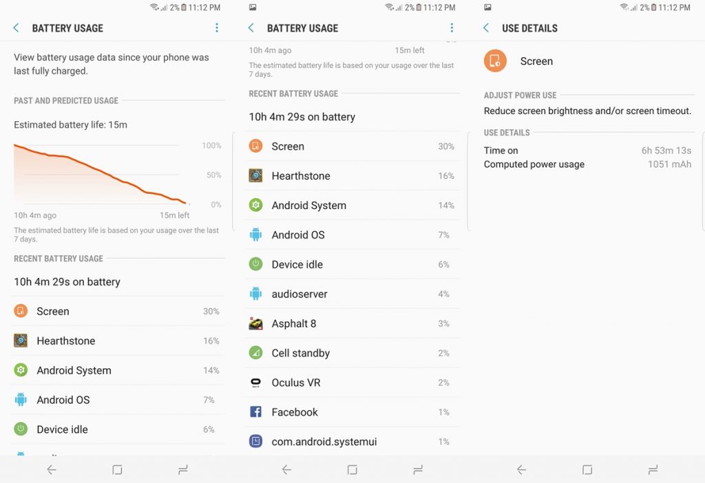
I was most concerned about this aspect of the Galaxy S8+. Not only does the S8+ have a smaller 3,500mAh battery than the Galaxy S7 edge’s 3,600mAh cell, the former also has a bigger, more pixel-dense display. Honestly, getting into this review, I wasn’t optimistic I could get decent battery life out of the S8+.
And I was never happier to be proven wrong.
On average, I was consistently getting at least five hours of screen on time with the Galaxy S8+. On certain occasions, I was pushing almost seven hours of screen on time (I was on a Hearthstone marathon). To top it off, I set the display to its native 2960 x 1440 resolution instead of the default FHD+ option with Always On Display enabled.
Evidently, Samsung has done a really good job with the Galaxy S8+’s power optimisation. The power efficiency of the S8+’s 10nm Exynos 8895 processor and Super AMOLED display played quite an important role here too.
While the Galaxy S8+’s battery life is excellent, its fast charging feature isn’t quite as exciting. Within 30 minutes of charging, the S8+ was only charged up to 37%, and I’ve tested the charging rate on three different occasions just to be sure.
Display
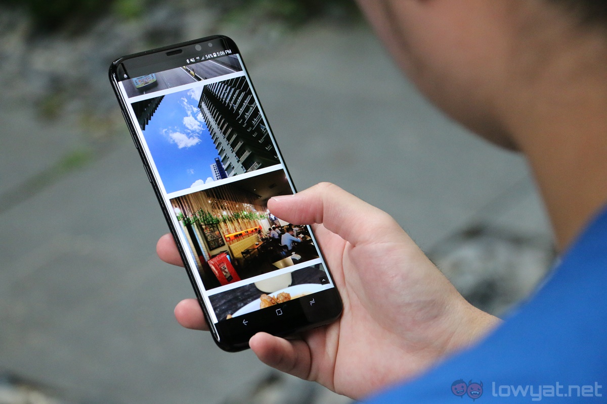
This is the hallmark feature of the Galaxy S8+. When the first few leaks of the S8+ started surfacing, I wasn’t quite sure if the Infinity Display was legitimate: it just looked too good to be true. Fast forward to today, and we have perhaps one of the most impressive displays on a smartphone.
As far as display technologies go, Super AMOLED panels are arguably the best there is, and the Galaxy S8+’s 6.2-inch 1440p display shows just how much the technology has matured. Not only are the display’s excellent black levels help conserve battery life by switching off the individual pixels, colours are also vibrant and punchy.
DisplayMate rated the Galaxy S8’s display very highly, and I’m inclined to agree with its assessment: it’s just a really pleasant display to look at. That being said, certain apps are not optimised for the phone’s unique 18.5:9 aspect ratio yet. To compensate for this, there will be black bars on either sides of the display.
Audio
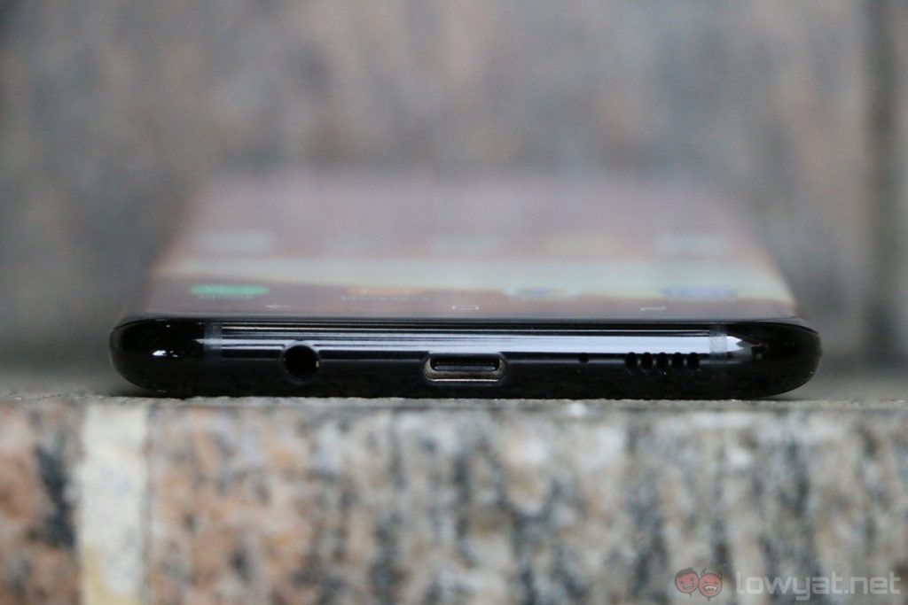
Out of all the Galaxy S8+’s many impressive features, its audio is perhaps the phone’s most…ordinary aspect. Don’t get me wrong: compared to other flagship-tier phones, the S8+’s bottom-firing mono speaker is noticeably above average with decently loud maximum volume. But in comparison to say, the HTC U Ultra‘s BoomSound speakers, the S8+ isn’t quite up there.
Camera
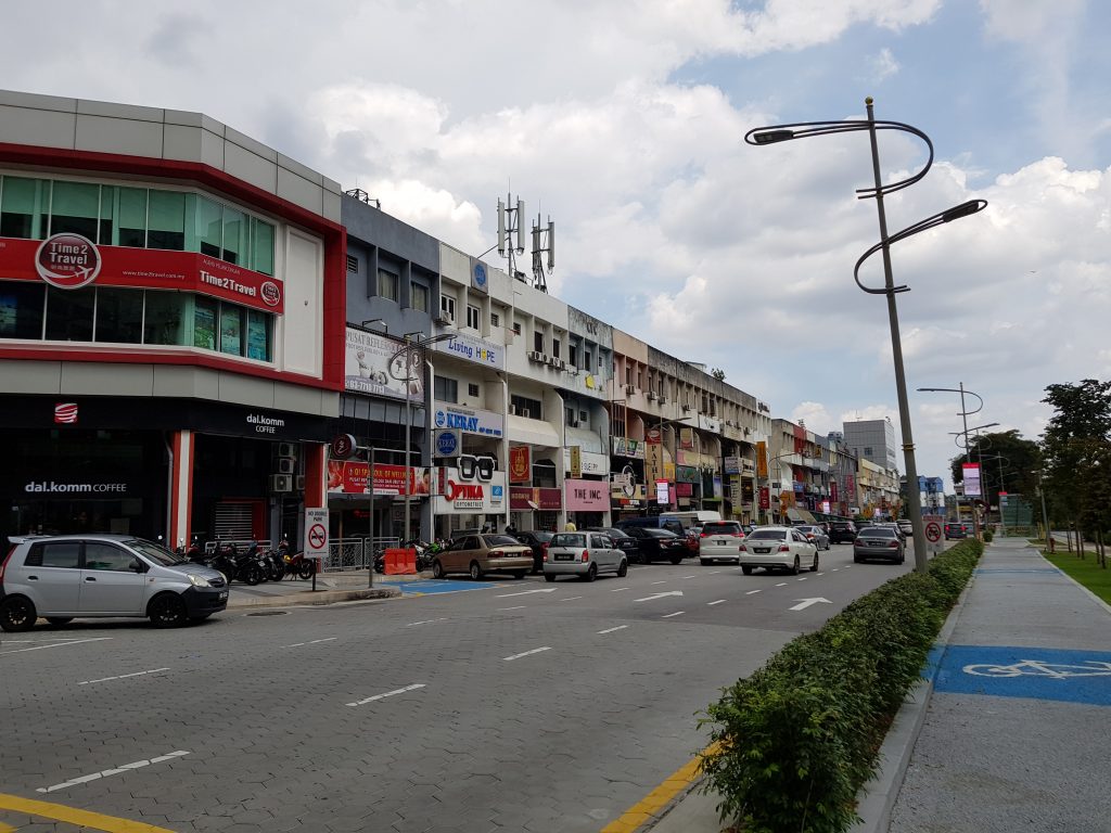
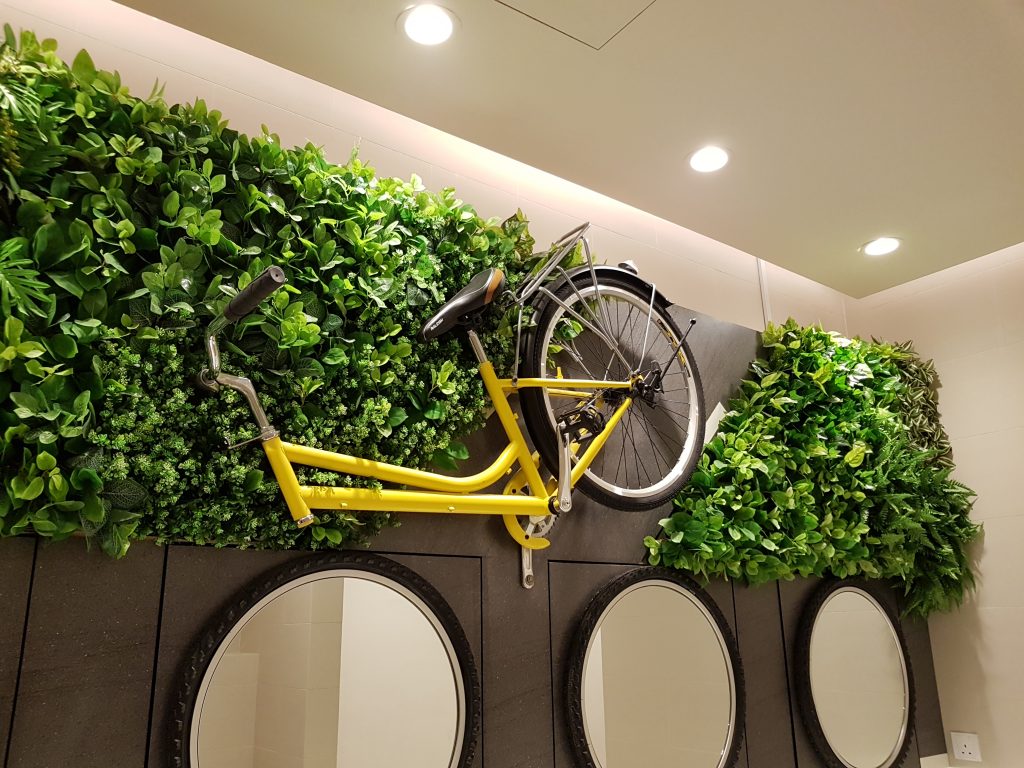
Samsung didn’t push the envelope with the Galaxy S8+’s camera, but that’s not exactly a bad thing. Instead of overhauling what is already a very good camera, the Korean company focused on refining it further on the S8+, and there are definitely tangible improvements here – just check out the camera comparison between the S7 edge and the S8.
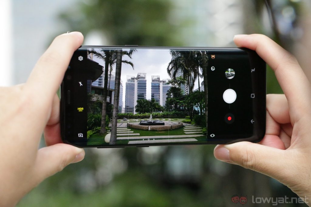
Shooting with the Galaxy S8+ is a really, really fun experience. The camera app launches fast with a double-press of the power button, the camera UI does not feel sluggish regardless of lighting conditions, and…it just works; something many phone makers still struggle with.
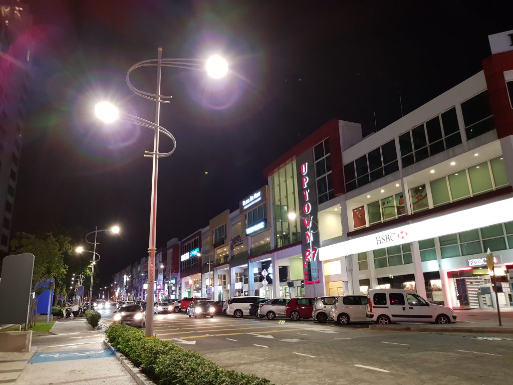
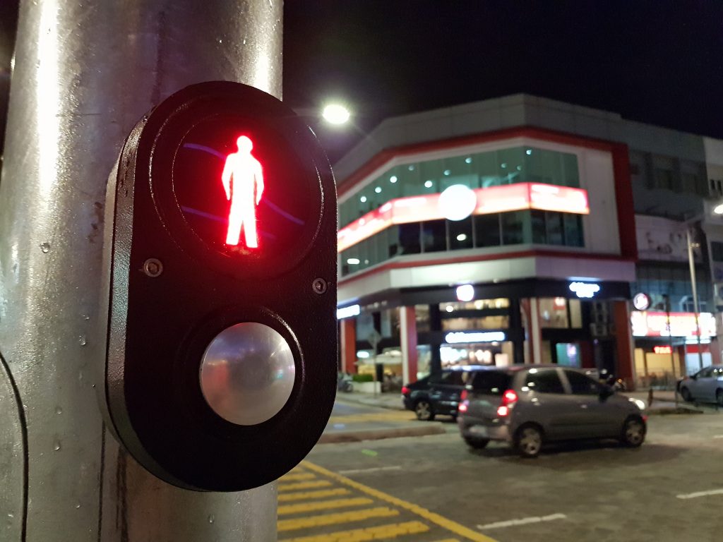
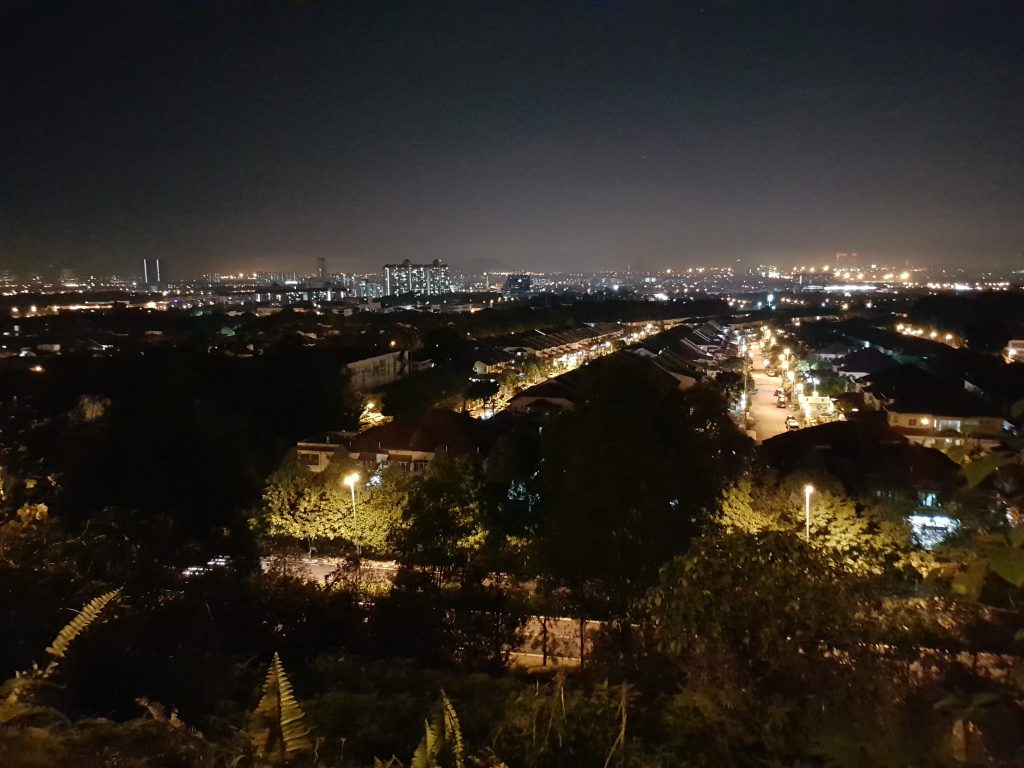
When it comes to camera performance, there’s no doubt the Galaxy S8+ is one very capable shooter. Under adequate lighting, the S8+ can deliver really great-looking shots, but this is really a given for any flagship-tier smartphone. In fact, it’s in less than ideal lighting conditions where the Galaxy S8+ really shines.
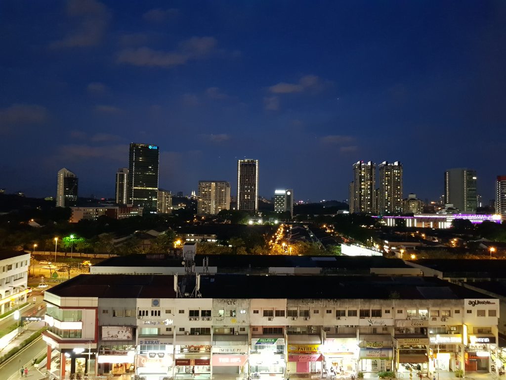
Not only does the shooting experience does not degrade in low light conditions, the Galaxy S8+ can still produce some impressive shots. Images look bright – but without overexposing dark areas – noise level is minimal, and detail preservation is great. Of course, the S8+’s autofocus speeds remain very fast even in low light conditions.
I’ve used quite a number of flagship smartphones over the past few years, and none of them really have what the Galaxy S8+ offers: near-instantaneous focus locking, almost no shutter lag, and most of all, effortless shooting experience regardless of lighting conditions.
Honestly, I never had quite as much fun shooting with a smartphone camera as I did with the Galaxy S8+.
Sample Images
Competition
The saying “you get what you pay for” is as true as it gets with the Samsung Galaxy S8+. Retailing at a whopping RM3,699, it is one of the most costly Android smartphones in the market now. In fact, the Galaxy S8+ is priced pretty closely to one of its main competition: the iPhone 7 Plus.
In comparison to the Galaxy S8+, the iPhone 7 Plus retails from RM3,799, and that’s only for the 32GB model. On top of that, the iPhone 7 Plus also lacks expandable storage, not to mention a less impressive display and design. That being said, the iPhone 7 Plus does offer faster app loading times and very polished user experience that some would argue is superior to Android. After all, these are inherently iOS’ advantage over Android – for now, that is.
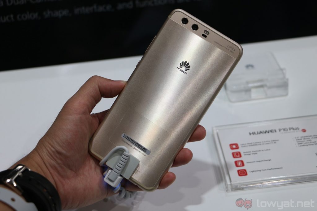
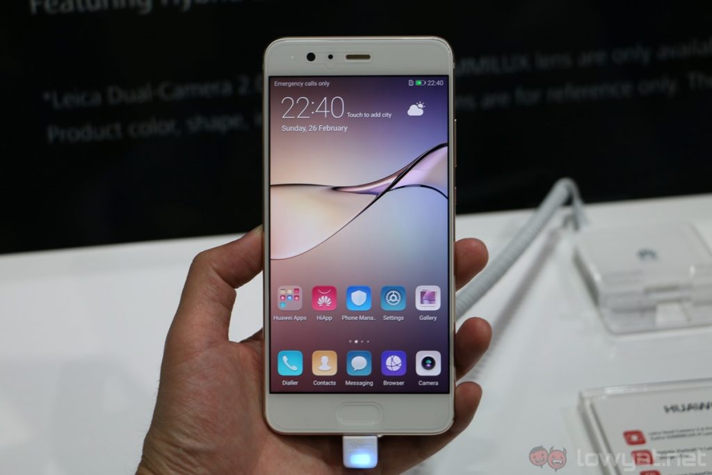
In the Android space, we have the Huawei P10 Plus, which retails at RM3,099; that’s RM600 less than the Galaxy S8+. For less money, the P10 Plus has double the S8+’s internal storage at 128GB, as well as 6GB of RAM instead of 4GB. On top of that, the P10 Plus also comes with a dual-camera setup, although we still have yet to see if it’s comparable to the S8+’s camera performance – that’s something we plan to find out in the near future.
However, the Galaxy S8+ definitely has a few key advantages over the P10 Plus. For starters, the S8+ is water-resistant, it offers better performance, and it is definitely much sleeker-looking. Next to the Galaxy S8+, the P10 Plus looks especially…bland.
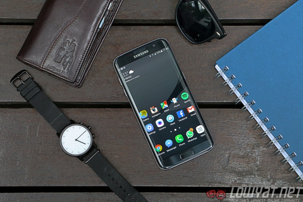
And then we have competition from the Galaxy S8+’s own family: the Samsung Galaxy S7 edge. Although the S7 edge is last year’s flagship, it can still hold its own against many high-end smartphones in the market today. If you look hard enough, the S7 edge can be found going for less than RM2,500 too, making it that much more compelling.
Based on our camera comparison, the S7 edge’s camera performance is only slightly below the Galaxy S8+. On top of that, the S7 edge also shares many of the S8+’s great qualities, including an IP68-rated body, a 5.5-inch 1440p dual-curved Super AMOLED display, as well as a sleek glass and metal design.
Of course, as the successor to the S7 edge, the Galaxy S8+ does have more than a few notable upgrades. The S8+ has an improved camera, a much sleeker design thanks to its 6.2-inch Infinity Display, and of course, better performance courtesy of the newer and more power-efficient Exynos 8895 processor. Then again, whether or not these improvements are worth the price difference is another question entirely.
Conclusion
I don’t believe there’s a “perfect smartphone” to suit everyone’s individual need, but for the vast majority of people, I reckon the Samsung Galaxy S8+ – as well as the more compact S8 – will be the closest phone to perfection today. Well, assuming they’re willing to drop the cash for Samsung’s latest and greatest flagship yet.
To be frank, I don’t think anyone will be truly unhappy to use the Galaxy S8+ as their daily driver – its steep price tag notwithstanding. It is sleek, it is fast, and any upcoming smartphones will almost definitely be compared to it. The Galaxy S8+, much like its predecessor, sets the benchmark on what you can expect from a 2017 flagship.
Photography by Terry Bass.
Follow us on Instagram, Facebook, Twitter or Telegram for more updates and breaking news.


