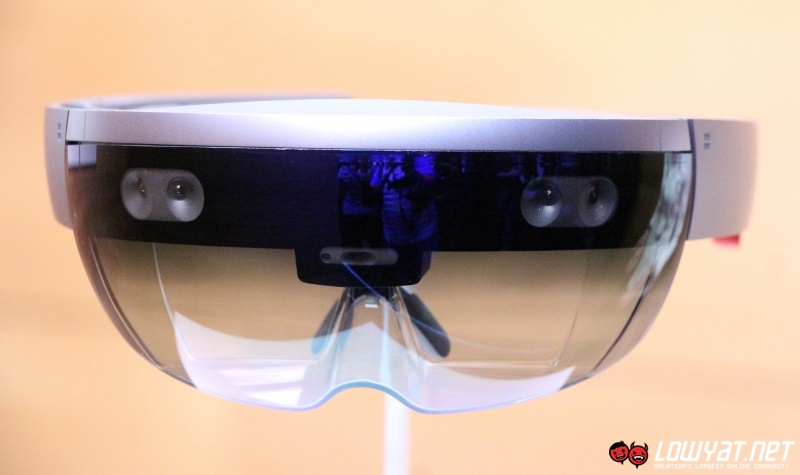
A leaked video has revealed what the current Microsoft Hololens Start Menu and UI looks like. Discovered by Twitter user WalkingCat, the video from Actiongram is accompanied by documentation on how to use the Hololens – providing us with the best look we’ve ever had of Microsoft’s headset outside of the presentations.
The leaked materials mainly concern the Actiongram app which was passed on to beta testers. These testers are currently tasked with taking videos using the app; which allows users to overlay augmented reality holograms into the real world.
https://www.youtube.com/watch?v=L3_viBxB8Fc
As far as the Hololens interface goes, the Start Menu is unmistakably lifted from Windows 10 Mobile – complete with tiles and application list. Using it is similar to a mobile device, with the only difference being that taps are done in the air (and called Air Clicks instead). Scrolling is accomplished by tapping on scrollbar arrows; which is a little disappointing. It would have been more intuitive if Microsoft allowed air swiping to scroll across lists.
This was an interesting look at what Microsoft is planning for the Hololens, even if we still can’t see what regular consumers would want it for.
[Source: WalkingCat (Twitter)]
Follow us on Instagram, Facebook, Twitter or Telegram for more updates and breaking news.


