The Samsung Gear S2 was one of the best smartwatches released last year. Although it was lacking in terms of third-party app support, its hardware was definitely superior to many offerings from other manufacturers.
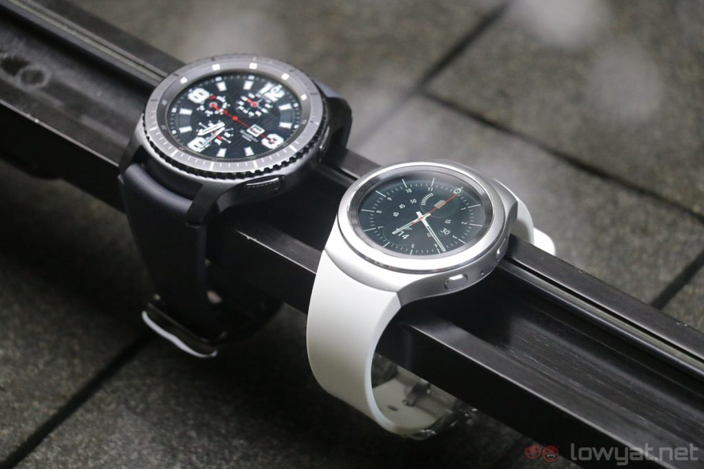
A year has passed, and now we have its successor: the Gear S3. In many ways, elements of the Gear S2 are present on the Gear S3, but it goes without saying that the latter is – and should be – more refined and sleeker-looking. Unfortunately, the Gear S3 still shares the same shortcomings of its predecessor, but it’s not exactly a bad smartwatch by any stretch of the word.
Design & First Impressions
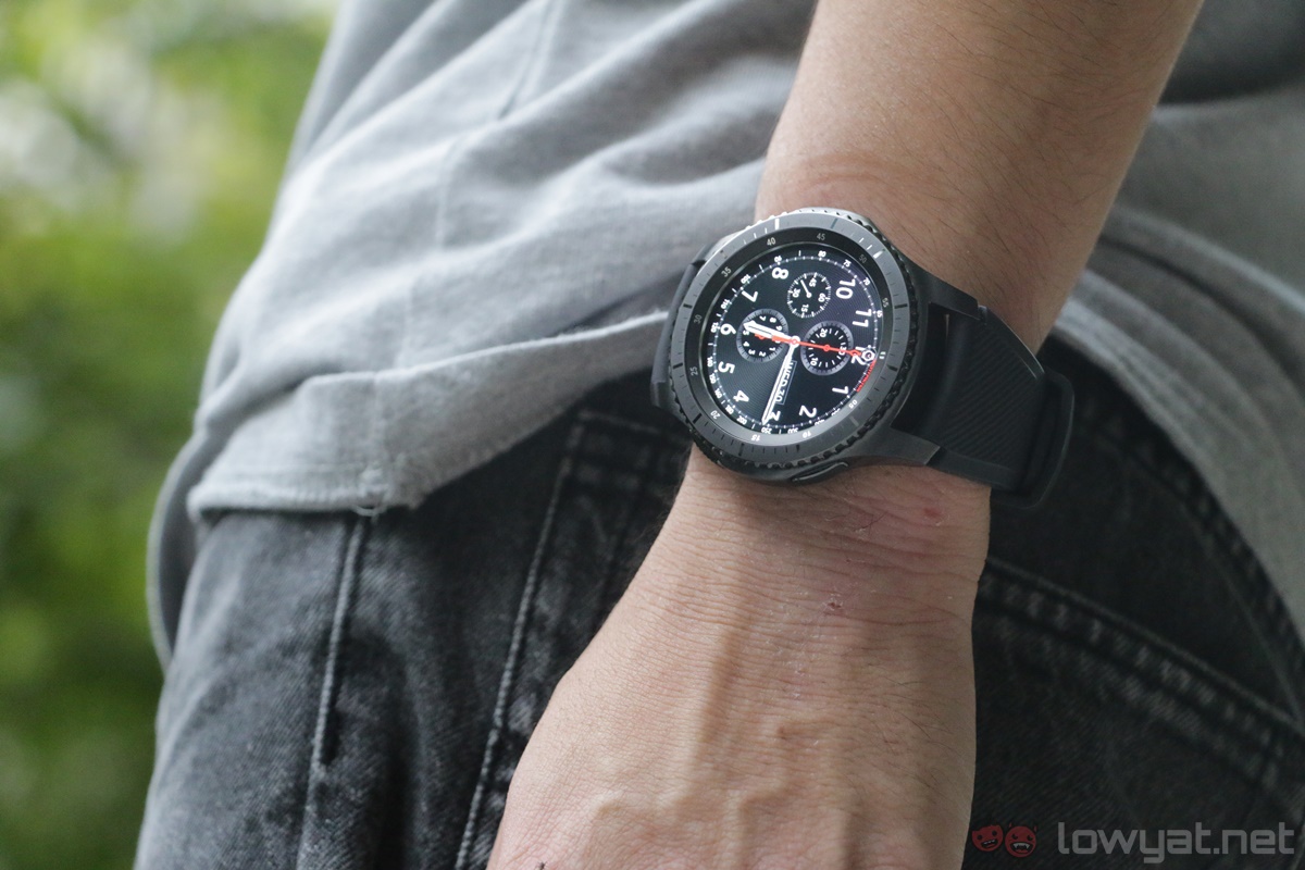
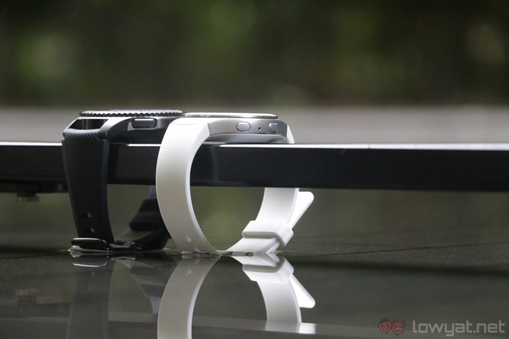
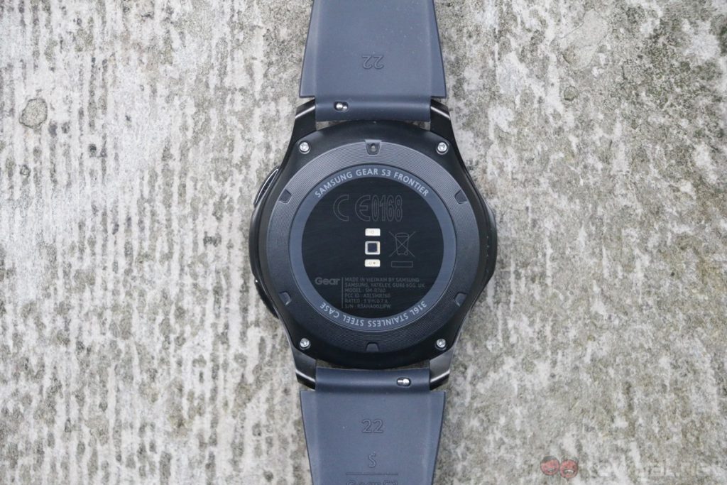
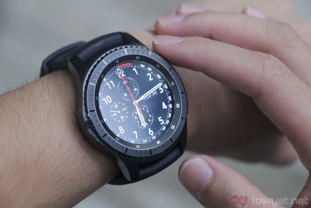
Like the Gear S2, the Gear S3 has two variants: Classic and a new, masculine Frontier edition which we used for this review. Internally, they are the same with the hardware; the differences lie only in the exterior design.
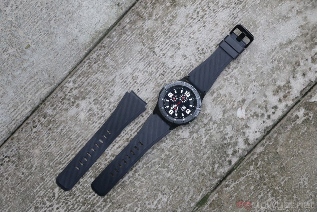
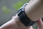
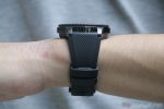
Personally, I prefer the Frontier Gear S3: the rugged appearance makes it look like chronograph watches more expensive than the Gear S3’s RM1,399 price tag, while its silicone strap makes it more ideal for outdoor activities.
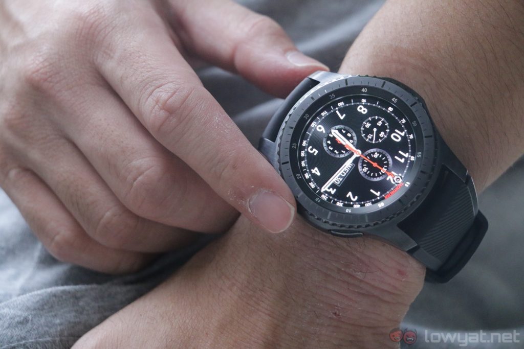
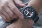
It’s been almost a year since I used the Gear S2, and I’m reminded of the simple joy of using the rotating bezel as a UI method. It’s intuitive and also just so satisfying to use. It’s the biggest differentiating factor for the Gear smartwatches from Samsung over the competition, and one which I feel makes the Gear UI the best among smartwatches.
Also, it’s worth pointing out that the rotatable bezel of the Gear S3 has a more distinct click from the Gear S2; its bigger size also makes it easier to rotate.
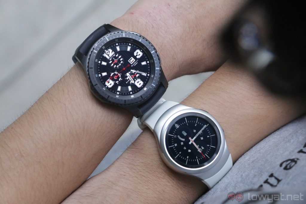
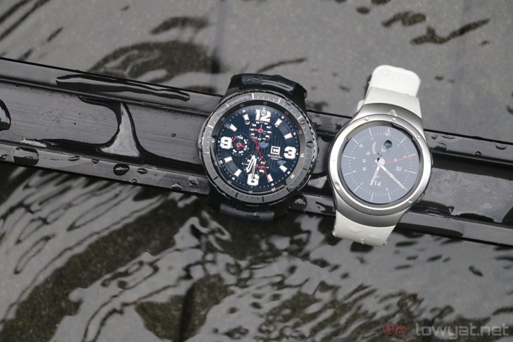
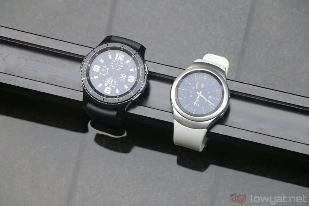
However, size itself is an issue with the Gear S3: it’s bigger and thicker than the Gear S2, which won many fans over simply because it was less bulky compared to the Android Wear watches of the time. While I myself don’t mind the bigger dimensions of the Gear S3 (it gives it a more masculine look), there will certainly be folks that don’t share the same sentiment.
However, it is undeniable that the Gear S3 is certainly a very handsome smartwatch. In fact, it looks more like a watch than a smartwatch, which is really a testament to how well-designed the Gear S3 is.
Speaking of straps, it’s great to see that Samsung has moved away from the proprietary strap found on the standard Gear S2. Whichever variant of the Gear S3 you get, you can easily swap the stock straps for any standard 22mm ones; two straps of different lengths are also provided with the Gear S3.
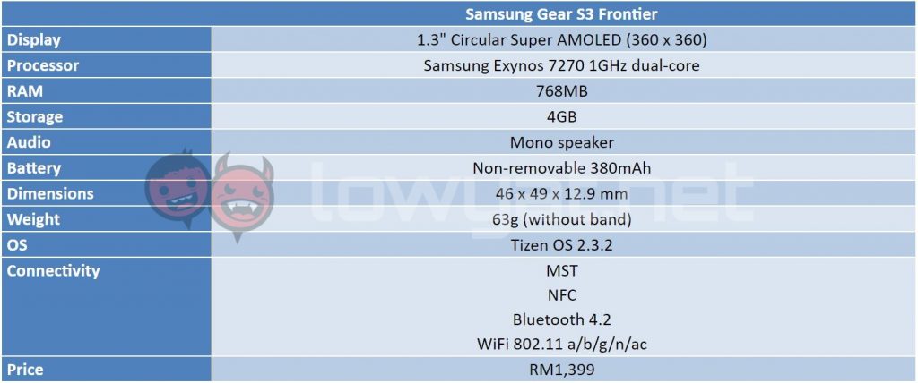
Then we have the 1.3-inch Super AMOLED display of the Gear S3, and what a display it is. Although the Gear S3 has the same 360 x 360 resolution display as its predecessor, it’s still sharp with no noticeable pixelation; it’s also really bright with punchier colours over the Gear S2.
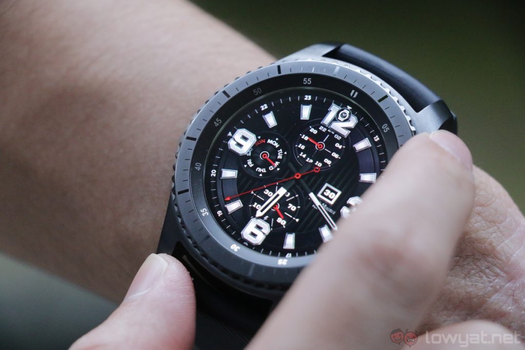
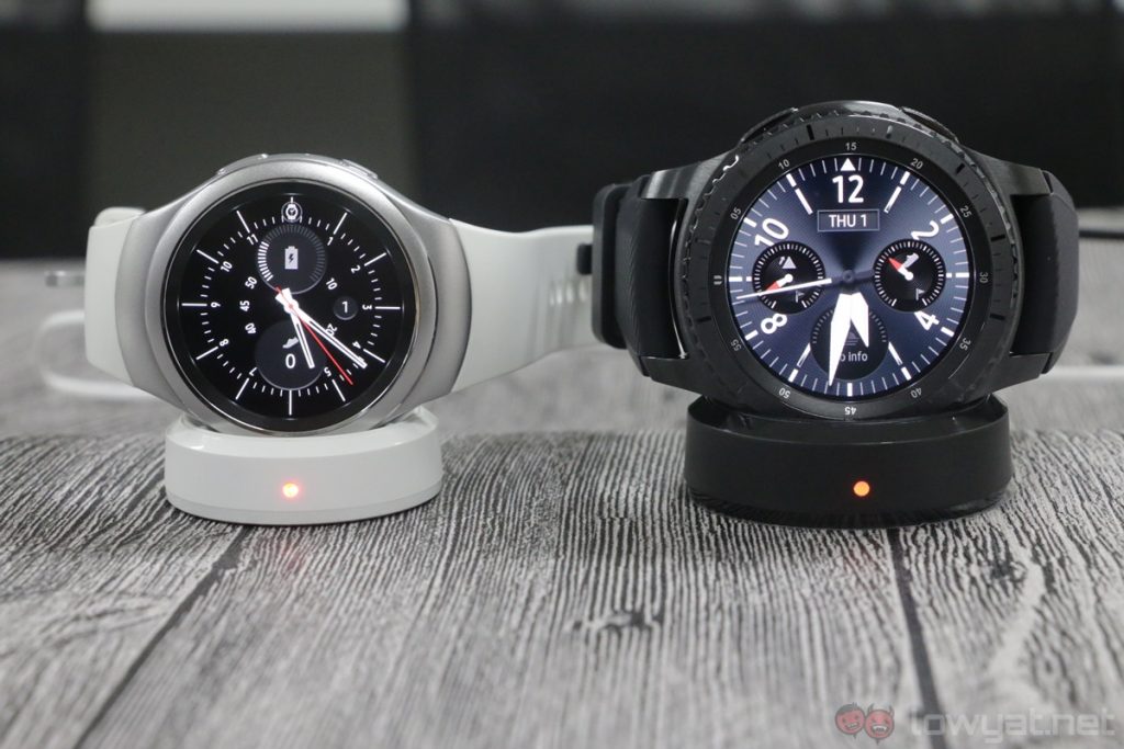
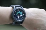
The fact that the display itself sits in a recessed area underneath the Gorilla Glass SR+ gives the Gear S3 an even more watch-like appearance; I also love the watch faces’ designs in Always On Display mode – they’re a lot more…normal-looking (though with the amount of downloadable watch faces, you could practically go for any look you prefer including this sick Fallout watch face our friends at Amanz used).
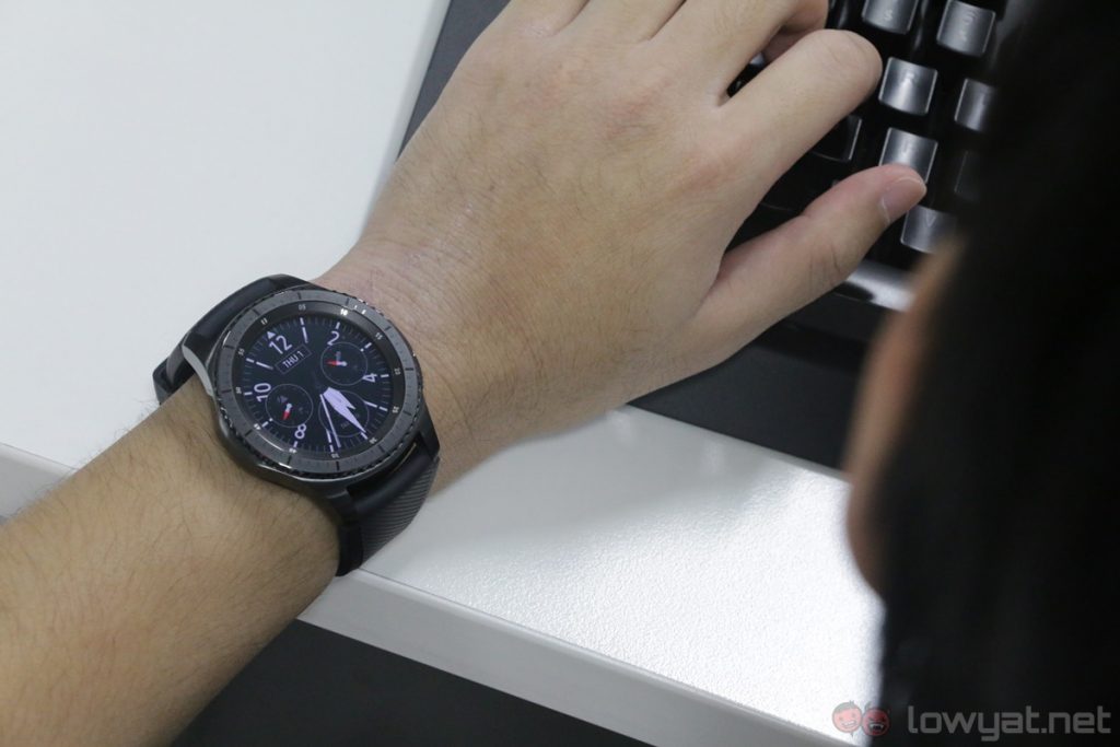 The Always On Display of the Gear S3.
There is a lot to love about the Gear S3: both the Frontier and Classic editions are handsome, very watch-like wearables, and the rotatable bezel is amazingly fun to play with while simultaneously being ridiculously intuitive. While these are great qualities to have in a smartwatch, the Gear S3 still has its fair share of weaknesses.
Hardware
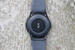
In many ways, the Gear S3 is a blown up version of the Gear S2, but it does come with a newer Exynos 7270 processor and a more generous 380mAh battery – the Gear S2 had an Exynos 3250 chipset and a 250mAh battery. With a bigger battery, it’s only natural that the Gear S3 has better battery life, which is certainly the case here; I’ll elaborate more further down this review.
Also new to the Gear S3 is the inclusion of a dedicated speaker, which allows users to make calls – or listen to music, if that’s your thing – with the smartwatch alone. The Gear S3 isn’t the first wearable to implement this feature, but it’s neat feature whose novelty somewhat diminishes over time (even if I felt like a secret agent each time I did it).
Software
The rotating bezel isn’t just the only differentiating factor on Samsung smartwatches: they run on Samsung’s own Tizen OS, a lightweight platform built to perform on slower hardware.
The circular UI based on Tizen on the Gear S3 hasn’t changed much from the Gear S2, but that’s not exactly a bad thing: the software is polished and intuitive. What remains a weak point is third-party app support.
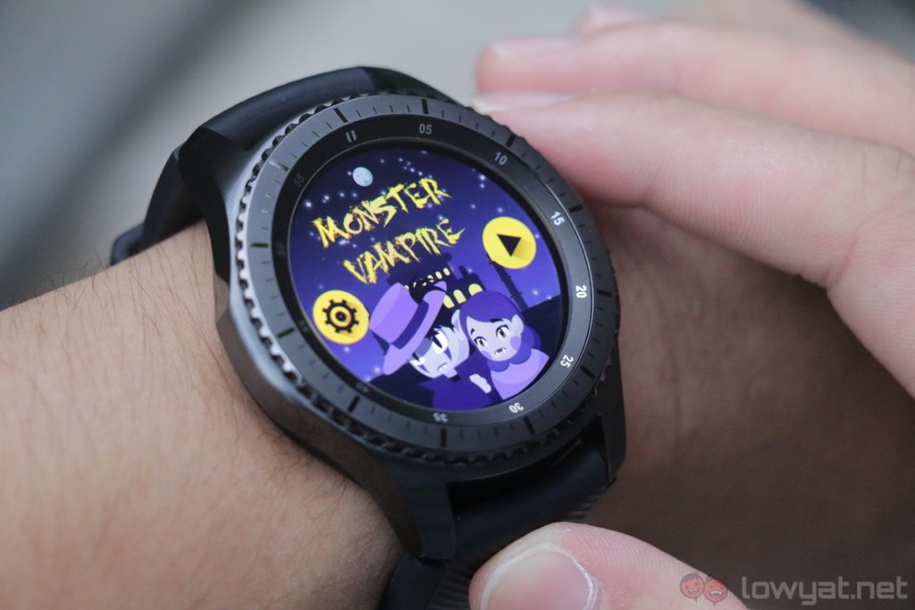
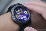
It has been a year now since I encountered this with the Gear S2, and the situation isn’t any better today. There is a tiny selection of games (I know, playing games on a 1.3-inch display doesn’t exactly sound very enticing), the Spotify app for the Gear S3 still isn’t here yet – though it’s said to be launching sometime this month – and…the Samsung Galaxy Apps store are just mainly filled with a plethora of different watch faces.
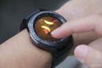
 Games available on the Gear S3 aren’t very enticing.
In comparison to Android Wear, S Voice is really no replacement for Google Now’s many useful voice commands. I can’t launch, say, Facebook or WhatsApp on my phone through S Voice, and the virtual assistant sounds very robotic in comparison to Google Now. That being said, I can still place calls and set alarms with S Voice, which proved to be useful in more than one occasion. Nonetheless, S Voice is still limited in functionality over Google Now, ultimately.
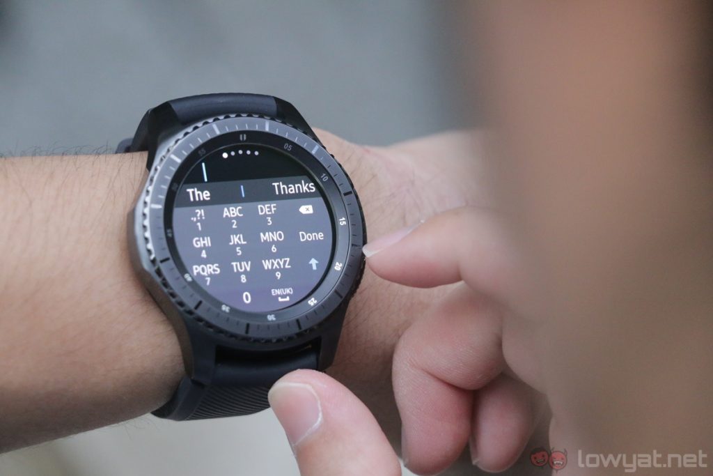
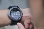
But, there are advantages to Tizen OS. For one, I can reply to messages with a T9 keyboard on the watch, and thanks to the bigger display, it’s pretty easy to type out proper messages should the need ever arise.
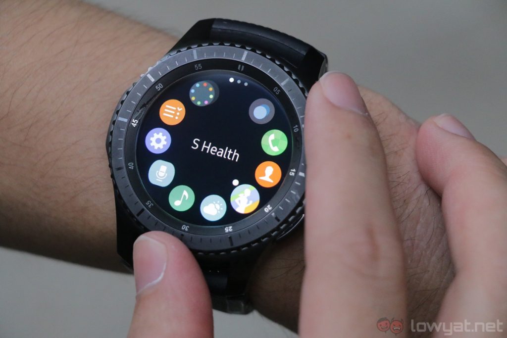
On top of that, the rotatable dial is also very intuitive to use on the Gear S3: I can change between different screens on the home page with it, and even to scroll through all apps available on the smartwatch. Most importantly, because the UI does not require tapping on parts of the already small screen, I can do these without obstructing the display at all.
Tizen OS also handles notifications well on the Gear S3. I have my personal and work emails synced to my phone, and the Gear S3 sort emails sent to these two accounts separately. However, it doesn’t bode well with Telegram notifications: the Gear S3 will only display the latest message.
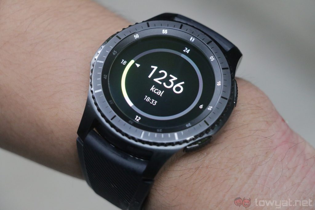
Aside from that, S Health on the Gear S3 is a pretty interesting app. It can track the amount of calories I’ve burnt in a day, the number of steps I’ve taken, and it’ll also periodically record my heart rate throughout the course of the day, which I found rather useful. I was told there’s a feature that notifies you when your heart rate is abnormally high (when not working out), but thankfully that didn’t happen to me during the time I wore this watch.
I was pleasantly surprised too when the Gear S3 automatically detected I was working out when I wore it to my weekly badminton session; it’ll then tell me how much calories I’ve burnt for that specific set. I’m not entirely sure just how accurate these recordings are, but I’ll take them as a conservative measurement.
It’s worth mentioning that Samsung Pay is also available on the Gear S3, with NFC and MST support built into the watch. But Samsung has gone silent on the payment solution’s rollout in Malaysia, so until that becomes official, it’s a latent feature on this watch.
I must also point out that since Malaysia does not yet support eSIM (which the Gear S3 does), voice calls are made via Bluetooth while connected to the phone. It’s a simplistic workaround, but to be fair there is little to no input lag in calls.
The user experience of Tizen OS on the Gear S3 is pleasant, but it is also the smartwatch’s main weakness. Third-party app support is one of the most important aspects on any platform, and honestly, it’s not about the number of apps – it’s in the number of useful apps. I listen to Spotify a lot when I drive, and it would be so much easier (and safer) to just skip songs with a tap on my wrist.
Battery Life
Thanks to its larger 380mAh battery, the Gear S3 definitely has better battery life than its predecessor. With the brightness level set to seven – it maxes out at 10 – and Always On Display mode active, I managed to get two days of battery life out of the Gear S3 rather easily.
Now, this isn’t as long as Samsung’s quoted battery life of three to four days, but it’s certainly respectable for a smartwatch of this caliber. Also, I imagine the battery life would be very close to Samsung’s claim with Always On Display mode disabled – but a watch isn’t a watch if it can’t tell the time, all the time.
Competition
2016 is a quiet year for wearables: manufacturers aren’t releasing as many smartwatches as previous years. But that doesn’t mean there’s no worthy competitor to the Gear S3.
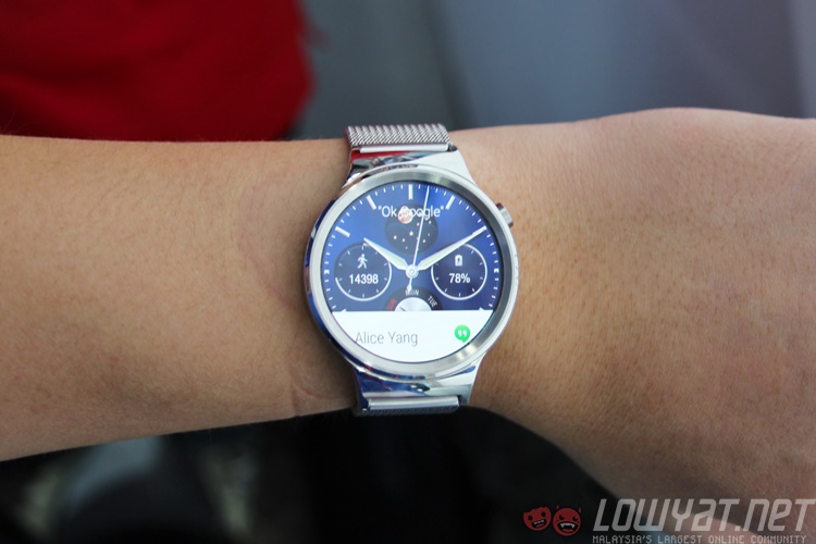
For one, we have the equally sleek-looking Huawei Watch. Although it’s a 2015 smartwatch, there’s no denying that the Huawei Watch is one handsome Android Wear device. It features a bigger and sharper 1.4-inch 400 x 400 circular AMOLED display protected by sapphire crystal glass, a Qualcomm Snapdragon 400 processor paired with 512MB of RAM, and 4GB of built-in storage. In contrast, the Gear S3 has more RAM at 768MB as well as a bigger 380mAh battery – the Huawei Watch only has a 300mAh cell.
Despite retailing at a hefty RM1,799 when it was initially launched in Malaysia, the Huawei Watch’s retail price has dropped quite a bit; it can now be purchased for as low as RM1,399, which is the same asking price of the Gear S3. The Huawei Watch is an interesting Android Wear alternative to the Gear S3, but really, the rotatable bezel of the latter just gives the Gear S3 an edge in the design department.
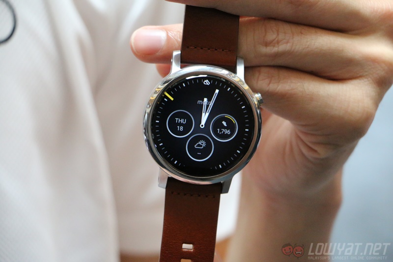
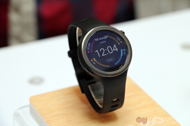
If you’re looking for something more recent, there’s the second generation Moto 360; the closest variant to the Gear S3 is the 46mm model, which retails at RM1,599. For that kind of money, the Moto 360 packs a bigger – but lower resolution – 1.56-inch 360 x 330 LCD display, a Snapdragon 400 processor paired with 512MB of RAM, 4GB of storage, as well as a sizeable 400mAh battery; 20mAh more than the Gear S3’s battery.
While beauty is in the eye of the beholder, I personally prefer the Gear S3’s design, especially its rotatable bezel and Super AMOLED display, which is more power efficient. On top of that, the black bar on the bottom of the Moto 360’s display really takes away from the circular design of the smartwatch. The Gear S3 also definitely has the upper hand in the hardware department; the same can’t be said of its software, unfortunately.
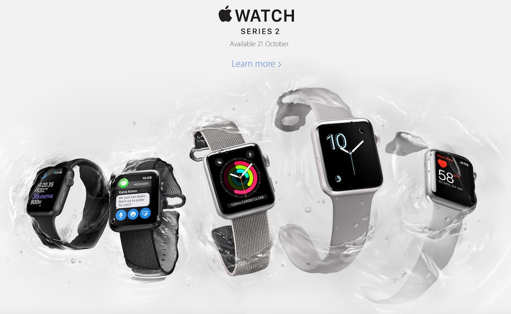
There’s the Apple Watch Series 2 to consider as well. Although the Gear S3 only works with Android devices for now, iOS compatibility is being worked on; it remains to be seen just how long it’ll take. We’ve been hearing this for a while now, after all.
The 42mm Apple Watch Series 2 features a 312 x 390 OLED display – complete with Force Touch technology – protected by sapphire crystal (or Ion-X glass, depending on which model), not to mention a more robust ecosystem with plenty of third-party app developers. Of course, the Apple Watch also costs more than the Gear S3: the 42mm model retails from RM1,749.
Conclusion
The Samsung Gear S3 is a fantastic smartwatch, that much is certain. Its fairly competitive RM1,399 price tag – for both the Frontier and Classic editions – makes it one of the more affordable ones too. However, as was the case with the Gear S2, third-party apps are still very much lacking. This, I feel, limits the true potential of the Gear S3.
Samsung makes some amazing hardware, but really, one year has passed since the Gear S2 was introduced, and third-party app support is still my main gripe with Tizen OS on the Gear S3.
But, if you’re not too demanding in the apps you use on a smartwatch (the Gear S3 actually has a number of decent in-house apps), the Samsung Gear S3 again is one of the most all-rounded smartwatches in the market today.
Photography by Terry Bass.
Follow us on Instagram, Facebook, Twitter or Telegram for more updates and breaking news.


