As expected, Apple has announced an update to its Music app, giving it a major design overhaul, as well as a new built-in lyrics function. At the on-going WWDC 2016 convention which kicked off last night, not only did the Cupertino company give its Music app a new skin, but also revamped some of its features to make it easier for you to find your favourite music.
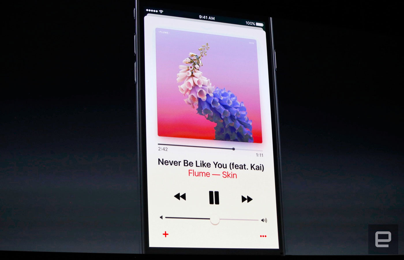
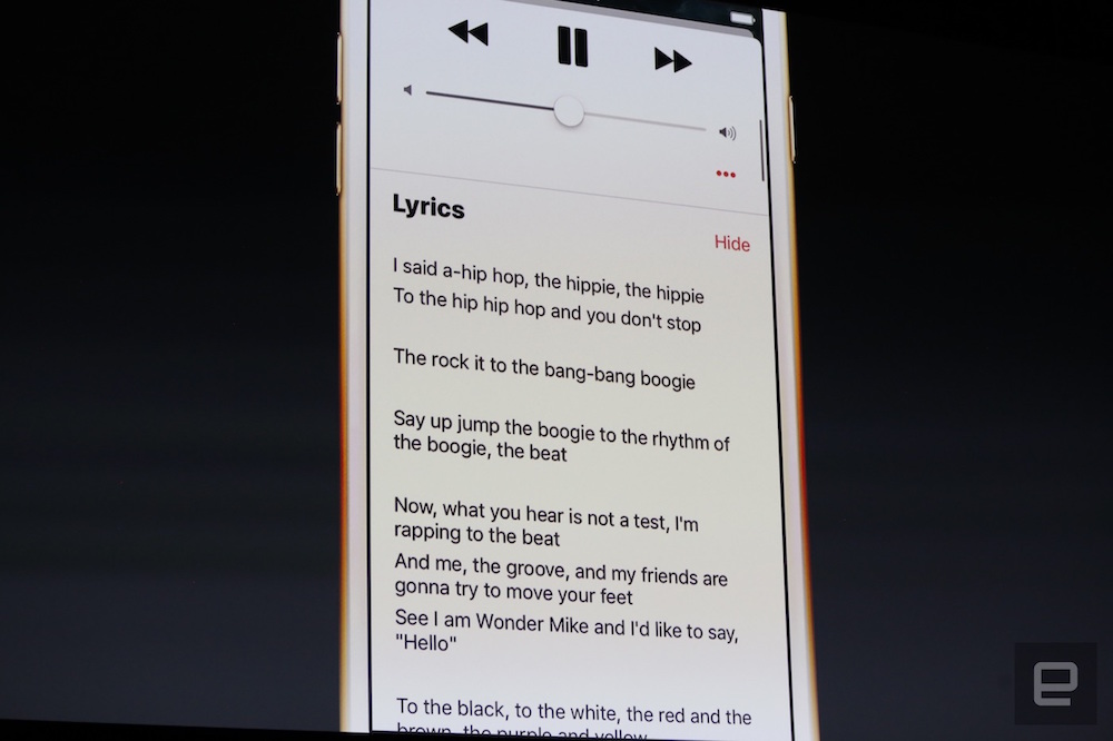
First up, it looks like the black and white rumour was true after all. The new Apple Music app has a very plain design with a splash of colour to bring more focus on the album artwork. Apple also redesigned its Now Playing interface with a card-like scrolling platform, as well as a new lyrics feature. The controls are located just above the menu for easy access, and lyrics are also easily accessible from the main screen.
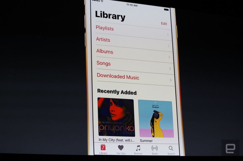
When you first load the app, the first thing you will see is the “Library” section as opposed to “For You”. The page will show you the music you’ve purchased, and a “Recently Added” summary for all the new activities in your Apple Music account. The “For You” tab also received some makeover, allowing you to discover new music based on your listening habits. There’s also a “Recently Added” menu so you can find the latest music.
Other notable changes include a new “Browse” tab that replaces the “New” tab, whereby users can find charts, a list of new releases and such. “Radio” has also been refreshed, making it easier for users to listen on-demand Beats 1 content. Apple Music now has 15 million paid subscribers, making it the fastest music streaming service to achieve such milestone.
The new Apple Music will be available for both desktop and mobile, and will be launched later this year. Public beta will begin next month.
Follow us on Instagram, Facebook, Twitter or Telegram for more updates and breaking news.


