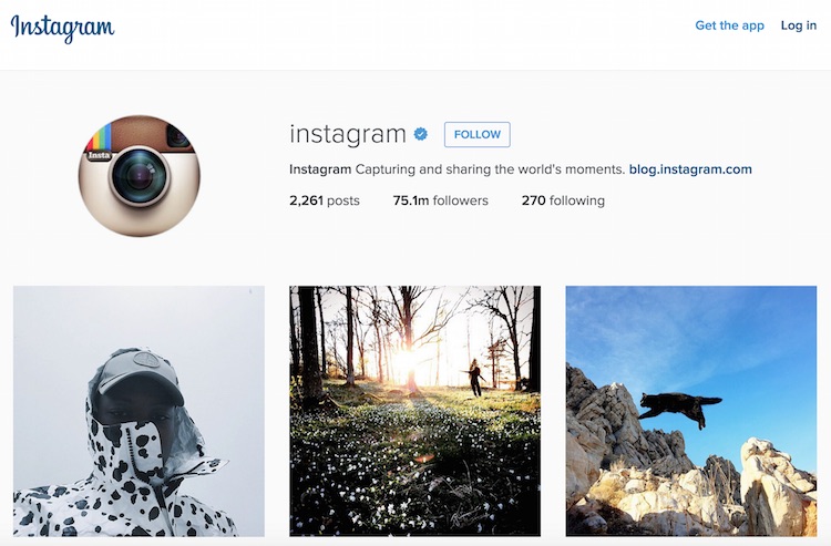
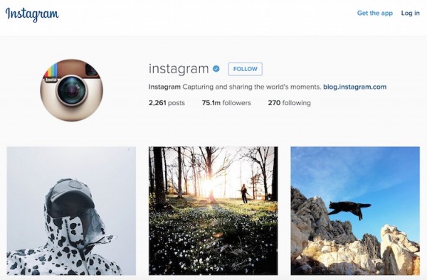
Instagram web has been around for over two years now, but their layout has always been rather boring with limited functionalities. The company now has a new design for its desktop and mobile version, giving a neater layout with bigger pictures compared to what we have now.
The cover image for Instagram profiles on the top that shows the latest posts are gone, along with the boarders and round edges. You will now see a simple profile of the person (with a round profile picture), along with a summary of his/her posts, followers and the number of people they are following. Right below, you will also notice that Instagram now display pictures in rows of threes instead of 5 tiny thumbnails.
The redesign is available for both desktop and mobile, and is currently being rolled out. If you don’t see a change yet, be patient as Instagram says that it should be available for everyone by the end of the week. It’s not a major update of course, but it’s something good to have. Instagram’s layout, especially for the web, has always been a little boring so it’s good to see them catch up to the trend now.
(Source: The Verge)
Follow us on Instagram, Facebook, Twitter or Telegram for more updates and breaking news.


