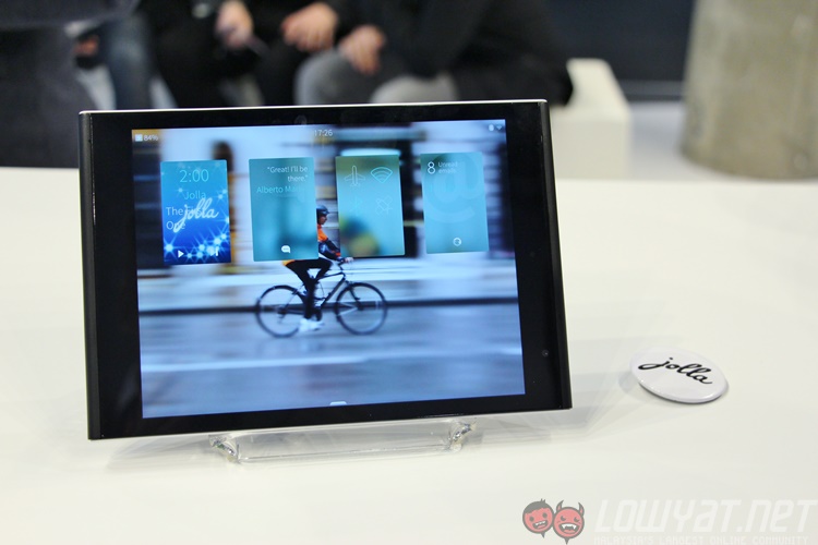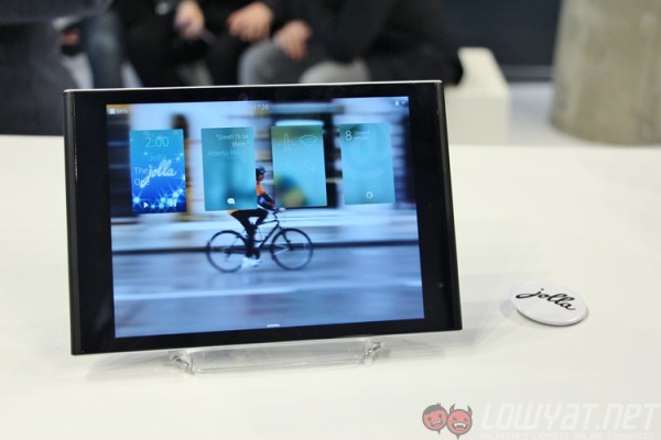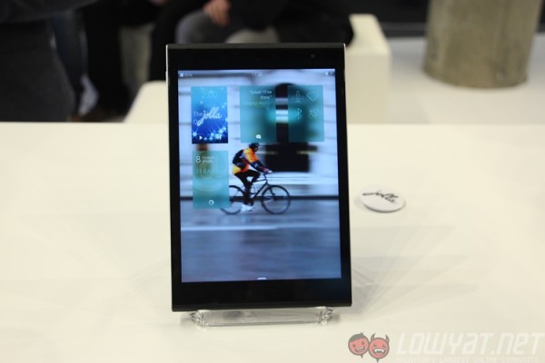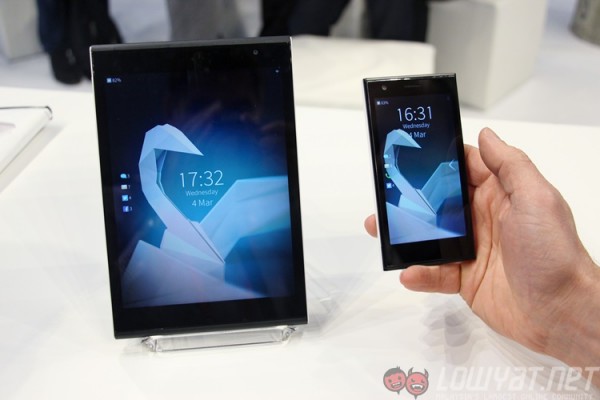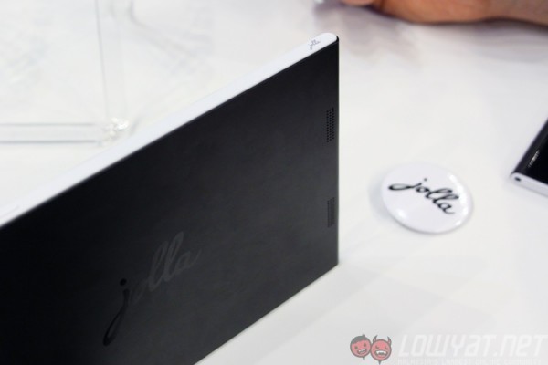
At MWC 2015, I was able to catch up on Jolla, the Finnish tech startup born from the ashes of Nokia. Its Sailfish OS mobile operating system has finally hit version 2.0, and the company were more than happy to share the new features on Sailfish OS 2.0 running on Jolla’s latest piece of hardware: the Jolla Tablet.
Sailfish is the name of Jolla’s mobile operating system. Developed by the same team which created MeeGo-Harmattan, Jolla vowed to carry on where Nokia left behind under previous CEO Stephen Elop. Its first smartphone, simply known as the Jolla Phone, was released in 2013 and was shown in MWC 2014. Running on a Qualcomm Snapdragon 400 quad-core processor with 1GB of RAM, it showcased Sailfish’s efficient use of power, allowing it to run on lower-end hardware without any issues.
Last year, Sailfish’s UI was a vertical scroller, with one-handed usage always in mind. A swipe up from the lock screen shows the home screen (which only displays the running apps), and another swipe up brings up the app drawer. From any app, an edge-swipe from the left of right minimises the app and takes the user back to the home screen. An edge-swipe from the top will close the app. The gesture-based UI, alongside the small 4.5-inch Jolla Phone, made it very easy to navigate with just one hand.

That being said, the vertical UI of Sailfish proved counter-intuitive for many people, including those who are familiar with MeeGo-Harmattan’s unique gesture-based interface. The edge-swipe from the top was especially confusing for those using Android devices – instead of seeing notifications, users ended up closing the app they were in instead. This, according to Jolla, was the catalyst behind the company’s decision to tweak Sailfish’s UI in version 2.0.
Now, Sailfish 2.0 has horizontal home screens, with two main home screens and a third “Partner Space”. The first home screen is the same home screen on the original Sailfish UI, showing all apps that are currently running. To the left is an Events view, which is essentially a very effective notification screen. Here, users can see upcoming calendar entries, new messages and any social media updates, all arranged by apps. The tablet mode contains additional information and shortcuts, making full use of the display real estate. To the right is “Partner Space”, which Jolla says will allow Jolla’s partners – such as telcos or brands – to create a custom home screen just for that brand.
Out of all Sailfish 2.0’s new features, this is likely to be the most controversial. While this may have been necessitated as a means to generate income for Jolla, it will likely create an intrusive experience that may break the minimalist and uniform tone of the platform. In our sample Jolla Tablet, there’s a Deezer widget lifted right out of Android (Android apps run natively on Sailfish) that does not gel well at all with Sailfish’s UI. Jolla says that this is an optional home screen that carriers or partner brands can customise with for customers, but devices purchased directly from Jolla will not have Partner Spaces.
Now, on to the Jolla Tablet itself. Announced last year as a crowd-funded project on Indiegogo, the Jolla Tablet proved to be quite a hit. It tripled its $380,000 goal in ten days, hitting one of the three stretch goals (microSD card support). It’s powered by an Intel Atom 1.8GHz quad-core processor with 2GB of RAM, and has 32GB of internal storage. This 384g tablet also packs a 7.9-inch 2048 x 1536 fully-laminated IPS display, a 4300mAh battery, while its imaging prowess aren’t exactly cutting edge: just a 5MP rear sensor (capable of 60fps 1080p recording) and a 2MP front shooter. But for just $249 (about RM925), this is one of the more affordable – and unique, with Sailfish OS onboard – tablets you can buy.
Navigating the new Sailfish UI was surprisingly intuitive and easy. New visual indicators and animations make it easier to know when there are pulley menus, or when you are minimising an app. The introduction of an app drawer than can be brought up anywhere on the device is really smart – with just one gesture you can locate all your apps. And with true multitasking – a signature feature on Sailfish – the Jolla Tablet is quite a joy to use. During my brief time with it, not once did the device fail to respond to any edge-swipes, and despite it being an alpha build Sailfish OS 2.0 seems to cover all the bases very well.
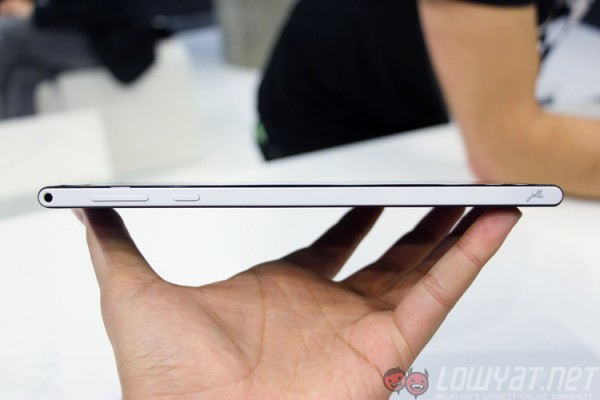
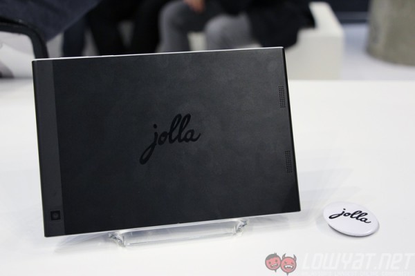
The tablet itself uses a combination of metal and plastic, where the black back is made from metal while the white side panels are made from plastic. The design also is reminiscent of the Jolla phone, with minimal branding and curved sides. While it isn’t as premium-feeling as, say, an iPad mini (or the Nokia N1 tablet), it feels uniquely different and as solid as most high-end tablets in the market today.
Perhaps most surprising of all was when a Jolla employee in the booth showed me how the Jolla Phone works with Sailfish 2.0. I was a little sceptical, seeing as it is basically 2013 hardware running on 2015 software, but within seconds I could see why Jolla is really excited about Sailfish 2.0. Animations were just as fluid on the phone as it was on the tablet, and the platform scales very well for smaller displays. You can see more in the video demo above.
We’re still some time away from seeing a large-scale adoption of Sailfish OS, but with limited resources and a thriving community Jolla has already demonstrated that it can produce good-looking software paired with uniquely-designed hardware. With the official availability of Ubuntu for smartphones – which was also demonstrated at MWC 2015 – and Tizen, these alternative mobile operating systems look to be finally maturing – even if it is highly unlikely that any of these platforms will eventually be the next Android or iOS.
Follow us on Instagram, Facebook, Twitter or Telegram for more updates and breaking news.


