2014 was a watershed year for smartphones. With the emergence of the Chinese smartphone makers, virtually every major smartphone company was caught off-guard. Consumers now had access to better made smartphones at significantly lower prices; who would want to pay double the amount for virtually the same phone?
In the midst of all this, another smartphone maker came virtually out of nowhere. Calling themselves OnePlus, the company released the OnePlus One or what it called the “2014 Flagship Killer”, boasting premium hardware for about half the price of, say, the Samsung Galaxy S5 or the HTC One M8. Now that we’re into 2015, is this still one of the best value-for-money smartphones you can buy?
FIRST IMPRESSIONS & DESIGN
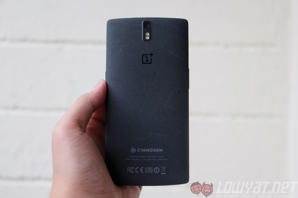
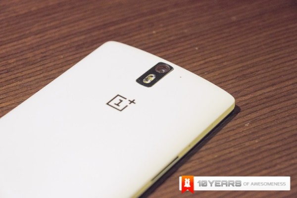
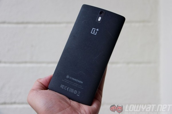
Thanks to some genuine hospitality, I managed to catch hold of a pre-release unit of the OnePlus One in the middle of last year. Sporting the Silk White back cover, I was instantly struck by how grippy the soft-touch rubber was. Fast forward later that year, I had a colleague who bought a Sandstone Black variant, and again I was amazed by what OnePlus delivered – why hasn’t anyone thought of toying with different materials for the back cover?
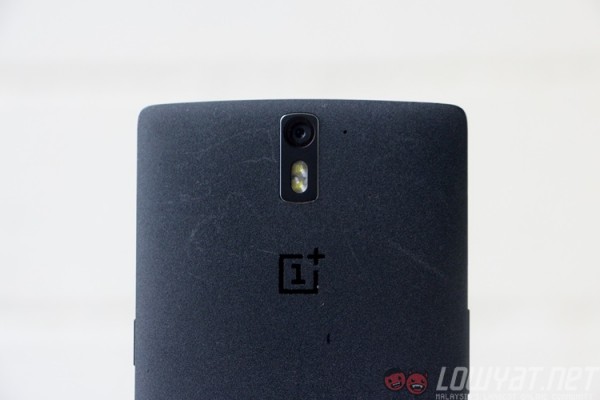
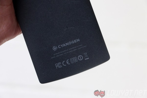
The grippy but smooth Silk White and the grainy Sandstone Black covers offer a wholly unique experience from the usual polycarbonate, metal or glass covers – for once, here are covers that encompass both form and function, and to this day the One in my opinion has the best-designed back cover not just because of how it looks, but how it feels.
When it comes to its overall design, the One has somewhat a handsome restraint in the sense that while it maintains an overall minimalistic look, the little details lend a sophisticated feel upon closer inspection. This intricacy extends even onto its packaging, which got me more excited than I’d care to admit when I first saw it last year.
But, there is an overwhelming and undeniable similarness in design of the One to another Chinese smartphone, the Oppo Find 7. Indeed, there has been some doubt cast about OnePlus being a subsidiary of Oppo (or sub-brand, as Huawei calls its Honor division) – but since we’ve covered this a while ago, let’s go back to the phone.
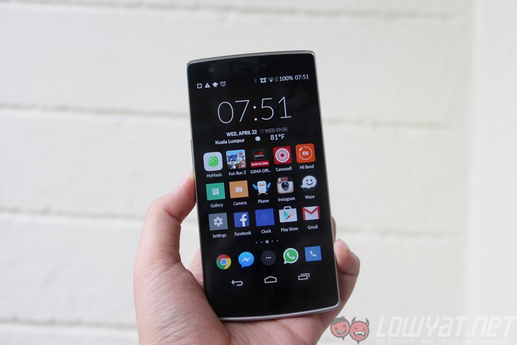
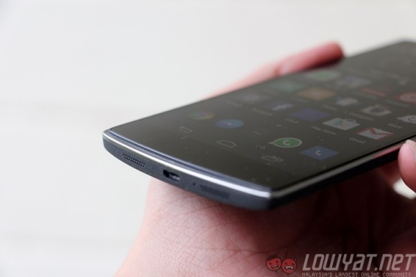
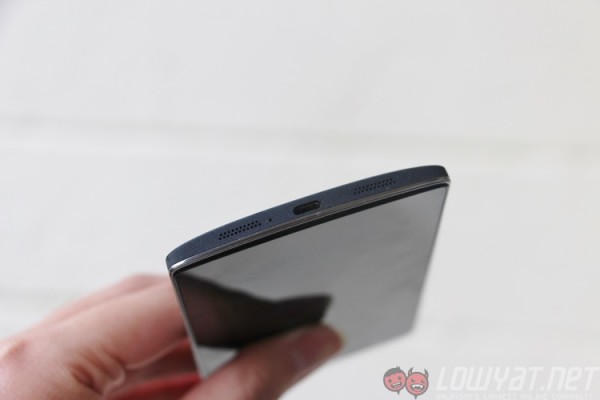
For a smartphone with a 5.5-inch display, the One feels very comfortable in my hands. The gently-curved back certainly helps, but the thin side bezels are the real space saver. What’s odd though is with OnePlus’ decision to have the glass display protrude above the device – a cleft is clearly visible on all sides of the phone, leaving an awkward gap at the top and bottom of the display that easily catches dust over extended use. What’s worse is when you drop the device face-first: the glass will take all the impact.
HARDWARE
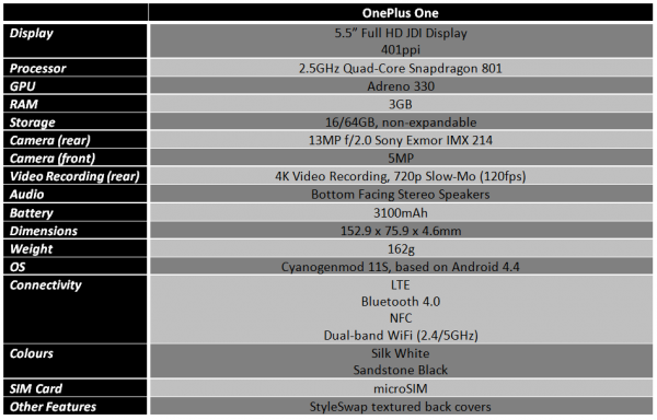
Even in 2015, the OnePlus One’s hardware is still impressive. For a product that’s priced at RM1,199, the One has virtually similar hardware to the HTC One M8, Sony Xperia Z3 and the Samsung Galaxy S5. As our hardware comparison table below shows, the One cuts no corners when it comes to hardware.
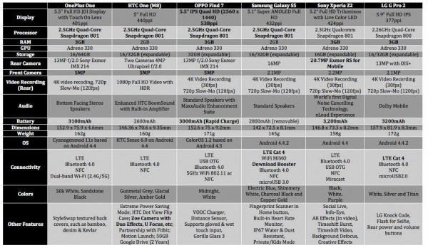
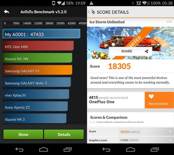
Today, those numbers may not look as impressive, what with octa-core flagship chipsets making the rounds, but make no mistake: you’ll still be getting outstanding performance on the One, where a big portion of it is due to the Cyanogenmod ROM (but more on that later).
BENCHMARKS
SOFTWARE
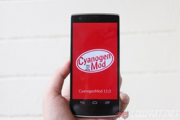
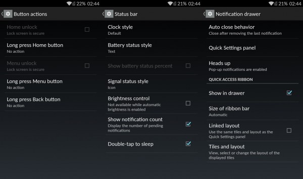
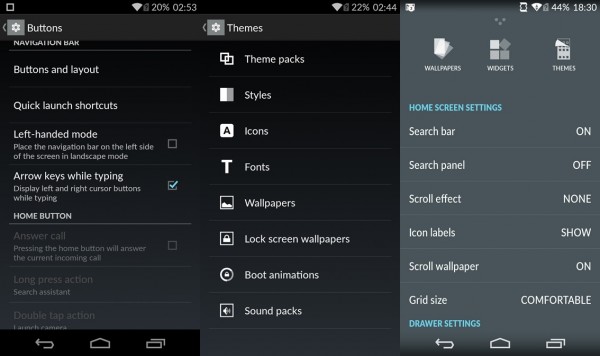
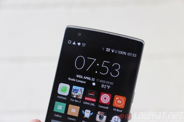
The One runs on a slightly modified version of Cyanogenmod, a massively popular Android ROM. Basically, it’s stock Android – with a healthy dose of steroids. Cyanogenmod offers an extensive array of customisation options, and this version running on the OnePlus extends that even further.
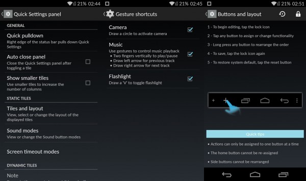
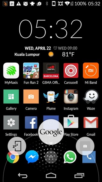
To scratch the surface, you can set the grid on the homescreen to display more or less apps, while the swipe-up gesture to open Google Now supports two more functions. The One also offers a choice of on-screen or capacitive navigation buttons. If you choose on-screen buttons, you can even add more buttons beyond the usual Back, Home and Recent Apps.
Despite running on Android 4.4.4 KitKat (the new Lollipop-based CM12S is gradually seeding via OTA), the One also offered that it called “pop-up” notifications – which is almost the same kind that you see on Android 5.0.
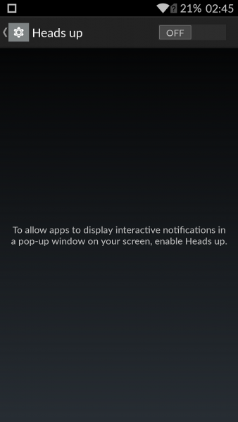
You can also enable gestures when the screen is off – you know, like on the Find 7. In fact, the same set of gestures is present here, like a circle for the camera, or a “V” for the flashlight. While they are useful in theory, the screen often found the act of slipping the phone into my pocket as a “V” gesture, and I’d end up walking with a glowing left pocket before someone points it out.
Then, there’s Cyanogen’s own themes store. This system-wide themes support is a lot more extensive than what you’ll find on normal themes, where you’re not only able to customise the icons, fonts and wallpapers, but also tweak the boot animation of your device.
In all, I was giddy with the amount of things I could customise for this to be my phone. Trust me when I say you’ll spend a good 30 minutes in that Settings page just experimenting with the software customisation options at your disposal.
Beyond that, Cyanogenmod 11S on the OnePlus One feels exceptionally fast and light, and is one of the best Android ROMs I’ve used on any smartphone. The responsiveness of CM11S on the OnePlus One is largely due to the fact that this ROM was optimised for the hardware, allowing it to perform a lot better than any Android ROM. More importantly, there are plenty of little touches where you least expect it to be that really makes the software experience a really enjoyable one.
BATTERY LIFE
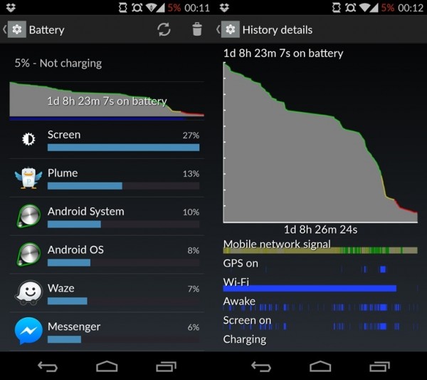
With its light and responsive software, one can expect that the battery life on the OnePlus One to be good – and it doesn’t disappoint. The One is only one of three smartphones that I’ve used to consistently offer about 1.5 days of battery life.
Yup, I can unplug my phone from the charger in the morning, use it for the rest of the workday and go to sleep with about 40% battery. That’s enough to last me till lunchtime the next day, which is awesome. While OnePlus does not explicitly mention it, there is some form of rapid charging support – I’ve used Samsung’s Adaptive Fast Charge charger to charge the One, and it goes from zero to full in just over two hours – compared to the one hour or so that the Galaxy S6 takes.
Regardless, the 3,100mAh battery on the OnePlus One is a big figure for a “standard”-sized smartphone, but it is right up there with the likes of the Sony Xperia Z3 and the Samsung Galaxy Note 4 as offering the best battery life on an Android smartphone.
DISPLAY
Sporting a 5.5-inch Full HD display made by JDI, the One rarely disappoints in this area. As displays get ever denser, nobody seems to really ask, “why?” There are no visible pixels on the 5.5-inch screen, and colour reproduction is excellent throughout.
The Full HD display may have been the norm back in 2014 flagships, but even to this year, the OnePlus One’s display isn’t just more than adequate, it also helps boost battery life, and that’s always a big plus.
AUDIO
The One features two speakers mounted at the bottom, separated by the microUSB port. Beyond personal consumption, however, these speakers are unlikely to match HTC’s BoomSound stereo speakers.
That being said, the speakers are more than good enough for daily use, especially for YouTube videos and games – just be sure not to muffle them when holding the phone horizontally.
CAMERA
So far, so good for our favourite flagship killer. But what really makes or breaks a premium smartphone these days is the camera. While OnePlus has performed admirably in many aspects, the camera is One’s Achilles Heel.
OnePlus fitted a Sony IMX 214 13MP BSI sensor on the One. It’s a similar sensor that can be found on the Oppo Find 7/7a, the Xiaomi Mi 4 and a host of other high-end Chinese smartphones. While each of these companies added their own software algorithms for the sensor to perform to their respective preferences, OnePlus seems to have wholly ignored that aspect in the international build of the One.
While the international variant of the One runs on Cyanogenmod’s camera app that’s based on Android Jelly Bean, the Chinese variant which ships with ColorOS has an immensely better-optimised camera app that really makes full use of the 13MP sensor. Indeed, many have claimed that the difference in image quality between these two to be very apparent – not to mention the addition of new camera modes.
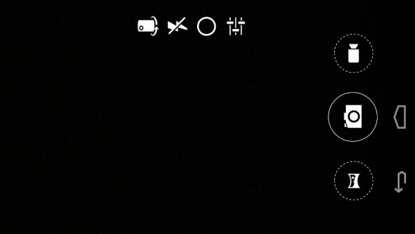
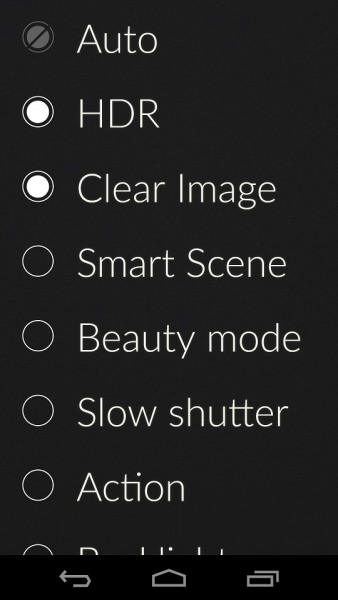
That being said, I only tested out the stock camera app, which looks visually like any Nexus camera app (before the Google Camera app was introduced). It’s got the same UI, but OnePlus has added gesture controls, allowing you to not just swipe horizontally to open the Gallery app, but also have vertical swipes to switch between camera modes like HDR, Clear Image and so on.
Now, here’s where things can get very confusing. You see, unlike other camera apps, the ROM’s orientation lock also extends to the camera app – and by extension, so do the swipe gestures. In other words, if you’ve got orientation lock turned off, the camera app’s button will swivel as you move between portrait and landscape modes. Turn it on and use the camera in landscape, and suddenly the swipes become mixed up – a horizontal swipe switches between modes while a vertical swipe opens the Gallery.
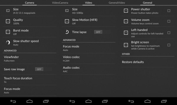
The camera sensor is actually quite powerful. The One lets you take 13MP 4:3 pictures in JPEG or RAW, records up to 4K DCI videos, and has welcome features such as slow-motion and time-lapse recording as well as a slow-shutter speed option.
However, it is clear that the camera’s hardware isn’t optimised with the software. The One consistently delivered images that were really just average. Unlike Samsung’s excellent work with its cameras on the Galaxy Note 4 and Galaxy S6, I couldn’t trust the image output of the One. Too often images were blurry, underexposed or suffered from slow autofocus. I’ve even had the “loading pentagon” icon remain on the viewfinder long after a HDR image had been shot and saved.
In this aspect, the One didn’t kill any flagships, but my joy for mobile photography died a little.
SAMPLE IMAGES
Click on each image (or open in new tab) for full resolution
COMPETITION
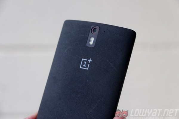 Months of use have reduced the One’s sandpaper-like texture, and scuffs have slowly become permanent scars.
As a 2014 flagship, where does the OnePlus One stand closest to? Which smartphone can be deemed a rival? Can it even be called a “2015 flagship killer”?
Well, that’s a bit far-fetched. However, all things considered, the One’s RM1,199 price tag is still a very competitive one. With 64GB on board and not forgetting the fast Snapdragon 801 2.5GHz processor, this is easily one of the best smartphones in its price range – if not the best.
Also, with Cyanogen OS 12 already rolling out and the option of a completely new ROM in OxygenOS, the One is a very exciting smartphone to have for those who love tinkering.
https://www.youtube.com/watch?v=Tn4hHhIHLxk
For its price, a close competitor would have to be the Honor 6. Also a 2014 flagship, the Honor 6 offers LTE Cat 6 and a sharper Full HD display for a fraction less of the One’s price tag, but offers little in design and customisability.
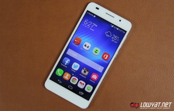
Also, if you’re looking to get a bargain deal on the HTC One M8 or the Samsung Galaxy S5, the One is seriously worth a closer look. Heck, the One’s even cheaper than the Oppo Find 7!
CONCLUSION
For a flagship that’s about six months old and priced firmly in the middle of the market, the OnePlus One holds a very unique position.
It is certainly no match for this year’s flagships, but it’s priced less than half what these new devices are going for – something a lot of people seem to forget. On the other hand, some will consider the RM1,199 price tag excessive, given the fact that it translates to the same $349 price tag from six months ago.
Nevertheless, I still consider the One to be a solid buy for those looking for a good, reliable smartphone without taking some micro-credit loan. Like we mentioned in our 2014 awards, the One ticks so many boxes on the first try – and that’s a huge testament to OnePlus. Not every smartphone maker would breathe new life into a device halfway through its lifecycle with the option of flashing to a completely new ROM, either.
In addition, the sheer customisability of Cyanogenmod and the excellent textured back cover adds a personality that I’ve not seen before on any mainstream device, and that’s such a refreshing experience.
Just make sure you download that ColorOS camera app.
Follow us on Instagram, Facebook, Twitter or Telegram for more updates and breaking news.


