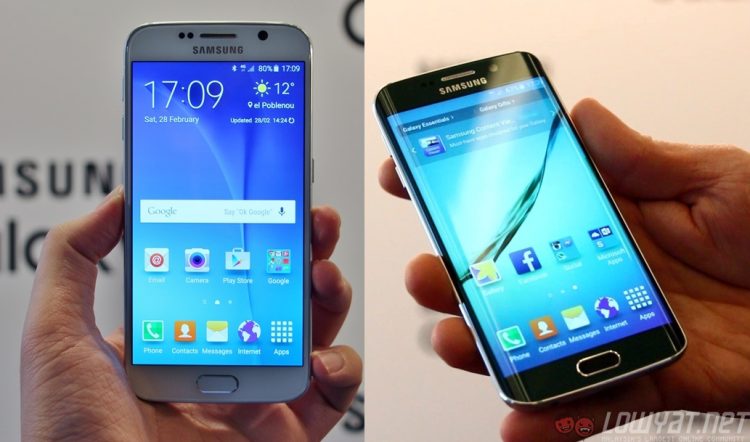
Just moments ago, Samsung has finally announced its two latest flagship smartphones: the Galaxy S6 and the Galaxy S6 edge. With so much at stake, Samsung has made the bold move of redesigning its sixth iteration of the company’s flagship smartphone from the ground up, using premium materials along the way. But how does it translate to the final product?
GALAXY S6
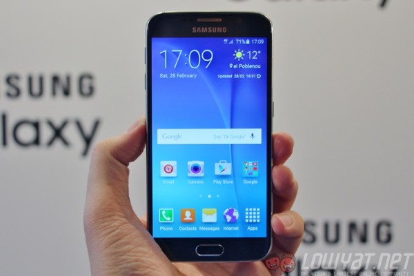
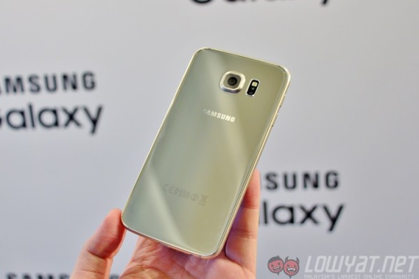
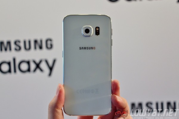
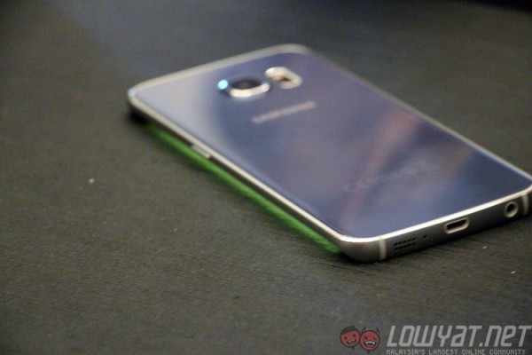
The Galaxy S6 may have been completely redesigned, but the South Korean company made sure that the Samsung identity remains. That being said, this is visually unlike any of Samsung’s previous smartphones. Gone are the mishaps of previous devices; there are no cheap-feeling plastic or perforated back cover designs to be seen here.
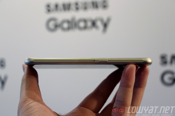
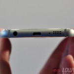
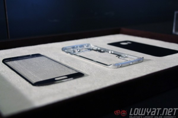
This is the classiest Samsung has gone with its phone designs, incorporating materials that are deemed “premium” in its latest flagship. Instead of a plastic back cover, Samsung went with glass (Gorilla Glass 4, to be exact). The metal frame is also said to be made from an “aerospace-grade alloy”. The speakers have finally shifted from an awkward position at the back to the bottom of the device.
Samsung cynics will be quick to point out the visual references. The bottom of the metal frame looks like it was lifted off an iPhone, while both Sony and Apple have used glass as the material for the back of the phone (even Xiaomi uses it for its latest Mi Note smartphone). But if you look closer, there are little details that have come from previous Samsung devices, such as the thicker edges of the metal frame (which thankfully looks a lot more subtle than on the Galaxy Alpha and Galaxy Note 4).
Also, remember the time when people used to say that the iPhone 6 rips off the HTC One?
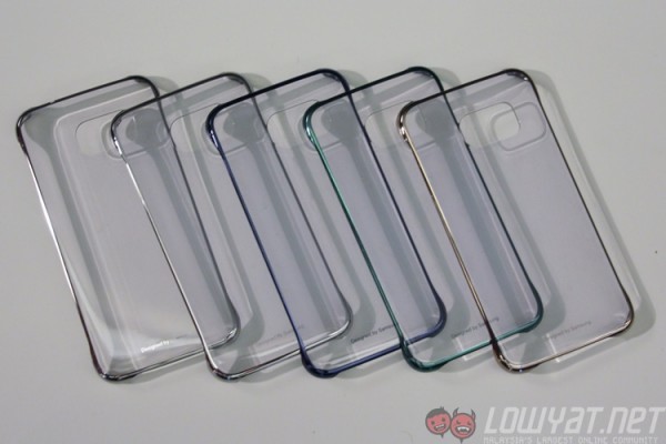
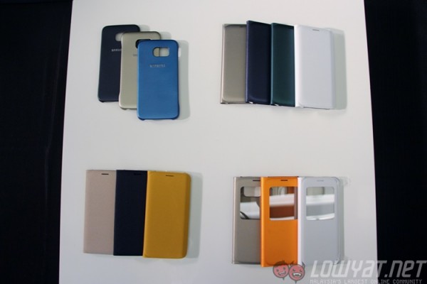
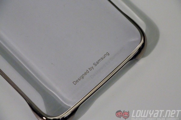
As a whole, however, the Galaxy S6 feels very solid and compact. This sturdiness is largely due to the glass rear, though this also means the back becomes an ugly fingerprint magnet very quickly. Even some of the new covers that are designed for the Galaxy S6 feature this same level of translucence and shininess.
Another point of contention is the fact that the back cover (and hence battery) is non-removable, and there is no microSD card slot. This may be a minor issue for most of us (the S6 ships with a minimum of 32GB internal storage option), but given that Samsung has always provided the option of removable batteries and expandable memory, this could turn into a bigger risk than Samsung may have anticipated.
In our brief time with the Galaxy S6, the phone felt exceptionally zippy, moving about the different built-in apps and menus with perfect animation and scrolling. The only time there’s some waiting is with the Flipboard app, which again is located to the left of the home screen.
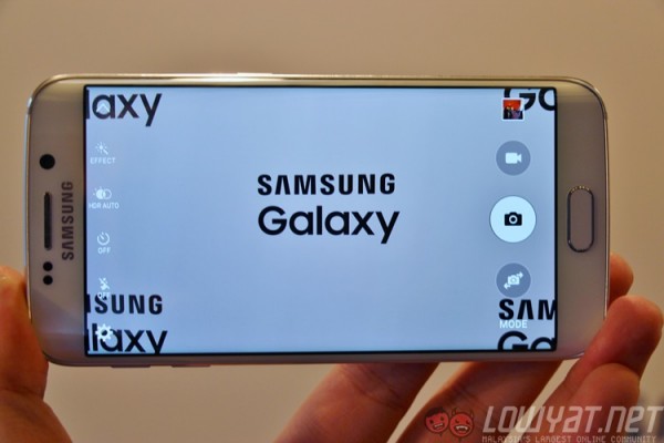
The same cannot be said of the camera app. The S6’s camera launches at a very impressive 0.7 seconds – this is made possible by the fact that the camera is always on standby. What’s even better is that Samsung has added a quick launch shortcut for the camera, and it’s brilliant. A double-press of the home button – previously launching the S Voice app – now launches the camera. Samsung has not revealed detailed information, but the AF lock is so quick, there’s not even an AF indicator in the default camera mode. Every time you move the device, the camera automatically hunts and locks focus, and does so almost immediately.
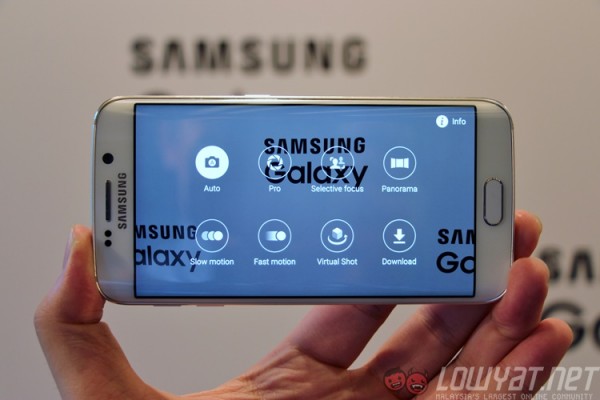
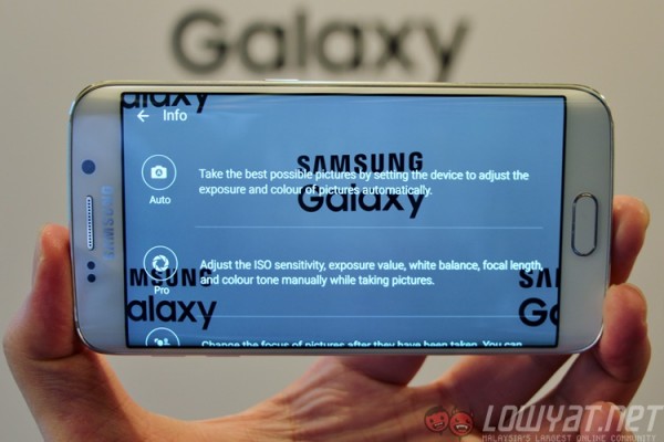
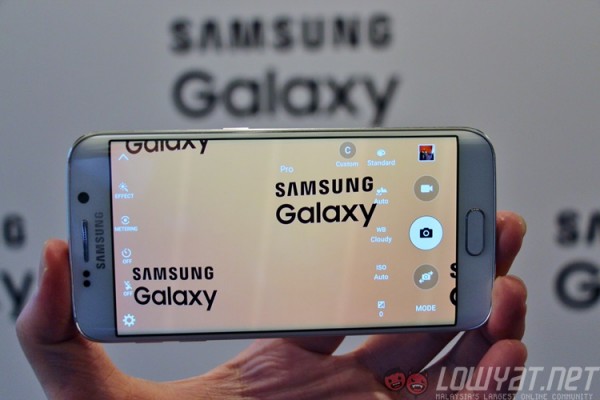
The S6’s camera now sports several new features as well. The first is Pro mode, which as you’d expect gives you plenty of settings to tweak in real-time, including EV, white balance, ISO, focal length, and colour tone, and save them in custom settings. Another feature that Samsung will inevitably hype up is Virtual Shot, which lets you capture a 360-degree image of an object, and then preview it on the phone by panning the device around. Virtual Shot looks remarkably similar to Android’s Photo Sphere, which debuted on the Nexus 4.
Finally, there’s AF Tracking, which is a new mode that locks focus on a subject by simply tapping on the screen. The sensor will then track and maintain focus on that subject for as long as it is in the frame.
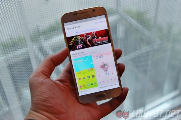
The Galaxy S6’s software has two new additions, both of which are features widely available in smartphones from China. The first is a Theme Store, which lets you skin the UI with custom icons, wallpapers and text with just a tap. As expected, choices are rather scarce, but there is a cool Avengers theme that Samsung says will be a limited edition download.
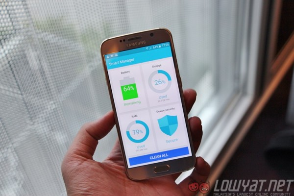
The other software addition is Smart Manager, which should be familiar to all who have used a Chinese smartphone. Basically, it is an app that offers a one-stop location to view and manage your smartphone’s resources and security. You can take a look at how much storage is remaining, or how much RAM is currently in use. At the bottom is a “Clean All” option that clears off all background processes and deletes unnecessary data.
In all, though, Samsung has done a Sony with the Galaxy S6…and that’s a great thing. The Xperia Z3 was touted as packing “the bestof Sony”, combining the Japanese company’s expertise in display, audio and camera technologies into a handsome mobile product. The Galaxy S6 is an excellent amalgamation of Samsung’s expertise in display and semiconductor prowess, and its camera looks to be quite promising based on our first impressions. The Galaxy S6, for now, seems like an excellent device.
There’s just one problem: Samsung also announced the Galaxy S6 Edge.
GALAXY S6 EDGE
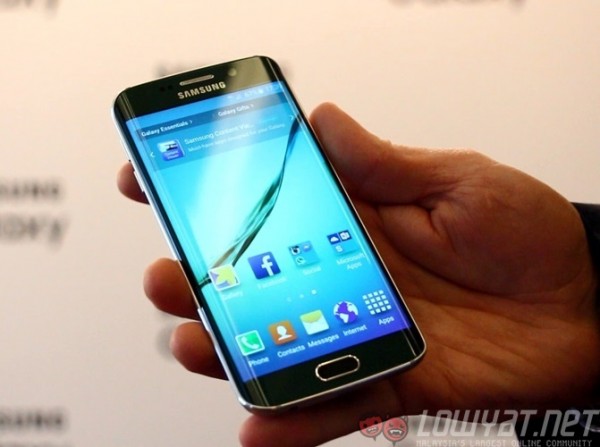
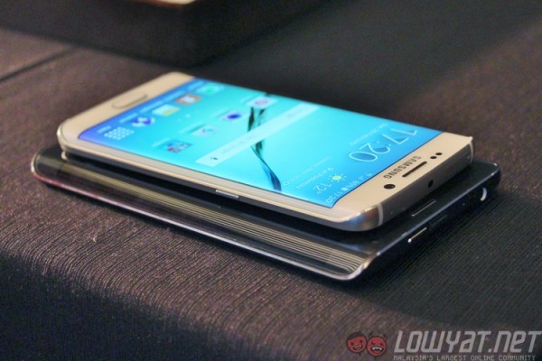
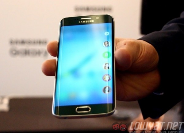
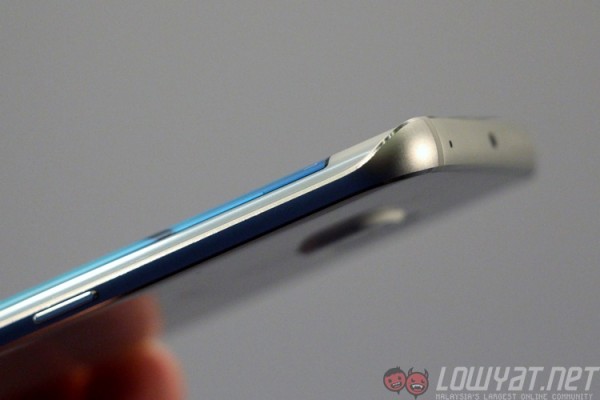
Meet the Galaxy S6 edge. It’s basically the same as the Galaxy S6, with the same internal hardware and a similar design, but with a display that curves on both sides.
In fact, the display of the Galaxy S6 edge looks more like the back of a phone, where some companies design ergonomic curved backs that make it comfortable to hold. But to have the display technology to translate this to the front of the phone is something else entirely.
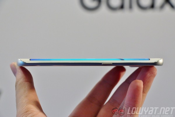
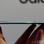
Samsung’s Youm technology, which was unveiled in 2013, is finally embodied in its finest sense with the S6 edge. The Galaxy Note Edge, while interesting, has an Edge Screen that made an already large phone wider, making it pretty awkward. The S6 edge wraps the display better this time around, making it thinner than the normal S6, while the metal frame gives you something solid to grip at the sides.
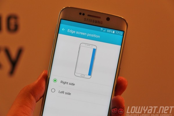
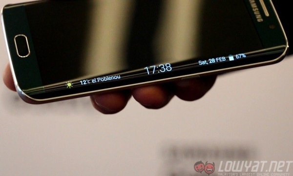
The key difference between the S6 and S6 edge is, of course, the Edge Screen. It’s obviously curved on both sides of the display now, allowing right- and left-handers to equally enjoy the benefits of the Edge Screen. The curved sides are also less pronounced than that on the Note Edge, and that’s a good thing: it means the S6 Edge is more comfortable to hold.
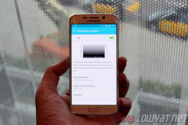
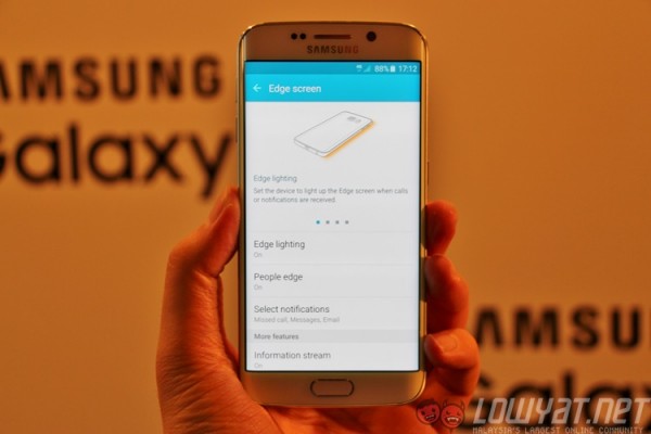
More importantly, Samsung has been working on genuinely useful features for the Edge Screen, which now has two main ones: People Edge and Information Stream. People Edge is a more organic application of the Edge Screen, where it lives on top of the main screen; a swipe from the edge of the Edge Screen will reveal five bubble heads (similar to those in Facebook Messenger) which are five of your favourite (or most-accessed) contacts. Tapping on any of these contacts gives you options to call, SMS or email them, without requiring you to trawl through your contacts list. A sixth bubble on top of these contacts lets you tweak which contacts you’d like to display here.
In addition, these contacts are colour coded which appear to have only one useful application. When the phone is placed face down and one of your favourite contacts calls you, a wavy light animation in the colour assigned to your contact will be triggered on the Edge Screen. Should you be busy, you can then hover your finger on the fingerprint sensor, which will end the call and drop a text to the contact indicating that you are busy.
On the other hand, Information Stream is basically an upgraded version of the Edge Screen that is on the Galaxy Note Edge. It plugs into more third-party resources now, allowing you to have more information displayed on the news ticker.
But in truth, there still aren’t many actual benefits of the Edge Screen. Samsung has found the technology and means to mass-produce curved displays without knowing real-life applications that leverage on this new feature. It has even reverted some of the “immersive” in-app controls back to where they should be. For instance, the camera app now has the shutter button in the right position, instead of at the Edge Screen, which sits way too far from tapping with the thumb.
That being said, I have to be honest here: I spent a lot longer with the S6 Edge than I did with the S6 during our hands on session, and it wasn’t because there was a shortage of S6 devices available. There is something inexplicably attractive about this phone than any Samsung phones I’ve encountered in the past. The phone feels great, the back is minimalist, the front has personality and a uniqueness that no other phone has.
For a company that’s always placed function over form, this shift in mindset with the S6 edge is certainly a very positive one. It also has the side effect of making the S6 look rather…ordinary.


