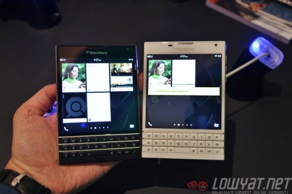
BlackBerry’s latest flagship smartphone, the Passport, is officially here. Announced in Malaysia less than 24 hours after it was unveiled globally in three cities around the world, it is clearly a statement of intent of the struggling company’s move to focus on its core target market. The Passport itself is a reflection of that same move: a device solely catered and fully focused for the “mobile professional”, and it is unashamedly designed to be so.
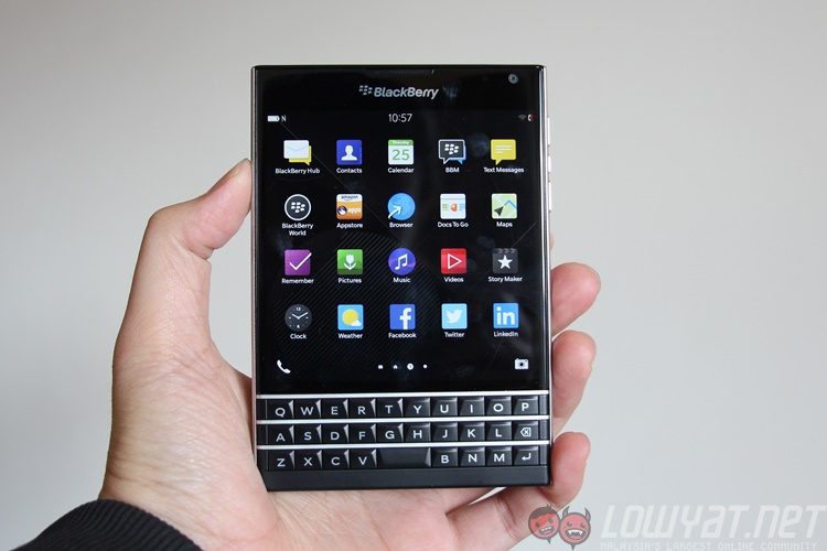
Let’s get something right out of the way: the BlackBerry Passport looks and feels really weird. That square display…that square body….after years of being conditioned to be perfectly comfortable with slim, rectangular blocks, the Passport will feel truly awkward to hold (and see) the first time round. The square body makes it quite a challenge to hold with one hand, and navigating with one hand is nigh on impossible.
Never before has a smartphone demanded the use of two hands to do absolutely everything.
But hey, I’m not what BlackBerry calls a mobile professional. I’m perfectly comfortable with my Android smartphone, and I’ve been spoilt by SwiftKey’s virtual prowess. So I tried to think like a mobile pro – the productivity-focused, power-suited, success-driven individual who is always working on the move. Slowly, I begin to see some rationale in BlackBerry’s square madness.
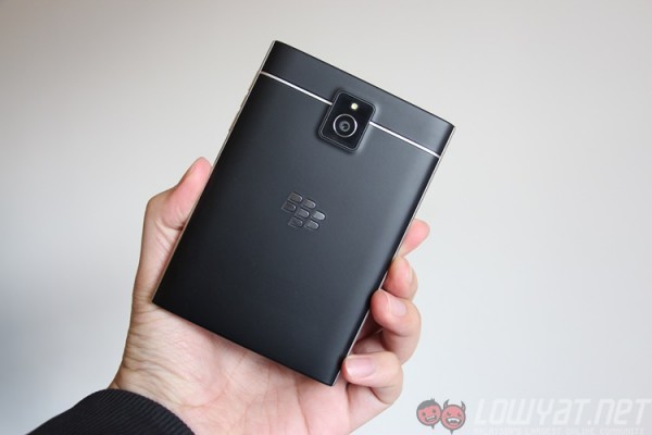
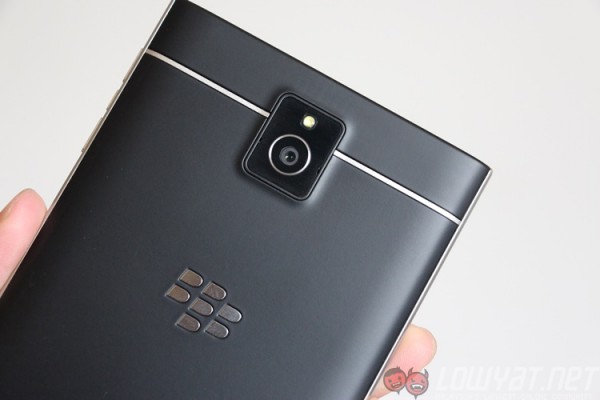
Take a look at the back of the Passport. It’s strikingly sleek and handsome. If it weren’t for the square shape, this really does look like James Bond’s smartphone of choice. The soft rubber back feels great just as it did on the Q10, and despite its shape the Passport had no trouble fitting perfectly in my slim fit jeans pocket. Because it is wide and not long, it didn’t hamper my mobility at any point in time – and that alone addresses quite a big issue with the Passport.
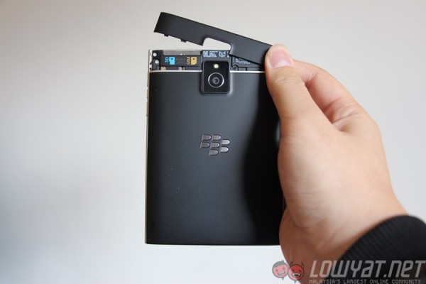 Only the top portion of the back can be removed, providing access to the microSD card slot and SIM card slot
Not only that, the Passport really feels like it could take a beating and still survive for you to send that all-important email. The stainless steel frame adds plenty of rigidity to the Passport, and it’s not-at-all slim chassis and rounded sides means it is very comfortable in the hands. At a time when smartphones are getting unnecessarily thin for the sake of being thin, this is a welcome change.
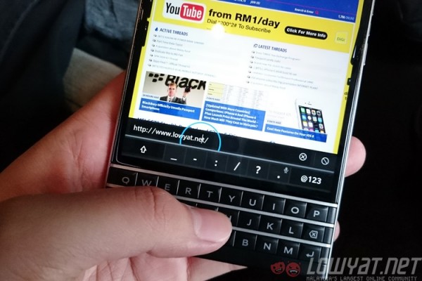
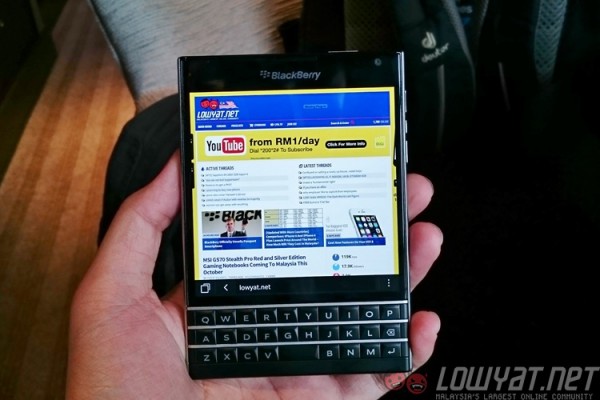 Web pages are rendered in full, and the screen is large enough that you do not need to zoom in and pan around
The screen, a 4.5-inch 1:1 display with a sharp 1440 x 1440 resolution, is very impressive. Blacks are deep, and the 435ppi pixel density ensures visible pixels are not an issue. Viewing angles are great too – you just need to get used to the awkward square display. On the other hand, that square shape really comes to its own when you start browsing the Internet or read word documents. That extra wide display means that there’s no need to zoom and pan around to read texts comfortably.
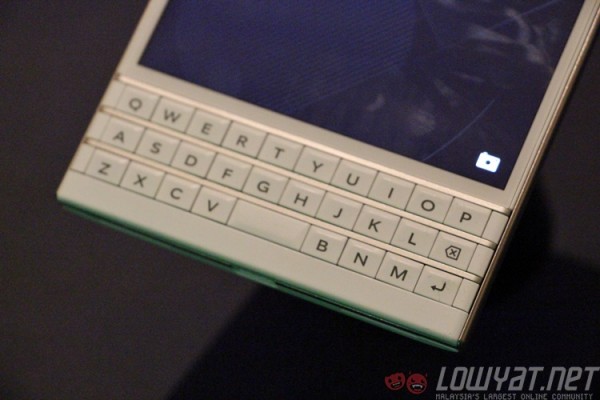
Immediately below the display is the new keyboard for the Passport. It’s a three-row physical keyboard, while a fourth row appears on-screen, allowing it to change dynamically based on what you’re typing. It’s touch-enabled too, giving it plenty of nifty tricks up its sleeve.
First off, with touch, you can scroll through web pages and documents on the keyboard, without ever touching and obscuring parts of the screen. It is a pleasant surprise the first few times you do this, though I found myself following old habits occasionally and scrolling on-screen. There’s a pretty steep learning curve when you’ve been used to something for years, and it shows when you first use a Passport.
The touch-enabled physical keyboard really comes into its own when you start typing on it. As I mentioned earlier, I am not a champion of physical keyboards, and the Passport doesn’t make it any easier to adapt. The three-row keyboard feels cramped, especially when you consider the space bar is located in the middle of the bottom row, smack in between the “v” and “b” keys. All punctuation mark keys are located on the dynamic portion of the keyboard – which is on-screen above all the keys. And that’s really odd. Like I said, there’s a steep learning curve.
But, once you get used to the location of the keys, the typing experience gets somewhat smoother. What I really like about the Passport’s keyboard are the word prediction engine, which even from the start was able to have a good grasp of what I was going to type next – I’m pretty sure it’s not because I’m a predictable person. And it’s so easy to insert a prediction: a swipe up beneath the three word suggestions (located on the left, middle and right side of the bottom half of the screen) from your keyboard inserts that prediction. Made a typo? One swipe to the left from your keyboard removes the current word.
One aspect BlackBerry is especially proud of is with the text selector. Different Android companies have different ways of selecting a portion of text on the screen: you either double tap or long-press on a particular word to enable the text selector. With the Passport, a double-tap anywhere on the keyboard opens the text magnifier. Hold the upper/lower case toggle and swipe left, and you’ll highlight portions of text. You can move your finger to highlight whole paragraphs easily and without obstructing the screen.
Despite the joys the keyboard offers, there’s a lingering feeling that the physical keyboard feels rather cramped. BlackBerry could have added an additional row at the bottom to incorporate the punctuation keys (and the space bar!), giving much needed real estate for users to work with.
The Passport is also one of only two BlackBerry smartphones to run on the new BlackBerry 10.3 update, which has two significant additions: the Amazon Appstore and BlackBerry Assistant. BlackBerry’s partnership with Amazon means the BlackBerry 10 platform now has access to hundreds of thousands of Android apps, which is an important step for BlackBerry.
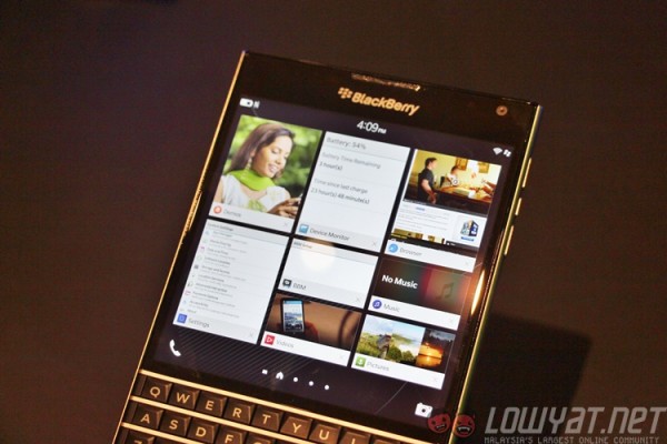 The multitasking window (also the primary home screen) is very confusing once you have more than eight apps running. You can see a preview window (called Active Frame) on each running app, but you have no idea which app will be killed when you open another app. The first four running apps have a larger Active Frame than the last four. What’s that about?
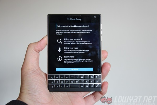
The 10.3 update also introduces BlackBerry Assistant, the company’s take on virtual assistants. Like Siri, Google Now and Cortana, BlackBerry Assistant is a very capable assistant, and its contextual awareness means you can ask things like “should I bring an umbrella today?” and have it tell you today’s weather. There’s pretty tight integration with BlackBerry’s core apps as well, especially with the Calendar app. In Car Mode, you can have BlackBerry Assistant dictate your new messages and emails, and dictate a reply for it to do the rest. It’s nothing new, but BlackBerry’s powerful word recognition engine means it should fail less often than other virtual assistants – even if this one sounds a lot colder and mechanical than others.
In a world where almost virtually every smartphone is a block of rectangular, the Passport really stands out – though perhaps not for the right reasons. It looks and feels premium, and offers plenty of features that are focused to aid very specific types of users. But the square shape is awkward to look and hold, and demands the use of both hands.
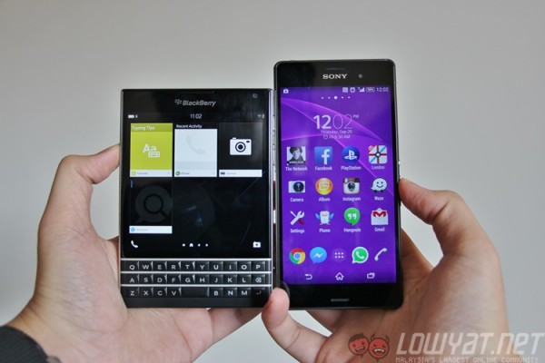 BlackBerry Passport (left) and the Sony Xperia Z3 (right)
That being said, the Passport improves on every aspect of the Q10: it has a larger display, more powerful hardware, a physical keyboard with plenty of new features, exceptional battery life and a virtual assistant to keep you moving. If you swear by a BlackBerry, it’s a no-brainer to upgrade to a Passport…just try it out in stores first to see if the size will be an issue.
Follow us on Instagram, Facebook, Twitter or Telegram for more updates and breaking news.


