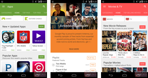
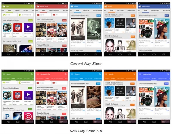
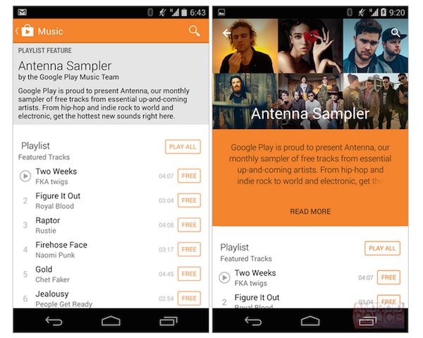
Google may have just given its Play Store an interface overhaul just a couple of months ago but it looks like you can expect more changes to come your way soon. Android Police has gotten their hands on some Google Play Store version 5.0 update showing off a slightly redesigned interface with a more “materialized” content listing.
Unlike the previous update that brought a major redesign, giving the Play Store bigger images all around, the new version will have only a small facelift. Play Store 5.0 will focus on bringing a more “materialized” design to the storefronts for Apps, Games and Books. On top of that, the new version will also make the apps more inline with Android L release with fun visual treats and refreshed toolbars.
One of the most noticeable changes is the color palette, which features a flatter, and more vivid and brighter colors. The tabs of each category have also been given the same treatment. If you open up the individual apps, you can also say hello to a new design that focuses more on images.
According to Android Police, this is just an early look of Play Store’s upcoming version 5.0 release. There will definitely be more work done on the Play Store so you can expect more changes to happen, but they should be more or less pretty inline with what we’ve just seen.
Check out Android Police for a more in-depth look into Play Store 5.0.
(Source: Android Police via: Engadget)
Follow us on Instagram, Facebook, Twitter or Telegram for more updates and breaking news.


