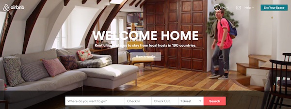
Searching for a place to stay and putting up your place into Airbnb has just gotten a whole lot easier as Airbnb announces a brand new design to its website, mobile app, as well as its logo. The new Airbnb website is now “flat” with big images, allowing users to easily find the information they want in a more attractive and neater format compared to previous design.
Announced just last week, the new design is available for Airbnb web as well as mobile app users. While the look and feel is now different, the way things works will still remain the same for hosts, and the search feature will remain the same as well, allowing you to enjoy the new layout while being able to use things the way you’re familiar with.
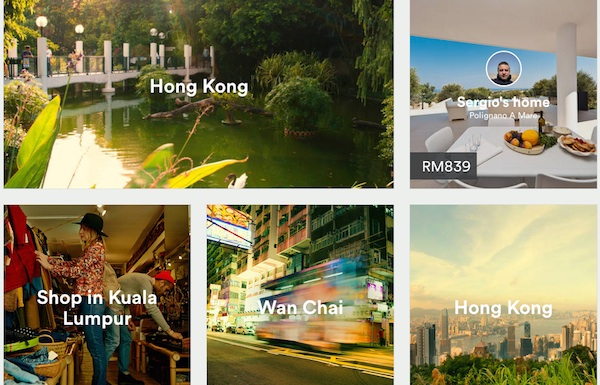
Listings are now much more attractive than before and are filled with more information to help travelers make a booking decision. The new Airbnb now comes with bigger pictures that hogs up half the listing page and are accompanied with clearer listing information, prominent amenities and house rules, as well as neighborhood details. Check out a quick tour of the new features and layout right below.

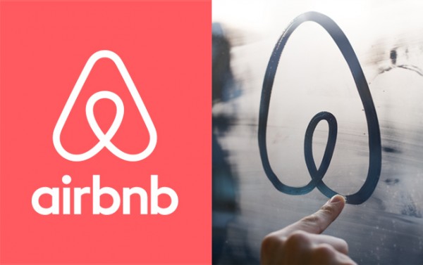
At the same time, the company also announced a new, modern logo to replace the lower-case cursive “a” that has been used over the past few years. The new logo, called the “Belo” internally, now looks like an uppercase “A”. The logo was created in partnership with a U.K.-based design studio and the company hopes that it will better represent its ambitions as a global hospitality brand.
Meanwhile in case you’re wondering, yes, Airbnb is now available in Malaysia and you can even find local place, or list out your space on Airbnb. Find out more about Airbnb in this official Airbnb _my post in our forum, or visit Airbnb to check out the new design.
(Source: TechCrunch, Airbnb)
Follow us on Instagram, Facebook, Twitter or Telegram for more updates and breaking news.


