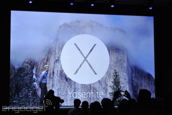
Today at WWDC 2014 Apple announced the next generation of its desktop operating system, Mac OS X 10.10 Yosemite. Immediately you can see that a lot of Yosemite has borrowed from the radical redesign of iOS with iOS7 by replacing the gradients that we are all familiar with, with translucent panels which “adjust” with your wallpaper. On top of this, Apple have also introduced a “dark mode” which replaces the white, luminous theme with a darker, eye-friendly grey.
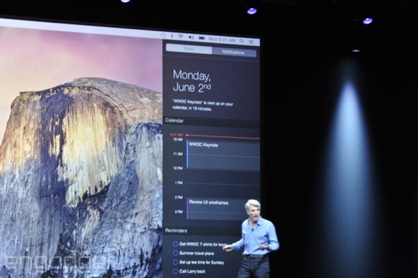
It’s not just the look that has been changed with 10.10; the Notification Centre also draws from the same functionality of the iOS version, showing the “Today View” that is on by default on mobile and makes what wasn’t all that interesting a little more useful.
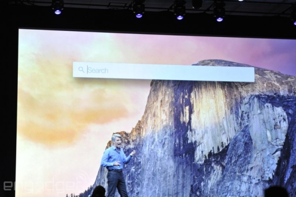
Spotlight will also be given a facelift. Instead of staying forgotten by the top right, it gets a centre search bar which allows you to gain an enhanced “Alfred” like functionality, returning search results from the web. This is Apple taking steps forward to come closer to Google Now and it does look pretty impressive.
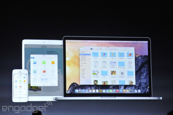
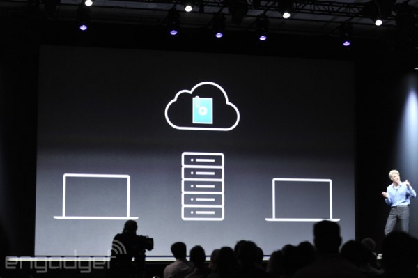
Next up is iCloud Drive. Encroaching on apps like Dropbox and Google Drive, Yosemite puts the content of your iCloud right in your finder. Those files are automatically synced across your Macs (and even Windows PCs!) and are all fully tag friendly and subsequently searchable.
Following up from that is a feature that is called MailDrop. Maildrop allows you to bypass mail attachment file size limitations by automatically separating the file from the email, putting it on your iCloud then forwards a secure link on your email, kind of like an automated Dropbox public file upload. This works for files up to 5GB.
Apple is looking to release Yosemite in the fall with developers getting it today, but members of the public will get an opportunity to test it out with the public beta. Mac OS X 10.10 Yosemite will be a free update on release.


