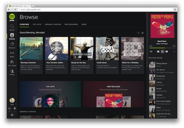
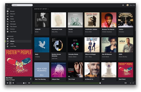
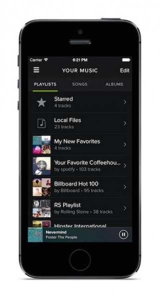
Spotify has quickly become a staple alongside things like Whatsapp and Instagram in many people’s lives. I for one use spotify for my music as opposed to the built in player on my phone. Today, Spotify unveiled a brand new look, swapping the lighter hues for a darker, more refreshed layout and feel.
It’s not all just on the surface, Spotify has also debuted their “My Music” functionality that helps you save, organize and browse your favourite music the way YOU want to.
Building your personal music collection just got a lot easier.
- Content is king. Our new design makes accessing your favourite music smoother than ever before. The new dark theme and refined interface lets the content come forward and ‘pop’, just like in a cinema when you dim the lights.
- It’s Your Music collection. Save albums and browse their beautiful cover art, gather your favourite artists and create playlists for every mood and moment. Found a song or album that you like? Just hit save to add it to your collection. It’s that simple.
- We know you’ll love it. We’ve listened to all your great feedback to ensure that everything looks and feels just right. You told us you preferred a darker interface – so here it is.
ON top of this they have also improved the Browse feature with more relevant and localized content. Updates will be rolling out across all platforms gradually
Follow us on Instagram, Facebook, Twitter or Telegram for more updates and breaking news.


