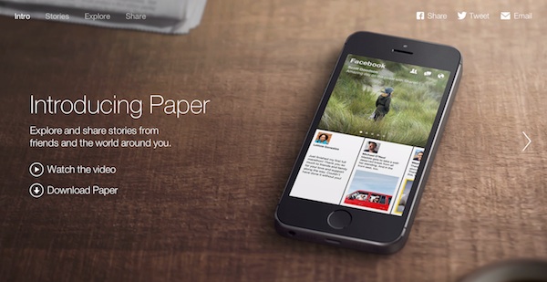
So there has been a buzz about the latest app from Facebook called Paper, a magazine-style iPhone app that is set to pull your Facebook content and digest it into a layout reminiscent of apps like Feedly and Flipboard. With the popularity of these apps it’s no wonder Facebook decided to dip their fingers into this part of the pie.
Unfortunately this app is not available in the Malaysian app store just yet, but we managed to grab a copy from the US iTunes store to take it for a spin. Will Paper succeed with revamping the way you use Facebook and replace your newsfeed with flippy columns and pages? Head on past the jump and figure out for yourself!
UPDATE: Check out how to download it for yourself, after the jump!
The intro video and opening screen is very reminiscent of the whole iOS7 look of everything.
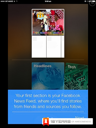
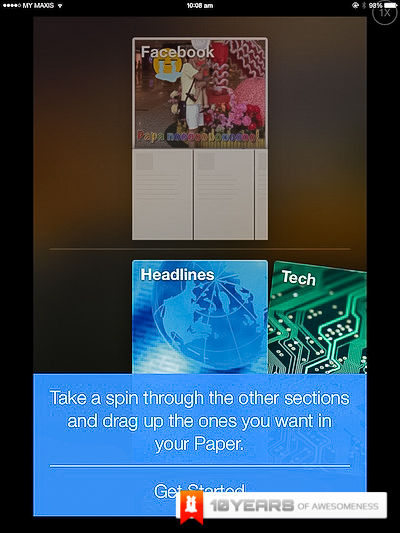
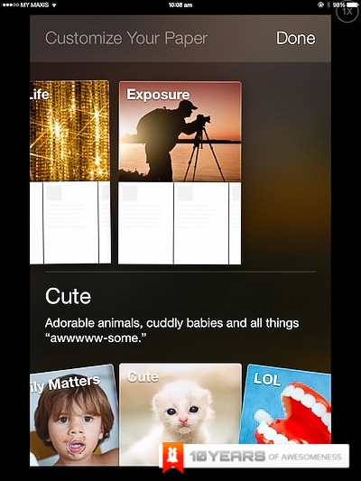
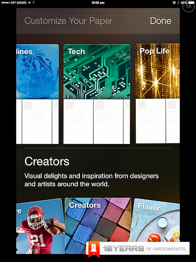
Now you can choose what appears on Paper, Headlines and Tech are the no brainers for me!
Here are some examples of what you can put on your Paper
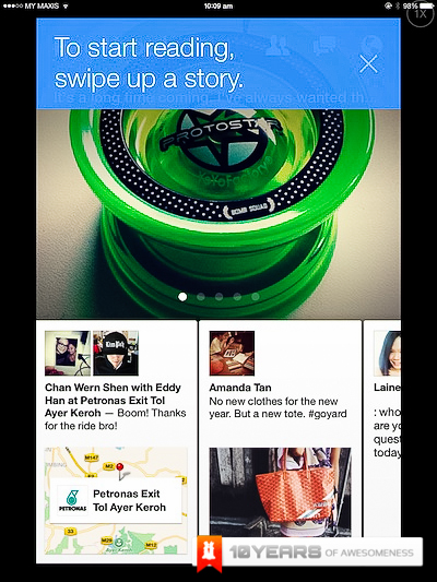
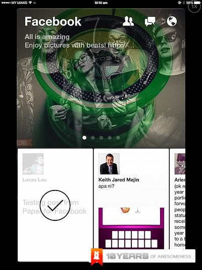
This is the default start screen when you open paper. The top will be larger stories, rotating automatically with time, often with pictures and able to be interacted with, swiping between them to display the various genres you selected and tapping to open. At the bottom there are cards displaying a random set of stories in a random order of date. To open one of the cards, you swipe upward.
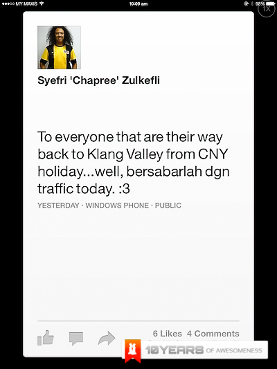
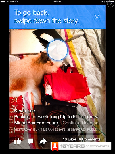
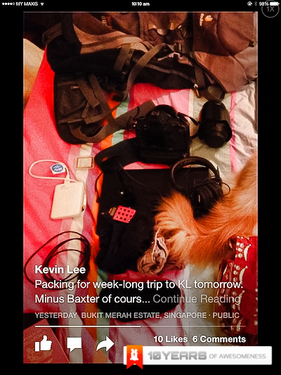
Each story you open will fill the screen and appear like this. To get to the next and previous stories you swipe left and right as well as down to close.
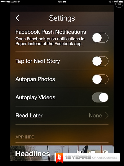
For larger images, it will appear cropped and you can see the whole image by tilting your phone, making use of the phone’s accelerometer, sliding the image to view the whole thing. You can also enable auto-pan in the settings. In my opinion this is just a “because we can” feature and has not much use in daily use. It looks great but feels wrong.
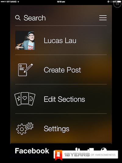
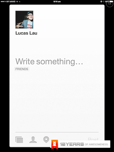
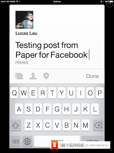
To create a new post, you swipe down to bring up your user screen and tap create post. As you can see it’s rather intuitive and easy to post, letting you upload image and tag people as well.
The settings are simple and not too much to worry about.
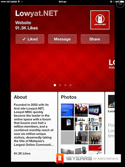
Facebook pages also display quite nicely, with the top swipe cycling through years and the bottom the About, Photos, Post on the Page and then the stories
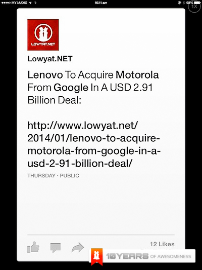
Pages posts also retain the same look as the user posts on Paper
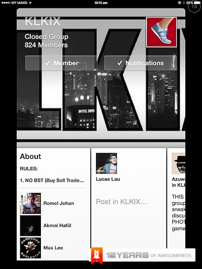
The same goes for user groups, it’s using the same layout as pages and people.
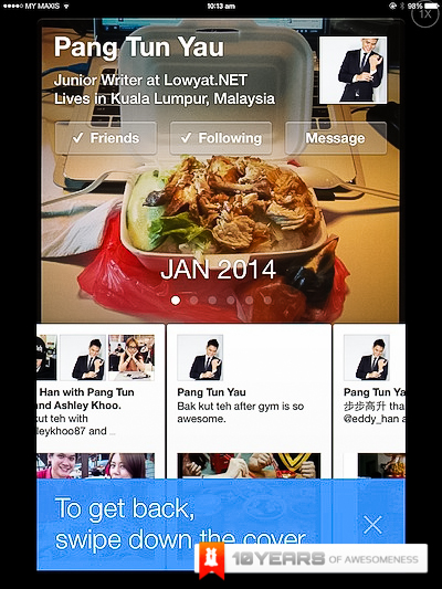
Viewing someone’s profile is similar as well, with the top carousel swiping through years as well.
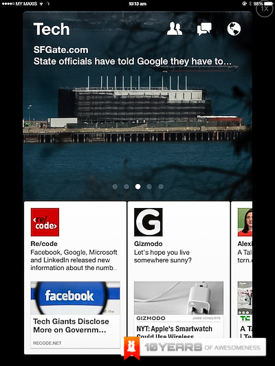
This is an example of one of the categories that you define in the setup. It will pull top stories from the popular sites in the Genre.
Conclusion
For now, Paper is only for the US and for iPhone but I can see why. The app is definitely designed with the iPhone in mind. I used an iPad mini to test it out and I can’t help but feel the interface would be more intuitive for 1 hand use on a smaller device. All in all, while it’s still a very beautiful interface, I’m not sure it could replace the traditional feed for me. The benefit to this is that it observes your unsubscribed rules like your desktop but I prefer to see all of my entries in a timeline. Perhaps its what I’m used to and this is the future, who knows?
For those of you who want to download it and don’t live in the US or have a US account, here’s how!
- Go to the App Store.
- Go to “Apple ID:”
- Log in with your password as you normally would.
- Once you’ve logged in, go to your settings, find “country,” then “change country or region” and change your country to “United States.”
- Click “none” when it asks you for payment information.
- Search for Paper, download it, then change your country back to wherever you’re from. Voila! You’ve got Paper, at least until Facebook updates the app with a region lock.
What do you think? Is Paper for Facebook the next big thing? Leave us a comment!
Follow us on Instagram, Facebook, Twitter or Telegram for more updates and breaking news.

