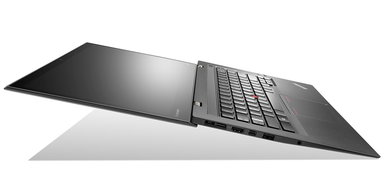
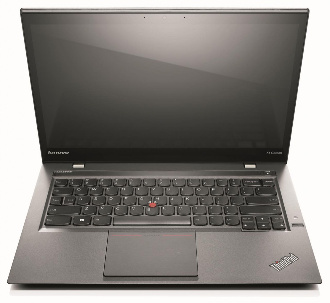
Lenovo’s ThinkPad X1 Carbon, which first made its debut in late 2012, is for me the most sexy laptop ever made. The perfect balance between power and portability, it further engages the geek within me with choice words such as “carbon fibre chassis”, “meets or exceeds Mil-Spec durability standards”…and of course, ThinkPad. If money was not an option, this would be the laptop I’d recommend to everyone looking for a laptop.
Last year, Lenovo further added the appeal of the X1 Carbon by adding a touch display to the Ultrabook, while barely affecting its slim silhouette with the ThinkPad X1 Carbon Touch.
Last week at CES 2014, Lenovo went a step further with the introduction of the refreshed, 2014 edition of the ThinkPad X1 Carbon – and it is treading some dangerous waters in its efforts of revolutionizing the keyboard.

One of the aspects many do not consider when purchasing a laptop is with the keyboard and touchpad, preferring instead to focus on the hardware and design. The keyboard is the one area of the laptop users interact with the most, so ideally it should be in any consumer’s top requirements when buying a laptop. The amount of travel the keys provide, the amount of space between each individual key, even the shape of the keys all help in determining what makes a good keyboard.
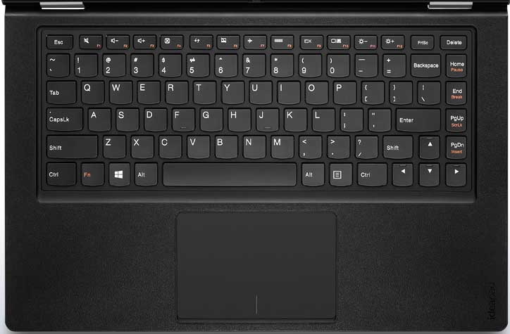
Lenovo, and in particular its ThinkPad range of business-oriented laptops, have always been regarded as the makers of the best keyboards for Windows laptops. Lately, however, it seems they are starting to lose the plot. A couple of years back the Chinese company introduced the AccuType keyboard for its consumer-based IdeaPad laptops. It was the company’s shift to chiclet or island-style keyboard layouts and it was apparent that some of the ThinkPad knowledge went into the AccuType keyboard: it was fantastic. The keyboard was comfortable, keystroke travel was great…it was almost the perfect laptop keyboard. Almost.
The one single gripe I had (and never got used to) was the placement of the four navigation buttons – Home, End, Page Up and Page Down – on the right side of the keyboard (as above), which meant that the Backspace, Enter and Right Shift keys were all truncated to make way. As a touch typist, it was a nightmare for me. I used an IdeaPad Yoga 13 for review sometime last year, and I constantly hit Home instead of Backspace as I was used to “normal” modern keyboard layouts. It was one of the very rare moments that I experienced rage quitting.
With the 2014 ThinkPad X1 Carbon, Lenovo further makes its keyboard layout more complex. Gone is the Caps Lock key; in its place are the Home and End keys. The “Delete” key now sits to the right of Backspace. Even more controversially, Lenovo removed the F1-F12 keys in favour of an “Adaptive Keyboard”.

The new keyboard layout is certainly radical, and in its quest to find the perfect keyboard layout, Lenovo risks alienating the core community of people who swear by the ThinkPad and its much-lauded keyboard.
But is change really a bad thing?
With the new keyboard layout on the ThinkPad X1 Carbon, I believe Lenovo is thinking critically. The other aspects of a laptop have slowly evolved for the better: processors get exponentially faster and more efficient each year, displays get sharper and now allows for touch interaction. So why hasn’t the keyboard evolved alongside these components?
Lenovo took its time, too: the first ThinkPad to feature an island-style keyboard, the ThinkPad X1, debuted in 2011. 2012 saw the introduction of a chiclet-style keyboard on all ThinkPads, called the ThinkPad Precision keyboard, which only had six rows instead of the traditional seven (and brought about quite a backlash). Two odd years later, the company is attempting to evolve the keyboard again, with the removal of another row in the keyboard of the X1 Carbon.

The new “Adaptive Keyboard” is an interesting take on maximising space on the standard keyboard. Removing a Caps Lock key and substituting the function with a double tap of the Left Shift key allows Lenovo to include Home and End as individual keys on the X1 Carbon, now that the F1-F12 row is gone.
The Delete key, too has been pushed down next to Backspace to accommodate the dynamic keyboard. Personally, I feel it’s on the “wrong” position just like the Home key was on the AccuType keyboard, but perhaps with the hundreds of hours of internal R&D, the company obviously feels it is something users will eventually adapt to.

What will be a concern, though, is with the Dynamic Keyboard itself. On the ThinkPad X1 Carbon, the F1-F12 keys give way to a capacitative touch strip that dynamically changes based on which apps are open on the Ultrabook.
It isn’t an entirely new idea; back in the Intel Core 2 Duo days both Sony and Compaq had laptops which feature touch strips for volume and brightness controls…and both had reliability issues over time. If Lenovo can figure how to overcome potential durability issues with the Dynamic Keyboard, then I believe this new Adaptive Keyboard might just work.
And judging by its past record, if anyone could make a good keyboard great, it’d be Lenovo.
Follow us on Instagram, Facebook, Twitter or Telegram for more updates and breaking news.


