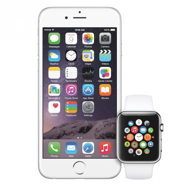
Oh dear. What’s gotten to Apple? The company that prides itself in making the best-designed products has just unveiled three new devices with designs that are decidedly unexciting. Surely I can’t be the only one who feels this way?
For the longest time, Apple has consistently stated that the iPhone is the best-designed smartphone there is. And back in the day, it probably was. Sophisticated engineering paired with minimalist design and premium materials, the iconic design was one of the prime reasons why consumers were willing to shell out top dollar for every new iPhone.
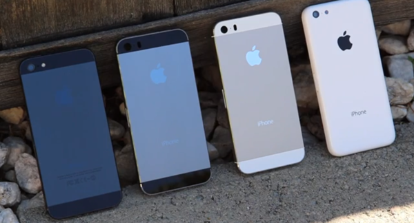 Love it or hate it, the older iPhone designs were iconic.
On top of that, Apple also made engineering wonders like the iMac and the MacBook Air; you cannot deny that good design is intrinsically built into every Apple device.
http://www.youtube.com/watch?v=RS5mzvqWM-c
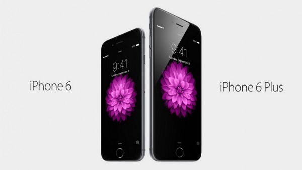
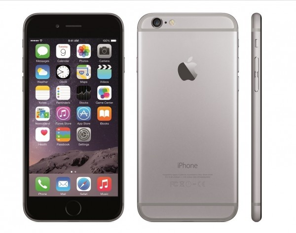
Now let’s take a look at the new iPhone 6 and iPhone 6 Plus. It’s virtually unchanged from the leaked images we saw months ago, and back then we were more forgiving since it looked more engineering sample than finished article. The two iPhone 6 models – especially that Silver version – look startlingly unfinished. One look at the back of the device and it’s plain to see why: Apple seems to have made no effort to incorporate the plastic strip around the back of the phone into some sort of design aesthetic; it’s tasteless and lacks finesse. And then there’s the camera module, which protrudes in a manner that would even make the hardiest of iFans squirm just a little.
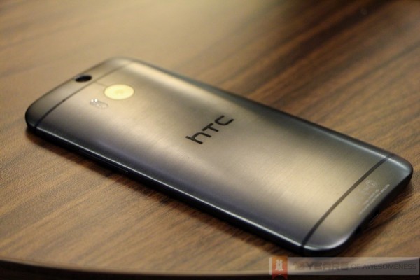 The HTC One (M8), for reference on how to incorporate antenna strips into smartphone design
Why the unrelenting focus on making the phones thinner? Why can’t it be slightly thicker to hide that camera protrusion and increase the battery capacity, for example?
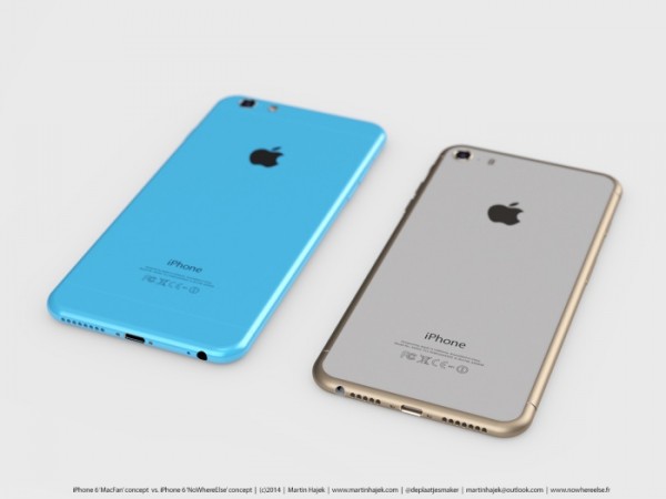 Not the real iPhone 6, but you kinda wish it was, don’t you?
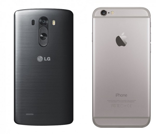
This isn’t 2011 any more. Every smartphone manufacturer is stepping up its game, with the full knowledge that the specs race is simply not enough to win customers. Take a look at HTC and its handsome One (M7 and M8), Motorola and its ergonomic Moto X. And then take a look at the two South Korean giants. LG has vastly improved its smartphone designs, offering exceptionally well-designed devices across its portfolio. Just compare the LG G3 with the iPhone 6, and the attention to detail is obvious.
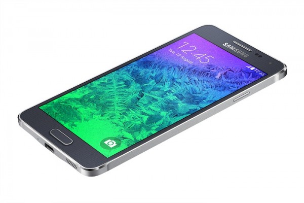
Samsung, for all the criticism its faced, is now waking up. It’s taking it slow with its “evolution of Galaxy design”, but already you can see noticeable differences. The Galaxy Alpha is perhaps the first Samsung Galaxy smartphone I have no issues with aesthetically, and it will only get better as Samsung refines this new design language.
Take a look at the iPhone 6 again.
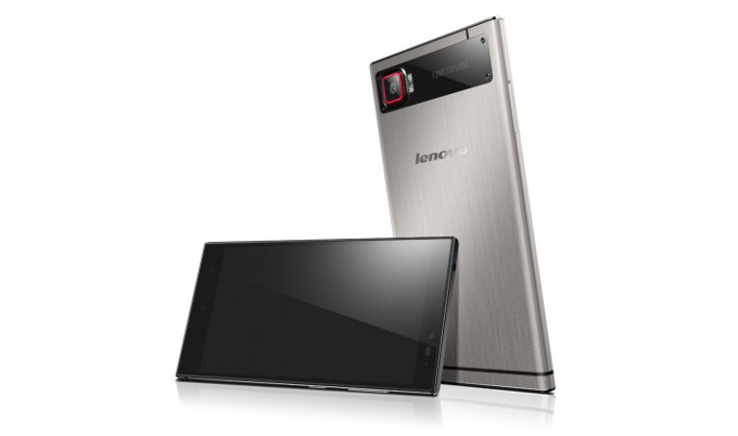
Now let’s look at another threat for the iPhone 6: the Chinese smartphone companies – Xiaomi, Huawei, Oppo, Lenovo and OnePlus. You don’t need to be an analyst to see just how fast these companies are iterating its smartphone designs to offer totally unique, fresh and attractive designs.
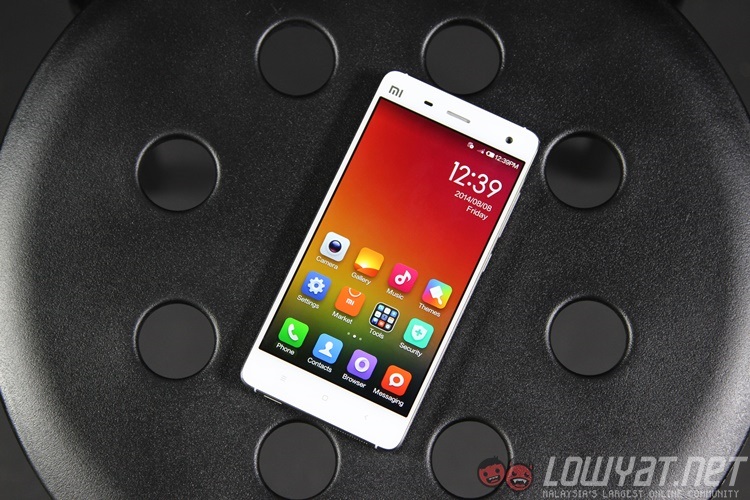
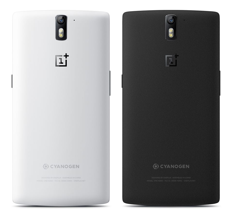
Xiaomi cannot stop talking about how lovingly crafted its machined steel frame is on the Mi 4. Oppo’s N1 has a rotating camera, for crying out loud. Lenovo’s new Vibe Z2 Pro feels like something out of a sci-fi movie. And if you can get your hands on a OnePlus One, you’ll know what I mean when I say Sandstone Black is the best back cover material ever.
Now, take a look at the iPhone 6 again.
Let’s turn our attention to the Apple Watch. Sir Jony Ive stated that the iWatch Apple Watch was in development for three years; I’m positive that’s the reason why it looks three years behind in terms of design. It’s chunky. It’s square. And worst of all, Apple did not once mention how long its battery life was.
http://www.youtube.com/watch?v=ktujsc4ZUTo
On top of that, the new Digital Crown looks like it could be used a lot better when the Apple Watch is not strapped to your wrist, don’t you think?
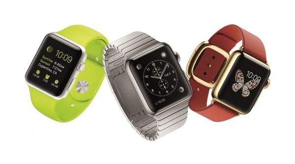
In an industry where every manufacturer is accelerating its development of its smartwatches in anticipation of the much-feared iWatch that would blow all of them out of the water, perhaps these companies need not have worried too much. So much excitement, so much secrecy…over nothing. And don’t even get me started on those gimmicky features that Apple chose to focus more on instead of the actual useful software features.
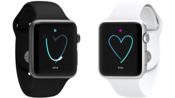 Seriously, Apple. (Image: Softonic)
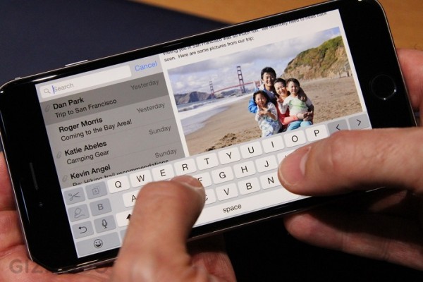
It’s such a pity. Such a pity, because within the iPhone 6 and Apple Watch lie genuinely brilliant additions, both in design and in software. The iPhone 6 and 6 Plus are two of very few smartphones that support Voice over LTE (VoLTE), a technological shift that will eventually guarantee crystal-clear voice calls. The iPhone 6 Plus has a new Landscape Mode, which not just switches the orientation, but adds more content wherever possible: in Messages, you get a tabbed view with your inbox to your left, and the current viewed message taking up the rest of the space on the right. Even the Landscape Mode keyboard has more keys.
Similarly, the Apple Watch has completely rethought the watch strap, making it effortlessly interchangeable with a simple slide-and-lock mechanism that does what a flimsy pin does for traditional watches. The new UI is fresh and is pretty promising. Even some of the new straps easily look better than most of the Android Wear and Tizen smartwatches. Plus, that Mickey Mouse watchface will win you over.
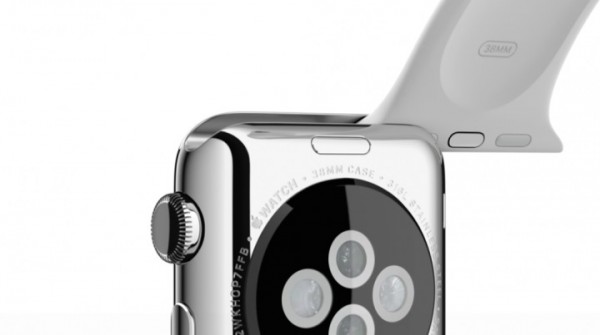 (Image: Tech in Asia)
And to be very frank, that Digital Crown does look like an innovative way of navigating on a small screen, which if Apple’s promotional videos are to be believed, should be silky smooth and intuitively easy.
http://www.youtube.com/watch?v=gCluaJe3lb4
This is the second year that at least one of us here feel underwhelmed by the new iPhone. In 2013, we felt that Apple was taking the easy route and not take risks by simply iterating on what’s already good for the iPhone 5s; by 2014, it simply cannot do so anymore. However, the execution of the new, larger iPhone and first-ever smartwatch leave so much to be desired, lacking in touches that define an Apple product. Granted, virtually nobody on this side of the world has actually seen it first hand, but as they say, a picture says a thousand words:
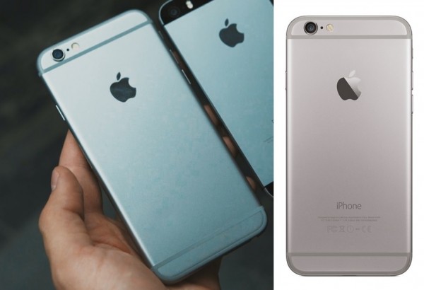 iPhone 6 leaked image (left) and official iPhone 6 press render
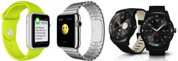 Apple Watch (left) and LG G Watch R (right)
“Designed by Apple” used to mean something. With the new iPhone 6 and Apple Watch, I’m not quite sure anymore.


