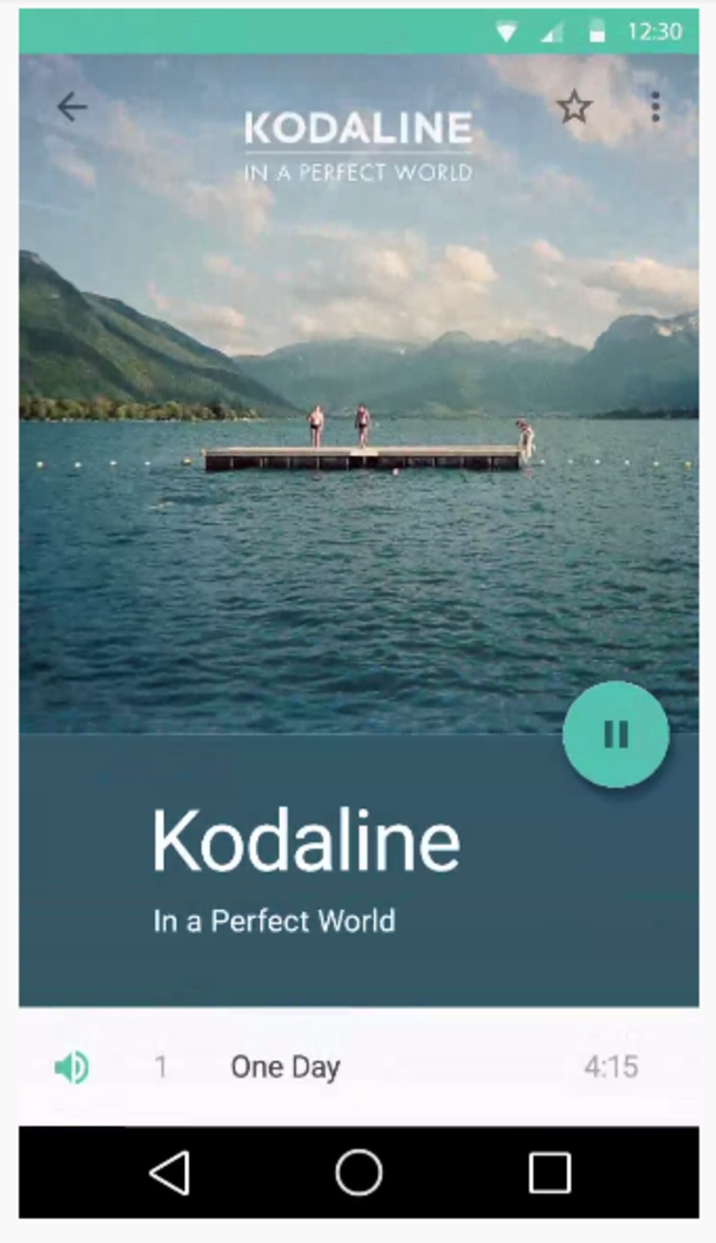
At Google I/O 2014 Google have announced the beautiful new design language that will stretch across their entire portfolio from Android to Chrome OS and beyond. The new interface is based on a “unifying theory of a rationalized space and a system of motion.” According to Google, “Our material is grounded in tactile reality, inspired by our study of paper and ink, yet open to imagination and magic”.
What Google is doing is bringing depth to the interface, replacing the rather dated Holo UI with a more colourful, responsive version of the OS. The interface is a little more responsive and you can sense depth from the animations and transitions, from slide in’s (complete with a Z scale component so a card casts shadow on the layer below) to rippling effects on the screen.
Follow us on Instagram, Facebook, Twitter or Telegram for more updates and breaking news.


