EDIT: Updated With Video
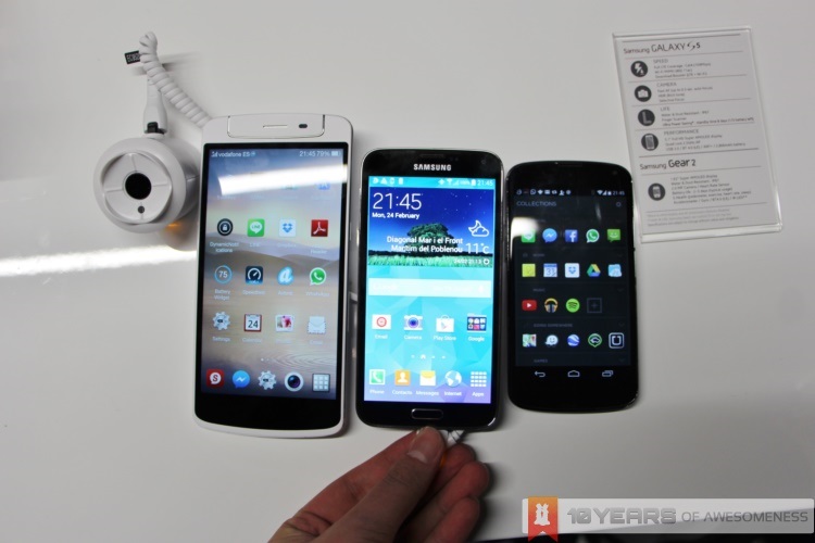
Samsung’s latest Galaxy smartphone has finally been unveiled, bringing along its own set of surprises. Contrary to what the many, many rumours and leaks have led us, the Samsung Galaxy S5 opts for a more refined Galaxy experience – and a handy set of new features.
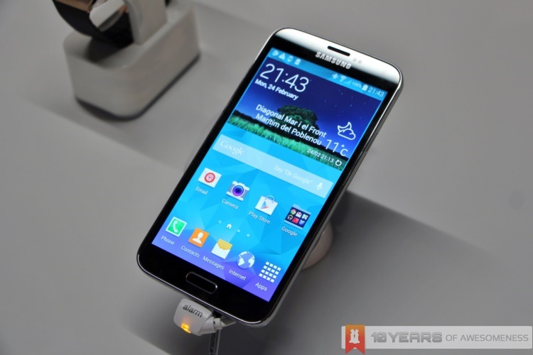
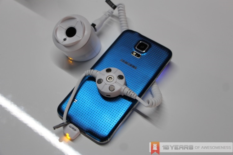
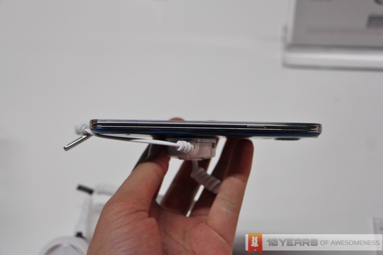
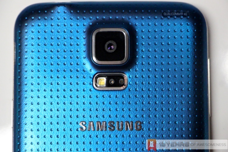
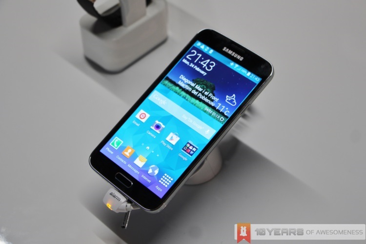
Right off the bat, those who were looking to see Samsung finally move away from its Galaxy design language were proven wrong, as the Samsung Galaxy S5 looks close to a carbon copy of 2013’s Galaxy S4 from the front and sides. The main difference between the two lies at the back: gone is the glossy plastic cover and in its place is a new soft, matte and rubbery cover with a “perforated design”. All these provides a reassuring grippy texture to the Galaxy S5, lending a surprisingly good feeling on the hands – especially when held with one hand.
Of course, it goes without saying that the little dots on the back cover will undoubtedly split opinions, especially when it was this design choice which Samsung considers to be “Modern Glam”. Some would also remember that Asus went for a similar rubbery texturized cover with the 2012 Nexus 7, so the design isn’t entirely new and appears to have more plus sides than bad ones. Personally, the soft-touch finish and grippy feel more than makes up for what looks like a practical design choice.
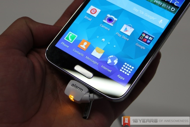
Moreover, there is a lot to be impressed with with the Galaxy S5. For instance, the S5 looks just like the S4, but is rated IP67 for dust and water resistance. The back cover is removable, too, and the only visible difference is that the microUSB 3.0 port is covered with a flap – a common feature for smartphones with water and dust resistance.
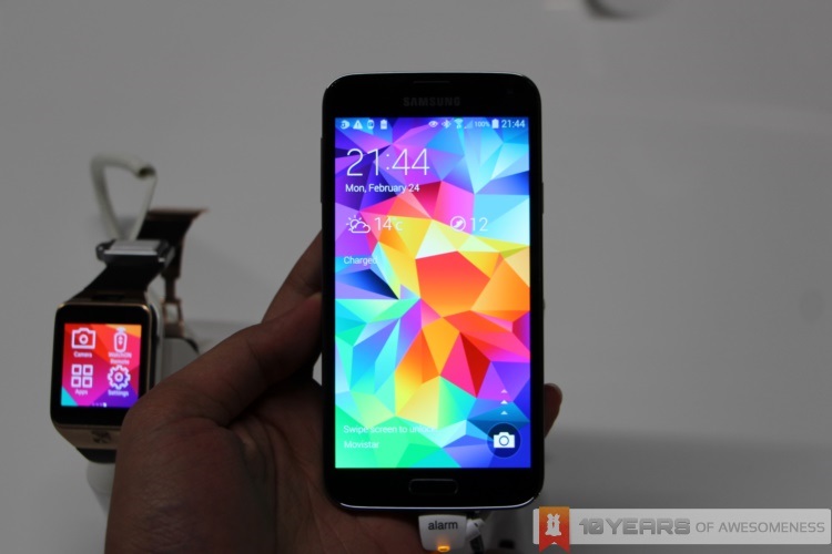
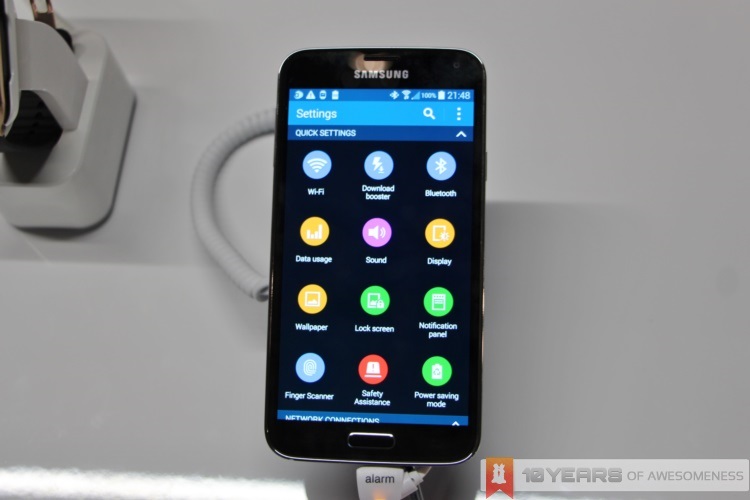
Moving on to the software, while many were again expecting a radical shift in Samsung’s much-criticized TouchWiz UI, the Korean company has instead fine-tuned the TouchWiz experience instead of going for an iOS 7-like overhaul. The interface is largely the same, save for a few things: the quick toggles on the drop-down menu looks a lot more refined, the My Magazine app is now a swipe to the right from the home screen (instead of a Google Now-style swipe up from the bottom of the screen), and finally an completely revamped Settings layout. In fact, most of the S Apps are no longer on the front and centre of things in the GS5.
Instead of the four-column Settings layout in the old TouchWiz, Samsung has opted for a icon-based UI in the Settings app. It is much different from before, and adds an extra step to activating or deactivating any settings: there is no space for quick toggles in the Settings app due to the icons-based grid interface. It’s also rather odd that only the Settings menu has this interface, and may perhaps be a hint that this is a style that the company is working on for future interfaces.
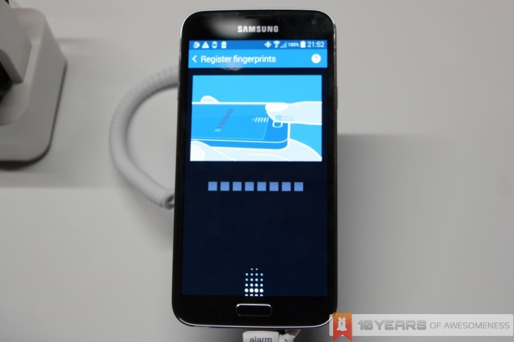
Speaking of the future, Samsung has not only fitted one biometrics detection feature on the Galaxy S5, but two: a fingerprint sensor as well as a heart rate monitor. While the former has already had a few implementations from Apple and HTC, Samsung can lay claim to having the world’s first smartphone to feature a heart rate monitor. While integrating them into smart wearables like the Gear 2 and Gear Fit makes total sense, it is rather odd to see a heart rate monitor on a smartphone, especially since there doesn’t appear to serve any real function, unlike the fingerprint sensor.
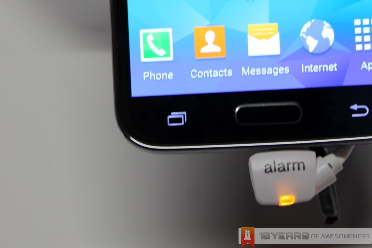
Located on the physical home button, the fingerprint scanner of the GS5 is a little like a mash up between Apple and HTC’s fingerprint scanners on their smartphones. The GS5 requires a swipe down the home button to scan (like the HTC One max) while the location of the sensor is the same as the Apple iPhone 5s. However, Samsung has further expanded on the implementation of the scanner, beyond just unlocking the phone and opening apps. After a brief setup process (where you have to scan one finger up to eight times before the sensor fully recognizes it), you can also assign other fingers to unlock the phone, and even lock certain data into your very own Private Mode. It must be said, however, that the sensor is very particular on how you swipe your finger. It refuses to scan if you swipe in any other way than perfectly straight down the centre of your finger.
Finally, there’s the new camera on the Galaxy S5. The Galaxy S5 not only sports a new 16MP sensor, but Samsung has also fitted a companion image processing chip that help speed things up. Furthermore, the sensor itself is, on paper at least, pretty amazing. For the first time on smartphones, the Galaxy S5 features Phase Detect Auto Focus (PDAF), allowing for a seemingly unnaturally fast autofocus of only 0.3 seconds. There’s also a new real-time Rich Tone HDR mode that can also be used for video recording, and finally a really interesting Selective Focus mode, which blurs out parts of the image to provide depth to images.
Having tried out the camera on the Galaxy S5, it is safe to say that the sensor really is as good as Samsung is hyping it out to be. Autofocus is insanely fast, while the cluttered UI has also been refined: the various shooting modes have been narrowed down to less than 10, with most of the old settings combined into a Shot & More mode. Selective Focus, despite taking several seconds to process after a shot is taken, lends a very professional feel to images taken on the GS5. While still nowhere near the 41MP PureView goodness of the Nokia Lumia 1020, the Galaxy S5’s camera is more than capable to hold its own.
The Samsung Galaxy S4, while outselling almost every other Android smartphone in its time, was deemed by some inside Samsung to not be good enough. It was felt that the S4 didn’t offer more for the user to move away from the older Galaxy S III. With the Galaxy S5, it also appears that Samsung is playing it safe. It is definitely different, but also somewhat familiar. Will this formula succeed with consumers as it did with the Galaxy S4? We’ll soon find out.
Follow us on Instagram, Facebook, Twitter or Telegram for more updates and breaking news.


