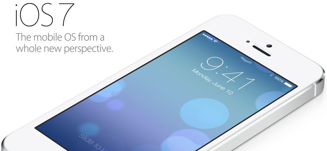
Apple’s decision to completely redesign its aging user interface for the latest iteration of its mobile operating system, called iOS 7, has naturally sparked many a debate. From the fanboys of other platforms raging on iOS 7 “ripping off” elements of their venerable operating systems, to iOS fans lamenting the drastic changes on iOS 7, there are enough unpleasantries being bandied about online to render Internet trolling absolutely unnecessary for the next few days.
I was never a fan of iOS. I championed open-sourced platforms such as MeeGo, Ubuntu Touch and Sailfish OS to stimulate innovation in an increasingly stagnating industry. With iOS 7, however, I think Apple deserves a genuine pat on the back for bravely moving away from its comfort zone in its attempt to revitalize its platform – even if it meant “ripping off” from other platforms.
Flattering the Other Platforms
http://www.youtube.com/watch?v=zcebqUdvDrw
Watching the 30-minute video above, anyone who has been exposed to the mobile operating systems available in the market will definitely experience various, repeated episodes of deja vu. Let’s get this out of the way: yes, there were plenty of “new” iOS 7 features that have appeared before on other platforms. The Verge‘s Aaron Souppouris and GigaOm‘s Kevin C. Tofel both went into great depth tracing the influences behind iOS 7, which shows concrete inspirations from Android, Windows Phone, MeeGo…and even Windows Vista.
In fact, one could go further. Sailfish OS, the new mobile platform from the same people behind MeeGo-Harmattan, has a system-wide feature called Ambience, which dynamically and intelligently adapts the system’s colour theme to match the prevailing colours of the user’s selected wallpaper. A near-carbon copy of this is found on iOS 7, just like how Sailfish’s use of translucency – which was shown to the world as early as November last year – making an appearance on Apple’s latest iteration of iOS.
Pre-made innovation, as Souppouris aptly puts it. But does it really matter?
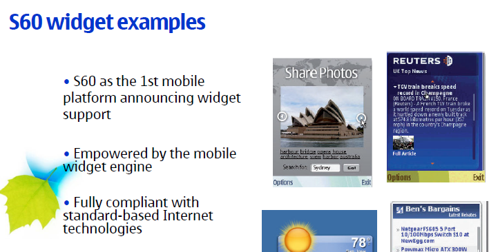
At some point or another, one platform will absorb features from the competition into their own product. webOS had plenty of features that were adopted into other OSes such as Android. Symbian had support for widgets on the S60 platform way back in 2007. MeeGo-Harmattan’s Swipe UI in some aspects was reminiscent of iOS. Never forget, too, that the founders of Android had Steve Jobs as a mentor back when in the early days of iOS. And, the massive undertaking that was Project Butter on Android last year was a direct riposte to the buttery smooth animations that iOS consistently achieves.
Is it a crime, then, that iOS 7 is seemingly made out of the best bits that the competition offers? Of course not. If anything, iOS7 may just prove to be the catalyst for Apple and the competition to innovate further in mobile user experiences – whether they be entirely new ideas or older ones revisited with fresh new perspectives.
And, from what we can see of iOS 7 so far, it appears that the whole is greater than the sum of its seemingly copied parts. From the inspiration drawn from various other platforms, Apple has managed to conceive an entirely cohesive and elegant user interface that finally blends minimalistic design with powerful software engineering. That takes a lot of work, and a testament to both Jony Ive (SVP of Industrial Design) and Craig Federighi (SVP of Software Engineering) at the company.
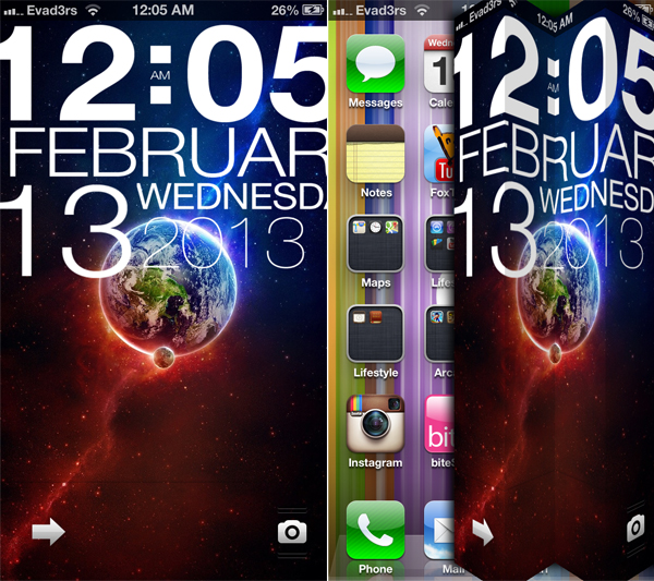 Some of the UI tweaks that can be found on jailbroken iOS
Postulating further, iOS 7 also signals a shift in the train of thought inside Apple. As a result of the closed walls of iOS, community developers introduced jailbreak hacks of iOS, bringing along with it a slew of features (settings toggles, among others) and gesture-based navigations into iOS. While Apple did everything they could to prevent any kind of jailbreak releases of iOS, it appears that they have also absorbed some of the ideas and incorporated them into iOS 7.
A New Old Way of Interaction
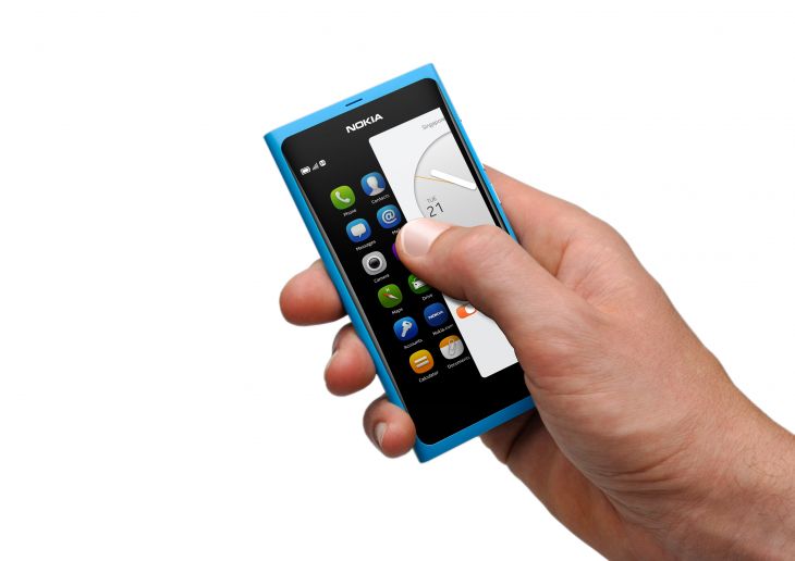
One particular feature subtly making an entry into iOS 7 is the use of gestures. Gesture-based navigation isn’t something new, but since the fully gesture-based Swipe UI introduced in the Nokia N9 in 2011, there has been a steady adoption of gesture navigation in button-based platforms such as Android, and it is proving to be the way forward in future mobile user experiences (UX). It is intuitive and, when done right, offers a delightful yet practical user experience.
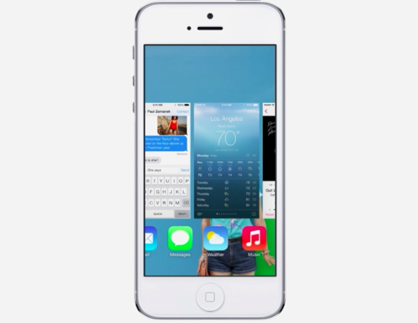
With the introduction of the “swipe to go back” gesture in most of iOS 7’s stock apps, it is fairly certain that gesture-based navigation will finally see a breakthrough in mobile platforms. I have already seen, with my own eyes, my editor close to shedding tears of joy seeing the swipe animation as his thumb moved across the screen of his iPhone 5 running iOS 7, the email gently sliding away to reveal his inbox. “Finally!” I hear him scream enthusiastically, thumb still on screen. If someone already familiar to gesture-based navigation is so excited about it finally arriving on iOS, imagine the impact this will have on the tens of millions of users who have never used anything other than iOS before. This level of excitement can only be good for the entire industry.
On the Other Hand…
Not every criticism of iOS 7 was about the blatant copying of Android and the other platforms. There were genuine concerns about the new OS that Apple should really be looking to fix – with iOS 7’s iconography right on the top of the list.
Confusing. Amateur. A childish attempt. Those were just some of the scathing opinions regarding the new set of icons on iOS 7. And they’re true: the new icons lack any kind of synergy between them, where a minimalistic black and white icon can be next to a vibrant one with a full rainbow of colours. Some icons are flat, some feature backgrounds with colour gradients that give a sense of depth. It’s a jarring experience that indicates a lack of attention to detail that is very unlike the company identity.
In addition, Apple should also be explaining further its definition of allowing multitasking for all apps. Is this “true” multitasking that some platforms, such as Blackberry 10 and Sailfish, offer? From the video demo above, it seems as if Apple’s definition of multitasking is more of a selective one: apps that are used the most are refreshed frequently, even if they’re not opened. It’s a feature similar to what Sony offers with the Battery Stamina mode in its new Xperia smartphones and, recently, in the Qualcomm Snapdragon Battery Guru app. However, whether open apps are frozen when the user sends it to the background still remains a mystery for now.
Of course, it is important to keep in mind that iOS 7 is still in beta mode. We will definitely see a much-improved version of the platform when it is available later this year – preferably with a better set of icons.
The Bigger Picture
Soon after the iOS 7 announcement, Sotiris Makrygiannis, the former head of productivity and director of applications for MeeGo at Nokia, shared via Twitter that he’s “having a big smile“. Rather than vocally chastising the American company for lacking ethics/creativity/credibility with their efforts on iOS 7 that seem to copy parts of the Swipe UI found on the MeeGo-running Nokia N9, Makrygiannis takes it all in his stride.
If the head of development of such a project can understand the significance of Apple’s new direction for iOS 7 and the UX, who are we to blast Apple for ripping off winning ideas from other platforms? If anything, Apple’s adoption of such ideas and features actually paves the way for greater awareness of innovations that were driven by other platforms (and giving new platforms such as Sailfish and BlackBerry 10 the exposure they deserve) with the help of its massive user base and, just as importantly, revitalizes the mobile industry to be open for more innovation – especially coming from a company many have claimed to be stagnating.
It’s an exciting time for the mobile industry. Let’s not allow fanboyism to cloud these moments. In the words of the editor, “don’t just be a fanboy. Be a fan of tech.”
Follow us on Instagram, Facebook, Twitter or Telegram for more updates and breaking news.


