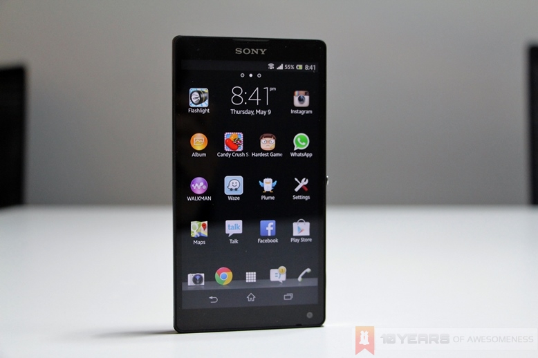
Marking the revival of its ailing mobile division, Sony went loud by launching not one, but two flagship smartphones that pair elegant design with high-end specs – something previous Sony smartphones have failed to do. I saw – and came away impressed – with the more expensive Xperia Z earlier this year, and our review left us excited for what’s to come in future Sony smartphones.
However, the Japanese company also has the Xperia ZL, the little brother of the Xperia Z. Shedding the glass back and water and dust resistance rating, Sony has also packed in some features on the ZL that is not found on the Z. Crucially, the ZL is priced significantly lower than the Z, and is one of the most affordable premium smartphones in the market. Is this the ace up Sony’s proverbial sleeve?
Review continues after the break.
First Impressions
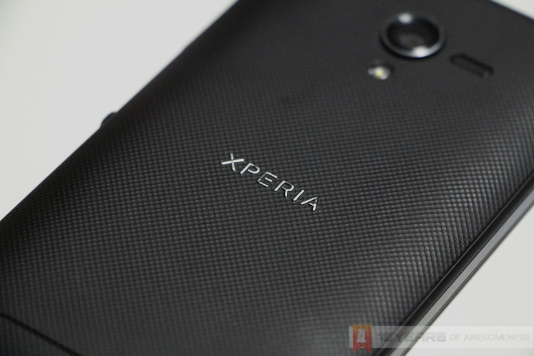
As Sony’s more affordable premium smartphone, the Xperia ZL has a less expensive look to the device, with the classy glass back on the Xperia Z replaced by a matte plastic back cover on the Xperia ZL. In my earlier preview I touched on the fact that the Xperia ZL has a smaller footprint compared to the Xperia Z; Sony also markets the Xperia ZL as “the most compact 5″ smartphone” in the market. Interestingly, the Xperia ZL is roughly the same size as the 4.7-inch LG Nexus 4, despite the larger screen. And, I found the ZL a lot more comfortable on the hands compared to the Z.
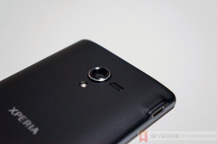
There are several factors behind this. The shorter and slightly thicker ZL makes the device a lot more comfortable to use for long periods, and the textured matte plastic back gives plenty of grip. Compared to the angular edges of the Xperia Z, the Xperia ZL’s gently curved sides melds effortlessly to the palm, similar to the HTC One and HTC Butterfly. It may not look as classy as the Xperia Z, but the ZL offers a more practical alternative.
Hardware
The Sony Xperia ZL shares similar hardware to the Xperia Z, with the exception of the water and dust resistance. On the other hand, the Xperial ZL adds two other features not found on the Z. The first is a dedicated camera shutter button, which should appeal to the camera enthusiasts, while the other is an IR blaster that allows users to use their Xperia ZLs as a remote control for TVs and home entertainment systems.
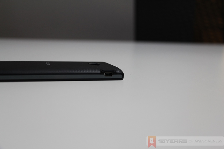
Due to the lack of dust and water resistance, all ports on the Xperia ZL are left exposed – which is more of a good thing than bad. After repeatedly opening and closing the flap covering the microUSB port and audio jack on the Xperia Z, the flaps soon became more difficult to fully close – not to mention how cumbersome both processes become after a while.
Software
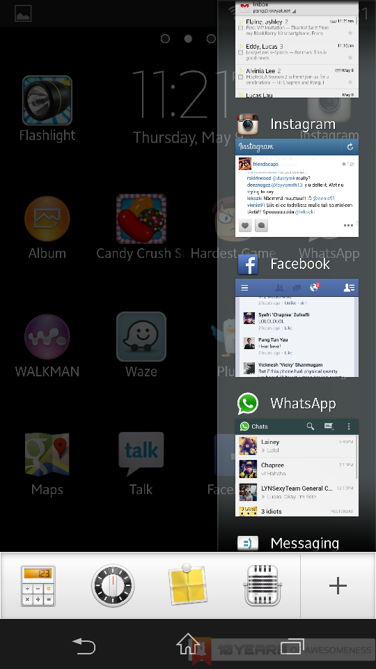
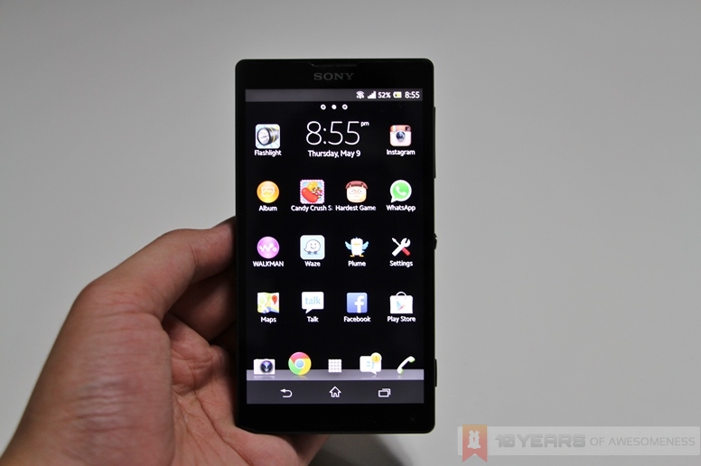
Once again, just like the hardware, the Xperia ZL’s software is an exact clone of that in the Xperia Z. The minimalist UI skin on top of Android 4.1.2 is a lot easier on the eye than the others in the market. In addition, Sony’s other features on the Xperia Z and ZL offer great user value. Software tweaks such as the Small Apps, which opens mini applications such as a calculator or note-taking app on top of any other app, is a smart addition to the Android skin. Sony’s attention to detail is also very apparent, with the toggle boxes taking after the iconic power/unlock button of the phone – subtly unifying hardware and software.
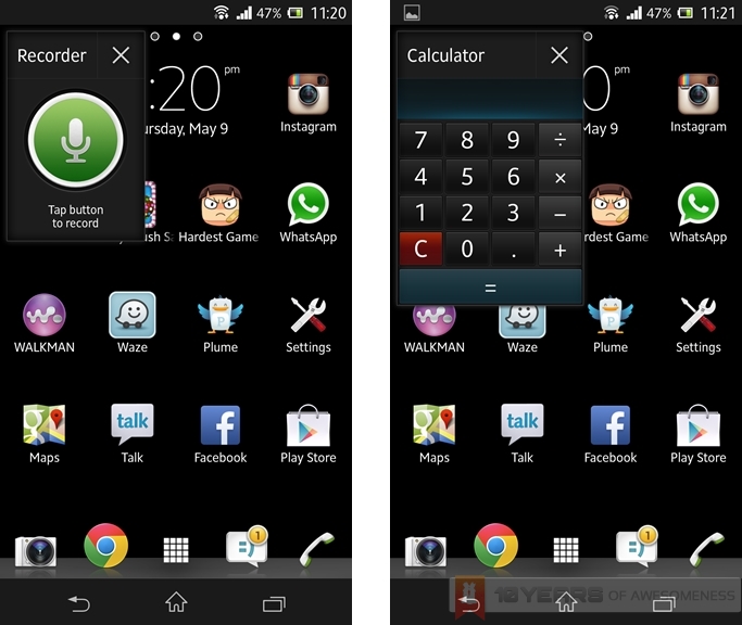 Sony’s UI skin also adds the Small Apps feature, allowing users to open mini apps on top of any app.
Sony Mobile has also paid plenty of attention to tweaking the power management on both the Xperia ZL and Z. The Full HD screen and top-shelf specs were always going to draw lots of power, so the inclusion of power saving features such as Stamina Mode is a welcome addition. Also, there is also the “Location-based WiFi” feature, which automatically turns on the phone’s WiFi connection when it is in range of a saved WiFi network, thus saving more power by not having the device constantly searching for open WiFi connections.
Unfortunately, despite the addition of these tweaks that add user value, the UI skin as a whole feels…for lack of a better word, unfinished. Opening the camera app, for example, takes about a second or two – and longer if opened via the lockscreen shortcut. Speaking of which, I faced a very interesting issue when opening the camera app from the lockscreen shortcut: opening the gallery via the camera UI will lead me back to the lockscreen. Unlike other bugs, this was persistent and occurred repeatedly before magically disappearing a day or two later.
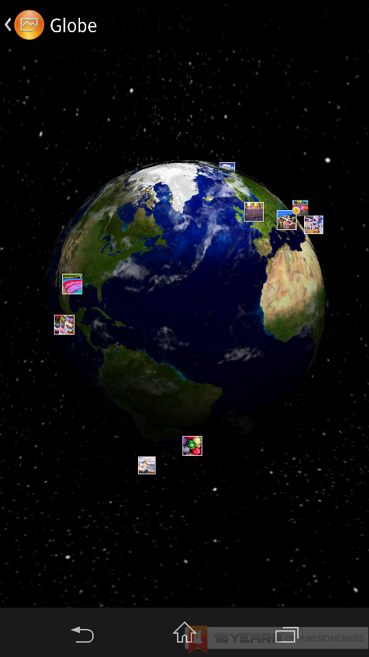 The Globe View in the Gallery allows users to view their geotagged photos from a 3D globe view.
Other instances regarding the software such as lag when switching between home screens and, in some cases, in and out of apps, can be a frustrating affair – leaving the impression that the software and UI could have been worked on a little bit more for better optimization.
Battery Life
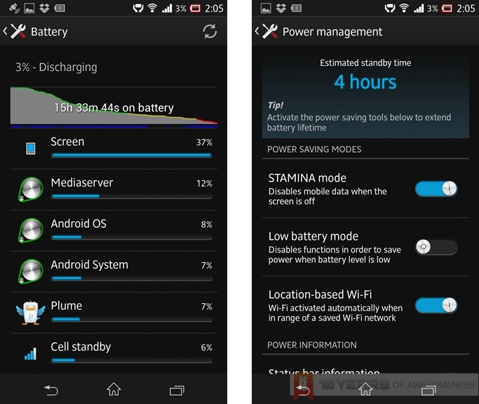 Battery life on the Xperia ZL with Stamina Mode on.
The Xperia ZL is packed with a 2370mAh battery which, strangely enough, is marginally larger than that on the Xperia Z (2330mAh). However, the TFT screen’s power-hungriness is a big factor behind the device’s rather disappointing battery life. A usual work day scenario will drain the battery from 100% to 25% in around 8 hours – pretty low for a high-end device.
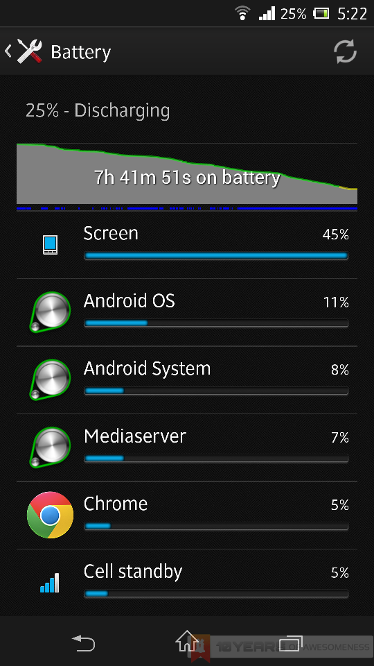 Battery life on the Xperia ZL with Stamina Mode off.
On the other hand, Sony’s power management tools come to good use in this case. The Stamina Mode feature, which kills off all background connections save for apps whitelisted by the user, greatly improves battery life. With Stamina Mode on, I managed close to 16 hours of use – more than double what it is without Stamina Mode.
Display
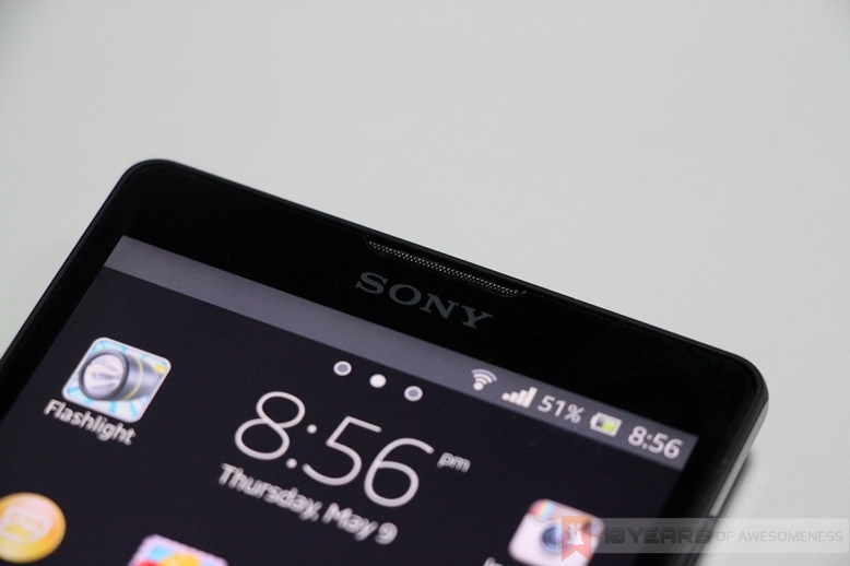
Like the Xperia Z, the Xperia Z packs a 5-inch Full HD TFT screen, protected by a scratch-resistant and shatterproof glass. They both also feature what Sony calls an Opticontrast panel, where the touch sensor is built into the LCD display. The display is also boosted by the Mobile BRAVIA Engine 2, for increased colour contrast and overall visual enhancements. While they sound good on paper, the results are a mixed affair.
While the screen is generally good, viewing angles on the Xperia ZL is very much a letdown, with colours badly washed out when viewed off-centre. Screen brightness could also be better, and the automatic brightness setting is too aggressive, which meant that I had to disable it and manually setting the proper brightness for the screen – which would naturally draw more power.
Audio
Sony drew upon its Walkman expertise to improve the audio experience for the Xperia Z and ZL, and while the Z may not have performed well in that aspect, it is – oddly enough – not the case with the Xperia ZL. The xLOUD audio enhancement software is not a gimmick: the sound coming from the small mono speaker is remarkably loud. Not only that, it manages to retain audio fidelity rather well, too. Of course, the sounds will break at higher volumes but it is fair to say that the audio quality on the Xperia ZL is a pleasant surprise.
Camera
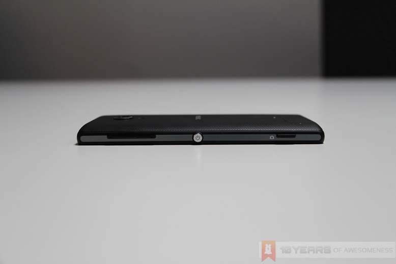 The Xperia ZL also sports a dedicated camera shutter button that is not found in the Xperia Z.
One aspect where Sony pushed hard in its marketing for the Xperia Z and ZL is in the company’s new 13MP Exmor RS sensor, with the powerful Intelligent Auto feature that dynamically switches modes on on the fly depending on the subject. There’s even a HDR Video mode, a first for smartphones.
 The powerful Qualcomm Snapdragon S4 Pro quad-core processor is able to render the various scenes available for the Xperia ZL camera in real-time.
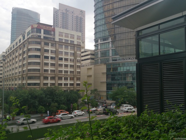 Outdoor sample shot (open in new tab for full-res image)
 Indoor sample shot (fluorescent lighting with no flash) (open in new tab for full res image)
Unfortunately, this is where the Xperia ZL disappoints again. As noted by Chapree in our Xperia Z review, images captured by the camera look amazing when viewed on the Xperia ZL’s Full HD screen, but the moment they are viewed on a larger screen – regardless of screen resolution – it is apparent that the images shot on the Xperia ZL is absolutely nothing to shout about. Daylight shots are sometimes washed out, while low-light images can be a torrid affair. (Find out how the Xperia ZL fared in our little smartphone camera shootout here.)
Competition
In April, there were only two devices bearing 5-inch, Full HD screens: the Xperia Z and HTC Butterfly. In the space of one month, that number has doubled to four with the addition of the Xperia ZL and the new Samsung Galaxy S4. Among the four, the Galaxy S4 boasts a more powerful set of hardware, and numerous software enhancements. On the other hand, Samsung retains the questionable build quality on the Galaxy S4 with its shiny plastic body.
The HTC Butterfly has also seen a price drop recently to RM2099. However, like the Xperia ZL and Z, it also suffers from software-related niggles that disrupt the user experience. Finally, the Xperia Z somewhat justifies the RM2188 price tag by having IP55/57 dust and water resistance which could be perfect to a specific market.
Conclusion
Sony’s decision to launch the Xperia Z and ZL concurrently is rather puzzling. Most of its marketing hype was to the more expensive Z, before they finally shifted the attention to the more affordable alternative much later. By that time consumer attention had already been diverted to Samsung and HTC’s new flagship devices, the Galaxy S4 and the One.
However, the biggest thing going for the Xperia ZL is the fact that it offers high-end specs at a price that is palatable to the masses. Also, the ergonomics of the device, for me at least, is a lot better than the Xperia Z.
Unfortunately, after using the device for close to a month, I can’t help feeling that the Xperia ZL could have – and probably should have – been a lot better. Regardless, it marks a significant step in the right direction for the Japanese company, as it attempts to wrest some market share in an ever-competitive Android OEM ecosystem.
Follow us on Instagram, Facebook, Twitter or Telegram for more updates and breaking news.


