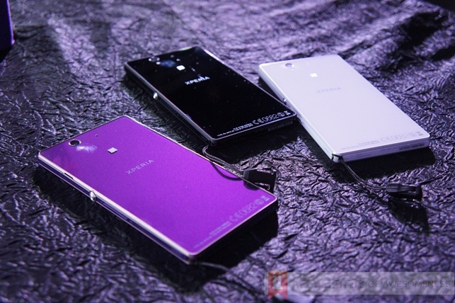
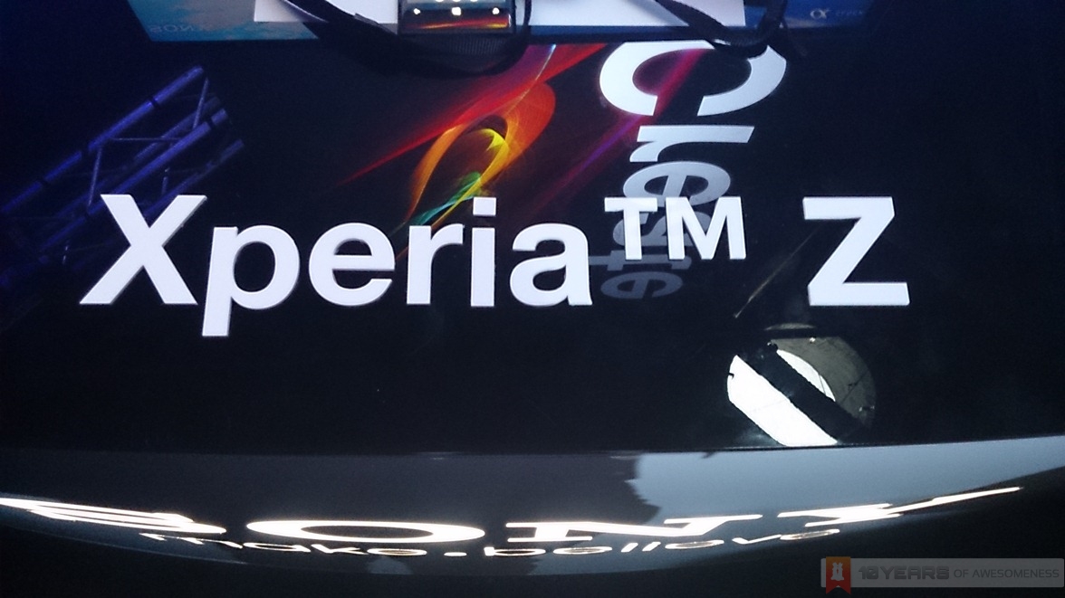
At the regional launch event for Sony’s latest flagship, the Xperia Z, we had some quality time with the prototype devices that were available during the event. At the moment, these devices are only prototypes as the software side is still being worked on for some bug fixes. On the outside, however, what you see here will be the final product.
Head on after the break for our quick encounter with this handsome device.
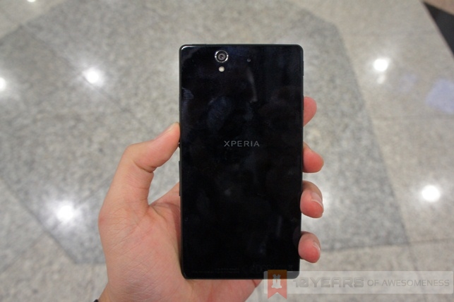
Having spent some time with LG’s Nexus 4 by Google last week, the first thing we noticed about the Xperia Z was the similarities between it and LG’s Nexus effort with regards to the back of the phone. Both phones feature glass-backed, minimalist approaches in terms of design – although the Nexus 4 has some pretty cool patterned gold design that reflects light in different angles, and the Xperia Z goes for a more traditional black.
The camera placement is similar too, as is the location of the Nexus/Xperia branding. However, with the Xperia Z’s large chassis, the back does feel a little plain, minimalism aside.
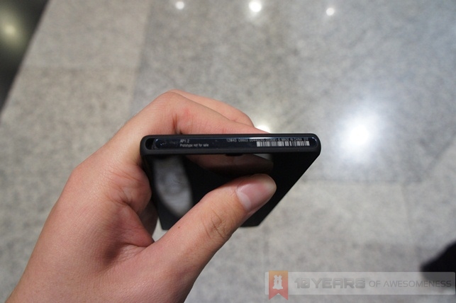 The bottom of the Xperia Z, which includes the words “Prototype Not For Sale”
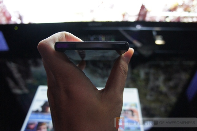 The top of the Xperia Z has a sealed port for the 3.5mm audio jack
Perhaps the understated back is part of the Xperia range’s new design language. Back in 2011 Sony’s Xperia Arc had an amazing design language which was supposed to set the company’s products above the competition, but unfortunately stumbled along the way. However, we’re really hoping that this new Xperia design language, called OmniBalance, will stick on for the next Xperia devices, because it is very handsome indeed.
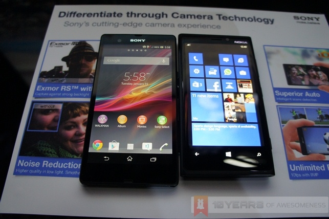
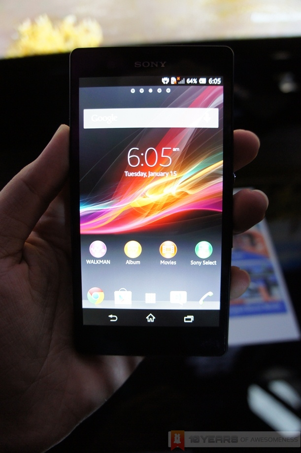
Featuring clean lines and curved edges, the Xperia Z is easy on the hands despite the large frame. It is also surprising to note that due to the slim bezels, the Xperia Z is only slightly larger than the Nokia Lumia 920, which has a screen that is 0.5 inches smaller.
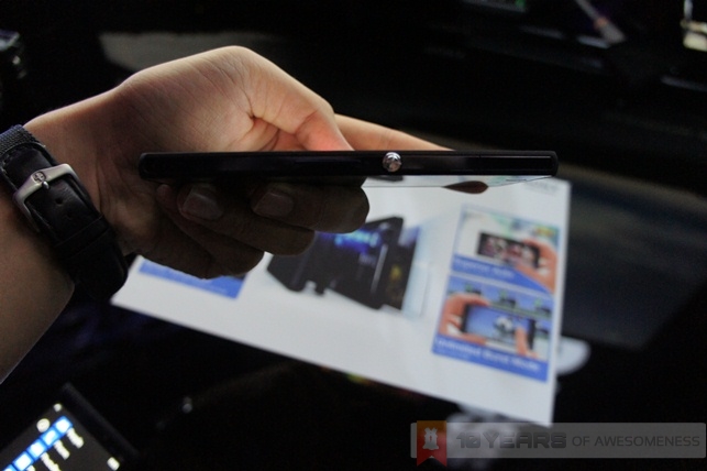
Along the borders of the phone, there is a matte finish that breaks the monotonous, all-black outer shell. And, sitting proudly – and very shiny – on the middle of the right side of the phone is the power button, which literally stands out both aesthetically and physically. The shiny metallic button juts out slightly from the chassis, more than usual buttons on smartphones. As a result, the power button is easy to locate, even when you’re not looking at the phone.
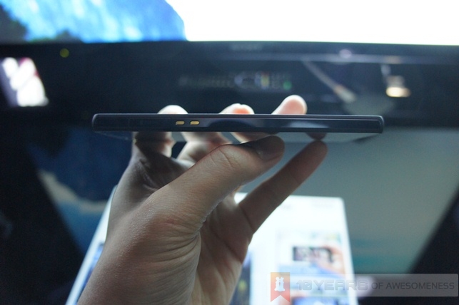
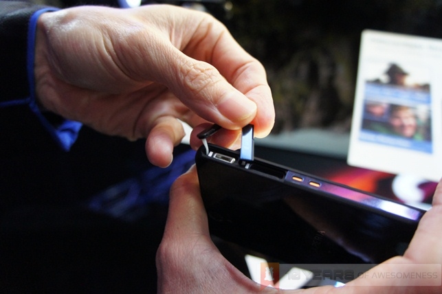
As a smartphone with IP55/57 rating for water and dust resistance, all the Xperia Z’s ports are sealed. This includes even the 3.5mm audio jack as well as the microUSB charger, which will be a big hassle for many. To overcome this, Sony has an optional charging stand which charges the phone via contact with the two gold plates as seen in the photo above.
Also immediately noticeable when the phone is unlocked is the display. Sony’s expertise with its Bravia TVs is evident here on the Xperia Z. The Mobile Bravia Engine 2 results in crisp and clear reproduction of images at all times.
It must also be noted here that the glass surfaces on both the front and back of the Xperia Z is not Gorilla Glass. Instead, Sony used tempered glass on the Xperia Z, which the company says is both scratch-resistant and shatterproof.
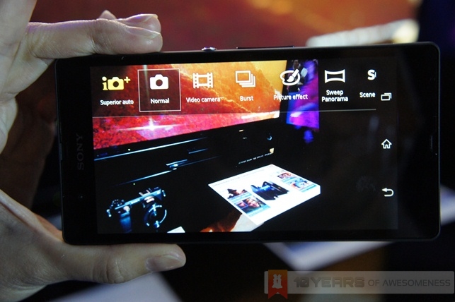
One of the more impressive features of the Xperia Z is the new 13MP Exmor RS camera. Besides a host of new scene modes, the Xperia Z’s camera sensor has a powerful Superior Auto mode, which dynamically changes scene modes as the camera is moved around. This way, the sensor is able to select the correct mode and lock focus faster, resulting in better overall image quality. Being in a low-light environment, we thought that the Lumia 920 was unmatched due to the OIS tech, but we found that generally, images shot on the Xperia Z is better than on the Lumia 920.
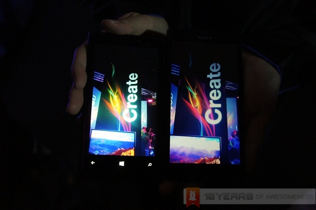 A quick sample shot taken with the Lumia 920 (left) and Xperia Z (right)…
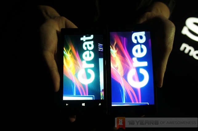 ...and the 100% crop of the images.
And finally, a quick sample image snapped from the Xperia Z (resized):
We’re not done yet with the Xperia Z, so stay tuned to Lowyat.NET for more!
Follow us on Instagram, Facebook, Twitter or Telegram for more updates and breaking news.


