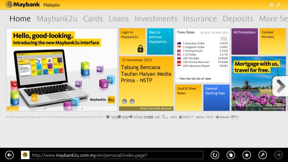
With a design that looks pretty similar to Windows 8 user interface, Maybank recently have deployed a brand new UI for Maybank2U which is one of the most popular online banking service in Malaysia. While the Live Tiles-like design looks pretty good in general and is aligned with the bank’s official website, the release of the new UI doesn’t seem to go very smooth for Maybank.
A general observations on their Twitter feed and Facebook page showed that there are no short of complaints from users regarding Maybank2U new design. Most of the complaints revolved around the slow loading speed of the site which I experienced it myself.
Hours after the rollout, the bank finally reverted back to the old Maybank2U interface just less than an hour ago and all things are fine in this world once again. So far, Maybank didn’t mention any specific details behind the performance issues of the new site but we do hope they will be able to rectify all of them before deploying the new UI once again.
Follow us on Instagram, Facebook, Twitter or Telegram for more updates and breaking news.


