The runaway success that was the Samsung Galaxy S III, the Korean company’s flagship Android smartphone of 2012, was one of the defining moments for the Korean giants. Naturally, the challenge for Samsung was to build a worthy successor for 2013. The question was, how do you improve one of the top Android smartphones of its time?
For Samsung, it was largely this: make it bigger, make it more powerful, and pack it with every single software feature its engineers can think of – and then some.
With a slew of sensors and suite of apps, Samsung is calling its latest Android flagship, the Galaxy S4, as a “life companion”. On a recent assignment in the UK for Samsung Premiere 2013, I requested to use the Galaxy S4 – which we previewed a while back – as my daily driver as part of the review. Find out how my temporary life companion fared after the jump.
First Impressions
Cheap. Boring. Uninspired. Plasticky.
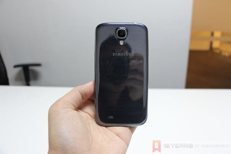
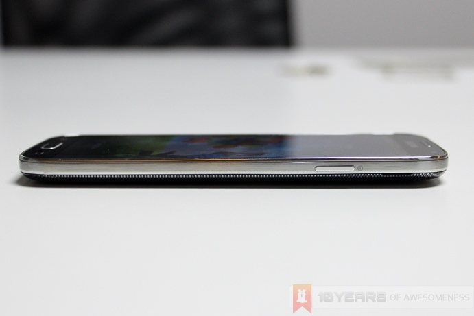
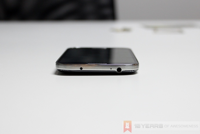
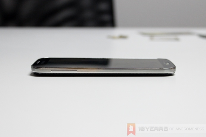
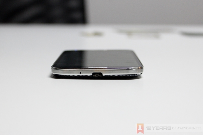
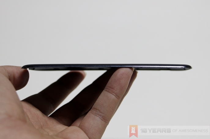
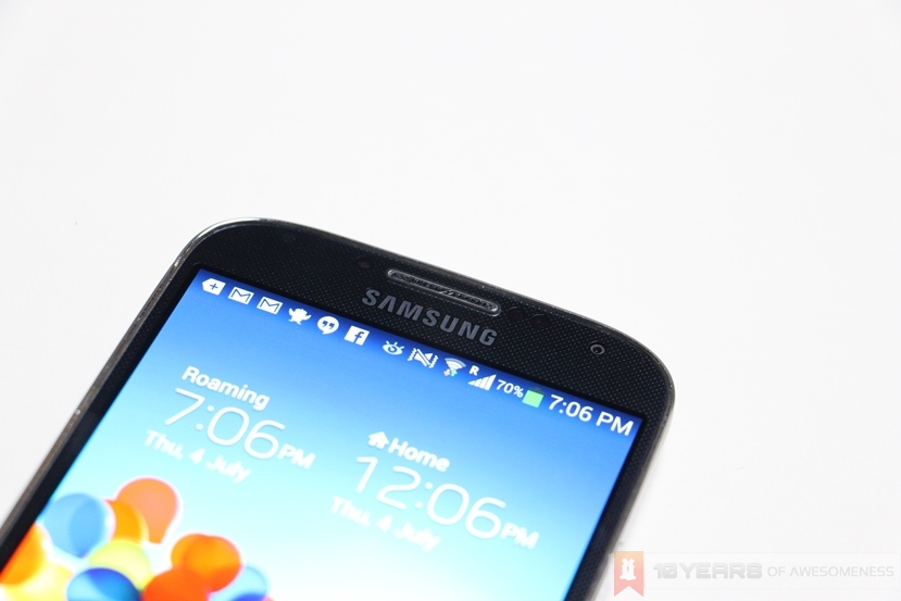
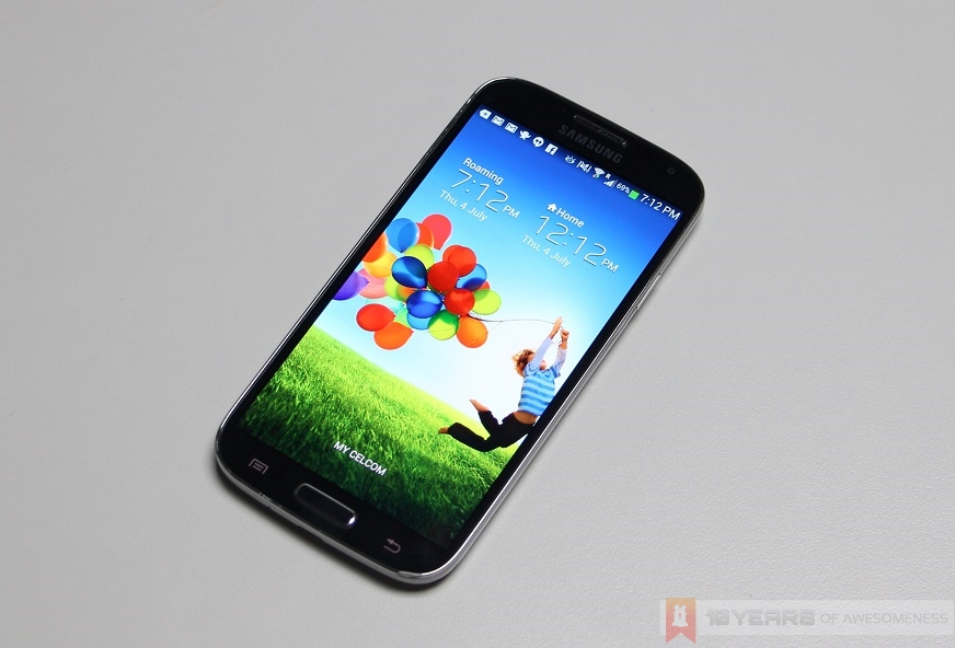
Call it what you want, but the Galaxy S4’s design is a massive letdown. Let’s start with the design. Some may call it a design that works; after all, the Galaxy S4 is almost a carbon copy of the Galaxy S III – which sold more than 30 million units worldwide. Samsung even manages to make the S4 both thinner and lighter than the S III, while packing exponentially greater hardware into its chassis.
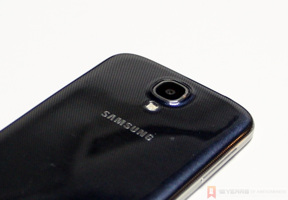
Theoretically, that should make the S4 better, but there isn’t a fine line between a design language and copying lock, stock and barrel. Samsung’s designers, despite what they might say, were definitely lazy in designing the S4. Nokia’s Lumia line are distinctly different among them, but are immediately identifiable by their shared design DNA. Take one look at the Galaxy S4, and you’d be hard pressed to find any visual indication that it isn’t the Galaxy S III.
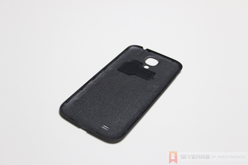
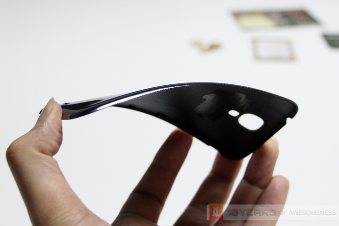
On top of that, there’s the sensationally cheap-feeling materials used for the body of the Galaxy S4. Polycarbonate plastic never felt so cheap on the hands, and Samsung manages to make the S4’s first impressions a lot worse with its choice of a faux brushed metal design on the sides, and a back cover that looks textured but is actually printed – making the S4 look even cheaper than it already is. The back cover, like the S III before it, is one of the flimsiest covers to be seen in a mobile device: it’s thin enough to be easily bent with one hand, and in no way inspires any sort of confidence that the S4 can take a beating in the long run. Indeed, the S4 scuffs very easily, and accidental drops results in very apparent dents.
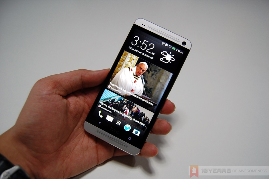
Samsung took a massive gamble by playing safe with the S4’s design – especially in light of the sexy, all metal HTC One, arguably the Galaxy S4’s biggest rival in the premium Android smartphone segment, and it’s safe to say that in this regard, Samsung could not have fluffed it up more.
Hardware
Software
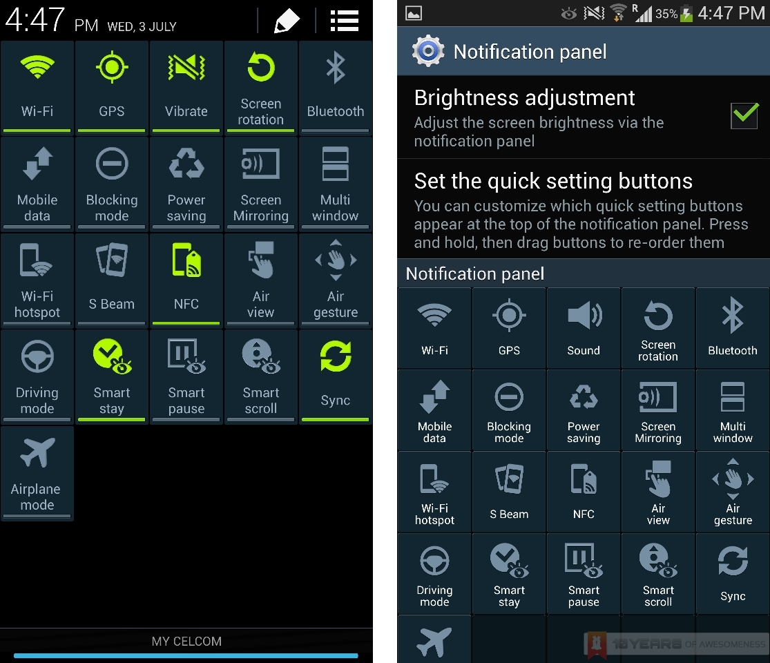
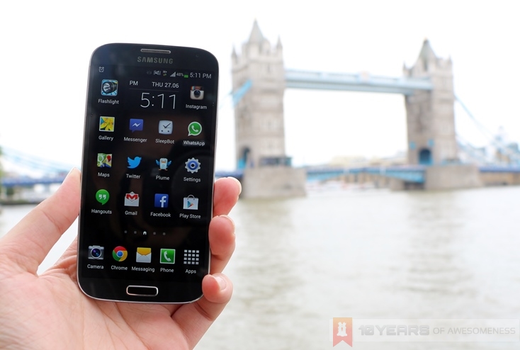
Things doesn’t get any better the moment I switched the device on. Aesthetically, the TouchWiz skin has never been the best: the dark blue/lime green colourway for the drop-down menu is jarring, while the “bloop bloop” sounds from the “Nature Inspired” S III makes a return here too. The revamped lock screen, with its Light Effect when you swipe the screen, does feel rather over the top – especially after the admittedly cool-looking animation began losing its coolness.
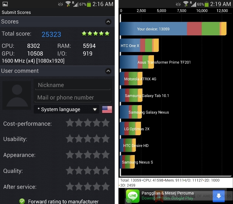
Samsung’s kitchen sink approach on the Galaxy S4 takes a toll on performance as well. With its range of rather gimmicky features bundled into the software, the Galaxy S4 suffers from an embarrassing amount of lag. Navigating through the home screens is sometimes a jittery experience, as animations are stuttered, and widgets occasionally crash. On top of that, the camera app is persistently slow to launch – if it doesn’t cause the device to hang: some tech journos received units that hung and rebooted each time they launched the camera app or Instagram.
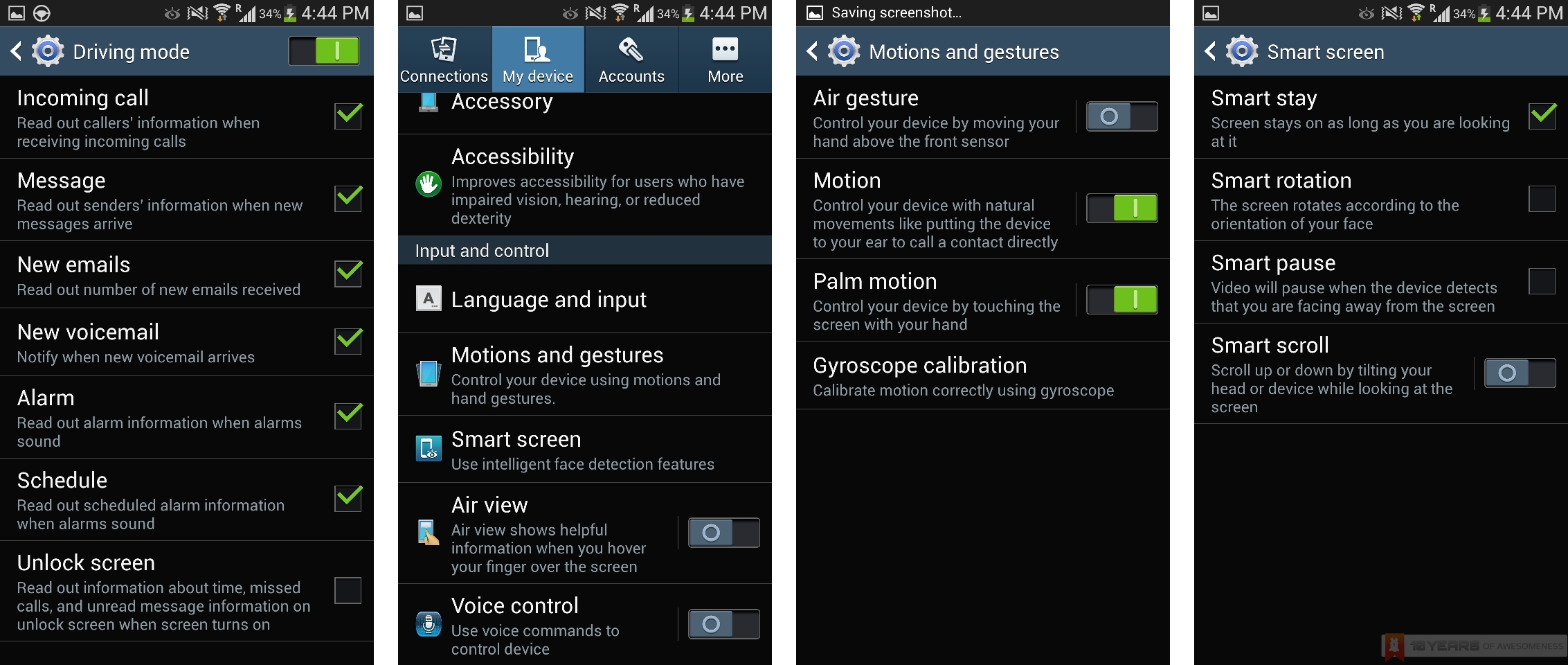
For all that they were hyped up to be, Samsung’s software features on the S4 were largely more gimmicky than smart. Smart Stay failed to keep the screen on most of the time, while Smart Scroll only works for a few of the Samsung apps. Smart Pause, which pauses a video when the user is not looking at the screen, seems to track the user’s face instead of the eyes; your head needs to not be facing the screen before the video pauses. Smart Scroll, similarly, seems to track the user’s head, and is extremely inconsistent. S Voice pales in comparison with Google Now and seems rather redundant. Air View and Air Gestures, while useful party tricks, offer little in terms of real-life use.
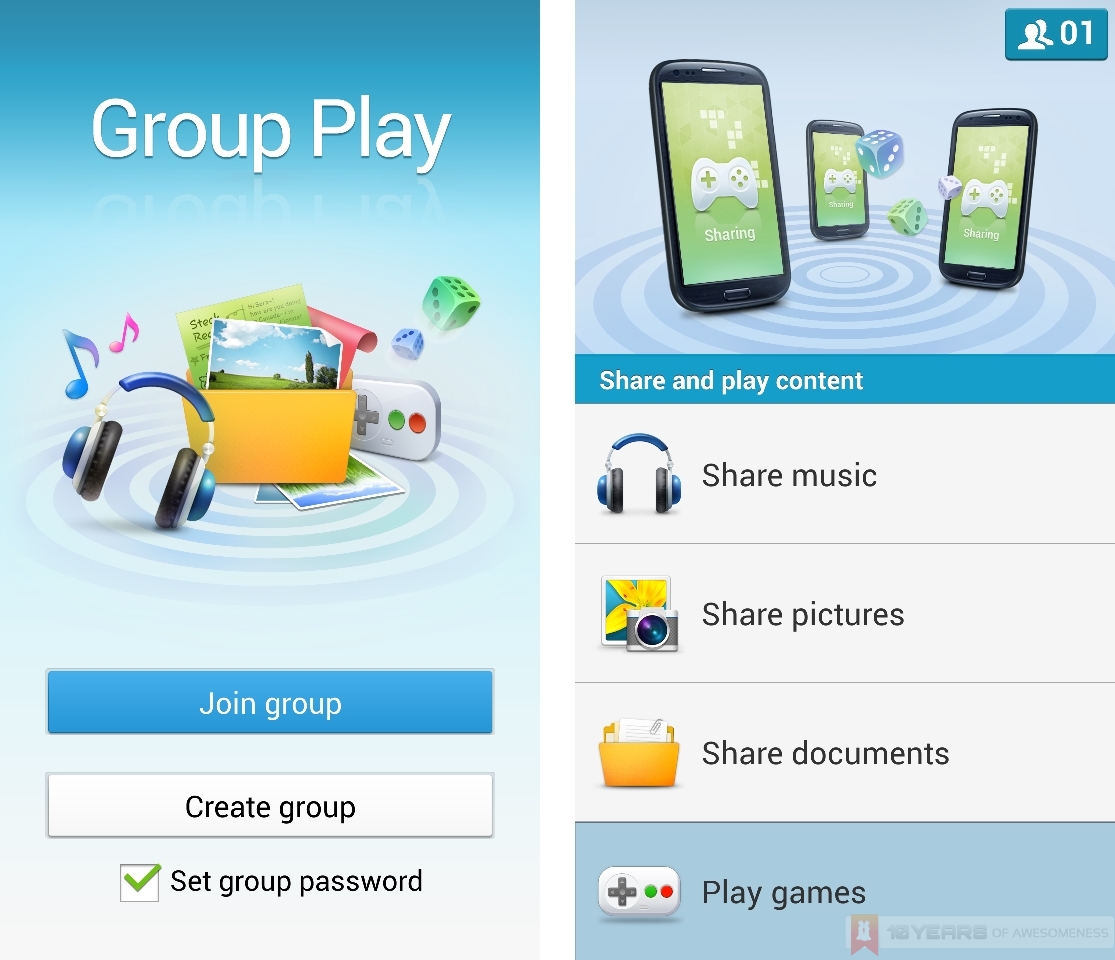
Interestingly, there was one feature that was, in my view, rather alarmingly miscued in its promotion. Group Play, as promoted by Samsung in their ads, lets nearby Galaxy S4 users share, among other things, music playback. In reality, I believe more Samsung Galaxy users will use Group Play as a quick mass file transfer app. Group Play sets up a WiFi Direct connection, where the user can share music, pictures and documents – as well as play multiplayer games – which can then be accessed by other users on the temporary Group Play connection (which is secured by a user-selected password). In an impromptu photo-taking session I was able to download multiple files shared on a Group Play connection between the GS4 and two other Galaxy devices without having to leave my seat to tap the other devices to connect via NFC.
The TouchWiz UI also occasionally rubs on the wrong side of Android 4.2.2. One of the additions of Android 4.2 that I use the most on the LG Nexus 4 is the widgets support on the lockscreen, where users can add widgets to the left or right of the lock screen in a manner similar to home screens. The Galaxy S4, which runs on the latest Android 4.2.2, supports lockscreen widgets that users can customize to launch either the camera or any of their favourite apps with just a swipe from the edge of the screen. Unfortunately, when users add a security PIN to unlock the device, the Galaxy S4 does not support lockscreen widgets. I tested this on the Nexus 4, and found my camera quick-launch widget to work perfectly despite the presence of a PIN request. The unadulterated Android OS was intuitively smart, too, as the gallery app will only display images taken in the current session (i.e. images shot after “bypassing” the PIN) and locks the others. The Galaxy S4, however, disables the quick-launch widget completely, unnecessarily sacrificing convenience for security.
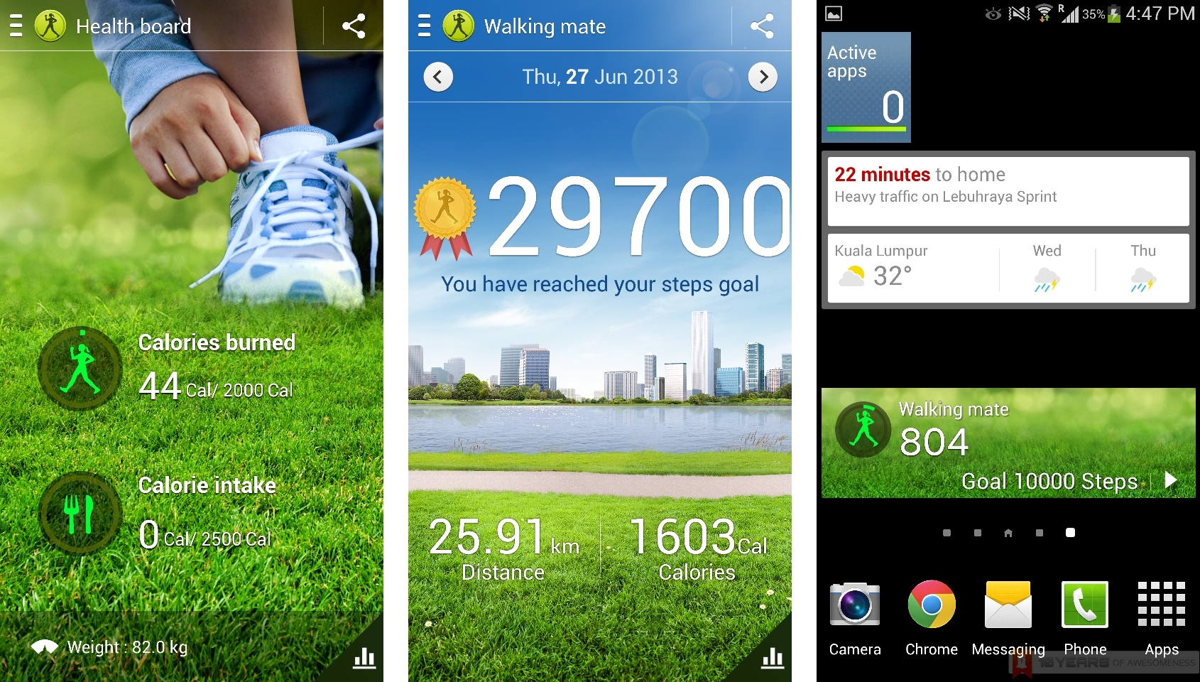
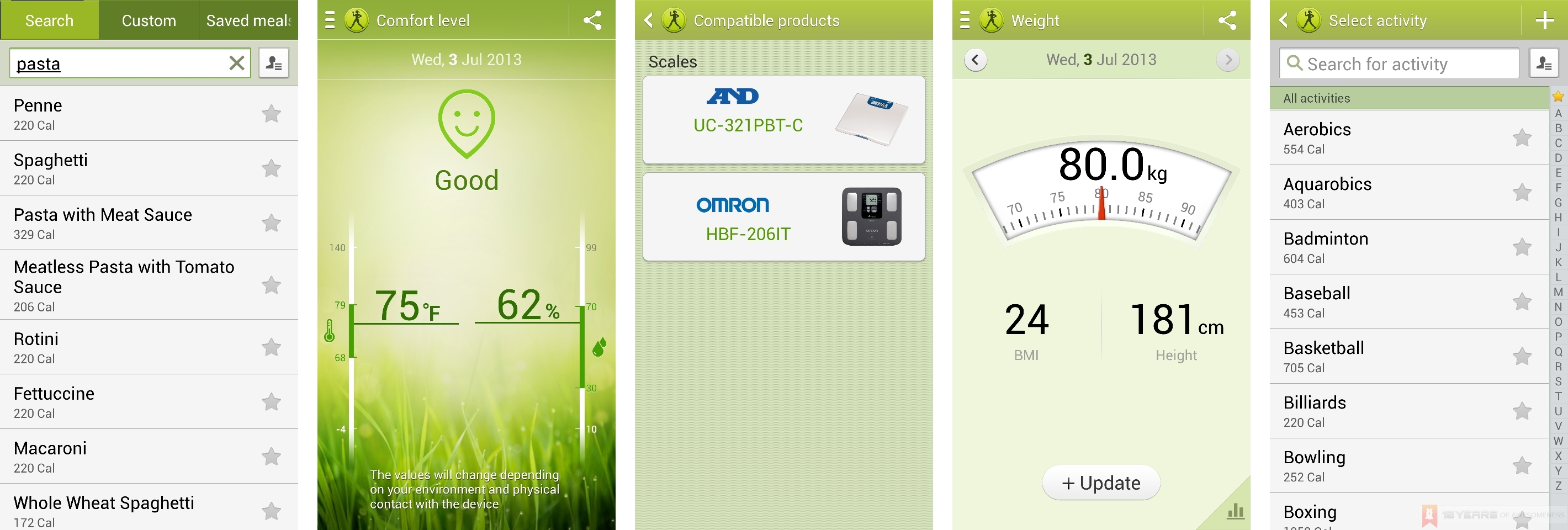
Just about the only software feature I enjoyed using the most was the Walking Mate app, which tracks the amount of steps the user has made using the built-in pedometer. Walking Mate is just one of the apps under the S Health suite, which also includes Exercise Mate, Food Tracker, and Comfort Level. Both the Exercise Mate and Food Tracker houses an impressive database of exercise activities and dishes, respectively, and lets users keep count of their calorie intake as well as calories burned from their workouts. The temperature and humidity sensors, meanwhile, power the Comfort Level app, which lets the users know of the conditions of the environment around the user. While at first glance, the S Health app seems rather unnecessary on a mobile device, I found myself launching the app more frequently or glance at the Walking Mate widget to keep track of how many steps I was taking, or the temperature of the surroundings, confirming my initial feelings about S Health having the potential to be a masterstroke by Samsung by catering to an increasingly health-conscious society.
As you can probably see, things are slowly looking up for Samsung’s hero device.
Battery Life
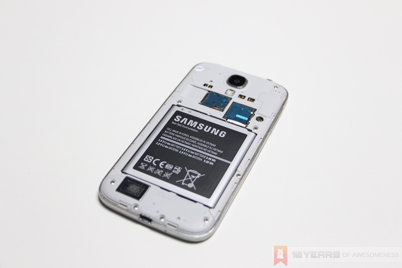
Samsung packed a large capacity 2600mAh lithium ion battery pack into the Galaxy S4, allowing it to power its impressive array of sensors that make it a life companion. Interestingly, the non-LTE model that I used (I9500) that runs on the Exynos chip appears to have a shorter battery life than the Qualcomm Snapdragon 600-running LTE variant (I9505) despite having similar battery packs.
While I did not have the LTE model on hand for a thorough side-by-side comparison, the GS4 I was using is more than capable at handling a standard day in the office. By the end of working hours, I often found that the battery levels were hovering around the 50% mark. In London, where I was on a 3.5G network and using the device intensively, a full charge would drop to about 40% in around four hours – but that’s with lots of use of the camera as well as Google Maps, as well as switching off most of the Smart features.
Display
Samsung packs a super gorgeous 5-inch (4.99 inches, to be exact) Super AMOLED screen on the Galaxy S4, with a Full HD resolution for a dense 441 pixels per inch. As with all S-AMOLED screens, colours are exceptionally punchy and sometimes borders on the over-saturated. It will not please the purists due to the rather unnatural colour reproduction, but the general consumer will love the punchiness of the colours on display.
The Galaxy S4 also does a good job with the automatic brightness settings, which often adjusts the brightness just right – and does so subtly as well. When in dark environments the Galaxy S4 gradually darkens the screen, unlike some I’ve seen which aggressively shifts to minimum brightness before hunting for the perfect shade.
Audio
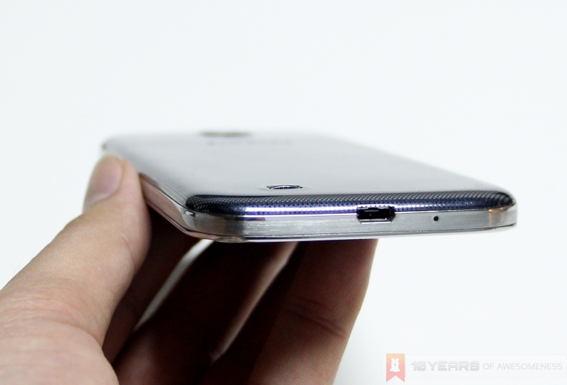
The Galaxy S4 shifts the location of the speakers from being next to the camera module on the S III, to the bottom left of the device. Just like the Nexus 4 (whose speakers are located on the bottom right), the speakers are almost always muffled by the user’s hand. Unlike the Nexus 4, however, the GS4 speakers are very loud for their size. While it’s no match for the stereo BoomSound speakers on the HTC One, the rear speakers on the Galaxy are very impressive.
In addition, the speaker grille also features a subtle hump, which prevents the Galaxy S4 from lying flat on the surface and muffling the speakers. As a result, audio output is noticeably louder when the device is placed on a hard surface.
Camera
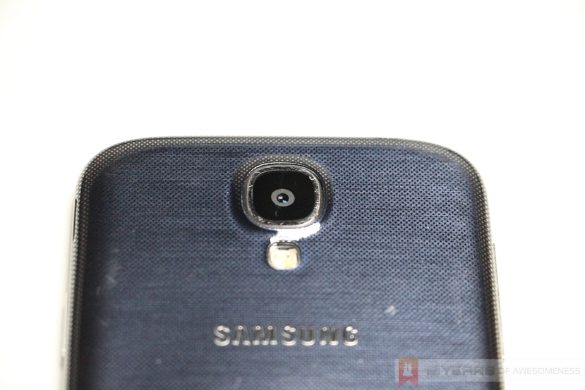
And so we come to the pièce de résistance of the Samsung Galaxy S4: the 13MP camera, packed with an array of features so powerful it takes a good second or two before it launches. At least, that’s what I tell myself every time I tap on the camera icon and wait for it to launch.
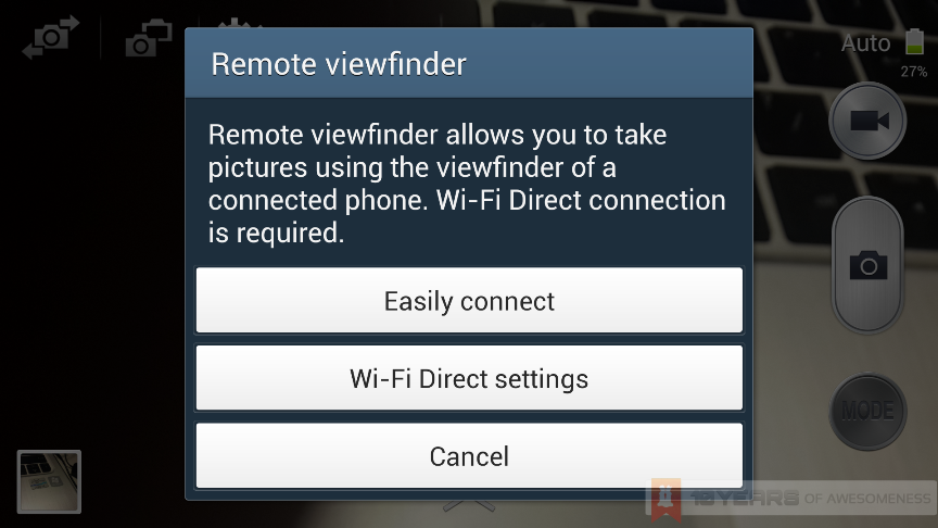
The 13MP rear sensor is the largest fitted by the Korean company on any of its smartphones, and sports 12 Smart Modes with pre-set settings for various shooting configurations and lighting conditions. The camera can also record in 30fps 1080p with digital image stabilisation while also snapping images simultaneously. On top of that, there is an auto night detection toggle, Dual Shot, Auto Share, as well as a Remote Viewfinder option with another smartphone connected via WiFi Direct.
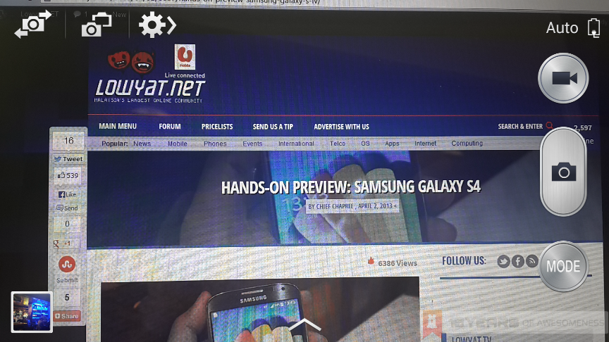 The UI of the Galaxy S4 camera app
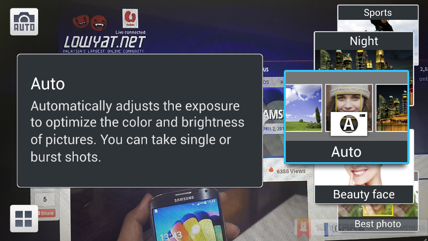 The Galaxy S4 camera app offers 12 Smart Modes for various shooting configurations
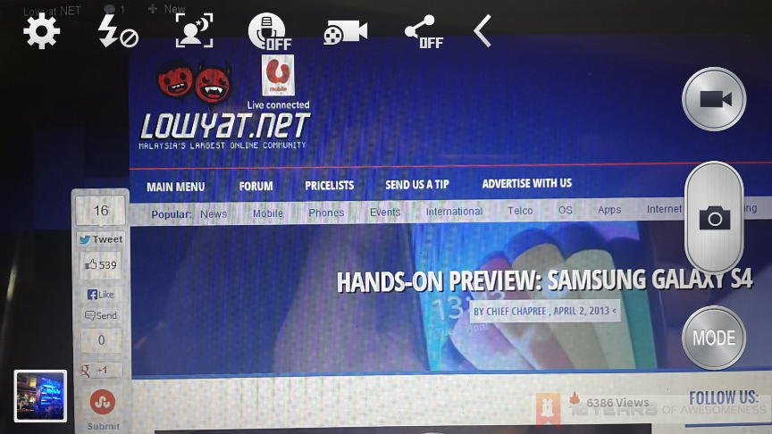 Expanded settings toggle on the top left, with more settings available by tapping on the Settings icon on the top left
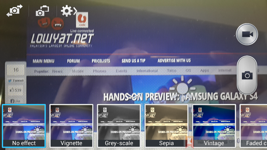 The powerful Exynos Octa chip renders the various filters in real time
At its core, though, the Galaxy S4 snaps very impressive images under good lighting, while the large megapixel count ensures that images are captured with lots of detail. Low-light shots are decent too, though it isn’t able to absorb as much light as the HTC One or the Lumia 920. While the UI can appear cluttered compared to stock Android, the various toggles allow for greater control over the features that the camera offers. Users can manually change ISO, exposure value, white balance and even set up voice control for the camera.
 Outdoors – Auto (Open in new tab for full-res image)
 Outdoors – Auto (Open in new tab for full-res image)
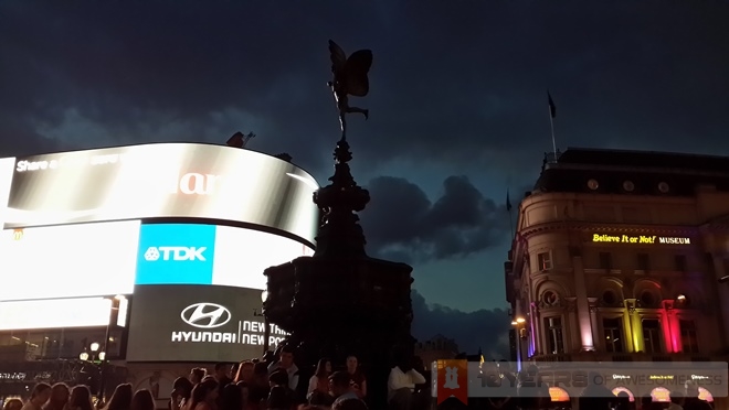 Outdoors – Night (Open in new tab for full-res image)
One of the features that Samsung promoted more prominently is the Dual Shot and Sound and Shot features on the Galaxy S4’s camera. Dual Shot snaps images on the front and rear cameras simultaneously, before superimposing the front camera’s image onto the rear camera’s shot. After some usage, it appears as if Samsung hyped the Dual Shot feature to be a lot more than it actually is. After all, the front and rear cameras will capture images with two different backgrounds, which makes the resulting superimposed image a little jarring on occasions. While I did use Dual Shot on several occasions, the resulting images are just not quite usable: I’ve got a stamp of my face next to the Big Ben – and both are about the same size, and another where my head is hovering over the Shankly Gates at Anfield. The concept sounds great – especially for the solo traveller (or the forever alone) – but the application of superimposing two different images onto a single image is simply…odd.
 Dual Shot (Open in new tab for full-res image)
 Indoors – Rich Tone (Open in new tab for full-res image)
 Indoor – Auto (Open in new tab for full-res image)
 Outdoor – Rich Tone (Open in new tab for full-res image)
Similarly, the Sound and Shot mode is another heavily-promoted feature on the GS4’s camera. Users can snap a shot while recording background audio for up to nine seconds after the image is captured. The keyword here is, of course, after. The Sound and Shot mode does not begin recording audio until after the image has been shot. For many occasions, it may not be a big deal, but imagine a scenario such as a singer at a concert about to hit a chorus, or even a product launch when the VIP proudly shows off the device for the first time – the timing needs to be just right. A better solution would be to allow users to record audio at any time before or after an image is captured, which then allows for greater creative applications of Sound and Shot. In addition, images taken with Sound and Shot cannot be viewed with the audio accompaniment anywhere else besides the Gallery app, further reducing the mode’s appeal.
Competition
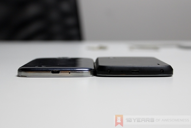 Samsung Galaxy S4 (r) and the LG Nexus 4 (l)
For a device with bleeding-edge specs and performance at a premium price tag, there are only two devices on par with the Galaxy S4 vying for the attentions of the deep-pocketed – and only one of them is an Android smartphone: the HTC One and the Apple iPhone 5. iOS users will not appreciate the lag that plagues the GS4 and just about every Android smartphone in the market, but a colleague who uses the iPhone 5 noted that the GS4’s Super AMOLED Full HD display is superior to the iPhone 5, and the camera offers plenty more options for customization.
However, the bigger battle here comes from Taiwan. The HTC One is just about every tech journalist’s choice whenever the GS4 vs HTC One question pops up, and perhaps rightly so: the HTC One offered LTE connectivity at launch, is light years ahead in terms of design and build quality, and actually attempts to innovate on the software side with the introduction of BlinkFeed. The one major point of contention of the HTC One, of course, is the UltraPixel camera which suffers from a noticeable lack of detail due to its low 4MP count.
Conclusion
The Galaxy S4 is a mixed bag of gimmicky features and pleasant surprises. Beneath the heavily-promoted software gimmicks, Samsung adds some unique features not to be found in any competitor device. For every Smart Scroll, there is an S Health that somewhat makes up for it. The camera produces some pretty amazing shots, and its HDR and Panorama modes perform better than any I’ve seen in competing products, but is slow to load and even crashes occasionally. Group Play is a particularly useful mass file transfer and real-time multiplayer app that is grossly under-promoted.
Was Samsung right, then? Is the Galaxy S4 fit to be labeled as a Life Companion? If you can bear the occasional lag, the heavy TouchWiz UI, and most importantly the all-round cheap feel of the device’s build, the Samsung Galaxy S4 is a compelling device that comes pretty close to being a life companion. Not a slick and classy-looking one, but a life companion nonetheless.
Follow us on Instagram, Facebook, Twitter or Telegram for more updates and breaking news.


