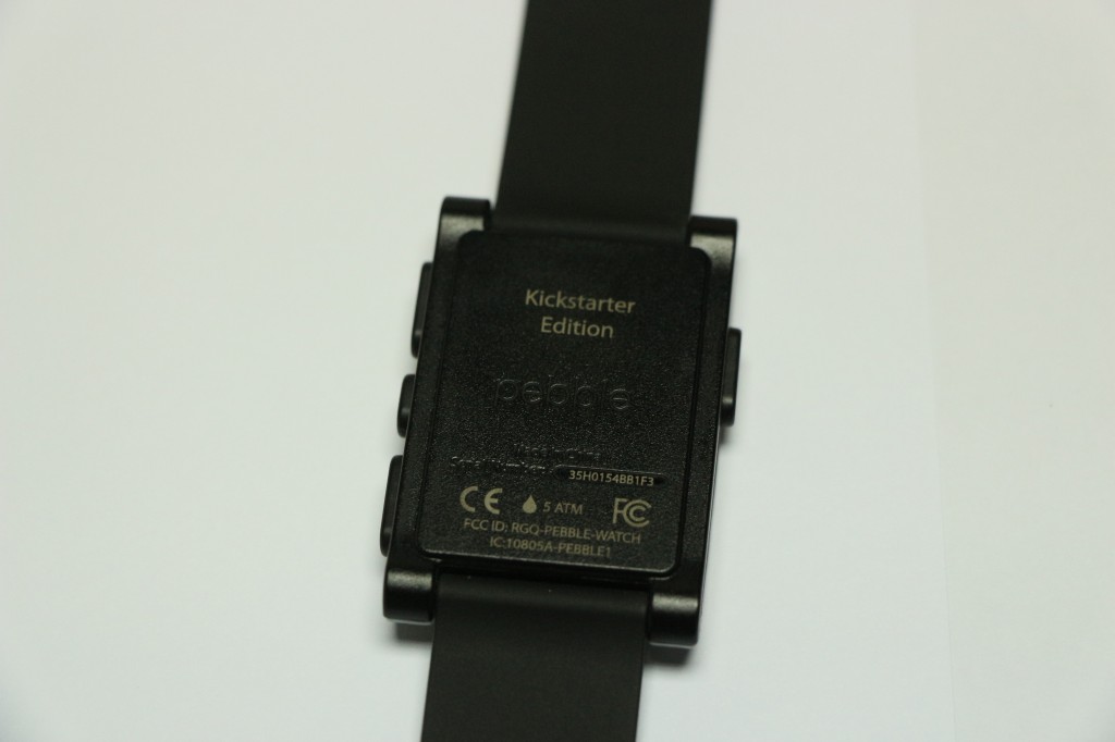
I probably should begin this review by stating the obvious. Pebble has been around for a while now. However, my grey version was one of the last to be shipped; but more importantly, it arrived just in time for the announcement that Pebble is available at Best Buy. Not that it matters to a country with no Best Buy.
There is a certain minimalist approach to the packaging. There isn’t much printed on the outside of the box, even the name of the device only appears on the bottom of the box. Filling the box is just the Pebble, and a charging cable (I appear to have misplaced mine already). Which made for one of the shortest unboxing videos ever made.
Review continues after the break
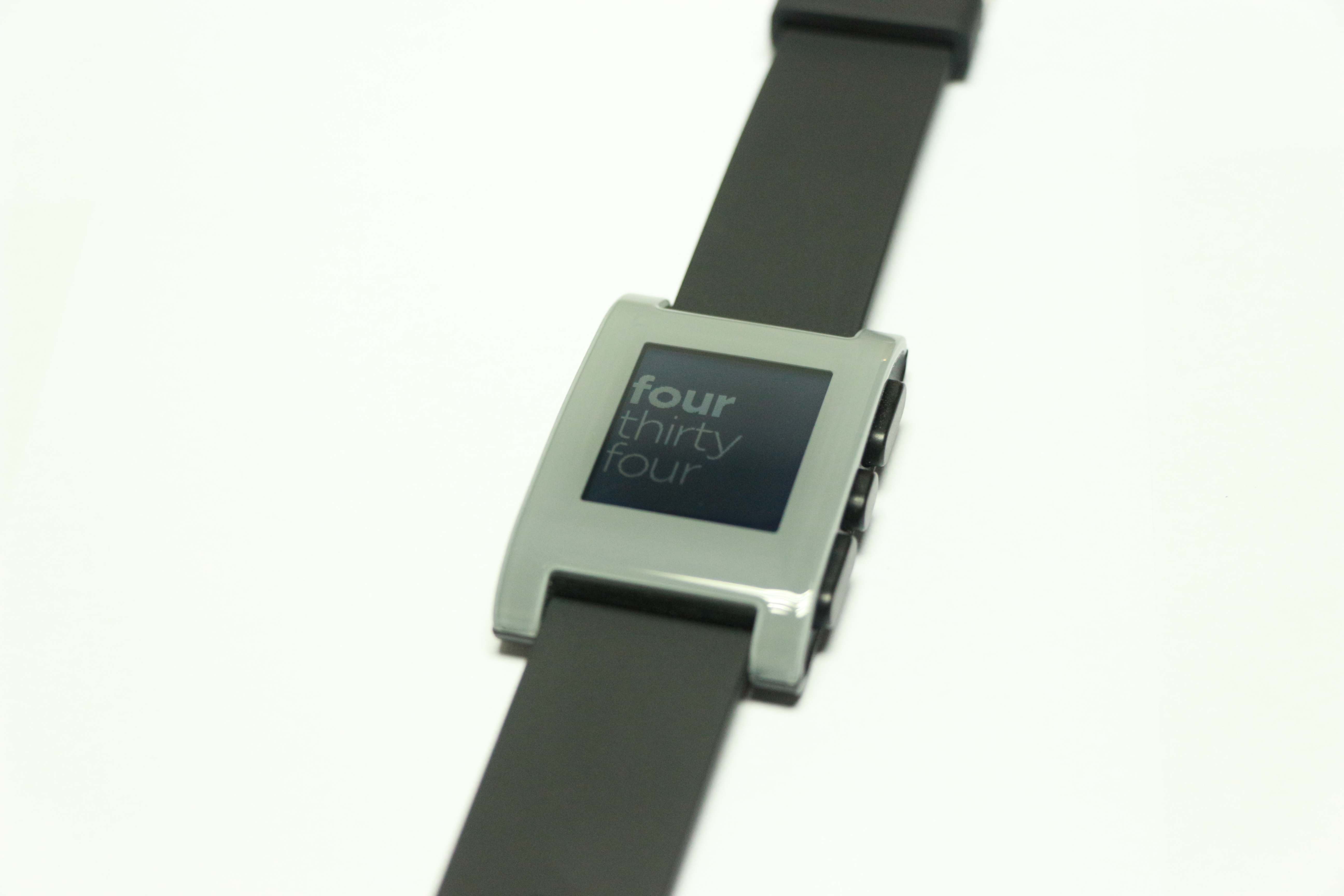
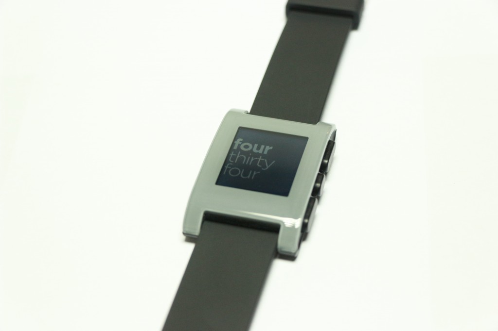
Are watches supposed to look like this now? Plastic is a fantastic material to build with, provided that one is speaking about the detail quality of tabletop miniatures. It looks a little less impressive when put on the face of a watch. Still, it isn’t the worst offender of the tech market. And it has a little homemade charm to it (I could be a little biased towards Kickstarter startups).
Grey may not have been the optimal choice of colour though.
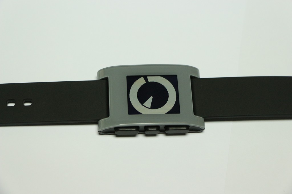
Four buttons grace the smartwatch, and allow quite a bit of control over its limited functions. If anything, these buttons may have been built a little too sturdy. Pressing anything requires a bit more force than is usual for modern electronics. Admittedly, this does prevent one from accidentally rejecting calls.
Initial specifications called for an e-paper screen; which is apparently different from e-ink. It’s pretty much just a backlit LCD screen. Go figure. Displaying at a resolution of 144 x 168 pixels, it does what it needs to do. Font size can be adjusted between two whole settings. I stuck with the larger version because it allows me to read messages with a discrete glance at the watch. Just like casually checking the time. Not at all being impolite by checking my phone every 15 minutes.
The constant vibration from incoming messages can get annoying if you’re trying to concentrate on something; like say, write a review of the Pebble. Oddly enough, muting a conversation in Whatsapp does not stop the watch from informing you about incoming messages. Vibrating alerts can be turned off, for those moments when a vibrating watch proves too distracting.
As far as customisation goes, Pebble doesn’t actually have many apps. At least not on the official store. The official apps are mostly elaborate watch faces. Not all of which are readable; naturally, I gravitated to those. Because they looked the coolest and most abstract. It tells the time, give or take five minutes.
Unofficially, there is quite a bit more you can do with the pebble. Some games even exist, although it would be quite embarrassing to lose a chess match to your watch (I have no comment on the matter). Controls are what you expect it to be, clumsy and difficult to coordinate. More importantly, you probably own a smartphone so why aren’t you playing games there?
As a first generation smartwatch, Pebble does what it needs to do. Is it worth the amount you’re paying for it now? Yes, but only if you love technology. Otherwise, just wait to see if the whole thing catches on.
Follow us on Instagram, Facebook, Twitter or Telegram for more updates and breaking news.


