Last week, Nokia Malaysia launched its latest budget smartphone, the Asha 501. Powered by the new Asha Platform operating system, the Asha 501 further blurs the definition of a smartphone, bringing smartphone-like features to ever lower price points. At RM299, this phone may very well be one of this year’s success stories of the industry.
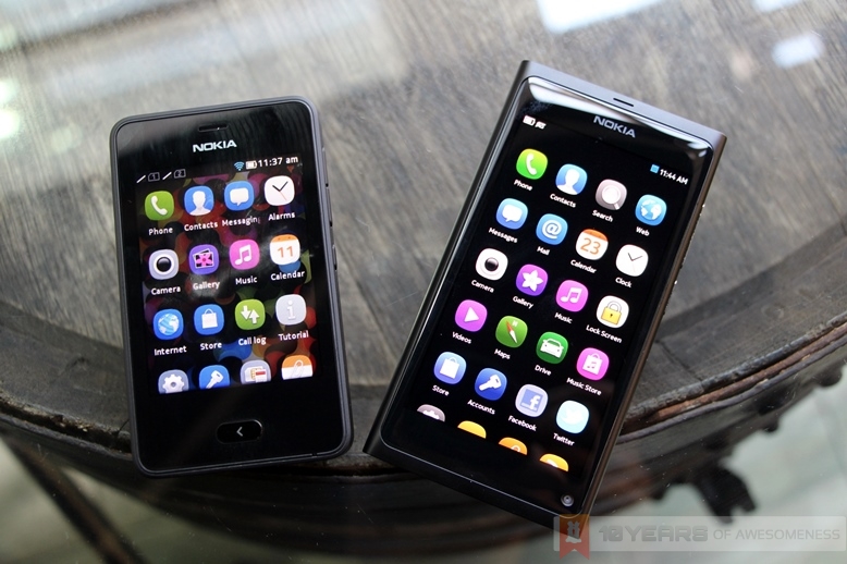
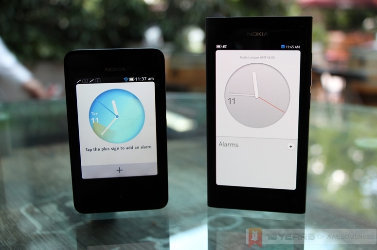
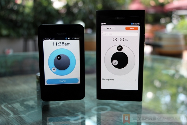
Part of the reason behind the elevated interest in this budget device is in the user interface Nokia has furnished the Asha 501 with. Boldly going away with the bland UI on the Series 40 OS, the Asha 501 sports a very, very similar UI to Swipe, the much-lauded interface only seen in the company’s forgotten child, the Nokia N9. Nokia themselves has mentioned that the Asha Platform’s UI takes after that of the “much-loved” N9, but beyond that, the company has tried hard to mention the N9 as little as possible in their marketing of the Asha device.
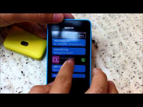
And why should they? The Asha 501 looks very much to be yet another proof of what might have been for the Finnish company, of a perfect synergy between its smartphone and smart feature phone lineup of MeeGo and the Asha Platform – or should we even call it Meltemi, the scrapped “MeeGo lite” project meant to power the Asha lineup?
Article continues after the jump.
“A Swipe is All You Need”
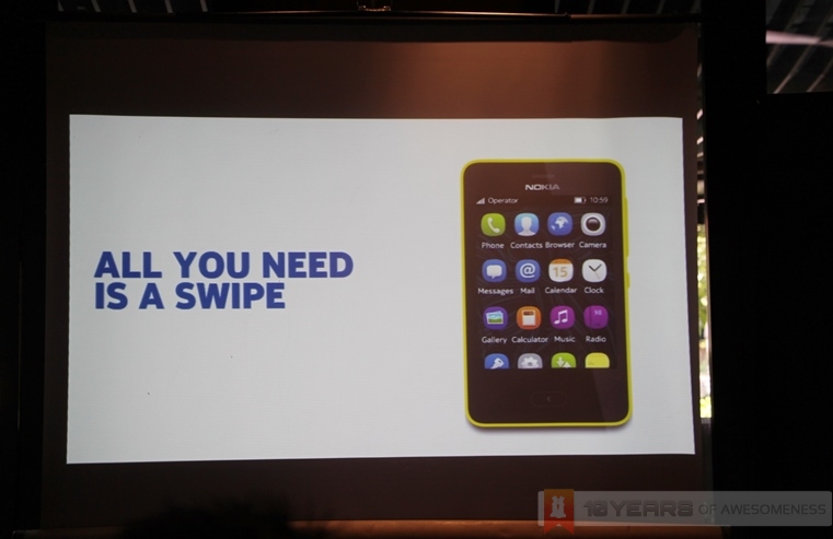
The Asha 501 has plenty in common with the Nokia N9, once the company’s flagship smartphone back in 2011, both in the hardware and the UI features. In fact, this was very much highlighted in one of the presentation slides during the launch event (pic above), which is highly reminiscent of the N9’s “Everything is Just a Swipe Away” motto.
http://www.youtube.com/watch?v=_3d8xzeNoJY
http://www.youtube.com/watch?v=gfE3B6L-Otw
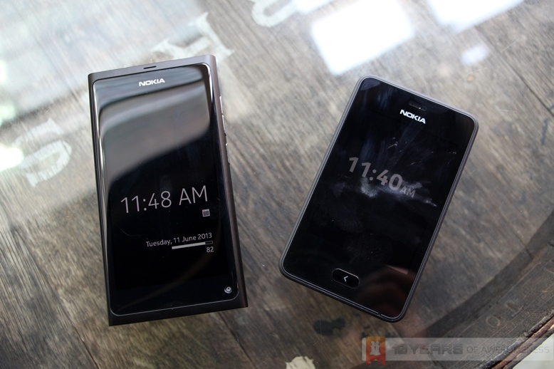
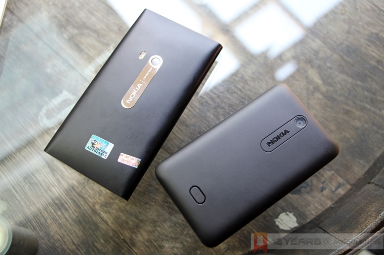
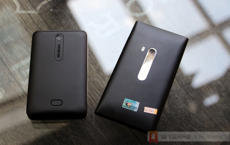
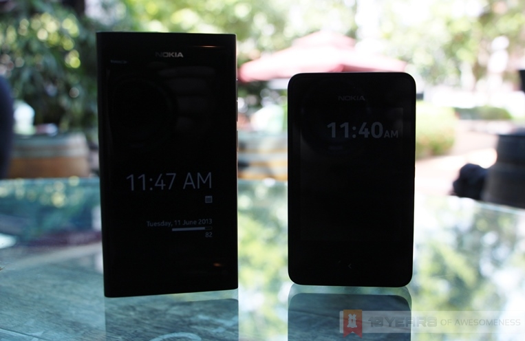
The Fabula design language is distinctly present on the Asha 501, such as the smooth rounded polycarbonate body and the design cues around the camera. There’s the always-on screen, too – a feature Nokia now calls Glance Screen. Also, like the N9, users need only double tap the screen to wake the phone. Even the lockscreen is unchanged, where a swipe from the side bezels unlocks the device, or swiping away at a notification brings the user straight to the app.
The home screens are pretty similar as well, with an iconography that is immediately familiar to those fortunate enough to have seen the first and only MeeGo-Harmattan device. While the Fastlane home screen is a new feature, it looks a lot like an evolved version of the Events home screen from the N9.
Perfect Synergy
This coherence and synergy from the low-end to the premium markets is something that none of Nokia’s competitors could achieve with Android or Windows Phone, and would have been something amazing to behold. With one unified or visually familiar user interface, first-time smartphone users – those the Asha 501 is targeted at – can easily shift to a higher-end Nokia device with little to no learning curve, thus retaining its consumer base while still bringing more first-time users in. With an estimated one billion new smartphone owners to upgrade from feature phones this year alone, this would have been an incredibly powerful stimulus for the company in the long term.
Unfortunately, at the top end of Nokia’s portfolio is not MeeGo, but Windows Phone 8. At the launch event, a Nokia Malaysia rep mentioned that the Asha 501 contains features that they will immediately be familiar with as they upgrade to a higher-end Nokia device – the Lumia range of smartphones. When asked to elaborate, the upcoming Amber update for WP8 was mentioned, which brings the new Glance Screen and the double-tap to wake features exclusively to Nokia Windows Phone 8 devices. Once the phone is unlocked, however, the Asha Platform and Windows Phone 8’s user interface are vastly different, making the rep’s statement rather flawed.
MeeGo & Meltemi: the Could Haves, Should Haves, and What Ifs
Meltemi, the scaled-down version of MeeGo that was rumoured to be mere months away from completion before it was scrapped last year, looks like it lives on on the Asha Platform – a new OS built with the know-how brought over from Nokia’s acquisition of Smarterphone. MeeGo was always lauded by its developers as a very scalable platform, capable of performing well even in low-end hardware. It was a big advantage for the platform, because it allows for a cohesive product lineup that none of Nokia’s competitors can offer. Android and Windows Phone have proven to be crippled when run on low-end processors with limited RAM, and as a result, the user experience on cheap Android and Windows Phone devices are pretty bad – not to mention the fact that these devices quickly become obsolete compared to the higher-end variants.
But alas, MeeGo is no more and Meltemi is a stillborn. We may never know how dire were Nokia’s financial woes, which triggered the $1 billion deal with Microsoft causing Nokia to drop most of its homegrown OS efforts to concentrate on the Lumia range of Windows Phones. Evidently, the platform is proving difficult to scale down, prompting the continuation of the Asha lineup. Whether Nokia’s strategy succeeds with Windows Phone at the high and mid end, and Asha Platform for the low end, only time will tell.
Until then, here’s one last look of what could have been for the once-mighty Finns.
Follow us on Instagram, Facebook, Twitter or Telegram for more updates and breaking news.


