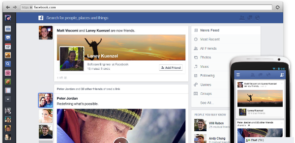
Last week, we reported that Facebook teased an event whereby it will unveil a new design for its News Feed and if you’ve been waiting eagerly for that moment, it’s here. Not too long ago, Facebook finally took the curtains off its redesign, giving us all a much cleaner News Feed whereby we can filter content by type to display, i.e. photos, music, games (for all your fake Facebook accounts generated for gaming purposes I suppose), and such. The new design will be rolled out slowly not only to its desktop site, but also to Facebook mobile apps as well.
So, what’s different in the new design? As you can see in the image, the News Feed is much larger now, allowing you to focus on what you really care about. According to Mark Zuckerberg, his goal is to let everyone have the best personalized newspaper, hence the flexibility to pick and choose what you want to show up in News Feed. With larger images – 50% of content in News Feed is now Photos and almost 30% comes from pages – the new News Feed is now more visually engaging, helping Facebook achieve its goal.
The new design now also has a uniform menu tray that pops out from the left side of your display, making it easier for users to navigate to any part of Facebook without having to go all the way back to Facebook – I can visualize how neat that would be for mobile apps. The new design will be applicable for all devices despite their screen size, so you can have a seamless experience no matter where you go.
Check out Facebook for more information and to join the waiting list to be one of the first to experience the new face lift. Meanwhile, let us know what you think of the new design.
http://www.youtube.com/watch?v=YaQQHYQHnMk
Follow us on Instagram, Facebook, Twitter or Telegram for more updates and breaking news.


