“Every once in a while, a product comes along that changes our perception of how we use technology, and how natural it can feel.”
– Marko Ahtisaari (Head of Design, Nokia), June 2011
As we usher in the start of a new calendar year, it is the perfect time to look back and wonder just what might have been. We look back at the highs and lows that we encountered over the past twelve months, and think of the path not taken. It is fitting, then, that perhaps we take one last look at what might have been for a device that could and should have changed the fortunes of a once-great company as well as the smartphone scene all at once.
Eighteen months ago, Nokia announced a smartphone unlike any other it has produced before. It was a proper smartphone, one that looked miles away from previous Nokia phones: it was sleek, modern and simple at the same time. The hardware was pretty modern, too; no underpowered processors with severely limited RAM issues to be seen here. And, it runs on an operating system that Nokia had announced dead months before the phone’s announcement.
This, ladies and gentlemen, is the Nokia N9.
From OSSO to MeeGo
For a detailed account of the history of MeeGo, head on to this brilliant article on Taskumuro, which has accounts from various ex-Nokia employees.
Long before the launch of the N9, in 2005 Nokia had a group of employees who were running a project called Open Source Software Operations (OSSO). Its goal was nothing short of ambitious: to produce a product that would change the world. In 2007 the OSSO team were renamed as Maemo, based on the open-sourced operating system of the same name that the team developed.
However, internal competition within Nokia from the Symbian team which began way back in 2005, brought about speculation inside Nokia that Symbian were deliberately slowing the Maemo team down for fear of Maemo’s success. It was the type of uphill challenges that the Maemo – and later on, MeeGo – team would have to constantly face for the next few years.
In 2010, Nokia and Intel reached an agreement to merge both companies’ open-source projects, Maemo and Mobile Intel (Moblin), into one open-sourced ecosystem called MeeGo. However, the merging of the two projects meant greater red tape, which hindered the progress of the Maemo team, who at the time were already developing its latest Maemo 6 OS – codenamed Harmattan.
http://www.youtube.com/watch?v=oU8kYwqZKgM
Nevertheless, the MeeGo team pulled together, and in June 21, 2011, Nokia announced the N9, the world’s only MeeGo-based consumer smartphone, which runs on a unique instance of MeeGo called MeeGo-Harmattan.
Unfortunately for the N9, by the time it was announced, Nokia’s new CEO Stephen Elop announced a partnership with Microsoft in February that year. Under the agreement, all of Nokia’s mid-range and flagship devices will be running Microsoft’s Windows Phone OS, leaving MeeGo to “project” status for “longer-term market exploration”. Contractual obligations meant that the N9 had to be released, despite the Microsoft alliance, putting it in a unique position as an accessible niche consumer product.
The N9’s Hardware: Many Nokia – and Industry – Firsts
http://www.youtube.com/watch?v=RqxYiXtzKd0
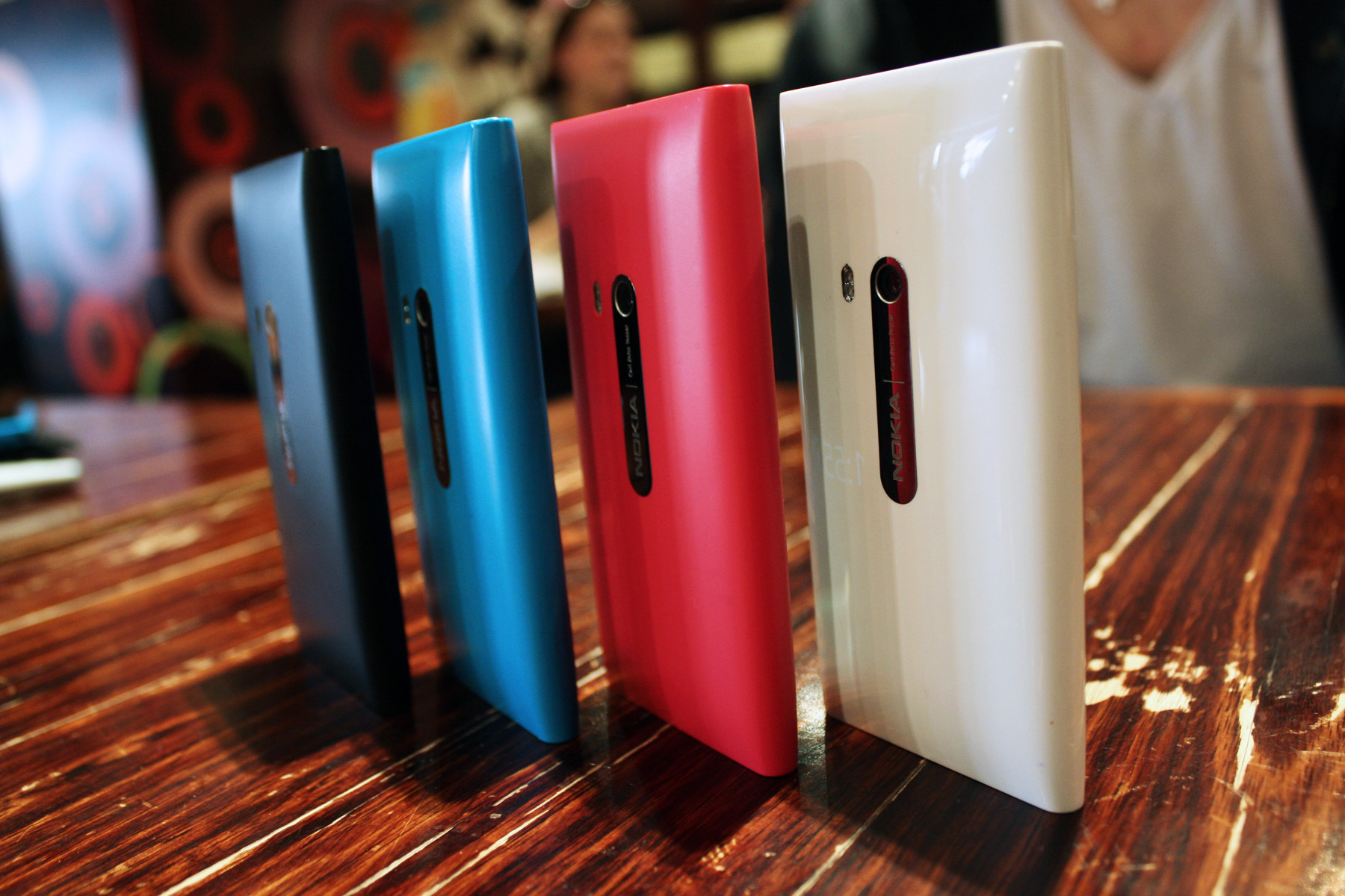
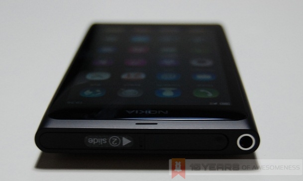
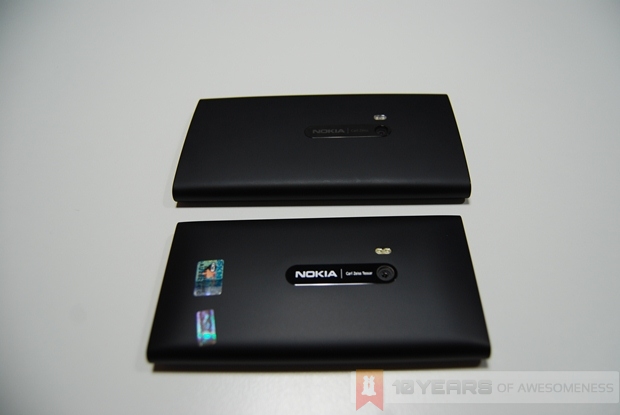
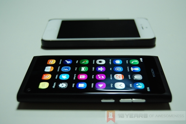
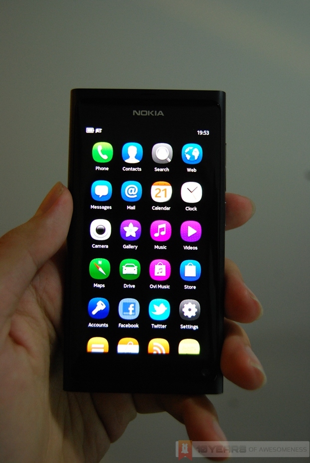
Nokia was very proud of the N9, and for good reason. The Swipe user interface was unlike any other UI in the market, and was very well received by critics. One reason why Swipe UI feels completely different on the N9 was because the N9 was built for the UI. The N9 was the first smartphone to employ a convex-curved glass that seamlessly flowed out of the polycarbonate body, which assists swipe gestures from the edge of the screen.
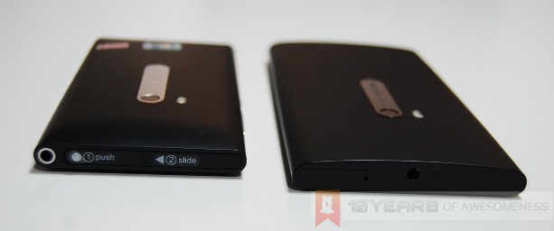
Also, the N9 was the first smartphone to use polycarbonate for its chassis. Polycarbonate’s properties make it one of the best choices for a smart device: it is more durable than standard plastic and the polymer is coloured through (or colour-inherent). It also has excellent antenna performance, unlike phones made from metal. Today, polycarbonate has made its way into plenty of other smartphones, proving that polycarbonate is no mere marketing gimmick.
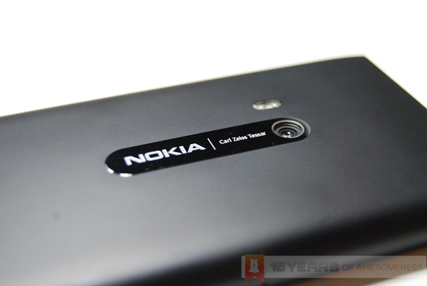
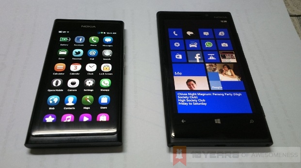
The Finnish company is also extremely proud of the industrial design of the N9, which was known inside Nokia as the “Fabula” design language. This is a simple yet extremely difficult to manufacture design, simply because of the body’s tapered ends and seamless transition from polycarbonate to glass screen. The “Fabula” design language has proven to be such a hit among critics and consumers alike, it now lives on as the primary design for all of Nokia’s flagship devices, as can be seen with the Lumia 800, 900 and 920.
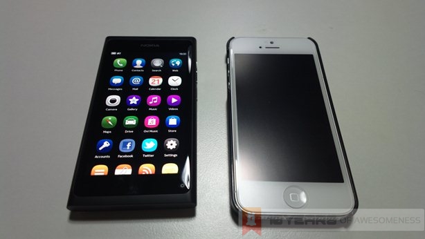
At a time when smartphone screen sizes were beginning to grow larger and more unwieldy, Nokia decided that the N9 would be a phone that could comfortably be operated with one hand as it is with both. The N9 sports a 3.9-inch display, which the company believed was the perfect screen size for one-handed usage. Fourteen months later, Apple announced the iPhone 5, featuring a 4-inch screen that the company mentions is the perfect size for use with one hand.
Finally, there is the screen itself. While the N9 did not push pixels like today’s Full HD Android smartphones, it had, at the time, one of the best smartphone displays in the market. There are two key reasons behind this, one of which is Nokia’s ClearBlack Display technology, which features polarizing filters that increases viewing angles as well as greatly improving outdoor usability. In addition, the N9’s screen was also built with no air gaps between the touchscreen and the Gorilla Glass on top, which gives the impression that the icons are “floating” on the display. Pair this technology with a ClearBlack AMOLED display, and you’ll have a screen where black colours are displayed so deeply that at you’ll have a hard time seeing where the screen ends and the bezel begins.
http://www.youtube.com/watch?v=LxUymqLGG-M
The N9’s Software: Inspiring Gestures on Other Platforms
Despite now being classified as a dead OS, MeeGo not only lives on with community projects such as Mer and Nemo (as well as Sailfish from Finnish startups Jolla Mobile – more on that later), many of the features seen on MeeGo-Harmattan live on today on other platforms.
Take Windows 8, for example. Of course, the Start Screen is more reminiscent of Windows Phone 8’s Live Tiles, but there was one gesture which came straight from MeeGo-Harmattan: while in any app on the Metro Windows 8 UI of the OS, a downward swipe from the top bezel to the bottom will close the app. This “Swipe down to close” gesture remains, for me at least, the most elegant gesture to close an app on any mobile platform – and potential patent lawsuits aside, it is pretty cool to see this gesture incorporated into Windows 8.
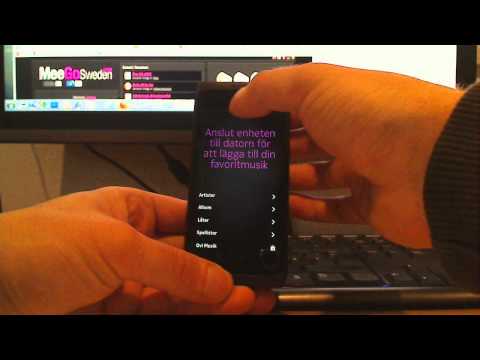

 The World Gaze app, an experimental app from Nokia’s Beta Labs that was only available on the N9
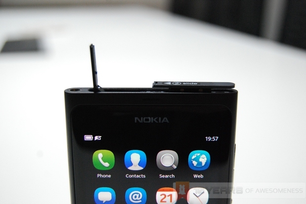
Naturally, when talking about MeeGo-Harmattan’s gesture-driven UI, it isn’t difficult to draw comparisons with RIM’s upcoming operating system, BlackBerry 10. BB10 remains one of the most intriguing OS releases of this year, despite being close to a year late. Like MeeGo-Harmattan, BB10’s UI is heavily based on gestures. To unlock a BB10 device, users simply swipe up from the bottom bezel (on the N9, it is a double tap to wake the phone, and an edge-to-edge swipe to unlock). More than anything, BB10’s gestures appear to be an evolution to MeeGo-Harmattan’s Swipe UI, and despite initial complaints from Nokia followers, many have since gotten pretty excited over what RIM has to offer at the end of this month.
Glanceability Concept: Devastatingly Effective
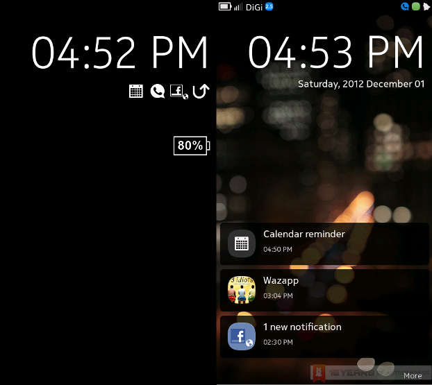
When describing the concept of Live Tiles on Windows Phone, Ahtisaari describes a concept that Nokia refers to as “Glanceability”. Live Tiles allow users to keep up to date with the latest notifications without having to interact with the device in any way. Of course, this concept was revealed in an interview during the Stephen Elop era. The glanceability concept stretches further back in time, and can be seen on display even in Nokia’s feature phones of several years ago.
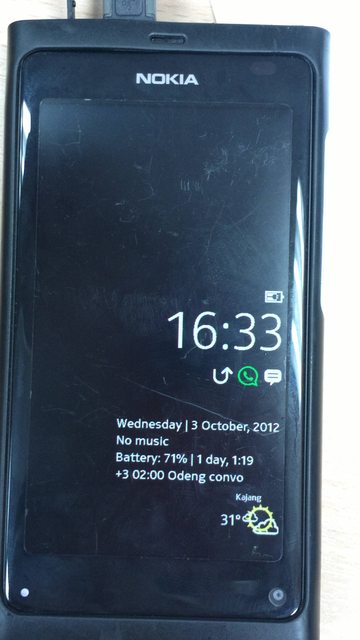 (Image Credit: pikachu @ forum.lowyat.net)
The N9 has an always-on low power screen mode which displays the time as well as phone notifications. Some community developers even managed to add more information to be displayed on the screen, such as weather and battery percentage. In addition, due to the properties of AMOLED screens, this low power screen mode takes up very little energy, and refreshes every few minutes to prevent the pixels from burning in. This low-power screen is the epitome of Nokia’s glanceability concept, and one which is not replicated anywhere else other than on some Symbian smartphones. The simple yet devastatingly effective idea of a low-power mode has since appeared on some Android devices, and may have also inspired Russian company Yota Devices to produce the YotaPhone, an intriguing Android smartphone coming this year that has two screens: a high-resoulution LCD main screen, and a secondary low-power Electronic Paper Display (EPD) which can display all user notifications, calendar entries as well as for use in apps, should developers support it.
The Big Picture: Nokia and Windows Phone
Nevertheless, Nokia has gone on a path of no return with its alliance with Microsoft. Looking back, the big-money deal definitely looks one-sided, and pushed the Finnish company to the brink of bankruptcy. As reported by TechCrunch, Nokia was very well aware of the fact that Windows Phone 7 was a stopgap OS whose devices had no upgrade path to the upcoming Windows Phone 8. Yet, Nokia went ahead with the deal and then prematurely announced that its current revenue-generating OS, Symbian, was to be discontinued in 2016, and the MeeGo efforts to be shelved (key members of the MeeGo team at Nokia left in July 2012, leaving it as good as dead). As a result, none of Nokia’s WP7 devices sold well, even with the deep discounts the Lumia phones were being sold at. Rumours also emerged that in the final quarter of 2011, Nokia sold more N9s than the sales of all Lumia smartphones.
One year on, and Nokia’s WP8 devices have finally seem to catch on with the public. Nokia’s flagship Lumia 920 has been well received by critics, who praised the smartphone’s stunning imaging capabilities and impressive build quality. The Windows Phone 8 platform also seems to have finally caught up with the other big players, though it still has its fair share of hiccups. Hence, the question remains: is Windows Phone 8 better than what Nokia’s MeeGo team could have come up with in the span of one year?
http://www.youtube.com/watch?v=dr0sKQ9YEFw
In the space of eight months, the MeeGo-Harmattan platform received three major software updates (although this also showed just how rushed the OS was when it was released), and the user experience after the final PR1.3 update remains among the most delightfully intuitive on any mobile device, despite the chip architecture that is now three years old. Hence the above question is as tantalising as it gets for anyone who follows Nokia.
Looking Forward
As an owner of an N9 myself, it is becoming perfectly clear that while there is incredible community support for applications (there was a software update for a Twitter client just last week), and developers continuing to experiment with the UI, the hardware is becoming increasingly dated. The days when I would pick up the N9 just to double tap and swipe around the homescreens for no apparent reason will soon end. The question that many N9 owners like myself are probably asking is, what next?
One solution could be the YotaPhone. It is certainly an interesting concept: an Android smartphone with a low-power e-ink screen and has Swipe-like gestures? It solves the apps issue that has plagued the platform and the hardware issue in one blow. On the other hand, BlackBerry 10 is another appealing avenue: it has another gesture-based UI that looks like an evolved version of Swipe, plus BlackBerry World has compatibility with Android apps.
 (Image Credit: AllBoutN9)
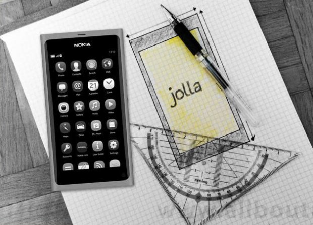
However, the obvious choice would probably be Finnish startups Jolla Mobile. Founded and staffed by former Nokia MeeGo employees as well as some community developers, the company is building on the work done by the MeeGo spin-offs Mer and Nemo, and built an entirely new UI on top (Swipe UI remains Nokia’s intellectual property). In November, Jolla heralded the first public appearance of its MeeGo-based Sailfish OS and the company’s UI called Jolla UI. An announcement over its first device is expected to be released this quarter, with a view for a Q2 launch. Interestingly, Jolla will be producing its own Jolla-branded smartphones as well as licensing its OS in an effort to boost the fledgling ecosystem, despite the OS also being compatible with Android apps.
In his review, Vlad Savov of The Verge likened the N9 to an Italian supercar. To a certain extent, he was right: at times when the N9 worked, it was breathtaking; at others, the aging hardware can cause the OS to crash under heavy load. Personally, I feel the N9 is like our first car: it is a unique love affair between man and machine. It may not be the best car in the world, but it evokes a sense of excitement for the owner seeing it on the driveway that makes the him want to take it out for a spin. It is for that reason why the N9 is probably the most underrated smartphone ever made.
(Featured Image Credit: My Nokia Blog)
Follow us on Instagram, Facebook, Twitter or Telegram for more updates and breaking news.


