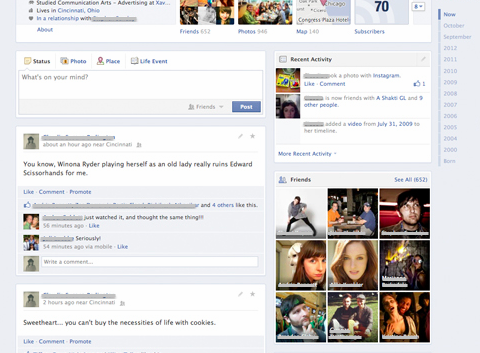
Never one to shy away from trying out new features, Facebook has reportedly been trying out a new layout for its Timeline. Previously, Timeline posts appear on two columns, which may be rather confusing for many since users need to look on both columns separated by a line between the two columns indicating the chronology of posts.
The new layout eliminates this line, and instead opts for a single column for posts. This, judging from the screenshot above, instantly makes Timeline a lot easier on the eye, as posts appear more streamlined. This layout is currently being tested by a select number of users, before the company eventually updates the site with the new layout – soon, hopefully.
(Source: CNET)
Follow us on Instagram, Facebook, Twitter or Telegram for more updates and breaking news.


