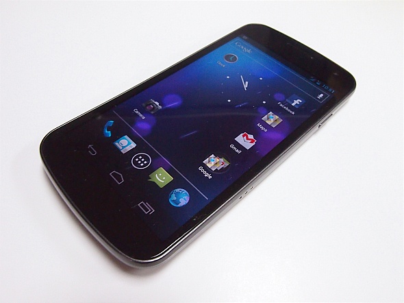
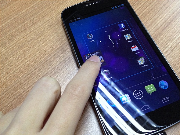
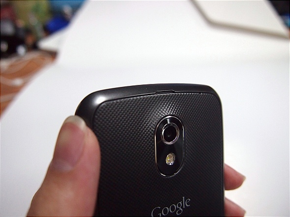
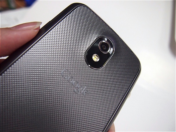
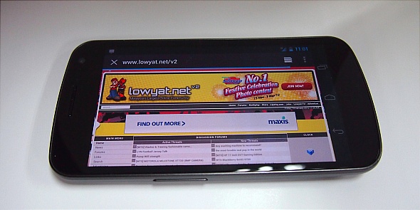
It’s finally here, today’s the day where DiGi finally ships the Galaxy Nexus to those who pre-ordered from as early as late last week, so what’s the big hype about the Galaxy Nexus? Well, the Ice Cream Sandwich OS of course. We were lucky to get our hands on one and here’s a quick introduction to the Galaxy Nexus; the 4.3” Super AMOLED Ice Cream Sandwich device packed with a 1.2GHz dual-core processor under its hood for a snappy performance.
Face Unlock
It’s so fast, I hardly notice it working; I actually thought it was faulty and it could unlock with any face because I could close my eyes, frown, grin, smile, stick out my tongue and it would still unlock – in less than a second mind you. That said, it could also unlock to a photo I have of myself; I thought they fixed that problem already?
If you put a face it doesn’t recognize in front of it, it will immediately bring you to an alternative way to unlock your phone – by pattern or by pin which wasn’t that fun because I had to keep turning the display off and on again to bring back face recognition.
I wouldn’t use it if I were you. I don’t know if all babies look alike because they’re all so cute and cuddly, Face Unlock unlocked to two different baby pictures; yes pictures, I used one to lock it and another totally different baby picture could unlock it.
Hit the break to find out more on what the Galaxy Nexus has to offer.
Interface
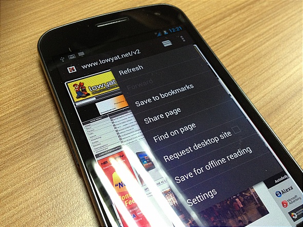
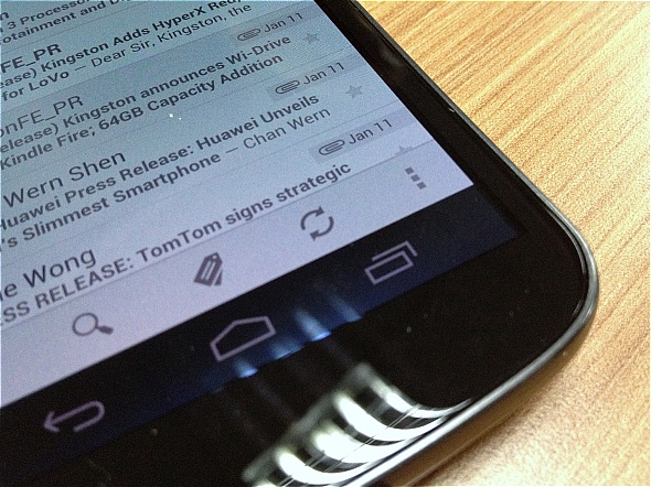
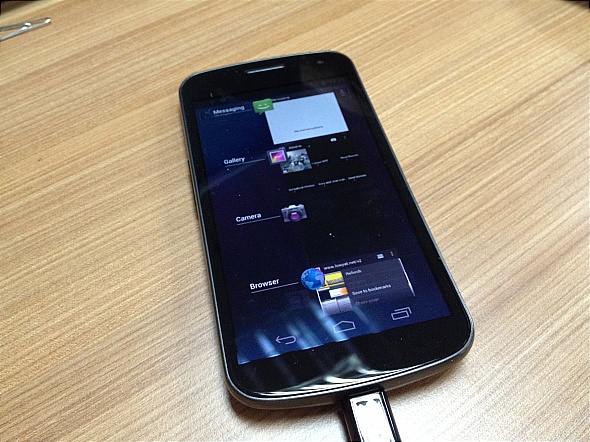
Perhaps the most obvious changes to this version of Android would be the interface. Notice how all physical buttons on the front panel of the display are removed, it now uses an on-screen button which can be quite annoying, especially the “menu” button. In certain apps, the menu button (indicated using 3 dots) would be located on the bottom right corner while at other times, it would be on the top left (which makes things even more annoying because you would have to scroll all the way up to access it).
If you’ve used the Honeycomb version before, the bottom menu would be more recognizable; back button would the located on the left, home on the middle and the right button would show all the tasks that are running.
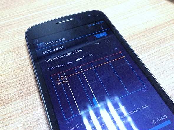
There are also additional features in ICS like the ability to track your data usage and get it to warn you when you hit a certain limit within a determinable timeframe – very useful especially if your telco charges you by the kb when you exceed the limit.
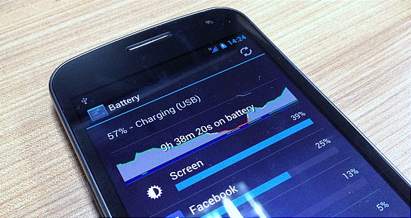
You can also track your battery usage and see which app is draining out your precious battery life.
Shortcuts, Apps and Widgets
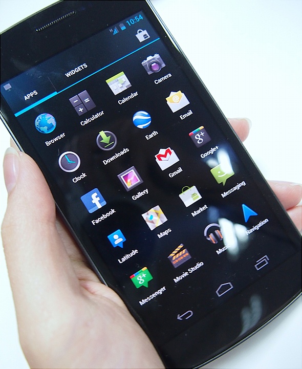
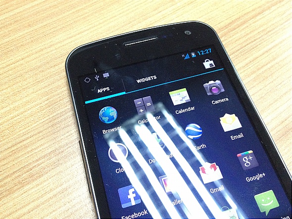
Adding a new item to your home screen is much easier now, you won’t need to select if you would like to add a shortcut, widget, app specifically, all you need to do is access your menu, tap on the item you would want to place on your desktop, hold it, and it’ll automatically bring it to the home screen.
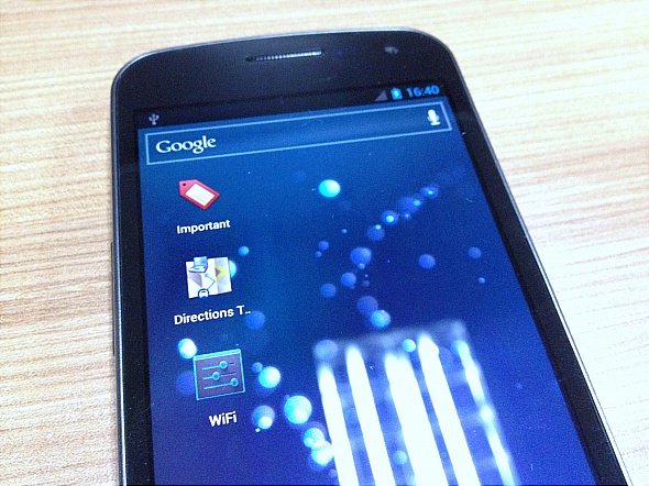
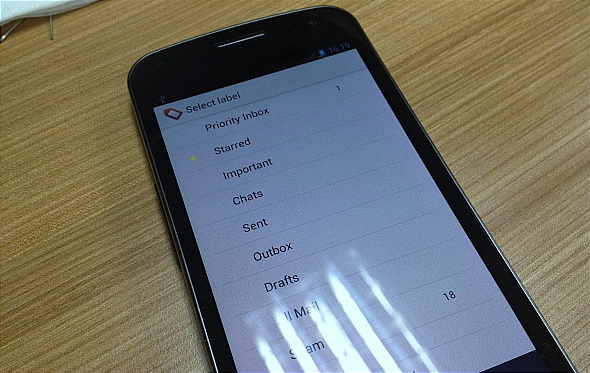
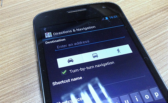
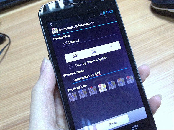
That said, shortcuts are also a lot more customizable now – you can select to put a certain contact on the screen so you can call that person without fumbling through your contacts, you can place a specific map direction, a specific Gmail account or even a specific label within that account, and well, so many more.
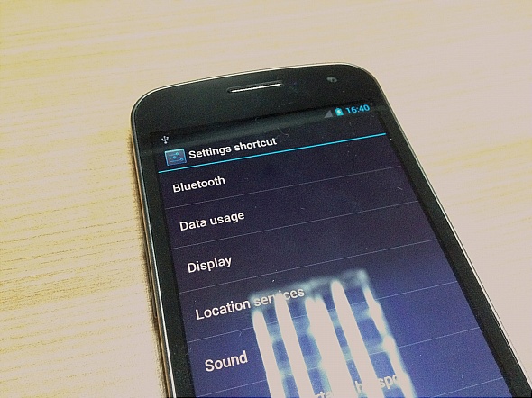
Setting the shortcuts to show me all “Important” mails only, the directions to a certain location – I chose work, hence the laptop icon on top, and shortcut that lets me change my WiFi settings directly without opening the entire settings page.
That’s about it, for now. Do check back for a full review but before leaving with the Galaxy Nexus, there’s one significant thing I must praise about the new phone – the improved keyboard! On top of being able to add new words to its dictionary – very important for us Malaysian users who have a lot of slangs, it is much easier to type and auto-correct is also much more accurate now. Finally, maybe ICS could change my mind about Android, I’ve always hated the keyboard on all the other versions.
Follow us on Instagram, Facebook, Twitter or Telegram for more updates and breaking news.


