EDIT: The unit we got was the 16GB version. The GSM version of the phone is currently available in both 16GB and 32GB flavours while the LTE version is only 32GB. Apologies again on our part for the oversight.
Since the start of the Android OS revolution many moons ago, the “official” Google phones have always been right up there in performance and popularity, starting with the illustrious Google Nexus One. The fact that all the Google handsets featured an experience sans manufacturers skins and UI “improvements” is what made these phones desirable in the first place. The problem was that the Nexus One wasn’t really available in Malaysia and even in the US, it was pretty expensive as it wasn’t tied to any carrier for subsidies.
The Galaxy Nexus is the 3rd phone in the series and the second that was manufactured by Samsung. After a bout of teasers that got the world salivating over it, we’ve finally gotten our hands on one to see what all the fuss was about. Is it everything we hoped for in a phone? Or does it fail to deliver on all accounts? Read on to find out!
Review Continues After The Jump
Exterior and First Impressions
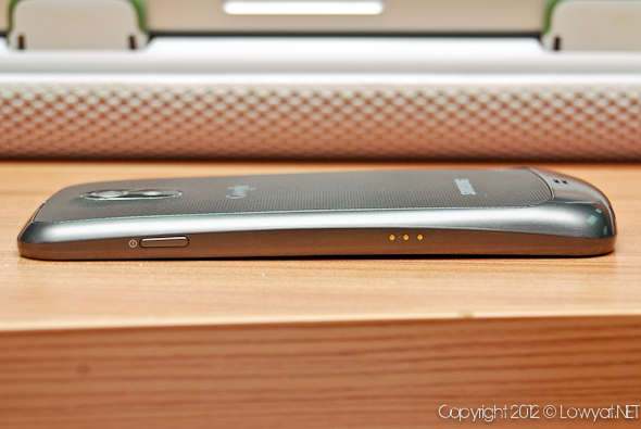
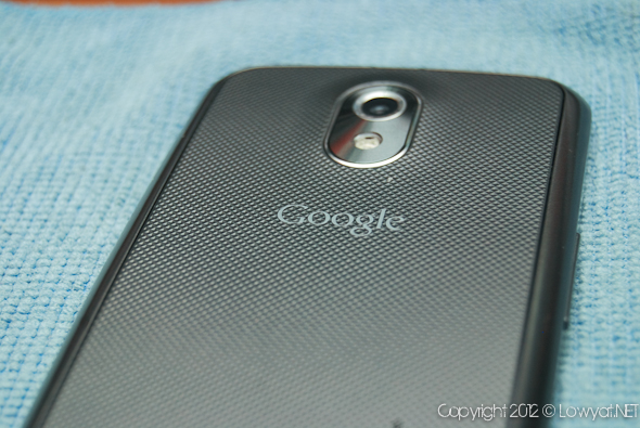
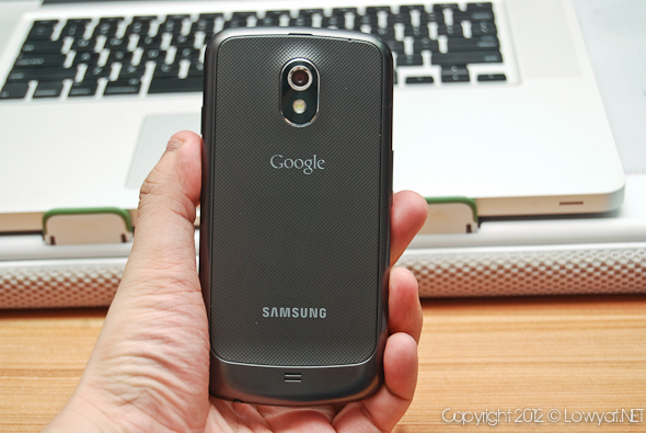
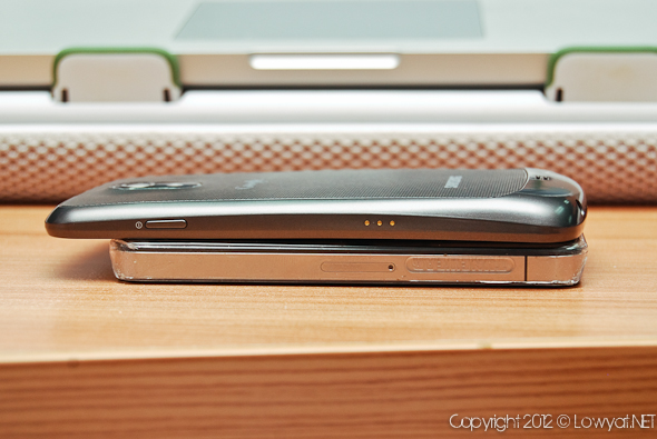
When you first unbox the Galaxy Nexus, you’re reminded of that sexy silhouette that was used as a teaser many months ago. While not exactly the thinnest handset on the market today, the Galaxy Nexus is built pretty well and despite being a Samsung handset does not feel the least bit plastic or cheap. That is of course until you remove the back cover. The trend of handsets to have jutting out chins, butts or foreheads is an alarming one to say the least, but the Galaxy Nexus’ posterior sits nicely at the bottom of your palm and doesn’t seem a tad bit out of place. Weighing in at a decent 145g and measuring 68mm x 135mm x 9.47mm, the phone is not exactly the most comfortable sized (in my opinion of course) but is pretty freaking sweet.
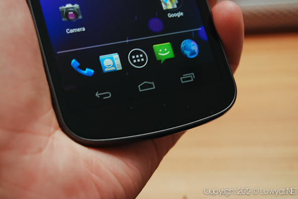
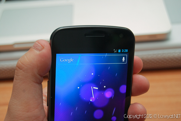
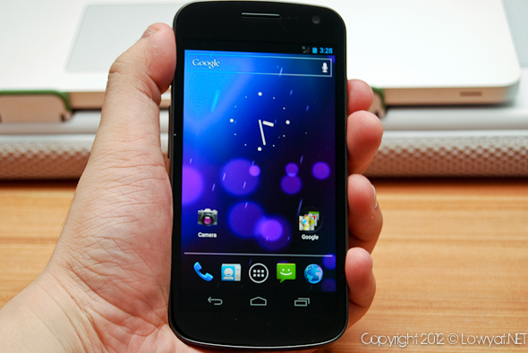
The Galaxy Nexus features a pretty big 4.65Inch 1280×720 Super AMOLED screen which takes up most of the front face of the phone and unlike phones prior, has 3 touch buttons not as a hardware solution but built into the Android 4.0 Ice Cream Sandwich interface. It certainly takes some getting used to, but in the end, you wouldn’t think anything of it. The bottom of the phone features a 3 color LED which you can set to change color depending on what notification is pending! Of course I had mine as green for WhatsApp, blue for twitter and white for everything else.
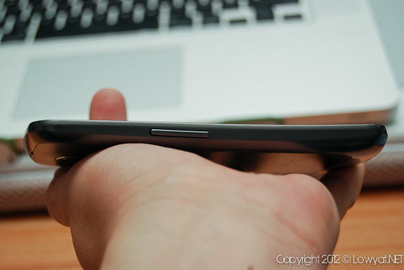
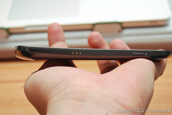
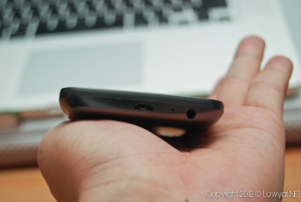
The button layout for the phone is pretty damn good, with the power on the right and volume on the left. USB takes the bottom with the audio jack and that rounds out the minimalist design. The omission of a dedicated camera button is a surprise and a little bit of a hinderance, but in the grand scale of things, it’s not that bad.
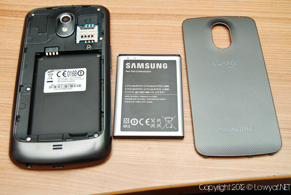
The only gripe I have with the Galaxy Nexus is with the black plate. For one, it’s not the easiest to remove for serial fingernail biters like me and is the only bit of the phone which actually feels cheap. I wonder if the Soya Cincau guys are actually bending this back cover all the way. Another thing you’ll notice is that this phone doesn’t come with a MicroSD card slot, opting instead for 32GB 16GB onboard Storage.
The Experience
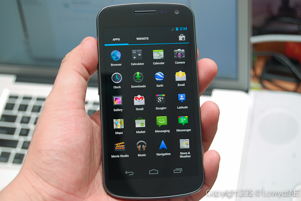
The Galaxy Nexus is powered by a 1.2GHz dual core processor and has 1GB RAM and you can really feel it. That combined with the new Ice Cream Sandwich OS, you can feel the fluidity and zero lag or stuttering when it comes to opening menus, multitasking and swiping through screens as a whole. The Super AMOLED screen is incredibly bright and contrasty and its no surprise with the handset manufactured by Samsung. Viewing videos or gaming, the Galaxy Nexus is a pleasure to use.
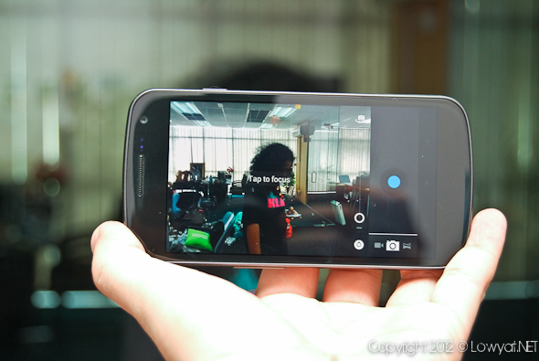
The Camera on the Galaxy Nexus isn’t exactly the best camera out there, with not that many customizable options and weighing in at a mere 5MP compared to many cameras out there, it’s definitely one of the things that lets the Galaxy Nexus down. When you take a picture as well, you probably won’t know you took one because there is no haptic feedback and a very soft sound. Perfect for perverted mobile phone camera experts everywhere. Check out some samples from the camera below
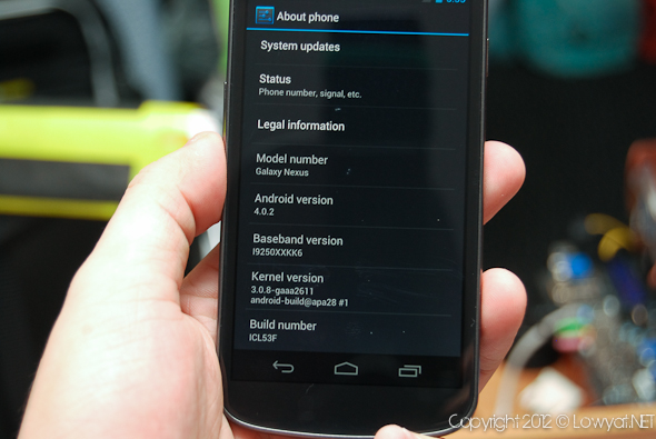
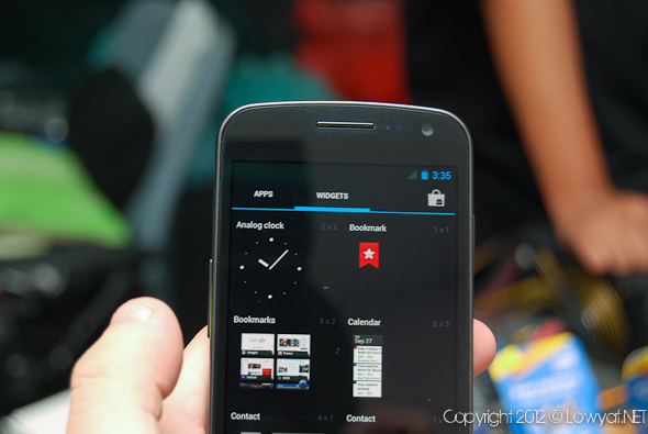
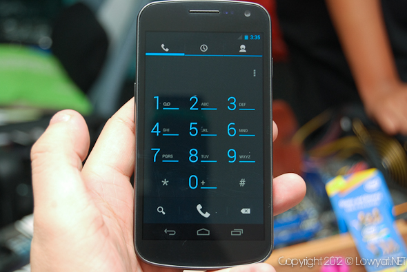
While it’s not an Android 4.0 Ice Cream Sandwich review, I thought I may touch on some things that are noteworthy with my first foray into the latest and greatest of the Android OS’. Firstly the touchscreen buttons takes some getting used to. While the back and home are the same, the rightmost button has been changed to show frequently used apps, sort of like a double tap home on Gingerbread. The menu/context button now only appears in some instances as 3 vertical dots. Sometimes it will be on the top of the screen and sometimes at the bottom, beside the apps list button. Not only does it look out of place there, it kind of ruins the flow of the clean OS. Let’s not forget the fact that right in the corner, you’re likely to press the open apps button with your thumb when aiming for the menu button. Hopefully since it is a software solution, it can be rectified as soon as possible.
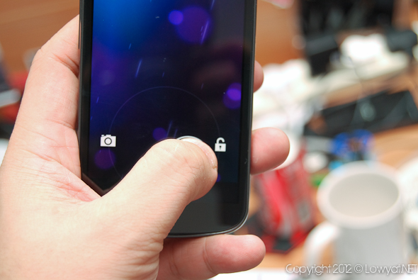
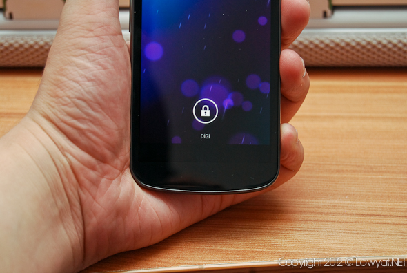
Another thing about Ice Cream Sandwich that slightly irks me is that the Google Toolbar is a permanent feature on your home screen, no matter what. I don’t even use it, why should I have it on my home screen! The lock screen is reminiscent of Sense 3.0 with the shortcuts, but falls just short as you only have 1 other option, which is the camera. Lastly, where on earth is my numerical battery meter? I can’t estimate how much battery I have just by a bar now can I? That being said, the battery life on the Galaxy Nexus is mediocre at best, If it is used as God intended, good luck getting a full day out of it. That 1850mAh battery doesn’t go far at all.
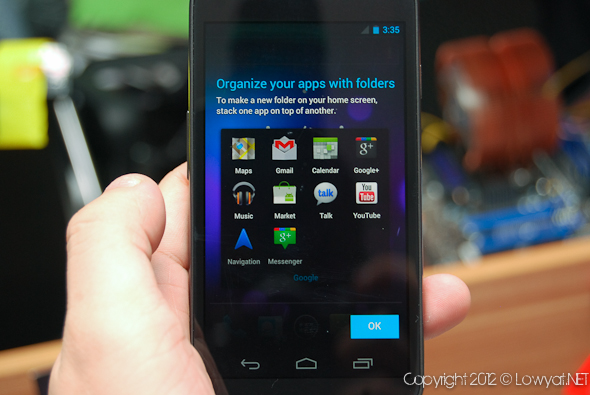
Overall, Ice Cream Sandwich is a great iteration in the line of Android OS’, changing many things from the ground up. The UI changes are welcome and the slick menus and the like are a breath of fresh air from the previous editions of the mobile OS. If you’ve used Honeycomb however, the changes won’t be as drastic. While there are some kinks in the armor that is Ice Cream Sandwich, its still probably the best Android OS by far.
I didn’t test features like the barometer, face unlock and all that jazz as to be honest, I never needed to in the time I used the phone. I will still stand by my opinion that these things are pretty much nice to have, but not at all essential to the user experience.
Conclusion
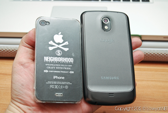
This is the first of the Nexus devices I’ve had the pleasure of using and color me impressed. The vanilla Android OS experience is certainly all its hyped up to be and the Galaxy Nexus is a very good first phone to showcase the OS. Most of the problems I have with the phone ARE software problems which can easily be fixed and as a phone, I have not many bad things to say about it. If I have to nitpick, I’ll have to say the phone could be better with a smaller screen and perhaps the option to have a microSD card to expand storage. The biggest gripe probably is the camera on the phone.
Will I recommend this phone to someone looking for a top of the line smartphone? Yes. The Galaxy Nexus is certainly a sign of great things to come for Ice Cream Sandwich and its compatible handsets. While the camera is not great, I think the good outweighs the bad and in fact, I’m considering this phone as my replacement to my aging un-named mobile phone.
The Galaxy Nexus is available now from both Celcom and DiGi. If you want more details on the pricing of the phone, check out our comparison on the DiGi and Celcom price plans here!
For more details about the Galaxy Nexus, check out the official site here
Follow us on Instagram, Facebook, Twitter or Telegram for more updates and breaking news.


