 (Image credit: 123rf.com)
For many consumers like us, the launch of a highly-anticipated smartphone or tablet is usually preceded weeks beforehand with rumours and leaks of the supposed device. Even the launch of a new operating system can kick off a round of speculation, as seen with Microsoft’s Windows 8 or RIM’s BlackBerry 10. While these may be enough to create a buzz leading up to a launch, they don’t provide much of an indicator whether the product will be a hit.
On the other hand, by peering at the stock prices of a company before the launch of its products, we can determine the investor’s view of the product – which perhaps offer a greater indicator of a product’s success. Why? Many investment funds hold blue chip stocks such as Apple, Google and Microsoft, and these funds analyse each company in their portfolio to check if they will perform in line with their expectations. A product launch can stimulate the share price of a company, for good or bad. Hence, these funds (as well as prudent retail investors) will have made their move weeks – sometimes months – before a product’s launch. In addition, these price charts also give a pretty good indication of investor confidence in the company itself.
Let’s take a look at the historical prices of the heavyweights in the industry such as Apple and Google, as well as flailing companies such as Nokia and RIM during the significant periods of each company for the past six months, and see if there were any visible trends leading up to big launches and announcements such as the iPhone 5, Nexus 4, 7 and 10, Lumia 920, and also operating systems such as BlackBerry 10.
As one of the most valuable companies in the world, how could we not start with Apple? 2012 has been a very productive year for the company, with the launch of a plethora of new and refreshed iDevices, such as the new iPad mini, the colourful iPod family, the sexy new iMac, and of course, the flagship iPhone 5. But how did investors feel about these devices? Did the iPhone 5 bring about the bull run many speculators were hoping for? Did the iPad mini cause the loss of investor confidence?
 Six-month chart for AAPL (Source: Google Finance)
 Three-month chart for AAPL (Source: Google Finance)
The chart on top is the six-month price chart for Apple’s stock prices on NASDAQ. A quick glance will tell you that the company’s share price has been on a downward trend since September. In fact, the three-month chart shows this pattern even better. Since hitting a high of $702.10 on September 19, it has lost close to $200 per share to $509.79 as of last Friday. Considering the total shares of the company, the company’s value dropped about $188b since September. So, what big event happened in September?
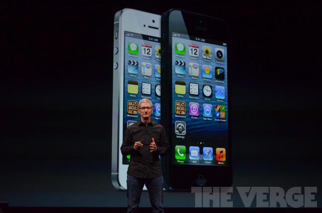
Yup, the iPhone 5 was announced on September 12. When rumours of the refreshed iPhone first emerged, market optimism and speculators alike drove the share price up by a good $150, hitting the $702.19 high a week after the iPhone 5 launch. Just like the previous iPhones, consumers immediately fell in love with the iPhone 5; it received two million pre-orders within the first 24 hours. However, when Scratchgate emerged a week later, questioning the company’s product quality assurance, Apple’s share price has been going down ever since. Even the launches of the iPad mini, fourth-gen iPad, Retina display Macbook Pro 13 and the new iMac in late October failed to turn the tide.
 12-month chart for AAPL (Source: Google Finance)
 5-year chart for AAPL (Source: Google Finance)
However, if you take a look at the longer one-year or even five-year chart, the company continues to be on an upward trend, although this current slump does appear to be one of the worst for the company in recent memory.
Let’s then take a look at Apple’s main industry rivals, Google. Despite its core business not being the manufacturing of smart devices, we can still see some patterns in their stock prices based on the company’s product launches.
 Six-month chart for GOOG (Source: Google Finance)
 1-year chart for GOOG (Source: Google Finance)
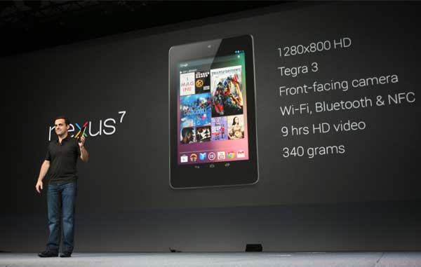
In Google’s six-month price chart, there is one clear upward trend where the price went up around $150 from late June until early October. This substantial increase can be mainly attributed to the launch of the company’s first Nexus-branded tablet, the Nexus 7. With a combination of pure Android and powerful hardware at super competitive prices, the Nexus 7 remains one of the better tablets in the market today, and clearly a well-received product in the eyes of the investor. In fact, it took a tax-related lawsuit to end market optimism on the company: about two weeks before the media reported that the company was to face UK lawmakers over tax evasion queries, its share price plunged over $100. However, shortly after the report came out, the company’s share price recovered and has been on a positive trend ever since, possibly buoyed by the launch of two more Nexus devices as well as the latest iteration of the company’s Android OS, indicating investors’ long-term optimism on the company.
 (Image credit: Hindustan Times)
On the other hand, price charts also give a good indication of a struggling company’s future. Here, we take a look at two fallen tech giants: Nokia and Research in Motion (RIM).
 5-year chart for NOK (Source: Google Finance)
Nokia’s five-year price chart is nothing short of depressing. The company’s share prices have been on a downward trend since December 2007, falling from the $38 mark to an almost unbelievable low of $1.69 in mid-July this year. It is hardly a surprise, then, that this slump coincided with the launch of the first iPhone from Apple in 2007, and the sudden realisation that Nokia’s phones were no longer competitive enough to be the industry leaders. The slump continued despite the announcement of the company’s newly-developed OS, MeeGo, and the launch of the first and only MeeGo device, the N9. The N9, in particular, helped bring a brief upward trend in October 2011 when the company hinted that there was strong demand for the device. However, the big disappointment that is the cancellation of MeeGo and the subsequent shift to Windows Phone failed to convince investors that Nokia was on the mend. However, with critics giving positive reviews on the latest Windows Phone 8 OS – as well as news that CEO Stephen Elop buying significant amounts of Nokia’s shares – has brought the company back on a positive trend.
 Six-month chart for NOK (Source: Google Finance)
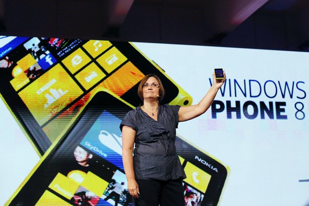
This upward trend continues to this day, as rumours of an amazing flagship Lumia smartphone in August to its actual launch in September being powerful catalysts. Last month’s launch of its HERE mapping service further increased investor confidence, in addition to highly promising sales of the flagship Lumia 920 smartphone.
Interestingly, Nokia’s fortunes mirror that of RIM. Its five-year price chart also shows a continued downward slump since August 2008. The company has been losing out to other smartphone manufacturers for the longest time after its BlackBerry smartphones gained a reputation of being “too serious” and not in keeping with the times. Even worse for the company is when news emerged that many corporate companies no longer issue BlackBerry phones to its employees, and instead has adopted the BYOD practice, further disrupting sales figures.
 1-year chart for RIMM (Source: Google Finance)
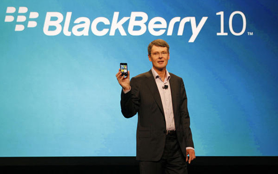
As a result, the company has been trying hard to reassure the public and investors alike that its upcoming operating system, BlackBerry 10 will be a game-changer. And, it seems investors think so too. After its low of $6.31 at the end of September, the company’s share price has gone up more than twofold to a price of $14.04 last Friday. The company looks to also be ready to deliver on its promise of a January 30 release of BlackBerry 10, with numerous leaks and even a device ready to be launched with the OS. Just like Nokia, it looks like RIM may have just turned a corner.
 6-month chart for RIMM (Source: Google Finance)
From blue chip heavyweights to the comeback kings, historical price charts always have a story to tell in the tech industry. It’s even more interesting how, with proper knowledge in the stock market and keeping abreast on the latest tech news, an investor can actually make correlations between the two and predict the potential success of a new device or software long before its official launch. It’s amazing when numbers can tell you just as much as words can, don’t you think?
Follow us on Instagram, Facebook, Twitter or Telegram for more updates and breaking news.


